

This gem was last updated on the 22.01.2024 (dd.mm.yyyy notation), at 06:53:53 o'clock.
About the gtk_paradise project

(The above image was partially autogenerated using cfdg rules. See this fine project here for more information pertaining to the autogeneration of such - or similar - images: https://www.contextfreeart.org/gallery/)
Welcome to the epic gtk_paradise project! Epic in the sense that no such similar project exists for ruby, in regards to ruby-gtk in general.
What is this project all about, then?
The gtk_paradise project bundles together code that can be used to make it significantly easier to work with the official ruby-gtk bindings to GTK - in particular for the GTK version 3 (also called ruby-gtk3 for the purpose of this document here), but to some extent also for the legacy GTK version 2 (called ruby-gtk2 for the purpose of this document here).
Since as of the release saga 0.11.x partial support for ruby-gtk4 (that is, bindings to GTK4) has been added as well. This does not yet work fully, due to many changes made upstream (in particular to the event-system), but eventually ruby-gtk4 will be fully supported by the gtk_paradise gem and eventually replace ruby-gtk3 - although that remains to be seen. As of April 2023, the primary target and focus for the gtk_paradise lies on ruby-gtk3, though.
What is GTK?
GTK itself is a toolkit for classical "oldschool" desktop applications first and foremost. These may not be en vogue anymore, but for quick prototyping desktop applications may be really extremely useful. You can even prototype widgets that respond to on-mouse-hover actions, so in some ways that is similar to how JavaScript functions in the web-browser. Perhaps in the long run we could one day even use one unified code base to allow us to create something in a single DSL, and have it run everywhere. Write once, run everywhere! \o/
Deprecation notice
ruby-gtk2 appears to be barely maintained actively anymore. As I can no longer compile it from source, since as of October 2023, support for ruby-gtk2 via the gtk_paradise project is semi-deprecated. I will retain the old code in examples/gtk2/ as-is, as well as the documentation; and I may fix bugs and improve things otherwise. But other than that, consider moving to ruby-gtk3 or ruby-gtk4. The primary focus as of 2023 is ruby-gtk3, with ruby-gtk4 one day being fully supported as well.
CSS Handling in GTK and the gtk_paradise gem
CSS files distributed in the gtk_paradise gem
All .css files that are distributed in the gtk_paradise gem will reside at the following location:
gtk_paradise/cascading_style_sheets/
This has to be documented, as previous releases of the gtk_paradise gem used another path for .css files.
Using Gtk::BaseModule to handle CSS rules
The gtk_paradise gem includes a few .css files which cater to my use case. If you want to make use of these CSS rules then, after including Gtk::BaseModule, call the following method:
apply_the_default_css_rules
This will read in the file content of the two files project.css and colours.css. The latter is for colours; and the former is for everything else. This will actually append the default CSS rules, so if you want to add CSS manually while also using this method, it is recommend to append these custom CSS rules before calling .apply_the_default_css_rules().
If you want to quickly verify the CSS in use for the widget at hand, as a String, then you can simply use this method:
display_the_CSS_rules
You can still append CSS lateron, such as:
append_these_CSS_rules '.bblack20 { border: 20px solid black; }'
CSS - how to add a CSS class to a gtk-widget in general
Say that your use case is to add a CSS class to a specific gtk-widget.
The default upstream API for achieving this, goes as follows:
.style_context.add_class('your_css_name_goes_in_here')
.style_context.add_class('bblack1') # For example, use the CSS class called bblack1. On my system this is equivalent to "border: 1px solid black"
More specifically with a real gtk-widget as example:
label = Gtk::Label.new('Hello world!!!')
label.style_context.add_class('bblack5')
Let's show yet another example, this time with the CSS rules coming first, and the widget that uses this CSS rule coming second:
# First the CSS rule is defined:
.fancy_styling {
  font-size:     50px;
  border:         8px solid darkgreen;
  border-radius: 32px;
}
button = Gtk::Button.new('Hello world!!!')
button_context = button.style_context
# Next, we add that CSS class to the button:
button_context.add_class('fancy_styling') # This will add the CSS class.
Note that Gtk::BaseModule, distributed via the gtk_paradise gem, simplifies this a lot. See other subsections in this document to showcase how this has been simplified.
Adding a new class goes via .add_class():
.add_class('white')
And removing it goes via .remove_class():
.remove_class('white')
You may have to remove an old CSS class before you can add a new CSS class.
Note that you can give a widget a name, similar to an ID in HTML, via .set_name():
.set_name("red_label")
label.set_name("red_label")
This allows you to use specific CSS classes too.
To create a hover effect, you could tweak the following CSS:
.button { border-radius: 15; border-width: 2; border-style: outset; }
.button:hover { background: #dff; border-color: #8bb; }
If you would like to see a longer explanation then have a look at the following URL:
https://shallowsky.com/blog/programming/styling-gtk3-with-css-python.html
Gtk::CssProvider
This subsection contains some information about class Gtk::CssProvider.
This class can be used to make CSS rules available for gtk-widgets. It is available by default if you require 'gtk3'.
If you have a local .css file and want to load it, consider using the following API (and adjust accordingly to your use case):
require 'gtk3'

css_provider = Gtk::CssProvider.new
css_provider.load_from_path('/home/x/programming/ruby/src/gtk_paradise/lib/gtk_paradise/css/default.css') # ← Provide the path to the .css file here.
CSS rules - various examples
This subsection will contain a few CSS rules as examples.
This is mostly just a quickref (quick reference), in the event that people want to refresh their knowledge about how GTK handles CSS rules.
Showing specific examples that work is best, because it is very simple and straightforward, in my opinion.
First: keep all widget names lowercase. There are old examples on the www available where the widget-names in use for CSS start with "Gtk", such as GtkEntry. Such examples no longer work and are deprecated. Instead, simply use, for instance, entry instead these days.
At any rate and without further ado, next come a multitude of different, specific examples.
Picking a proper font via CSS:
font-family: Monospace;
font-family: Cantarell; # Or use this family.
Set the size of the font at hand, via CSS:
font-size: 25px; # don't forget to put this inside the {}, of course.
Set the background colour of every window to a particular colour:
window {
  background-color: white; # replace this here with a colour of your choice; and use 'color' rather than 'colour'
}
To make a button show a hover-effect (when the mouse is "above" the button), try the :hover directive, such as the following example shows:
.button:hover {
  padding:          12px 48px;
  background-color: #4870bc;
}
(An alternative to the above CSS rule may be to make use of the method .override_background_color(), but here we focus primarily on CSS rules.)
It is possible to target specific children in a gtk-widget. For example, in order to specifically style the first child of a gtk-widget, such as for a button, try the following CSS rule:
.button:first-child {
  border-radius: 5px 0 0 5px;
}
Modifying two widgets at the same time via the same CSS style - in this case a gtk-button and a gtk-entry:
button, entry { /* Keep in mind that this would modify ALL buttons and entries at the same time.
  color: #ff00ea;
  font:  12px "Comic Sans";
}
You can also style / theme insensitive widgets in general, via:
*:disabled {
  background-color: #320a91;
}
Theme all labels in the first notebook tab:
notebook tab:first-child label {
  color: #89d012;
}
Theme the entry of a Gtk::SpinButton specifically:
spinbutton entry {
  color: #900185;
}
Apply the green colour to every gtk-widget, via *:
* {
  color: green;
}
If you want to style a Gtk::TextView widget, use a CSS rule such as the following:
textview.view {
  margin: 10px;
  padding: 10px;
  border: 2px solid rgba(0, 255, 255, 0.3);
}
To make a rounded border effect you can use CSS rules such as the following, via border-radius:
button {
  border:        6px solid steelblue;
  border-radius: 8px;
}
Or, via an ID, use the following:
#button1 {
  border:        6px solid steelblue;
  border-radius: 8px;
}
You can also give each coordinate a different value, such as via:
.rounded_corner {
  border-radius: 0px 0px 6px 6px;
}
This would lead to rounded borders on the bottom, but not on the top. In general, though, I think each of these four values being the same looks a lot better.
Either way, adjust the values to your preferences.
Make all selections appear in steelblue colour can be done via:
selection {
  color: steelblue;
}
Use an unequal border-width (e. g. empty on one area):
border-width: 2px 0 2px 2px; # This setting would factually omit the right border.
.small_border { border-width: 2px 0 2px 2px; } # Ready for copy-paste. \o/
If you have a need or use case to change the colour of the pulsing cursor in a gtk-entry or gtk-textview, also called a caret, then you could use something like this:
* {
  caret-color: gold;
}
This would change the colour of the caret to gold. This may be useful if your gtk-entry has a black background colour and you want to change this to a more visible caret - hence gold. The example at gtk_paradise/examples/advanced/025_showing_a_gold_caret_on_black_background.rb shows this via a simple entry.
You can also associate this with a specific CSS class or make the caret transparent, such as in:
.my_label { caret-color: transparent; }
.foobar   { caret-color: green; }
To give the whole window a fancy background, use a CSS rule such as the following (for Gtk::Window):
window {
  background: linear-gradient(153deg, #151515, #151515 5px, transparent 5px) 0 0,
              linear-gradient(333deg, #151515, #151515 5px, transparent 5px) 10px 5px,
              linear-gradient(153deg, #222, #222 5px, transparent 5px) 0 5px,
              linear-gradient(333deg, #222, #222 5px, transparent 5px) 10px 10px,
              linear-gradient(90deg, #1b1b1b, #1b1b1b 10px, transparent 10px),
              linear-gradient(#1d1d1d, #1d1d1d 25%, #1a1a1a 25%, #1a1a1a 50%, transparent 50%, transparent 75%, #242424 75%, #242424);
  background-color: #131313;
  background-size: 20px 20px;
}
So you can use linear-gradient too.
CSS Support in gtk3: using CSS in ruby-gtk3 and using CSS via the gtk_paradise gem
This subsection contains information about CSS in ruby-gtk3 (or, more accurately, in gtk3 itself, as ruby uses gobject-introspection for the bindings to gtk these days).
You can use CSS in ruby-gtk3, such as via class Gtk::CssProvider.
An example for how this can be used follows next - first, the CSS rules at hand for a gtk-label widget has to be defined:
label {
  font-size:  42px;
  font-weight: 800;
  color: steelblue;
}
We style a gtk-label there, to be quite large (42 px size), thick and in a colour variant.
Next, ruby code is shown to benefit from these CSS rules:
provider = Gtk::CssProvider.new
provider.load(data: USE_THIS_AS_THE_CSS_STRING)
Gtk::StyleContext.add_provider_for_screen(
  Gdk::Screen.default,
  provider,
  Gtk::StyleProvider::PRIORITY_APPLICATION
)
I am not sure how much of CSS is supported in GTK+, but sticking to the commonly used CSS rules, such as color, background-color and so forth, appears to be working fairly well. Since I keep on forgetting which rules may work and which ones may not, I intend to keep this subsection here as a quick reference; expect some CSS examples to be shown in this subsection.
As the above ruby-code in regards to Gtk::CssProvider is quite cumbersome to type (the last section has 7 lines of code, even though it is spaced out onto several lines of code), in December 2020 the following method was added to the gtk_paradise project:
Gtk.enable_default_css
This does precisely what the above 7 lines of code do.
The gtk_paradise project comes bundled with a file called default.css, in the directory css/.
This is mostly catered to my use case and needs, or just to be used for demonstration purposes, but it can also help teach other people how to use CSS via ruby-gtk.
The toplevel method:
Gtk.return_default_css
Will return the content of that file, as a String. You can then use this for the css-provider that has to be used API-wise.
To make use of CSS in ruby-gtk3 applications you may have to use class Gtk::ClassProvider, which is provided by the ruby-gtk3 bindings, as stated before. I found it a bit cumbersome to use it, though, so code was added to the gtk_paradise project to simplify dealing with CSS files.
Consider using this method:
Gtk.enable_default_css
You can pass the CSS string into this method. By default the main .css file will be used that is also distributed by the gtk_paradise project; the string that is returned via Gtk.return_default_css.
Note that you can give individual names to gtk-widgets, and use CSS to style them, such as how the following example shows:
#foobar {
  background: steelblue;
}

entry = Gtk::Entry.new
entry.set_name('foobar')
(Do not forget to use the css-provider.)
Sometimes you may not be able to make use of the background-color property. This may be due to the theme at hand, such as the Adwaita theme, which will set a default background-image on buttons.
Thus, one may have to remove it first, before making use of a background colour.
Example for this follows, in CSS:
button {
  background: none;
  background-color: red;
}
If you want to use a standalone .css file for Gtk::BaseModule, which is part of the gtk_paradise gem, then you can put a .css file into the same directory. Then, call this method:
use_css_file
# or:
# use_css_file if use_gtk3?
This will assume the default path to the .css file at hand.
Gtk::BaseModule makes use of this. I tend to use it via the method called reset(). See some examples under the classes/gtk3/ subdirectory or classes/shared_code/.
The studium gem is another example of a widget-set that makes use of that right now; look at the gtk3/ subdirectory in that gem, under gui/ for a working example. I intend to expand on this for all my other ruby-gtk3 code, starting from December 2020.
In January 2021, the classes/tabble/ project for the ruby-gtk3 code also makes use of that. Stay tuned for more CSS! \o/ (This has been relocated into widgets/gtk3/tabble/ in August 2021.)
You can style many of the widgets individually. For example, to colourize the text in a Gtk::TextView you could use this CSS rule:
textview text {
  color: steelblue;
}
To theme a particular label called foo_bar, use this:
label#foo_bar {
  font: 15px Sans;
}
To remove any shadow from a widget, you could try to use this CSS rule:
box-shadow: 0 0 0 black; /* removes shadow completely */
You can style tooltips as well; these are the slight pop-over widgets that appear if the user has the mouse cursor over some widget.
To give tooltips a background colour via CSS that is light grey, use something like this:
tooltip {
  background-color: lightslategray;
}
I verified that this works - and it did, in January 2021.
Or a bit more fancy stuff for a tooltip, including a larger default font:
tooltip {
  background-color: white;
  font-size: 25px;
  border: 3px solid darkblue;
}
And ready-made for addition in a ruby-gtk3 widget:
apply_these_CSS_rules 'tooltip {
  background-color: white;
  font-size: 25px;
  border: 3px solid darkblue;
}'
You can import existing .css files via import, such as:
@import url("path/to/common.css");
For the colours.css file that is distributed via the gtk_paradise gem the following code should work fine:
@import url("'+Gtk.project_base_directory?+'css_files/colours.css");
Make sure that the path to the .css file as such works, that is that the file also exists at the particular location at hand. See the example 002_import_CSS_file.rb distributed in the gtk_paradise project, at examples/css/002_import_CSS_file.rb.
You could also use relative paths such as:
@import url('../../.local/share/foobar.css');
If you use Gtk::BaseModule then you can also display the CSS that is used, via the following two methods:
show_CSS_in_use # this method simply outputs on the commandline the CSS in use
# and this method will return a scrollable widget containing the CSS rules in use
You can find out these CSS names, by the way, via the upstream API documentation, such as via https://developer.gnome.org/gtk3/stable/GtkEntry.html. Look at nodes entries in CSS; then you can find the elements that you may have to target in your own .css file. You can also use the GTK3-built-in debugger.
Note: if you only want to quickly change the background-colour of some widget, such as a gtk-entry, then you can simply use .override_background_color() instead.
Note that you can also use RGB values for colour entries in ruby-gtk3 and CSS, like the following example demonstrates:
background-color: rgb(241, 135, 135);
Or, if you also want to provide the transparence value at the end:
background-color: rgba (0, 0, 0, 0);
The four parameters stand for:
  red:   value
  green: value
  blue:  value
  alpha: value
You can use custom images, such as .png files, to replace the default check button and radio button.
Example:
GtkCheckButton {
  -gtk-icon-source: -gtk-scaled(url("checkbox-unchecked.png"), url("[email protected]"));
}
Unfortunately I was not able to get this to work, as it is using the old syntax. I have not yet tested how to target check_button or checkbutton.
Some guides on the www state that you can use entries such as GtkButton, in order to style a button - which is no longer correct. I found it simpler to use #button or .button instead, though.
I think the latter variant is significantly more readable, so I will prefer to use it rather than the longer variant GtkButton or alternatives such as button {}.
You can style on-mouse-hover events over a button like so:
.button:hover {
  color: red;
  background-color: #00ffff;
}
A scrollbar can be styled in this way
.scrollbar {
  -GtkRange-slider-width: 13;
  -GtkRange-stepper-spacing: 0;
  -GtkRange-trough-border: 1;
  -GtkRange-trough-under-steppers: 1;
  -GtkScrollbar-has-backward-stepper: true;
  -GtkScrollbar-has-forward-stepper: true;
  -GtkScrollbar-min-slider-length: 42;

  background-image: none;
  background-color: #ffff00;
}
The hover action over a button in gtk can be controlled in this way, as the second example shows:
button {
  background-image: none;
  background-color: yellow;
}

button:hover {
  transition: 4000ms linear;
  background-color: lightblue;
}
Note the transition: setting; here you can specify the time before the transition finishes. So, 4000ms means 4 seconds until that transition has completed. It's a bit like an event in JavaScript, if you think about it.
See the example hover_button_with_css.rb in the examples/gtk3/ subdirectory, at gtk_paradise/examples/gtk3/026_hover_button_example_via_css.rb.
To selectively style a currently pressed button, do:
button:active {
  background-color: #0274d9;
}
You can modify the border around a gtk-widget via CSS. The following list shows examples here:
border-color: #cccccc;
border-style: solid;
border-width: 10px;
border-style: solid;
border-style: none;
border-style: hidden;
border-style: dashed;
border-style: dotted;
border-style: double;
border-style: groove;
border-style: ridge;
border-style: inset;
border-style: outset;
To make gtk-entries use less space, the following CSS should work, just as it does for HTML/CSS regularly:
entry {
  margin-top:     0px;
  margin-bottom:  0px;
  padding-top:    0px;
  padding-bottom: 0px;
  min-height:     0px; /* ← This one is probably the most important for these. */
}
Note that you can also negative values for margin, such as via:
element_goes_in_here {
  margin: -4px;
}
This may or may not work, though, depending on the element at hand, so keep that in mind.
If you want to modify a gtk-entry when the user clicks on it, use something like this:
.hover:focus {
  transition: border 100ms ease-in;
  background-color: royalblue;
}
Adjust accordingly to your use case.
This also works for check buttons, such as via:
checkbutton:checked {
  background-color: #56f9a0;
}
And it works for focused labels as well:
label:focus {
  background-color: #b4940f;
}
To style labels within a window in a particular way in general, make use of CSS rules such as the following:
window label {
  background-color: #898989;
}
If you want to modify a Gtk::TreeView instance, and give the top-row some colour, such as red, then the following CSS code should work:
treeview.view header button {
  color: red;
}
Here is a variant of the above that may look prettier:
treeview.view header button {
  color: royalblue;
  font-size: 1.5em;
  font-weight: bold;
}
To style Gtk::Menu and Gtk::MenuBar, try:
.menubar .menu {
    border-image: linear-gradient(to top,
                  alpha(@borders, 0.80),
                  alpha(@borders, 0.60) 33%,
                  alpha(@borders, 0.50) 66%,
                  transparent 99%) 2 2 2 2/ 2px 2px 2px 2px;
}
Fonts can be influenced via font properties.
Typical values for this may include:
font-family
font-size    # such as font-size: smaller; font-size: larger and so forth.
font-style
font-variant
font-weight
font-stretch
For example, to increase the font size in all textview widgets, try:
textview {
  font-size: larger;
}
To use a monospaced font family for the same textview widget, this should work just fine:
textview {
  font-family: monospace;
}
To apply a shadow to the text, via CSS, try something like the following via the text-shadow property:
text-shadow: 0 -1px rgba(0, 0, 0, 0.8);
text-shadow: 1px 1px 5px black;
Spin button styling via CSS:
spinbutton {
  background-color: orange;
}
Styling an entry of a spin button via CSS:
spinbutton entry {
  color: #900185;
}
To style a Gtk::Grid via CSS, you can use something like this:
grid {
  border: 1px solid steelblue;
  padding: 20px;
}
(Be careful with the padding value though, as that may lead to a quite "re-positioned" Gtk::Grid placement. Smaller may be better than larger here.)
To set the opacity (or as I may call it, 'translucency') via CSS rules, try something like the following:
opacity: 0.95;
opacity: 0.8;
To add an underline to a widget, via CSS, try:
text-decoration: underline;
(I assume this only works properly for entries that relate to text.)
To set the background colour, try this:
background-color: green;
RGB values can, most likely, also be specified, such as via:
rgb (0, 0, 255);
A colour-gradient (progressing from one colour to another colour) can also be used by GTK. There are two colour gradients in GTK:
linear and radial
I have not tested this yet, but the syntax for the linear gradient should go like the following example shows:
-gtk-gradient (linear, start_x start_y, end_x end_y, color-stop (position, color), ...)
More about colour gradients in gtk can be seen here: http://moonlightcoffee.weebly.com/gtk-with-css.html
A text field, as a gtk-entry, could be designated like so:
.entry {
  color: blue;
  border-image: none;
  border-color: red;
  border-width: 3px;
  border-style: dotted;
  background-image: none;
  background-color: yellow;
}
Combo Box example, as a dropdown menu:
GtkComboBox {
  -GtkWidget-wide-separators: true;
  -GtkWidget-separator-width: 1px;
}
You can also provide specific rules for individual widget classes, such as all Gtk::Labels that have a special name set.
Example for this specifically in CSS:
label#foo-bar {
  font: 120px Sans;
}
And the corresponding ruby-code to that (don't forget to also use the CSS-provider):
label = Gtk::Label.new('Test!')
label.set_name('foo-bar')
To modify all Gtk::ScrolledWindow instances you can use the following CSS rule:
/* Style our main scrolled-window a little bit. */
scrolledwindow {
  border-color:  steelblue;
  border-style:  solid;
  border-width:  3px;
  border-radius: 4px;
}
Vertical sliders (part of a scroll-bar) can be styled in this way:
.slider.vertical {
  color: green;
}
Adjust according to your needs here.
How to style Gtk::Notebook via CSS?
Gtk::Notebook has a main CSS node called notebook, so you can target that. A subnode exists, called header, which can be targeted as well. Another subnode is called tabs, which contains one subnode per tab with name tab.
So, to illustrate this via a specific example, for an orange border around a notebook (3 pixels thickness), you could use the following CSS rule:
notebook {
  border: 3px solid orange;
}
To give all widgets within a gtk-notebook an uniform background colour, consider making use of this:
notebook {
  background-color: #a939f0;
}
To target the header-bar widget as a whole, you could use this rule:
notebook header {
  color: green;
  border: 2px dotted royalblue;
}
To enable mouse-over effects (aka hover), try this:
.button:hover {
  background: #dff;
  border-color: #8bb;
}
Don't forget to use appropriate colours. My rule of thumb is mostly to stay in the same colour; e. g. darker blue by default, and on hover-action use a lighter blue. (Some users may be colourblind, but most people can see colours, so... still, try to use colour variants, if possible, that many people can use. And don't rely only on colours alone as the sole cue.)
Note that on the www you often see snippets such as GtkLabel {} versus label {}. The former is deprecated as of 2021, so the latter should be used. (To me it is not so important because I find the # variant better and shorter than both, anyway.)
Since as of January 2021 you can also use a global, per-project specific .css file. This must reside at css/project.css for the time being of your project (actually, this requirement was dropped; you can now simply pass a path of your choosing, but I recommend to stick to css/project.css, as I will do so for my own projects).
At a later time, I will make this more flexible, but as I am testing this right now, I wanted to just add support and move on from that point.
Use this method call in reset() or elsewhere.
use_the_global_css_file
Note that the above is no longer valid as of 19.01.2021; I rewrote most of the old code and removed a lot. I will update the documentation here in the coming days and weeks.
CSS-Theme support exists in a weak manner; so far only one theme has been started.
It could be used like so:
read_in_from_this_css_theme(:rainbow_theme)
But don't use it yet - I need to polish this and add more themes. My idea is simply to make it possible to bundle some common themes with the gtk_paradise project, as-is. We could even use pure CSS themes perhaps.
Interestingly in January 2021 I discovered an additional name to use css, via the method .add_class(). I don't yet know the difference here to .set_name(), but anyway, the following example shows how this can be used:
/* The CSS rule first: */
box.container {
  padding: 155px;
}

# And then in ruby, you must use .add_class onto a
# style_context object:
box.style_context.add_class('container')
This has been simplified in gtk_paradise to:
box.add_class_class('container')
Note that the rules in the .css file need to start with a dot (aka .), so if you use a # instead then it will not work. I found that out when I tried to use #, but we need a ., to mark it as a css-class.
If you style the background-colour of a button, via background-color, and you don't see this colour, then perhaps an invisible image confuses gtk.
In this case, you could use this first:
background-image: none;
That way you can "clear" that part, before applying the colour as-is. This worked for me in February 2021.
To modify a checkbutton that is currently checked (that is, active), use something like this:
checkbutton:checked {
  background-color: #56f9a0;
}
To make the colour transparent, simply use:
color: transparent;
CSS in GTK also allows additional syntax. For example:
@define-color bg_color #f9a039;

* {
  background-color: @bg_color;
}
I am not sure whether this is a good addition or not. Personally I want to stay to CSS available for the www, in order to have a unified code base.
If you have a need to remove a CSS class again, you can use this method, if you use the gtk_paradise gem:
.remove_css_class
.remove_css_class()
.remove_css_class('name_of_the_css_class_goes_in_here')
I am also experimenting with in .rb file CSS code.
For now you have to call this method if you want to make use of that feature:
apply_the_css_string # For now this has to be called manually.
In the future I may invoke this automatically.
To style a notebook via CSS, try:
notebook tab {
  padding: 0.4em;
  border: 0;
  border-color: #444;
  border-style: solid;
  border-width: 5px;
}

notebook tab:checked label {
  color: darkblue;
  font-weight: 600;
}

notebook tab:checked {
  background-image: none;
  border-color: tomato;
  font-weight: 800;
}

notebook tab button {
  padding: 0;
  background-color: transparent;
  color: #ccc;
}

notebook tab button:hover {
  border: 0;
  background-image: none;
  border-color: #444;
  border-style: solid;
  border-width: 1px;
}

notebook tab {
  padding: 0.4em;
  border: 0;
  border-color: #444;
  border-style: solid;
  border-width: 1px;
}
If you want to remove a CSS class, use this method:
.remove_class()
.remove_class('name_of_the_class_goes_in_here')
You can also work with IDs similar to HTML/CSS. For instance:
label.set_name("red_label")
css = '#red_label { background-color: #f00; }'
But I find it often better to simply use CSS classes and attach them as-is, depending on what you'd like to see instead.
A brief history of the gtk_paradise project
The gtk_paradise project itself was created many years ago, and then eventually published on rubygems.org in March 2015, under its old name gtk_module
Due to various reasons, including a seemingly necessary clean-up of the old code base that was part of the gtk_module project, the project was eventually renamed (and subsequently restructured) into the newly named gtk_paradise gem, in January 2020.
The new structure for the project should be more logical, and thus make more sense as well, at the least compared to the older project called gtk_module. Furthermore, one focus was on being able to support both ruby-gtk2 and ruby-gtk3 (and eventually ruby-gtk4) - although, as previously mentioned, support for ruby-gtk2 is no longer as strong and some old code may no longer work either.
Use cases and goals for the gtk_paradise project
Over the years, the gtk_paradise project has had different primary use cases. These will be listed now, starting with the more important goals:
(1) provide a set of convenience bindings/code that may enhance the whole gtk-stack in ruby.
I did not want to be limited solely by the official upstream bindings to GTK alone. Instead, I wanted to use ruby more naturally when writing ruby-gtk applications. Certain DSL-like commands appeared to make sense to me in the widget sets, such as .on_clicked {}.
For instance, rather than use this variant:
.signal_connect(:clicked) {
puts 'The button was clicked.'
}
I wanted to use this variant instead:
.on_clicked {
puts 'The button was clicked.'
}
This seemed more natural and logical to me, but this was not possible because the official ruby-gtk bindings are more closely trying to match the official C API that governs GTK - and stop right at that point.
This is largely due to gobject-introspection these days, and in part to simplify maintaining these upstream bindings. Either way I wanted to have more freedom in how to write ruby-code for ruby-gtk. See also the glimmer-project by Andy - you can find it on rubygems.org. Perhaps one day glimmer may unify all of desktop, web-related widgets and so forth. One codebase to rule them all. \o/
(2) distribute a common code base for different gtk-applications, to allow re-use of the code, as a secondary goal.
For example, Gtk::BaseModule is a convenience module that can be included into subclasses, like in the following manner:
require 'gtk_paradise/requires/require_the_base_module.rb'
include ::Gtk::BaseModule
Or, even simpler than that, to just use this:
require 'gtk_paradise/require_gtk3'
class Foobar < Gtk::BaseModuleFrame # This automatically has include ::Gtk::BaseModule
end
Then, once that was done, certain methods, such as gtk_text(), or just text(), can be used, rather than the slightly longer variant called Gtk::Text.new(), or gtk_label() or just label() rather than Gtk::Label.new().
So really, this was mostly done due reasons of my laziness or simply convenience, but additionally to avoid or reduce on code duplication. Other users of this gem can then also rely that these methods are supported by the gtk_paradise project in future versions - at the least once version 1.0 is released. (Right now this gem is still in a beta release state, so things may change. I will try to not break things unless absolutely necessary, though.)
If we use a single method, such as text(), then we can easily change this at a later time, even if the upstream names change. This is one additional use case for the project: to allow working with ruby-gtk2, ruby-gtk3 and ruby-gtk4 (and ruby-gtk5 eventually, and so forth): one code base to rule-them-all.
Take note that in regards to ::Gtk::BaseModule, I use the leading :: here because I want this all to be part of module Gtk. The reason for this is mostly due to long-term convenience when making use of this project. Of course typing a leading :: is a bit annoying, so this is a downside, but it is better to modify the toplevel namespace Gtk directly, in my opinion: keep everything coordinated in one namespace. (This was different in the older gtk_module gem, which is another reason why that was changed for the gtk_paradise gem.)
(3) to distribute some smaller classes and even games written in ruby-gtk.
Before the gtk_paradise project existed, I collected these different classes into local .rb files mostly (naturally), and put them into different projects - but in hindsight I think it may be better if there is a dedicated project that bundles together code, in regards to GTK, and publishes that code as well, ideally in an improved manner.
Here a hope is that if you or anyone else creates some ruby-gtk application, say a small game or something like that, to send it to my email address (if you would like to), and if you deem the licence in the gtk_paradise to be an acceptable one; then I could integrate this game. (Please also add some documentation if you can; not everything has to be documented and commented fully, mind you, but at the least an introduction, the basic usage, and perhaps some comments within the .rb files.)
Note that since as of 2021 I bundle games-related code into another gem called games_paradise - this one will include some ruby-gtk based games as well, so games are no longer distributed in the gtk_paradise project. Nonetheless, the gtk_paradise project retains its use case of trying to distribute a shared code base, for other projects to operate from, and re-use (and share) different new gtk-widgets and new gtk-based applications.
(4) last, but not least, provide stellar documentation and explanations.
This is still ongoing, but hopefully this may be useful to you even if you do not use this project. I benefitted from tutorials based on python-gtk3, so I found this to be a useful and laudable goal for ruby too: teach people, explain things, document stuff.
These are the four major goals for this gem. There are some minor goals as well, but they are not that important to mention them here; if you are interested in more minor goals, have a look at the todo/ subdirectory of this gem - these minor goals are, to some extent, mentioned there. As a todo-list.
The licence of the gtk_paradise project
Since as of the 19th July 2021 (19.07.2021) the gtk_paradise project now uses the MIT licence. Before that the gtk_paradise project used the LGPL-2.1 licence (GNU LESSER GENERAL PUBLIC LICENSE Version 2.1), without the later clause though.
I am perfectly fine with both GPL and LGPL licences - they are good licences. But they also tend to cause more hassle than what often seems necessary when it comes to enforcement of the licence part. The project here is a hobby project, so I am not even paying that much attention as to what others do with this code to begin with really - it's not a "key project" for me at all whatsoever, in this regard.
The MIT licence is much, much simpler than the GPL - other than the no-warranty clause (aka "you are on your own when using this project"), there isn't really that much else to worry about it. Whereas the LGPL licence is like really huge compared to the MIT licence ... and we haven't even gotten to the GPL yet, forcing all downstream code to have the same licence (and permissions, granted upon other users, too).
Anyway - here is a good summary for the MIT licence:
https://opensource.org/licenses/MIT
I don't even 'care' about the copyright statement as such, per se, but in some jurisdictions there is no way to forego the copyright notice (I think in Germany), so simply substitute as appropriate in such jurisdictions. How courts evaluate anything is not up to me - for this project, the MIT licence is used. That's it.
Towards a version 1.0 for this gem
Right now (in 2021, but also in April 2023, when this document was again updated massively, and again in November 2023) the gtk_paradise gem is not yet ready for a 1.0 release. I am still experimenting a lot in 2021 - as well as in 2023.
At some later time I will decide which features will be retained, and which ones will be removed. Then the documentation and examples will be improved, everything will be significantly polished, and a "final" 1.0 release will be published. This one will be made available for a significantly longer time, so that people can begin to use it for more serious projects.
Final here means that this will be the final 1.0 release. Of course later releases may follow past 1.0, but 1.0 will remain hosted on rubygems.org for a longer time than subsequent releases.
But this will probably take a few years, so stay tuned in this regard.
Documentation for the gtk-paradise project
The documentation for the gtk-paradise project is currently lacking, admittedly so. This is not good and should be remedied in the long run.
There are several personal reasons as to why documentation is lacking currently: laziness, lack of time and lack of motivation. But another, somewhat trivial additional reason is that I am experimenting a LOT right now.
I have no real idea what happens with the gtk_paradise project in its current form in the long run, in regards to future changes. I want to simplify the project, which means that old code may be removed every now and then. Retaining the ability to change a project is very important, unless it becomes stable. Sometimes you may find better ways to express an idea in code - or in less code. So the gtk_paradise project is not very stable right now, and probably will not be for a long time, until I feel sufficiently pleased with its present form.
I once had that crazy idea that it would be nice to have a GUI-like DSL-layer over the terminal interface, the www, as well as classical desktop elements, as pointed out above. To use one unified code base for all GUI-elements.
While this is probably too ambitious a goal, I still want to try at the least some of those ideas that can help us write more desktop-GUIs in ruby-gtk, at a much faster "implementation speed" than before (I refer to our human life time that we invest in creating this, NOT to the speed of code-execution once an application is run). So ideas in this regard are very welcome - and I am experimenting with these as well.
Nonetheless, whenever possible I will try to slowly improve on the existing documentation distributed as part of the gtk_paradise project - but ultimately I think for the time being, it may often be better to simply peek at the source code itself for the different widgets used in the gtk_paradise project. Some errors and mistakes may exist as well, so have a look at the official gtk-documentation aside from the project here.
The whole gtk_paradise project is definitely more geared towards people already knowing ruby quite well, not necessarily aimed for beginners. Beginners should start with the upstream ruby-gtk bindings instead, and work through the examples and demo, until they have a sufficient grasp of the underlying concepts used by upstream GTK. Of course nothing prevents you from giving the gtk_paradise project a try as-it-is; beginners are, however had, not necessarily the main, primary target audience for this gem.
I, on the other hand, wanted to write widgets in a more ruby-centric manner, including some DSL-like elements, such as simply using gtk_button or even just button in order to create a button, or add methods such as .on_clicked to capture on-click events to such a button. If we are using code such as button {} then, in theory, we could eventually expand this to different toolkits, such as tk or qt, but also make such applications usable on the www if we map this to a functional interface - but these are mostly hypothetical thoughts for now. In practice, this project really just focuses on polishing ruby-gtk widgets directly.
How to benefit from the gtk_paradise project?
How to make use of this project in a way that may be useful to you or other people?
The gtk_paradise project tries to support different styles and remain flexible overall, so I can not tell you how you "should" use it - it all depends on various factors. It also depends on the way how you decide how to lay out the code.
So, rather than try to answer this fairly large and complex question, I will try to explain how I tend to use the project, which may serve as a general introduction into the gtk_paradise project as well.
First, I typically add code to a standalone widget; then I instantiate this widget into Gtk::Runner, via Gtk.run. In other words, that widget is put into a Gtk::Runner instance.
That way - and one advantage of doing this - I can avoid having to work with Gtk::Window directly, which I find to be a somewhat annoying widget. I find it more convenient to operate via Gtk::Runner. I can also modify Gtk::Runner easily and, for instance, automatically add all custom CSS rules that I use onto it. So you can see that it is more flexible than subclassing from Gtk::Window directly.
In the past, I used another approach, at the least for ruby-gtk3. Here I was subclassing from Gtk::Window directly, but since as of March 2021 I simplified this old approach - now I use the very same approach for both ruby-gtk2 and ruby-gtk3 in this regard. That was one reason for the rewrite from gtk_module to gtk_paradise, by the way.
Note that because of gtk3 changing things quite a bit, I created the directory called base_module_and_runner_module/, specifically for ruby-gtk3. I needed to improve support on the toplevel-instance directly.
The simplest way for me is to then use Gtk::BaseModule via the following code in custom widgets:
require 'gtk_paradise/requires/require_the_base_module.rb'
include ::Gtk::BaseModule
Note that this is put in requires/ - this should be guaranteed to work for a long time, even if I may change the code internally.
It should never become any more complicated than these two lines.
These two prior requires should then suffice, depending on whether you want to use gtk2 or gtk3:
require 'gtk_paradise/require_gtk2'
or
require 'gtk_paradise/require_gtk3' # This one should be more common these days.
So, put any (either, rather) of these two require lines on top of the .rb file at hand. If you are still unsure about the layout, simply look at the files that come distributed via the gtk_paradise gem. You will typically see them begin with this as the first line of ruby code.
I recommend to use gtk3 these days; the CSS rules are making it much more convenient to work with gtk3.
Structure of the gtk_paradise project
This subsection will include some information about the overall structure of the gtk_paradise project. This will NOT be complete; instead it merely provides some pointers. Note that this may become slightly deprecated over time, so consider it to be more of something that may have been correct at one point in time, but may have changed since then.
All files that are part of Gtk::BaseModule will reside under the subdirectory called base_module/.
The file app.rb, which can be found at gtk_paradise/app/app.rb, contains the code for the toplevel method call Gtk.app() - this one is aliased to Gtk.run(), which used to be the original name at one point in time.
This code can be used to quickly start a gtk-widget, and embed it into Gtk::Window.new() essentially. It reduces a bit of the necessary boilerplate code.
Some of the default gtk-classes are modified by the gtk_paradise project. These modifications will be stored under the gtk_classes/ subdirectory. The rule for entries in that directory is very simple: the name of the class will become the corresponding .rb file name.
So class Gtk::SourceBuffer would reside at gtk_classes/source_buffer.rb. Note that not all modifications can be applied, for various reasons, but many of the default classes are modified. Remember this when using the gtk_paradise project: it is NOT a project for the 'default', assumed usage. For that you are recommended to use vanilla ruby-gtk instead, without the custom modifications done by the gtk-paradise project. The primary focus for the gtk_paradise project is to try to be of help when it comes to efficiency, when writing code - thus, the gtk_paradise project is more of an applied toolset project that tries to enhance the current status quo. (The ruby-gtk bindings are, unfortunately, mostly just a wrapper over the C API itself. This limits the way how users can think about application code.)
Demo
The gtk_paradise gem comes with many example files, collected from different sources.
If you want to use a controller-widget to show some of them, consider looking at the subdirectory examples/controller/, the controller.rb file there. This defaults to ruby-gtk3. One day it should work for both ruby-gtk2 and ruby-gtk3, but I prioritise on ruby-gtk3 these days, so support for ruby-gtk2 may lag behind.
At any rate, run the controller.rb file to see what is available as demo. The basic idea is that the demo showcases all standalone examples, similar to main.rb of the official ruby-gnome / ruby-gtk bindings.
How to determine the version of ruby-gtk?
First, use either:
require 'gtk2'
require 'gtk3' # or this one here for ruby-gtk3.
Next, you can query some constants:
pp ::Gtk::Version::MAJOR
pp ::Gtk::Version::MICRO
pp ::Gtk::Version::MINOR
pp ::Gtk::Version::STRING # => "2.24.32"
Querying the GTK theme in use
You can issue the following command in order to query the theme GTK is using:
gtk-query-settings theme
Gtk::Calendar
Gtk::Calendar can be used to show a calendar in your application.
A new calendar can be instantiated in the following way:
calendar = Gtk::Calendar.new
Setting a different month can be done via the method .select_month().
Gtk::CheckMenuItem
Let's first show a small image, to indicate how this widget looks like in general:

The Gtk::CheckMenuItem widget is that small arrow-icon, associated with a label-widget on the right side, such as can be seen by the 'Toolbar' text or the 'Statusbar' text.
Gtk::CheckMenuItem is a subclass of Gtk::MenuItem.
This widget can be used to add a menu item that the user can select and deselect again. That way this menu element can be used as a boolean toggle, between true and false.
Every time the user clicks on this item the value is changed, so it really acts like a flip-switch.
Signals in GTK - showing the available signals and how to emit signals in ruby-gtk
This subsection is mostly a stub; I wanted to have an overview of signals that may be emitted. Furthermore, I wanted to document a bit how GTK makes use of signals.
If true is returned from an event callback, GTK+ will assume the event will not continue, as it has already been handled. A value of false means "continue with the event".
The close-event can be triggered via this method invocation:
.signal_emit('close')
This may be necessary if you want to add drag-and-drop support to a custom gtk-widget that you wrote.
If you want to respond to the situation where the user has released a key, use this code:
your_widget_goes_in_here.signal_connect_after(:key_release_event) { |widget, entry| puts 'The key was released.' }
Next comes a listing of signals that may be emitted - in the long run this will attempt to be a complete API reference. But for now, only one entry is here. :)
.signal_connect(:insert_text) # This is emitted in a Gtk::Entry when text is entered
GTK+ will emit the "destroy" signal when widget.destroy() is called explicitely.
Whenever a mouse button is pressed, a button-press-event signal is emitted.
Last but not least, here are some more signals that can be emitted:
text_view.signal_emit(:cut_clipboard)
text_view.signal_emit(:paste_clipboard)
text_view.signal_emit(:copy_clipboard)
Size of GTK-widgets
The minimum size of a widget can be determined via this method call:
.set_size_request()
You can observe that you can not minimize the widget below that threshold, so use this method cautiously.
If you use the gtk_paradise gem then you can use this on an instance of Gtk::Runner:
minimum_size width: 800, height: 600 # This variant is the shortest.
minimum_size(width: 800, height: 600)
minimum_size({width: 800, height: 600})
minimum_size({ width: 800, height: 600 }) # This one may possibly be more readable.
Keep in mind that by passing 0 as a parameter, GTK+ will try to make the widget as small as possible.
Pango
Pango can be combined with cairo for fancy text effects.
The following image shows this, as created by the example gtk_paradise/examples/pango/pango_power.rb:

Pango is able to use markup - that is, to use special tags in order to induce special effects.
The following paragraph shows some of these markup rules:
<span font_size="12">Foobar.</span>
<span font_size="14">Foobar.</span>
<b>"12"</b>.
<b>"14"</b>.
<span fgcolor="#00FF00">Foobar.</span>
<span fgcolor="green">Foobar.</span>
<span bgcolor="#00FF00">Foobar.</span>
<span bgcolor="green">Foobar.</span>
<span alpha="10">Foobar.</span>
<span alpha="50%">Foobar.</span>
<span fgalpha="10">Foobar.</span>
<span fgalpha="50%">Foobar.</span>
<span underline_color="#00FF00">Foobar.</span>
<span underline_color="green">Foobar.</span>
<span overline="none">Foobar.</span>
<span overline="single">Foobar.</span>
<span weight="bold" foreground="darkgreen">Hello</span>
Pango::Matrix
I am not entirely certain what to do with Pango::Matrix, but the following snippet shows how one could use it:
pango_matrix = Pango::Matrix.new
Pango::FontDescription.new(str = nil)
fd = Pango::FontDescription.new("Sans 18")
DEFAULT_FONT = Pango::FontDescription.new('sans 150')
Pango Weights
The old names for ruby-gtk2 were as follows:
Pango::WEIGHT_ULTRALIGHT
Pango::WEIGHT_LIGHT
Pango::WEIGHT_NORMAL
Pango::WEIGHT_SEMIBOLD
Pango::WEIGHT_BOLD
Pango::WEIGHT_ULTRABOLD
Pango::WEIGHT_HEAVY
Pango::NORMAL # normal font
So if you'd want to use a bold-text, you would tap into Pango::WEIGHT_BOLD.
For ruby-gtk3 use the following entries instead:
Pango::Weight::ULTRALIGHT
Pango::Weight::LIGHT
Pango::Weight::NORMAL
Pango::Weight::SEMIBOLD
Pango::Weight::BOLD
Pango::Weight::ULTRABOLD
Pango::Weight::HEAVY
Pango::Weight::NORMAL # normal font
Pango::FontDescription
This subsection shows a few use code examples involving Pango::FontDescription.
font = Pango::FontDescription.new('Hack 22')
FONT_TO_USE = Pango::FontDescription.new('Arial 20')
If you need this as a String to you can apply the .to_s method on this class.
Pango::Layout
A new Pango::Layout is typically created in this way:
pango_layout = @window.create_pango_layout
Thanks to a pango-layout one can draw arbitrary text onto widgets.
Here is an example for doing so:
pango_layout.width_points = page_width
pango_layout.font_description = font_desc
pango_layout.wrap = Pango::Layout::WRAP_WORD_CHAR
pango_layout.ellipsize = Pango::Layout::ELLIPSIZE_NONE
pango_layout.single_paragraph_mode = false
pango_layout.text = text

context = Gdk::Pango.context

pango_layout = Pango::Layout.new(context)
pango_layout.text = 'Ruby-GNOME2'
pango_layout.font_description = Pango::FontDescription.new('Sans Bold 18')
The upstream API documentation for Pango::Layout can be found here:
https://ruby-gnome2.osdn.jp/hiki.cgi?Pango%3A%3ALayout
Fonts can be modified as well:
font = Pango::FontDescription.new("Arial Bold 12")
font = Pango::FontDescription.new("Sans Bold 22")
@label.modify_font(font)

# or alternatively

window.modify_font(
  Pango::FontDescription.new( "#widget.settings.gtk_font_name 20" ) )
The upstream API documentation for Pango::FontDescription can be found here:
https://ruby-gnome2.osdn.jp/hiki.cgi?Pango%3A%3AFontDescription
Gdk
Gdk is in many ways the 'base' for Gtk.
You can find various components that can be helpful when building a GUI application. But you can also find oddities such as making a sound (a beep):
Gdk.beep
Unfortunately I have been unable to find out why this method was added.
Gdk::Drawable
Gdk::Drawable can be used for drawing. For instance, one can draw a rectangle of a pixbuf onto a Gdk::Drawable.
Basically Gdk::Drawable is the base class for all objects that respond to drawing commands.
The API is a bit complicated, such as:
.draw_drawable(@bgc, @buffer, rec.x, rec.y, rec.x, rec.y, rec.width, rec.height)
The Gdk::Drawable interface enables one to draw lines, points, elliptical arcs, rectangles, text, or images.
Gdk::GC
Gdk::GC is the graphics context library, tasked with drawing something on a screen.
Let's first look at a picture how this may look:

Gdk::Event
This section is a stub. It will eventually describe Gdk::Event.
To find out the particular type of a gdk-event, use something like:
.signal_connect(:event) {|, event|
pp event.event_type
}
This will then report the events, such as:
#<Gdk::EventType enter-notify>
#<Gdk::EventType motion-notify>
To check whether the user's mouse pointer is hovering over the widget, you could try to use code such as this then:
if event.event_type.name == 'GDK_ENTER_NOTIFY'
# Or, a bit more cumbersome: if event.event_type == Gdk::Event::BUTTON2_PRESS
If you want to find out into which direction scrolling occurred, such as for a gtk-entry, then consider using this raw code (or use the specialized method that is part of the gtk_paradise gem):
@entry_compile_this_program.signal_connect(:event) { |, event|
case event.event_type.name
when GDK_SCROLL
case event.direction
when Gdk::EventScroll::Direction::DOWN
puts "scrolled down!"
when Gdk::EventScroll::Direction::UP
puts "scrolled up!"
end
end
}
The configure-event is emitted when the size, position, or stacking of the widget's window has changed.
Note that there is some overlap between Gdk and Gtk. For instance, to query the current event you can tap into Gtk. such as via:
Gtk.current_event
Next comes a listing of some Gdk Events. Keep in mind that this listing is not complete though; use it just as a little helper.
Gdk::Event::NOTHING
Gdk::Event::DELETE
Gdk::Event::DESTROY
Gdk::Event::BUTTON_PRESS
Gdk::Event::BUTTON_RELEASE
Gdk::Event::2BUTTON_PRESS
Gdk::Event::3BUTTON_PRESS
Gdk::Event::CONFIGURE
Gdk::Event::DRAG_ENTER
Gdk::Event::DRAG_LEAVE
Gdk::Event::DRAG_MOTION
Gdk::Event::DRAG_STATUS
Gdk::Event::DROP_START
Gdk::Event::DROP_FINISHED
Gdk::Event::EXPOSE
Gdk::Event::FOCUS_CHANGE
Gdk::Event::KEY_PRESS
Gdk::Event::KEY_RELEASE
Gdk::Event::ENTER_NOTIFY # mouse over
Gdk::Event::LEAVE_NOTIFY # mouse out
Gdk::Event::MAP
Gdk::Event::MOTION_NOTIFY
Gdk::Event::PROPERTY_NOTIFY
Gdk::Event::PROXIMITY_IN
Gdk::Event::PROXIMITY_OUT
Gdk::Event::SELECTION_CLEAR
Gdk::Event::SELECTION_REQUEST
Gdk::Event::SELECTION_NOTIFY
Gdk::Event::UNMAP
Gdk::Event::CLIENT_EVENT
Gdk::Event::VISIBILITY_NOTIFY
Gdk::Event::NO_EXPOSE
Gdk::Event::SCROLL
Gdk::Event::WINDOW_STATE
Gdk::Event::SETTING
Gdk::EventKey
This is the event that is triggered when the user clicks on a key.
You can find out the name of the key via:
Gdk::Keyval.to_name(event.keyval)
Gdk::EventButton
This class is somehow connected to when a mouse click event happens.
Example code:
canvas.signal_connect(:button_press_event) { |widget,event|
  puts event.x
  puts event.y
Gdk::EventFocus
Gdk::EventFocus may be useful when it comes to scrolling.
I used the following case/when menu to check for things in the past:
when 'GDK_SCROLL'
  case event.direction
  when Gdk::ScrollDirection::UP
    e 'We scrolled up!'
  when Gdk::ScrollDirection::DOWN
    e 'We scrolled down!'
  end
Gdk::EventMotion
This subsection is currently a stub.
Gdk::Color
Gdk::Color can have three values: red, green and blue (and, actually, a fourth one, for alpha; at the least RGBA can).
The values for R G and B can range from 0 to 65,535, where 65,535 indicates full-colour intensity.
_ = Gdk.Color.new
_.red   = 65535 # To set the colour for red.
_.green = 65535 # To set the colour for green.
_.blue  = 65535 # To set the colour for blue.

# You can also pass these three values into .new()
# as-is:
Gdk::Color.new(0, 0, 0)
You can query the values via:
.red
.green
.blue
The start value is at 0. 65535 thus indicates "full intensity".
You can also use Gdk::Color.parse() to parse colours. I used this extensively back when I was using ruby-gtk2 primarily.
Examples for this:
CORAL     = Gdk::Color.parse('coral')
TOMATO    = Gdk::Color.parse('tomato')
LIGHTGREY = Gdk::Color.parse('lightgrey')

# or

Gdk::Color.new(65535, 65535, 65535) # This variant also works, for R, G, B.
The upstream API documentation for Gdk::Color can be found here:
https://ruby-gnome2.osdn.jp/hiki.cgi?Gdk%3A%3AColor
Gdk::Cursor
Gdk::Cursor handles cursors on a gtk-widget. It can be used to use an adjusted cursor as well, such as a larger cursor in the event that the user is visually somewhat handicapped. Or, if necessary, to use a sword-icon for a small computer game.
Let's first show the general syntax for use with Gdk::Cursor:
gdk_cursor = Gdk::Cursor.new(Gdk::Cursor::LEFT_PTR) # This cursor reflects a left-facing arrow.
In ruby-gtk2 you were able to obtain all cursors via this:
all_cursors = Gdk::Cursor::Type.values - [Gdk::Cursor::CURSOR_IS_PIXMAP]
In ruby-gtk3 the API has changed a bit. If you want to obtain all available cursors then you have to use the following API:
all_cursors = Gdk::CursorType.values # In August 2021 this had 80 entries.
If you have an instance of Gtk::Window then you can designate a new cursor via .set_cursor():
window.set_cursor(Gdk::Cursor.new(Gdk::CursorType::LEFT_PTR))
window.set_cursor(Gdk::Cursor.new(Gdk::CursorType::BOAT)) # This uses a strange boat-cursor.
Note that in ruby-gtk3 the above can be simplified, so rather than use Gdk::CursorType::BOAT you can use:
window.set_cursor(Gdk::Cursor.new(:boat))
You may have to call .realize on the main window first but I don't seem to need this anymore. I remember having had to do so during the ruby-gtk2 days sometimes.
An image is shown next that lists and displays the available, different cursors in GTK.

To view the available cursors, if you use the gtk_paradise project, you can use the following method:
pp Gdk::Cursor.available_cursors?
To use this in a cursor, first you need to call Gdk::Cursor.new().
Examples:
cursor = Gdk::Cursor.new(Gdk::Cursor::IRON_CROSS)
cursor = Gdk::Cursor.new(Gdk::Cursor::FLEUR)
Now that you have a cursor, you have to call set_cursor() on the gtk-window. You may have to first call .realize on that window.
Example:
window.realize # Always call this before invoking .set_cursor().
window.window.set_cursor(cursor)
Is it possible to use a custom cursor in a specific widget?
Yes.
Gdk::Display
To find out how many monitors are in use you could use the following method:
display = Gdk::Display.default
monitors = display.monitors
pp monitors.n_items # this returns 1 on my home system
Note that Gdk::Display can also be used to determine the resolution of the monitor in use - at the least of the primary monitor. There are other methods for when a user has several monitors/screens, but just to show you the ruby-gtk4 variant - it goes like this:
width  = Gdk::Display.default.primary_monitor.geometry.width
height = Gdk::Display.default.primary_monitor.geometry.height
puts width+'x'+height
Interestingly this also works in ruby-gtk3.
Gdk::DisplayManager
Usage example:
manager = Gdk::DisplayManager.get manager.displays.each { |display| puts display }
handler_id = manager.signal_connect(:display_opened) { |display| add_display(display) }
signal_connect(:destroy) { manager.signal_handler_disconnect(handler_id) }
Gdk::Keyval entries
Gdk::Keyval allows you to find out which key was pressed, as the low-level implementation.
It contains useful methods such as:
Gdk::Keyval.from_name
To do the reverse conversion you may use this:
puts Gdk::Keyval.to_name(event.keyval)
In ruby-gtk3 you can 'scope' to a key via:
Gdk::Keyval::KEY_a
The old ruby-gtk2 syntax was:
Gdk::Keyval::GDK_a
The following listing shows most of the values found to be handled by Gdk::Keyval, but not all of them. I gathered these them several years ago, so this list should be updated eventually - it may become outdated.
GDK_0 | Taste 0
GDK_1 | Taste 1
GDK_2 | Taste 2
GDK_3 | Taste 3
GDK_4 | Taste 4
GDK_5 | Taste 5
GDK_6 | Taste 6
GDK_7 | Taste 7
GDK_8 | Taste 8
GDK_9 | Taste 9
GDK_A
GDK_AE
GDK_Aacute
GDK_Abreve
GDK_AccessX_Enable
GDK_AccessX_Feedback_Enable
GDK_Agrave
GDK_Alt_L
GDK_Alt_R
GDK_Aring
GDK_Atilde
GDK_AudibleBell_Enable
GDK_B
GDK_BackSpace
GDK_Begin
GDK_BounceKeys_Enable
GDK_Break
GDK_Byelorussian_SHORTU
GDK_Byelorussian_shortu
GDK_C
GDK_Cabovedot
GDK_Cacute
GDK_Cancel
GDK_Caps_Lock
GDK_Clear
GDK_Codeinput
GDK_ColonSign
GDK_Control_L
GDK_Control_R
GDK_D
GDK_Delete
GDK_Down
GDK_Dstroke
GDK_E
GDK_ENG
GDK_ETH
GDK_Eabovedot
GDK_Eacute
GDK_Ecaron
GDK_Ecircumflex
GDK_EcuSign
GDK_Ediaeresis
GDK_Egrave
GDK_End
GDK_Eogonek
GDK_Escape
GDK_Eth
GDK_EuroSign
GDK_Execute
GDK_F
GDK_F1
GDK_F2
GDK_F3
GDK_F4
GDK_F5
GDK_F6
GDK_F7
GDK_F8
GDK_F9
GDK_F10
GDK_F11
GDK_F12
GDK_F13
GDK_F14
GDK_F15
GDK_F16
GDK_F17
GDK_F18
GDK_F19
GDK_F20
GDK_F21
GDK_F22
GDK_F23
GDK_F24
GDK_F25
GDK_F26
GDK_F27
GDK_F28
GDK_F29
GDK_F30
GDK_F31
GDK_F32
GDK_F33
GDK_F34
GDK_F35
GDK_Find
GDK_First_Virtual_Screen
GDK_G
GDK_Gabovedot
GDK_Gbreve
GDK_Gcedilla
GDK_H
GDK_Hiragana
GDK_Home
GDK_Hstroke
GDK_Hyper_L
GDK_Hyper_R
GDK_I
GDK_J
GDK_Jcircumflex
GDK_K
GDK_KP_0
GDK_KP_1
GDK_KP_2
GDK_KP_3
GDK_KP_4
GDK_KP_5
GDK_KP_6
GDK_KP_7
GDK_KP_8
GDK_KP_9
GDK_KP_Add
GDK_KP_Begin
GDK_KP_Decimal
GDK_KP_Delete
GDK_KP_Divide
GDK_KP_Down
GDK_KP_End
GDK_KP_Enter
GDK_KP_Equal
GDK_KP_F1
GDK_KP_F2
GDK_KP_F3
GDK_KP_F4
GDK_KP_Home
GDK_KP_Insert
GDK_KP_Left
GDK_KP_Multiply
GDK_KP_Next
GDK_KP_Page_Down
GDK_KP_Page_Up
GDK_KP_Prior
GDK_KP_Right
GDK_KP_Separator
GDK_KP_Space
GDK_KP_Subtract
GDK_KP_Tab
GDK_KP_Up
GDK_L
GDK_L1
GDK_L2
GDK_L3
GDK_L4
GDK_L5
GDK_L6
GDK_L7
GDK_L8
GDK_L9
GDK_L10
GDK_Lacute
GDK_Last_Virtual_Screen
GDK_Lcaron
GDK_Lcedilla
GDK_Left
GDK_Linefeed
GDK_LiraSign
GDK_Lstroke
GDK_M
GDK_Menu
GDK_Meta_L
GDK_Meta_R
GDK_MillSign
GDK_Mode_switch
GDK_MouseKeys_Accel_Enable
GDK_MouseKeys_Enable
GDK_Muhenkan
GDK_Multi_key
GDK_MultipleCandidate
GDK_N
GDK_Nacute
GDK_NairaSign
GDK_Ncaron
GDK_Ncedilla
GDK_NewSheqelSign
GDK_Next
GDK_Next_Virtual_Screen
GDK_Ntilde
GDK_Num_Lock
GDK_O
GDK_OE
GDK_Oacute
GDK_Ocircumflex
GDK_Odiaeresis
GDK_Odoubleacute
GDK_Ograve
GDK_Omacron
GDK_Ooblique
GDK_Otilde
GDK_Overlay1_Enable
GDK_Overlay2_Enable
GDK_P
GDK_Page_Down
GDK_Page_Up
GDK_Pause
GDK_PesetaSign
GDK_Pointer_Accelerate
GDK_Pointer_Button1
GDK_Pointer_Button2
GDK_Pointer_Button3
GDK_Pointer_Button4
GDK_Pointer_Button5
GDK_Pointer_Button_Dflt
GDK_Pointer_DblClick1
GDK_Pointer_DblClick2
GDK_Pointer_DblClick3
GDK_Pointer_DblClick4
GDK_Pointer_DblClick5
GDK_Pointer_DblClick_Dflt
GDK_Pointer_DfltBtnNext
GDK_Pointer_DfltBtnPrev
GDK_Pointer_Down
GDK_Pointer_DownLeft
GDK_Pointer_DownRight
GDK_Pointer_Drag1
GDK_Pointer_Drag2
GDK_Pointer_Drag3
GDK_Pointer_Drag4
GDK_Pointer_Drag5
GDK_Pointer_Drag_Dflt
GDK_Pointer_EnableKeys
GDK_Pointer_Left
GDK_Pointer_Right
GDK_Pointer_Up
GDK_Pointer_UpLeft
GDK_Pointer_UpRight
GDK_Prev_Virtual_Screen
GDK_PreviousCandidate
GDK_Print
GDK_Prior
GDK_Q
GDK_R
GDK_R1
GDK_R2
GDK_R3
GDK_R4
GDK_R5
GDK_R6
GDK_R7
GDK_R8
GDK_R9
GDK_R10
GDK_R11
GDK_R12
GDK_R13
GDK_R14
GDK_R15GDK_Racute
GDK_Rcaron
GDK_Rcedilla
GDK_Redo
GDK_RepeatKeys_Enable
GDK_Return
GDK_Right
GDK_Romaji
GDK_RupeeSign
GDK_S
GDK_Sacute
GDK_Scaron
GDK_Scedilla
GDK_Scircumflex
GDK_Scroll_Lock
GDK_Shift_L
GDK_Shift_Lock
GDK_Shift_R
GDK_SingleCandidate
GDK_SlowKeys_Enable
GDK_StickyKeys_Enable
GDK_Super_L
GDK_Super_R
GDK_Sys_Req
GDK_T
GDK_THORN
GDK_Tab
GDK_Tcaron
GDK_Tcedilla
GDK_Terminate_Server
GDK_U
GDK_Uacute
GDK_Undo
GDK_Up
GDK_V
GDK_VoidSymbol
GDK_W
GDK_X
GDK_Y
GDK_Z
GDK_a
GDK_apostrophe
GDK_b
GDK_backslash
GDK_c
GDK_cursor
GDK_d
GDK_dollar
GDK_e
GDK_f
GDK_femalesymbol
GDK_g
GDK_h
GDK_hyphen
GDK_i
GDK_j
GDK_k
GDK_l
GDK_m
GDK_n
GDK_o
GDK_p
GDK_q
GDK_r
GDK_s
GDK_t
GDK_u
GDK_v
GDK_w
GDK_x
GDK_y
GDK_z
Gdk::Pixmap
Gdk::Pixmap are instructions that can be used to draw graphics. These are typically small objects, such as a coloured circle or similar shapes.
How does a Gdk::Pixmap look like?

Gdk::RGBA
class Gdk::RGBA can be used to create arbitrary colours.
The next subsection gives some examples for this:
YELLOW  = Gdk::RGBA.new(1.0, 1.0,   0, 1.0)
CYAN    = Gdk::RGBA.new(  0, 1.0, 1.0, 1.0)
GREEN   = Gdk::RGBA.new(  0, 1.0,   0, 1.0)
MAGENTA = Gdk::RGBA.new(1.0,   0, 1.0, 1.0)
WHITE   = Gdk::RGBA.new(1.0, 1.0, 1.0, 1.0)
BLUE    = Gdk::RGBA.new(  0,   0, 1.0, 1.0)
The last value is for transparency. The other three values go from 0 to 1, so you may have to use a fraction there, in order to get red, green and blue mixed together in the desired colour.
Gdk::Screen
You can use Gdk::Screen to obtain the screen size, respectively the resolution.
Example for this:
x = Gdk::Screen.default # => #<Gdk::ScreenX11:0xba7aea6c ptr=0xba8d40b0>
x.width  # => 1920
x.height # => 1080
So, in other words, to obtain the default (current) screen you can use screen = Gdk::Screen.default.
Getting the resolution right is quite important - in the past I used hardcoded values for my main monitor, which is quite large. But this does not work well on smaller laptop screens, so since as of September 2021 I am slowly transitioning all my ruby-gtk applications to use a percentage value instead. So, rather than:
set_width(1920)
I may use this instead:
set_width('80%')
Note that in ruby-gtk4 Gdk::Screen is no longer available, which is rather unfortunate. I have not yet found a good replacement here.
Gdk::PixbufLoader
Gdk::PixbufLoader provides a way for applications to drive the process of loading an image, by letting them send the image data directly to the loader instead of having the loader read the data from a file. Applications can use this functionality instead of Gdk::Pixbuf.new or Gdk::PixbufAnimation.new when they need to parse image data in small chunks.
For example, it should be used when reading an image from a (potentially) slow network connection, or when loading an extremely large file.
To use a Gdk::PixbufLoader do this:
loader = Gdk::PixbufLoader
Next the method .last_write() can be used to display that image:
loader.last_write(Base64.decode64(DATA.read))
In order to obtain the pixbuf, one can simply obtain the variable or use the .pixbuf method on it:
loader
loader #.pixbuf
GdkPixbuf::Pixbuf
A Pixbuf essentially shows image-information.
The general arguments to GdkPixbuf::Pixbuf.new are as follows:
GdkPixbuf::Pixbuf.new(filename_goes_here, width = nil, height = nil)
Let's assign it to a variable, in order to point at the new GdkPixbuf::Pixbuf object:
pixbuf_image = GdkPixbuf::Pixbuf.new('/YINYANG.png', 50, 40)
You can also, for instance, make use of XPM files via GdkPixbuf::Pixbuf. While .xpm files are quite rare to see these days, one advantage is that you can simply embed the .xpm file as-is, even after the regular ruby code within the same file. Thus you can distribute everything via a single .rb file if you'd like to. Other than that I recommend to use .gif, .jpg or .png files - this may be easier in the long run.
The available (and thus supported) image-formats kept in GdkPixbuf::Pixbuf can be queried like so:
GdkPixbuf::Pixbuf.formats().map {|entry| entry.name }.sort # => ["ani", "bmp", "gif", "icns", "ico", "jpeg", "jpeg", "png", "png", "pnm", "qtif", "svg", "tga", "tiff", "xbm", "xpm"]
Thus 16 entries (as of August 2021).
If you wish to rotate such a pixbuf, you can use the method called .rotate():
rotated_pixbuf = pixbuf_image.rotate(GdkPixbuf::Pixbuf::ROTATE_COUNTERCLOCKWISE)
rotated_pixbuf = pixbuf_image.rotate(GdkPixbuf::Pixbuf::ROTATE_UPSIDEDOWN)
vbox.add(Gtk::Image.new(@rotated_pixbuf))
The possible ColorSpaces are::
GdkPixbuf::Pixbuf::COLORSPACE_RGB
GdkPixbuf::PixbufSimpleAnim
If you wish to animate an image you could use class GdkPixbuf::PixbufSimpleAnim.
You can instantiate a new PixbufSimpleAnim object via:
pixbuf_simple_anim = Gdk::PixbufSimpleAnim.new(64, 64, 24)
The arguments to this class would be as follows:
* width:  the width of the animation (Fixnum)
* height: the height of the animation (Fixnum)
* rate: the speed of the animation, in frames per second (Float)
* Returns: a newly-created Gdk::PixbufSimpleAnim
Individual frames can be added via .add_frame():
pixbuf_simple_anim.add_frame(pixbuf)
This used to work for ruby-gtk2; I am not certain wheter it still works in ruby-gtk3 and ruby-gtk4, though - probably it does not.
GdkPixbuf::PixbufAnimation
class GdkPixbuf::PixbufAnimation is useful when we wish to animate small game-related images.
Let's show the syntax to create a new pixbuf-animation:
pixbuf_animation = GdkPixbuf::PixbufAnimation.new("/floppy.gif")
So the general API goes like this:
GdkPixbuf::PixbufAnimation.new(filename) # ← pass in the filename to the image
Note that you can use different file formats - these will be detected automatically.
Once you have created a new GdkPixbuf::PixbufAnimation instance you can use some methods to obtain more data from that given image:
p @pixbuf_animation.width
p @pixbuf_animation.height
p @pixbuf_animation.static_image?
The last method, called .static_image?, determines whether we have a static image, or an image that is animated - such as an animated .gif with several steps. Being able to use animated .gifs can be used to create small games.
If, for some reason, you need an iter, you can use the following API for this:
iter = @pixbuf_animation.get_iter
The official upstream API documentation towards GdkPixbuf::PixbufAnimation can be obtained on the following URL:
https://ruby-gnome2.osdn.jp/hiki.cgi?cmd=view&p=Gdk%3A%3APixbufAnimation
GLib::Object
You can register a new type via:
GLib::Object.type_register
GLib::Object.type_register(type_name = Object.name) # ← More specific example.
This method will register type_name (the first argument to this method) as the name of a new dynamic type derived from parent_type. The type system uses the information contained in the GTypePlugin structure pointed to by plugin to manage the type and its instances (if not abstract).
The value of flags determines the nature (e.g. abstract or not) of the type at hand.
type_name: the name of the new type. The default is a value of Object.name.
The metohd will return nil.
Note that you can also subclass from GLib::Object.
Two examples are shown as to how to subclass from GLib::Object:
class Foobar < GLib::Object
  type_register
end

class Document < GLib::Object
  type_register
end
One use case for this was the old drag-and-drop example for ruby-gtk2. You can find some more examples on the world wide web where users give examples when they need to do this.
Another useful method may be GLib::Object.define_signal - but, again. I don't know how useful that is. I haven't needed this yet. It appears to be only useful for ruby-gtk3, not ruby-gtk2.
You may have to define a few additional signals, depending on your use cases there. This can be done via signal_new() (at the least for GTK2), such as in:
signal_new('close', GLib::Signal::RUN_FIRST, nil, GLib::Type['void'])
signal_new('document_added', GLib::Signal::RUN_FIRST, nil, GLib::Type['void'], GLib::Type['GtkMDIDocument']) # the document that was added
And then respond to this via:
.signal_connect(:clicked) { |, event|
signal_emit('close')
}
Since as of GTK3, thus ruby-gtk3, you have to subclass from GLib::Object and then use define_signal if you want to make use of a custom signal.
The following example shows how this is done:
class Foobar < GLib::Object
  type_register

  # Now use define_signal().
  define_signal(
    'foobar_signal', # signal name
    nil,             # flags (combination of GLib::Signal's constants)
    nil,             # accumulator; apparently not supported
    nil              # signal return type, where nil is void
  )
end
Then, if you want to emit the signal, you can do:
= Foobar.new
.signal_emit('foobar_signal')
This signal can be connected to just like any other GTK3 signal, using signal_connect:
e = Foobar.new
e.signal_connect('foobar_signal') do |sender|
  puts "Handler 1, sent by #{sender}"
end
e.signal_connect('foobar_signal') do |sender|
  puts "Handler 2, sent by #{sender}"
end
e.signal_emit('foobar_signal')
Working with gtk_table2()
Example:
use_this_dataset =
_ = gtk_table2(use_this_dataset)
Converting a GDK colour to a GDK-RGBA colour
This can be done via:
Gtk.convert_gdk_colour_to_gdk_rgba_colour
Internally this will call Gdk::RGBA.new() with the proper array.
Hiding and Showing a widget in GTK
You can hide a gtk-widget via:
.hide
And you can display it again via:
.show
Gtk::AboutDialog
To close an about-dialog properly, use something like:
about_dialog = Gtk::AboutDialog.new
about_dialog.artists = 'Jane Doe'
about_dialog. = 'John Doe'
about_dialog.comments = 'This Script creates recipe information '+
'which will be stored in sources.yaml'+
about_dialog.copyright = 'Copyright (C) 2005-2020 Robert A. Heiler'
about_dialog.signal_connect(:response) {
about_dialog.destroy
}
To set the name of a program in an about-dialog you can do this:
about_dialog.set_program_name "Battery"
To set the copyright use .set_copyright():
about.set_copyright "(c) Jan Bodnar"
You can assign a particular logo to be used via the following method:
about_dialog.logo = GdkPixbuf::Pixbuf.new('/path/to/file/foobar.png')
To set the version number of a program use:
about_dialog.set_version "0.1"
Gtk::ActionBar
Not much is known about this class at that point in time.
= Gtk::ActionBar.new
.set_valign(Gtk::Align::END)
.( = true)
Gtk::ActionGroup
To add new entries to a menu-bar, via Gtk::ActionGroup, one can use .add_actions. The following example shows this:
= [
["FileMenu", nil, "_File"],
["Quit", Gtk::Stock::QUIT, "_Quit", "<control>Q",
"Quit", @callback_quit],
["New", Gtk::Stock::NEW, "_New", "<control>N",
"Create a new file", @callback]
]
Gtk::AccelGroup
Via Gtk::AccelGroup it is possible to use HTML-like accesskeys, that is, shortcuts.
The most important method here is .add_accel_group.
Let's look at an example in this regard:
accel_group = Gtk::AccelGroup.new
add_accel_group(accel_group)
The following example shows how to use Shift+a (also known as ctrl+a) in order to trigger certain events.
This example was for ruby-gtk2 specifically, though, so it may no longer work as-is:
accel_group = Gtk::AccelGroup.new
accel_group.connect(
  Gdk::Keyval::GDK_A, :control_mask, :visible) { p "Hello World!" }
)
Note that Shift is the same as :control_mask.
It is also possible to change shift, via .accel_mods.
The API for this is:
.connect(accel_key, accel_mods, accel_flags)
Modified slightly it may look like this:
window.add_accel_group @accel_group).show_all
Will man das ganze mittels alt + Taste (Alt key) realisieren, geht dies mittels:
Gdk::Window::MOD1_MASK # Alt Key
Or more accurately:
accel_group.connect(
  Gdk::Keyval.from_name(second.to_s), Gdk::Window::MOD1_MASK,
  :visible) {
    the_entry.set_focus(true)
    the_entry.select_region( 0, -1 ) # select_region(start, )
  }
Another way how to do so is via .make_shortcut_key_for_gtk_entry, part of the gtk_paradise gem.
Let's look at another example - Gtk::Notebook and how to select a particular tab.
In order to use Alt+2 as accesskey we can use the following code - don't forget that we begin to count at 0, so the first tab is activated via .set_page(0):
accel_group.connect( Gdk::Keyval::GDK_2, Gdk::Window::MOD1_MASK, :visible) {
  notebook.set_page(2)
}
Take note that Gtk::ACCEL_VISIBLE ... is also known as GtkAccelFlags. The following constants are possible here:
ACCEL_VISIBLE = 1 << 0
ACCEL_LOCKED  = 1 << 1
ACCEL_MASK     = 0x07
In the gtk_paradise project class Gtk::Runner is used to denote different shortcuts.
This may look like so:
gtk_runner.add_shortcut(:q,  'name_of_method_that_will_be_called')
gtk_runner.add_shortcut(:q,  'fill_up_buffer')
gtk_runner.add_shortcut(:e,  'focus_entry', :alt)
gtk_runner.add_shortcut('e', 'focus_entry', :shift)
gtk_runner.add_shortcut(0,   'invoke_this_method', :alt)
gtk_runner.add_shortcut(1,   'focus_entry(1)', :alt)
The upstream API documentation for ruby-gtk in regards to .add_accel_group can be found here:
https://ruby-gnome2.osdn.jp/hiki.cgi?cmd=view&p=Gtk%3A%3AWindow&key=add_accel_group#add_accel_group
Gtk::Adjustment
Gtk::Adjustment widgets control the operating ranges of gtk-spinbuttons, Gtk::Viewport and Gtk::Range, for example. A Gtk::Adjustment object represents a value which has an associated lower and upper bound, together with step and page increments, and a page size.
The general API is:
Gtk::Adjustment.new( value, lower, upper, step_increment, page_increment, page_size )
All arguments given here are floats.
Specific examples for this:
 Gtk::Adjustment.new(5,5,5,5)
 Gtk::Adjustment.new(0.0, 0.0, 101.0, 0.1, 1.0, 1.0)
The specific step_increment value can be set like this:
adjustment.step_increment = 1
Two signals are important for this widget:
changed and value-changed.
The "changed" signal is emitted when properties of the adjustment have been altered, excluding the value property.
The "value-changed" signal is emitted when the current value of the adjustment has been altered.
The upstream API documentation for Gtk::Adjustment can be found here:
https://ruby-gnome2.osdn.jp/hiki.cgi?Gtk%3A%3AAdjustment
Gtk::Label.new and Gtk.text
This subsection is about text on a widget in ruby-gtk (or rather, GTK+ itself, as ruby-gtk is just a wrapper over the functionality made available by GTK+).
Gtk::Label.new can typically be used to create a new gtk-label, that is, just some part of a widget containing some text.
Let's have a quick look at how this may look like:

Let's look at a default example:
label = Gtk::Label.new
label.set_label("some text") # You can specify the text after creation-time.
puts label.text # And you can output this via .text().
You can also assign a new text via .set_text().
A toplevel method exists for the gtk_paradise gem that goes like this:
Gtk.text('Hello world!')
This seems to be a simpler API, doesn't it?
Oddly enough, I myself rarely use Gtk.text(). I tend to use gtk_label() these days, or just label() - but text() is a more objective name, in my opinion. Anyways.
Gtk.text() can be combined with other parts, such as adding a tooltip specifically:
gtk_text = ::Gtk.text(
  'Hello world!'
) {{
  tooltip: 'This text will simply display hello world, on mouse-hover events.'
}}
It is up to you which variant to prefer. The above code was primarily added in order to be quite succinct in the code when writing gtk-related components. But, as stated, I tend to use gtk_label() usually. It just feels more explicit.
You can justify the text via:
label.justify = :right
label.align_to_the_left # or use this method if you make use of the <b class="BOLD">gtk_paradise gem</b>
You can make a Gtk::Label selectable via:
label.selectable = true
This may be convenient if you need your widget to be copy/paste-able. Simply select the text, then copy/paste and transfer as-is.
In January 2021, I (re)discovered that you can use markup for Gtk::Label widgets. This is rather convenient, so let's show an example for this.
Specific use case:
label = Gtk::Label.new
label.set_text('Hello <span color="steelblue">world!</span>') # The word "world!" would be in steelblue colour.
label.use_markup = true
As this is useful, the method gtk_markup() was added onto Gtk::BaseModule. This will make use of the markup shown above and automatically call .use_markup = true.
If you want to increase the font size via markup you can use:
size="x-large"
To right-align a gtk-label in ruby-gtk3 you can use the following API:
label.set_halign(Gtk::Align::END) # or just :end
If you use the gtk_paradise project then you can simplify this a bit towards this:
label.align_to_right
It is up to you to decide which variant to prefer. I prefer method calls in general without arguments; adds a stronger DSL-like feeling, in my opinion.
To center it, use this:
label.set_halign(Gtk::Align::CENTER)
# If you use the Gtk::BaseModule then you could also use the following:
label.hcenter
# Or, the gtk4 way is via .halign :center, so you can use a Symbol too
Note that this works in general: if you want to center a widget in a gtk-box, use .set_halign().
If you use Gtk::BaseModule then you can also colourize individual words.
For example, to colourize entries in a label, do:
label = gtk_label
label.simple_markup(
  'F',  :steelblue,
  'a',  :royalblue,
  'n',  :steelblue,
  'c',  :olivedrab,
  'y ', :darkgreen,
  'L',  :steelblue,
  'a',  :lightgreen,
  'b',  :royalblue,
  'e',  :royalblue,
  'l',  :royalblue,
  ' - simply try to do some events on this '\
  'label such as pressing the enter-key'
)
The symbols will indicate the colour in use.
The following image shows how this may look:

Normally the text in a Gtk::Label widget can not be selected, but if you need this functionality you can do the following:
label = Gtk::Label.new('Hello world!')
label.set_editable(true)
You can modify a label to be bold, via:
label.make_bold
This method requires the modifications from the gtk_paradise gem.
This may look like this:

If you want to tilt / slant the text, use the following API:
label.angle = 5
This may then look like this:

You can also use colourized text via the method called set_markup.
The upstream API documentation for Labels in GTK4 can be found here:
https://docs.gtk.org/gtk4/class.Label.html
Gtk::AccelLabel
class Gtk::AccelLabel is a subclass of Gtk::Label.
It makes use of an accelerator key that is typically found on the right side of the label. The accelerator may be a key combination, such as Ctrl+S.
In a given menu for a gtk-application these accel-labels are often used to provide a quick shortcut-command.
The CSS node used by Gtk::AccelLabel is simply called label.
Gtk::AppChooserButton
class Gtk::AppChooserButton is essentially a button that can be used to launch an application chooser dialog.
Syntax example is shown next:
picker = Gtk::AppChooserButton.new('x-scheme-handler/mailto')
picker.show_dialog_item = true
The default item can be shown via this API:
picker.show_default_item = true
Custom entries can be added as well, via .append_custom_item(). These items will trigger signal_custom_item_activated() to be emitted when they are selected.
For URI handlers, the common type is x-scheme-handler/
x-scheme-handler/apt
x-scheme-handler/ddg
x-scheme-handler/file
x-scheme-handler/freetube
x-scheme-handler/irc
x-scheme-handler/http      # default application for a URL scheme
x-scheme-handler/https     # default application for a URL scheme
x-scheme-handler/mailto
x-scheme-handler/magnet
x-scheme-handler/postman
x-scheme-handler/rvlink
x-scheme-handler/rtsp
x-scheme-handler/steam
x-scheme-handler/trash
If you want to find programs that handle these schemes, have a look at reposcope.com. Example:
https://reposcope.com/mimetype/x-scheme-handler/steam
The Gtk::AppChooserButton widget looks like this:
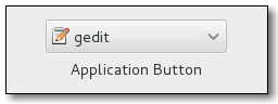
Gtk::Alignment
Gtk::Alignment controls the alignment of its child-widgets, that is it controls the orientation and padding as well as the size of the child-widgets.
Gtk::Alignment accepts four arguments:
Gtk::Alignment.new(xalign, yalixn, xscale, yscale)
Gtk::Alignment.new(0.5, 0.5, 1, 1)
gtk_alignment(0.5, 0.5, 1, 1)

- xalign # 0.5 means center-in-the-middle
- yalign # 0.5 means center-in-the-middle
- xscale # recommended value: 1
- yscale # recommended value: 1
The meaning of these values are:
<b>xalign</b>: <b>horizontal alignment</b> of the child widget, from 0 (left) to 1 (right).
<b>yalign</b>: <b>vertical alignment</b> of the child widget, from 0 (top) to 1 (bottom).
<b>xscale</b>: this is the value that is used by the child widget to expand horizontally, thus making use of unused space. The value range goes from 0 to 1. A value of 0 mean that this child widget may <b>never expand</b>. A value of 1 means that the child widget will expand.
<b>yscale</b>: as xscale, but in the vertical orientation.
Examples:
@alignment = Gtk::Alignment.new(0.5, 0.5, 0.0, 0.0)
@alignment.set_padding(1,1,1,1) # top, bottom, left, right
To position towards the right side, for instance:
@alignment = Gtk::Alignment.new(1, 0, 0, 0)
A value of 1 means that the child widget may occupy the full space as-is.
A value of 0.5 thus means "place the child-widget into the center".
To add a particular widget into a Gtk::Alignment you can use the following method call:
@alignment.add(Gtk::ProgressBar.new)
If you use Gtk::BaseModule then you can make use of the following API:
= gtk_alignment(1, 0, 0, 0)
<<
The upstream API documentation for Gtk::Alignment can be found here:
https://ruby-gnome2.osdn.jp/hiki.cgi?Gtk%3A%3AAlignment
Gtk::Application
Gtk::Application is specific for GTK3 (ruby-gtk3) as well as for ruby-gtk4.
Let's look at an usage example for ruby-gtk3:
require "gtk3"

app = Gtk::Application.new("org.gtk.example", :flags_none)
app = Gtk::Application.new('com.iridakos.gtk-todo', :flags_none)
The first argument is similar to how Java recommends package-names, via the reversed homepage of the program at hand. Personally I don't like this scheme, but whatever - it is kind of some standard at this point in time. What is important is to include '.' characters. The gtk_paradise gem may suppert the symbol :infer, which will take the filename (such as foo_bar_baz.rb) and turn it into a valid identifier (such as foo.bar.baz, in this example).
To make this gtk3-application then run, do:
app.signal_connect(:activate) { |application|
  window = Gtk::ApplicationWindow.new(application)
  window.set_title 'Hello GTK+Ruby!'
  window.present
}
app.run
Gtk::ApplicationWindow
Gtk::ApplicationWindow can only be used in ruby-gtk3, not in ruby-gtk2.
The following example shows how this can be used:
app = Gtk.application('org.gtk.button_box_example')
app.signal_connect(:activate) { |application|
  window = Gtk::ApplicationWindow.new(application)
  window.set_title('Window')
  window.set_border_width(10)
  window.add(Gtk::Label.new('Hello world!'))
  window.show_all
}
app.run
Gtk::Arrow
Examples for Gtk::Arrow:
left_arrow  = Gtk::Arrow.new(Gtk::Arrow::LEFT , Gtk::SHADOW_IN)
right_arrow = Gtk::Arrow.new(Gtk::Arrow::RIGHT, Gtk::SHADOW_IN)
Gtk::Assistant
Let's first look at an image how a Gtk::Assistant may look like, in order to understand the use case for this widget:

Here is a similar image, in addition showing a small red icon:

Gtk::Assistant is a subclass of Gtk::Window.
To create a new Gtk::Assistant widget in ruby-gtk, do:
assistant = Gtk::Assistant.new
To specify a certain size (width, height), use:
assistant.set_default_size(400, 300)
The current page can be obtained via:
assistant.current_page
The explicit setting towards the current page is:
assistant.current_page = 2
The number of pages can be obtained via:
assistant.n_pages
You can set a particular page-title via:
assistant.set_page_title(@page, "Dein Titel")
Appending a page can be done as the following example shows via .append_page():
page = Gtk::Label.new("Summary")
page.show
assistant.append_page(page)
Keep in mind that you can literally add any Gtk-Widget here, such as a button too:
assistant.append_page(Gtk::Button.new)
You need not necessarily destroy the widget, but instead can opt to simply hide it via .hide. The following code shows this:
assistant.signal_connect(:close) {
  assistant.hide
}
Let's look at yet another picture how this may look like:

Note that this was for ruby-gtk2. I have not yet made a screenshot for ruby-gtk3, so it may look quite different nowadays.
To set the page-type you can use the following API:
assistant.set_page_type(Gtk::Label.new("bla"), Gtk::Assistant::PAGE_CONFIRM)
If you want to append a new page to the assistant, use the following method called .append_page():
assistant.append_page(@page)
To specifically destroy the assistant-widget, do:
assistant.destroy
Gtk::AspectFrame
Gtk::AspectFrame is a subclass of Gtk::Frame.
Gtk::AspectFrame is useful whenever we need a widget that retains its original relative size - its aspect ratio. This is the essential rationale behind the design of this widget.
An example for this is a small video player that has to play a video with a specific ratio, to avoid distortions.
The CSS node used by Gtk::AspectFrame is called frame.
The API documentation for ruby-gtk can be seen here:
https://ruby-gnome2.osdn.jp/hiki.cgi?Gtk%3A%3AAspectFrame
For C gtk and the API see here:
https://developer.gnome.org/gtk3/stable/GtkAspectFrame.html
Gtk::BindingSet
class Gtk::BindingSet can be used to attach bindings (that is, key-bindings) to any widget, via Gtk::BindingSet#add_path().
The following snippet shows how this was done in ruby-gtk2:
binding_set = Gtk::BindingSet.new('j_and_k')
# j key
binding_set.add_signal(Gdk::Keyval::GDK_KEY_j, 0,
  'move_cursor', Gtk::MOVEMENT_DISPLAY_LINES, 1, false)
# k key
binding_set.add_signal(Gdk::Keyval::GDK_KEY_k, 0,
   'move_cursor',Gtk::MOVEMENT_DISPLAY_LINES, -1, false)
The only argument that has to be pased to .new() is the name of the binding at hand - in our case above, we called it j_and_k, and then added the proper signals for the j-key and the k-key.
The API is a bit cumbersome, as shown above already:
binding_set.add_signal(Gdk::Keyval::GDK_k, 0, 'move_cursor',Gtk::MOVEMENT_DISPLAY_LINES, -1, false)
This may have to be adjusted in order to work with ruby-gtk3.
Gtk::Border
A border can be used to separate widgets from one another.
Usage examples:
Gtk::Border.new(left, right, top, bottom)
border = Gtk::Border.new(4, 1, 4, 1)
You can also set to a specific value directly, such as:
border.set_left(5)
The rubygtk API can be seen here:
https://ruby-gnome2.osdn.jp/hiki.cgi?Gtk%3A%3ABorder
Gtk::Box
Gtk::Box is the parent for vertical (VBox) and horizontal (HBox) boxes in GTK.
An example how to create a new box goes like this:
box = Gtk::Box.new
box.homogeneous? # Is the box the same eveywhere?
box.spacing = 5 # Set the spacing of the gtk-box here.
# box.reorder_child(child, position) # Modify the children.
To obtain all children-widgets do:
.children
box.children
It is possible to determine the orientation of a box via:
Gtk::Box.new(orientation: :horizontal)
As shown above already, you can add spacing to a Gtk::Box instance via:
box.spacing = 2
As shown above.
The upstream API documentation for Gtk::Adjustment can be found here:
https://ruby-gnome2.osdn.jp/hiki.cgi?Gtk%3A%3ABox
Gtk::Browser (a custom add-on widget)
This mini-widget (a custom widget part of the gtk_paradise gem) can be used to open a remote URL in the main browser (hardcoded to palemoon for now).
If you want to use another browser then you have to define the environment variable called USE_THIS_BROWSER for the time being. At some point in the future support will be added to use/specify any browser.
Gtk::Builder
A GtkBuilder is an object that reads textual descriptions of a user interface and then instantiates the described objects.
To pass a description to a Gtk::Builder, call Gtk::Builder#add and Gtk::Builder#<<. If they fail to detect a description type, use Gtk::Builder#add_from_file or Gtk::Builder#add_from_string.
These methods can be called multiple times; the builder merges the content of all descriptions.
Usage example:
builder = Gtk::Builder.new
@child_widget = child_widget'

add_child(builder, child_widget) # add_child(builder, child, type)
Documentation for Gtk::Builder:
https://ruby-gnome2.osdn.jp/hiki.cgi?Gtk%3A%3ABuilder
Gtk::ButtonBox
Several buttons can be combined into a so-called ButtonBox.
The advantage of this widget is that the buttons inside this box will have the same layout, width and height, at the least for ruby-gtk3.
In ruby-gtk2 you may still have to use HButtonBox or VButtonBox, respectively.
A simple usage example follows for ruby-gtk3, in how to create such a button box:
= Gtk::ButtonBox.new(:horizontal)
Next it is possible to use .spacing= and .layout=:
.spacing = 20
.layout = :expand
The six valid arguments to .layout= are:
:spread
:edge
:start
:end
:center
:expand
These options are explained:
GTK_BUTTONBOX_SPREAD: Buttons are evenly spread across the box.

GTK_BUTTONBOX_EDGE:   Buttons are placed at the edges of the box.

GTK_BUTTONBOX_START:  Buttons are grouped towards the start of the box, (on the left for a HBox, or the top for a VBox).

GTK_BUTTONBOX_END:    Buttons are grouped towards the end of the box, (on the right for a HBox, or the bottom for a VBox).

GTK_BUTTONBOX_CENTER: Buttons are centered in the box. Available since 2.12.

GTK_BUTTONBOX_EXPAND: Buttons expand to fill the box. This entails giving buttons a "linked" appearance, making
                      button sizes homogeneous, and setting spacing to 0 (same as calling gtk_box_set_homogeneous()
                      and gtk_box_set_spacing() manually). Available since 3.12.
The .layout_style = is an alias to the method.
The following constants are used by Gtk::ButtonBox:
Gtk::ButtonBox::SPREAD
Gtk::ButtonBox::EDGE
Gtk::ButtonBox::START
Gtk::ButtonBox::END
Note that this corresponds to the symbols used, e. g. :spread, and so forth.
To put the layout in a vertical manner, try:
= Gtk::ButtonBox.new(:vertical)
To designate another orientation, try:
.orientation = :horizontal
# :vertical is also an option
# This should be Gtk::Orientation::HORIZONTAL.
To add other widgets into a Gtk::ButtonBox, do use .add():
.add()
To remove a widget again, which should work in general, use .remove():
container.remove()
To have the buttons spread evenly, try either :even or :expand:
.layout = :expand
If you use the gtk-paradise gem then you can simplify the code a bit:
= (:horizontal)
= # This is for the horizontal variant.
= # This is for the vertical variant.
The central aspect to keep in mind in regards to a button box is that it provides a consistent layout. The layout/spacing can be altered easily.
The upstream API documentation for Gtk::ButtonBox in ruby-gtk can be found here:
https://ruby-gnome2.osdn.jp/hiki.cgi?Gtk%3A%3AButtonBox
For the C API you can read more about gtk-button-box here:
https://valadoc.org/gtk+-3.0/Gtk.ButtonBox.html
Gtk::Calculator (a custom add-on widget)
First, let's look at an image of this custom widget as it looked in September 2022:

I may improve on this visually and functionality-wise in the future; for now this has to suffice, though.
Gtk::CssProvider - how to add CSS support to a gtk-widget
You can enable CSS rules for a particular widget, by leveraging Gtk::CssProvider.
The following example shows how this is done:
provider = Gtk::CssProvider.new
provider.load(data: USE_THIS_AS_THE_CSS_STRING)
Gtk::StyleContext.add_provider_for_screen(
  Gdk::Screen.default,
  provider,
  Gtk::StyleProvider::PRIORITY_APPLICATION
)
The gtk_paradise gem simplifies this a bit - see other subsections in this page to find out how you can simplify using CSS. But if you need to use a raw String as CSS rules, the above should work just fine.
Gtk::CellRendererText
Gtk::CellRendererText can be set editable, by setting its editable property to true.
Example:
cell_renderer_text.set_editable(true)
This will emit the 'edited' signal, which you can respond to in your Gtk::TreeModel.
The following example shows how to respond to this signal:
renderer.signal_connect(:edited) { |cell, arg1, arg2|
  puts 'I am being edited!'
}
To set the background of a cell renderer to green, consider using an API such as the following, via .background =:
renderer = gtk_cell_renderer_text
renderer.background = 'green'
renderer.background = 'blue' # or a blue background
Alternatively, in plain ruby-gtk3, this could go like this:
renderer = Gtk::CellRendererText.new
renderer.set_property('background', 'lavender')
renderer.set_property('foreground', 'black')
Gtk::CheckButton
First, let's show how a check button may look like:

A check-button has two states - the active state and the inactive (deselected) state.
To create a new check button, try this:
= Gtk::CheckButton.new("_A check button")
# button = check_button("_A check button") # If the Gtk::BaseModule is used.
To activate it, try:
.set_active(true) # This effectively means "selected".
To find out whether a check-button is active or inactive, try:
.signal_connect(:toggled) { ||
if .active?
puts "is active"
elsif not .active?
puts "is not active"
end
}
If you use the gtk_paradise gem, you can simplify this a bit to:
.on_toggled { ||
if .active?
puts "is active"
elsif not .active?
puts "is not active"
end
}
You can even combine two check-buttons to toggle one another via the .switch_state() method, if you use the gtk_paradise gem:
. { |, event|
.switch_state
.switch_state
}
A tooltip can be designated like this:
.tooltip_text = 'Hello, I am a static tooltip.'
Including markup for tooltips:
button.tooltip_markup = 'Hello, I am a <b>static "\
  "tooltip</b>, containing bold text.'"
)
You can disable modifications by setting this:
.set_editable(false)
.set_editable(true) # and re-enable it again here
The upstream API documentation for Gtk::CheckButton can be found here:
https://ruby-gnome2.osdn.jp/hiki.cgi?Gtk%3A%3ACheckButton
Gtk::CheckboxImage (a custom add-on widget)
class Gtk::CheckboxImage is a custom widge that can be used to indicate on/off switch. There are many alternatives to this, mind you, such as gtk-check-state or similar widgets, but I liked the visual looks of the default checkbox.
See the following image how this looks for on and off respectively:

Note that this may NOT look like this on your computer system, as it depends on the default icon theme in use. So for KDE users who use ruby-gtk3 it may look quite different. Nonetheless, on my computer system in November 2021 this is how it looked.
Why was this small widget created? I needed a visual way to quickly indicate whether a local directory contains different images (from real cards that are played in games) or not. Thus, I wanted a simple visual indicator for that, and I realized that the default check-button images would be useful, hence why this class was created.
To create a new instance do this:
require 'gtk_paradise/widgets/gtk3/checkbox_image/checkbox_image.rb'

checkbox_image = Gtk::CheckboxImage.new
Or, if you want to look at it standalone as-is, do:
checkbox_image = Gtk::CheckboxImage.run
Then you can toggle its state via:
checkbox_image.the_checkbox_is_on  # To switch it on.
checkbox_image.the_checkbox_is_off # To switch it off.
Gtk::Clipboard
GTK+ provides functionality to work with the clipboard.
The following subsection shows just a few examples, without much explanation:
# Tell the clipboard manager to make the data persistent
clipboard = Gtk::Clipboard.get(Gdk::Selection::CLIPBOARD)
clipboard.set_can_store([])
clipboard = entry.get_clipboard(Gdk::Selection::CLIPBOARD)

# You can assign text to the clipboad via .text=
clipboard.text = entry.text
Gtk::ColorSelectionDialog
Gtk::ColorSelectionDialog can be used to let the user select a colour. It will display a Colour Wheel as well as a few sliders and entry-boxes, for setting hue, saturation and the RGB values.
The basic API should go like this:
window = Gtk::Window.new
colour_selection_dialog = Gtk::ColorSelectionDialog.new("setting color")
colour_selection_dialog.set_modal(window)
colour_selection_dialog.modify_bg(Gtk::STATE_NORMAL, Gtk::Stock_color)
colour_selection_dialog.set_icon(GdkPixbuf::Pixbuf.new(USE_SOME_LOGO))
colour_selection_dialog.colorsel.has_palette = true # Displays the palette; this is recommended, in my opinion.
colour_selection_dialog.colorsel.current_color = @color[1]
colour_selection_dialog.show_all
colour_selection_dialog..signal_connect(:clicked) {
colour_selection_dialog.destroy
}
To set it to a transient try:
colour_selection_dialog.set_transient_for(self)
If you want to react to the on-colour-changed event, do this:
colour_selection.signal_connect('color_changed') {||
puts .current_color
}
The method .current_color will give back a Gdk::Color object.
To obtain a string of colours of the palette, do this:
selected_string = Gtk::ColorSelection.palette_to_string(colors)
Next a picture follows showcasing how Gtk::ColorSelectionDialog may look like:

An older picture from the ruby-gtk2 days follows as well next:

The official API documentation can be seen here:
https://ruby-gnome2.osdn.jp/hiki.cgi?Gtk%3A%3AColorSelectionDialog
Gtk::Colormap
A gtk-colormap is an object that maps between colour-values and the corresponding RGB values.
The usage goes something like this:
@colormap = Gdk::Colormap.system
Gtk::ColorButton (a custom add-on widget)
Gtk::ColorButton can be used to set a specific colour. The user can click on it, then a coloured box will appear which allows the user to pick a specific colour.
Next comes a screenshot showcasing this functionality:

@color_button = Gtk::ColorButton.new
@color_button.signal_connect("color-set") {
  p @color_button.color.to_a
}
add(@color_button)
The upstream API documentation for Gtk::ColorButton can be found here:
https://ruby-gnome2.osdn.jp/hiki.cgi?Gtk%3A%3AColorButton
Gtk::ColorChooserWidget
This widget can be used to pick a colour.
It looks like this:

Gtk::ColouredBar (a custom add-on widget)
The widget Gtk::ColouredBar is a custom add-on widget.
Let's show how to require and use it:
require 'gtk_paradise/widgets/gtk3/coloured_bar/coloured_bar.rb'
::Gtk::ColouredBar.run
This will show a coloured bar, by default black background on the left hand side, and yellow background on the right hand side. Also text is shown on the right hand side, indicating the percentage value.
The idea behind this is to act similar to conky - see google for conky images to understand this.
This is a bit hackish right now and I am not perfectly happy with it, but I just wanted to add that functionality then move on. At a later time I may improve on this.
This depends on CSS, so it is not available for ruby-gtk2. In theory code could be added to allow this for ruby-gtk2 as well, but since I am using ruby-gtk3 nowadays, I did not invest more time into that.
To determine the background colour you can use:
.set_colour1() # for the background colour on the left side
.set_colour2() # for the background colour on the right side
Not all colours wered added in the .css file (project.css) yet. At some later time I may investigate this again, or simply autogenerate all these colours for use in CSS.
Gtk::ComboBox
First, let's show a picture how a Gtk::ComboBox looked like in the days of ruby-gtk2:

If you need to set the active element of a Gtk::ComboBox then you can use the following API to achieve that:
combo_box.active = 0
Gtk::ComboBoxText
First, for a generic image of a combo-box-text, see the following image:

Gtk::ComboBoxText can be used in ruby-gtk3 to create a simple combo-dropdown-box.
The default listing is to show one entry per line. If you rather want to show several entries per line, you can use the following method call:
combo_box = Gtk::ComboBoxText.new # create a new instance of a combo box here
combo_box.wrap_width = 7 # Use this here to set to 7 entries per row.
To remove text do make use of the .remove_text() API:
combo_box.remove_text(position)
If you ever have a use case to obtain the model used in a combo-box, try the following API:
model = combobox.model
active = combobox.active # This will return e. g. -1
if active < 0
  return nil
end
return model[active][0]
To respond to changes of the combo-box, modify the following code:
combo_box.signal_connect(:changed) { |, event|
on_changed(, event, label)
}
You can also use a few aliases if you use the gtk_paradise project:
combo_box.three_per_row # This is the same as .wrap_width = 3
This may look like this:

The official API documentation for ComboBoxText can be found here:
https://docs.gtk.org/gtk3/class.ComboBoxText.html
If you prefer the pygobject documentation for a combo-box-text widget, see here the following documentation:
https://lazka.github.io/pgi-docs/Gtk-3.0/classes/ComboBoxText.html
Gtk::Cursor
To place a cursor in a Gtk::TextBuffer, try:
buffer.place_cursor(iter)
Gtk::DirectoryContentWidget (a custom add-on widget)
The Gtk:::DirectoryContentWidget can show the content of a local directory.
This custom widget was created specifically because I needed to show all directories and files in a given directory, for an interactive gtk-shell.
Since then I started to replace all similar use cases with that widget.
As a consequence of this, the widget has to be quite flexible and adaptable. The subsection here will eventually contain information how to adjust it to different use cases. My goal here is to make it so flexible that it can be used for as many different scenarios as possible.
For example, if you do not want the users to easily change the local directory by the bottom area (which is the default behaviour, to show that widget on the bottom), then you can invoke this widget like in the following way:
= ::Gtk::DirectoryContentWidget.new {
:do_not_use_widget_allowing_the_user_to_change_the_local_directory
}
In other words, a symbol that governs the behaviour of this widget.
The following image shows how this widget may look like:

Gtk::DrawingArea
The Gtk::DrawingArea widget can be used to draw elements onto. It allows us to display highly customized and adjusted elements.
A typical example for enabling this could go like so:
drawing_area = Gtk::DrawingArea.new
drawing_area.signal_connect(:draw) { do_something_here }
Interestingly enough, Gdk::Window is also a Gdk::Drawable. (I am not sure if Gdk::Window is the same as Gtk::Window, but Gtk::DrawingArea derives from Gtk::Widget.)
The following example shows the old pong game:

You can arrange simple circles filled with different colours as well:

Gtk::Editor (a custom add-on widget)
I am working on a gtk-editor for ruby-gtk3 as well, which will be made available as Gtk::Editor, a custom add-on.
This is mostly a prototype yet - tons of functionality is missing, some bugs exist as well. But in the distant future I intend to have this work so that I can write more ruby code, written in ruby. Thus, use ruby to modify ruby, kind of. :)
(Of course GTK itself is written in C, and most of ruby is also written in C - ruby is ultimately merely syntactic sugar over C. But it is an elegant syntactic sugar over C).
The current version in August 2021 looks like this:

Don't worry about it looking bloated - right now I am more interested in getting all functionality that I need. At a later time this will become more flexible, where the user has a lot more control over the layout and what not, including different CSS styling to use.
As this is a hobby project, I will only be able to add new parts every now and then, so don't expect this to ever become a professional grade editor. I will focus on customizability from the get go, though, so that others can use this as a base for modifications. Due to the slow pace of development, it may take a long time before this becomes really useful as a standalone-editor.
In August 2021 the associated custom class Gtk::FontSizeWidget was made more flexible, in that the individual buttons that change the font in use can now be layout via a grid. This allows us to easily arrange them side-by-side.
This is in particular useful if you want some navigational panel that shows these buttons.
Example for this:

In October 2021 I rewrote the code. The new code should be simpler and easier to maintain, and I think the editor is a still more useful now. Tons of functionality is still missing, though:
The Gtk::Editor, in October 2021, now looks like this:

Gtk::EntryCompletion
Gtk::EntryCompletion can be used if you need a widget that can display hints to the user, for which entries can be completed. It is a modified Gtk::Entry basically.
The raw syntax in ruby-gtk for creating a new entry-completion goes something like this:
entry = Gtk::Entry.new # First create the main Gtk::Entry.
entry_completion = Gtk::EntryCompletion.new # Next comes the EntryCompletion.
Now you can attach the completion-object to this entry:
entry.completion = entry_completion
Last but not least, you will also need to fill the completion-object with data - otherwise GTK does not know what the completable objects are.
Syntax example for this follows:
model = Gtk::ListStore.new(String)

ARRAY_COMPLETE_TO_THESE_ENTRIES.each { |v|
  iter = model.append
  iter[0] = v
}

entry_completion.model = model
entry_completion.text_column = 0
For simple array of Strings this is a bit cumbersome, so a convenience method was added to the gtk_paradise gem.
Usage example for this:
array = %w( cat mouse dog )
entry = gtk_entry
entry.simple_completion(array)
If you need to respond to the event that the user picked a match from the drop down listing then you can adjust the following code as-is for that:
completion.signal_connect(:match_selected) {|, event|
e 'A match was selected.'
false
}
Note that you can query the completion object (which is of class Gtk::EntryCompletion) via:
entry.completion
See also the file in gtk_paradise/examples/gtk3/053_entry_completion.rb - this shows a working example for such a gtk-entry-completion.
In ruby-gtk2 this looked similar to the following image:

See also the example file 069_entry_completion.rb, which is distributed in the gtk_paradise gem.
Button shortcuts in GTK
BUTTON1_MASK - the first mouse button.
BUTTON2_MASK - the second mouse button.
BUTTON3_MASK - the third mouse button.
BUTTON4_MASK - the fourth mouse button.
BUTTON5_MASK - the fifth mouse button.
Gtk::ErrorWidget - the error-widget (a custom add-on widget)
This widget is just a gtk-entry really. I wanted something as an alternative to Gtk::StatusBar, though, with a nicer, more flexible API.
Example:
require 'gtk_paradise/misc/error_widget.rb'
= Gtk::ErrorWidget.new(ARGV)
.capture_this_error(error)
Gtk::EventBox
Gtk::EventBox can be used to add events to widgets that normally do not respond to events, such as Gtk::Image.
An event mask has to be added to the event box, allowing it to infer onto what type of events this widget may respond to.
In order to create a new gtk-event-box, use something like this:
event_box = Gtk::EventBox.new.add(@image)
To respond to different events, such as reacting to the left-mouse-button press event, try:
.signal_connect(:event) { |widget, event|
  case event.event_type # event.event_type.name
  when Gdk::Event::BUTTON_PRESS # ← This is for the left mouse button click event.
  end
}
The available EventMasks are:
Gdk::EventMask::ALL_EVENTS_MASK          Accepts all types of events
Gdk::EventMask::BUTTON1_MOTION_MASK      Accepts pointer motion events while button 1 is pressed.
Gdk::EventMask::BUTTON2_MOTION_MASK      Accepts pointer motion events while button 2 is pressed.
Gdk::EventMask::BUTTON3_MOTION_MASK      Accepts pointer motion events while button 3 is pressed.
Gdk::EventMask::BUTTON_PRESS_MASK        Accepts mouse button press events.
Gdk::EventMask::BUTTON_RELEASE_MASK      Accepts mouse button release events.
Gdk::EventMask::BUTTON_MOTION_MASK       Accepts pointer motion events while any button is pressed.
Gdk::EventMask::ENTER_NOTIFY_MASK        Accepts events emitted when the proximity of the window is entered.
Gdk::EventMask::EXPOSURE_MASK            Accepts events when a widget is exposed.
Gdk::EventMask::FOCUS_CHANGE_MASK        Accepts change of focus events.
Gdk::EventMask::KEY_PRESS_MASK           Accepts key press events from a keyboard.
Gdk::EventMask::KEY_RELEASE_MASK         Accepts key release events from a keyboard.
Gdk::EventMask::LEAVE_NOTIFY_MASK        Accepts events emitted when the proximity of the window is left.
Gdk::EventMask::POINTER_MOTION_MASK      Accepts events emitted when the proximity of the window is left.
Gdk::EventMask::POINTER_MOTION_HINT_MASK Limits the number of GDK_MOTION_NOTIFY events, so they are not emitted every time the mouse moves.
Gdk::EventMask::PROXIMITY_IN_MASK        Accepts events emitted when the mouse cursor enters the proximity of the widget.
Gdk::EventMask::PROXIMITY_OUT_MASK       Accepts events emitted when the mouse cursor leaves the proximity of the widget.
Gdk::EventMask::PROPERTY_CHANGE_MASK     Accepts changes to object properties.
Gdk::EventMask::SCROLL_MASK              Accepts all scroll events.
Gdk::EventMask::STRUCTURE_MASK           Accepts events emitted when changes to window configurations occur.
Gdk::EventMask::SUBSTRUCTURE_MASK        Accepts events that change the configuration of child windows.
Gdk::EventMask::VISIBILITY_NOTIFY_MASK   Accepts change of visibility events.
So, if you have an event box and wish to respond to mouse-on-hover and mouse-on-hover-exit events, this one should do:
event_box.signal_connect(:enter_notify_event) {
  e 'mouse-enter-event'
}

event_box.signal_connect(:leave_notify_event) {
  e 'mouse-leave-event'
}
The actual event is GDK_MOTION_NOTIFY. This one is triggered whenever the pointer (which is usually the mouse) has moved.
You may have to add this event specifically via:
event_box.add_events(Gdk::EventMask::POINTER_MOTION_MASK)
event_box.signal_connect(:motion_notify_event) { puts 'The mouse was moved.' }
Pay also attention to the differences between .set_events() and .add_events() here. Via widget.add_events() you can add events to any gtk-widget, as far as I know.
Specific example for this:
add_events(Gdk::Event::BUTTON_PRESS_MASK)
add_events(Gdk::Event::SCROLL_MASK)
# or, in ruby-gtk3:
add_events(:scroll_mask)

# You can add these to a Gtk::Window like this:
windows = Gtk::Window.new
windows.add_events(Gdk::Event::BUTTON_PRESS_MASK)
windows.add_events(Gdk::Event::BUTTON_RELEASE_MASK)
windows.add_events(Gdk::Event::POINTER_MOTION_MASK)
More documentation for Gtk::EventBox can be seen here:
https://docs.gtk.org/gtk3/class.EventBox.html
Gtk::EventController (for ruby-gtk4 only)
Gtk::EventController are new in GTK 4. They have to be used when one wants to respond or react to events.
You can add an event controller to a widget via:
.add_controller()
widget.add_controller
The method .name() or .get_name() can be used to find out the name of the controller at hand.
Upstream documentation can be found here:
https://docs.gtk.org/gtk4/class.EventController.html
Gtk::Expander
Thanks to a Gtk::Expander it is possible to, for example, expand a menu.
The following image shows this - it looks like a simple arrow:

Here is the code:
expander= Gtk::Expander.new("text to show", with_markup = false)'
Next, a slightly longer example:
@expander = Gtk::Expander.new("_More Options", true)
@expander.signal_connect("notify::expanded") {
if @expander.
puts "Show or create widgets"
else
puts "Hide or destroy widgets"
end
}
To minimize the expanded expander (thus push it towards the top again), use this code:
@expander. = false
And to expand it again, try:
@expander. = true
Spacing can be set via set_spacing():
@expander.set_spacing(10)
To add a widget onto an expander, make use of .add():
@expander.add()
The upstream API documentation for Gtk::Expander can be found here:
https://ruby-gnome2.osdn.jp/hiki.cgi?Gtk%3A%3Expander
Gtk::FileChooserButton
Let's look at an image to see how a FileChooserButton may look like:

The next line shows how to instantiate a new file-chooser-button:
= Gtk::FileChooserButton.new("Gtk::FileChooserButton",
Gtk::FileChooser::ACTION_OPEN)
.filename = GLib.home_dir
.signal_connect("current-folder-changed") do |w, e|
p .filename
end
Gtk::FileChooser
You can select multiple files via .set_select_multiple.
Gtk::FileChooserDialog
To create a new file chooser dialog widget, the old code for ruby-gtk2 used to be as follows:
file_chooser_dialog = Gtk::FileChooserDialog.new("Open File",
  @window, # or use self here
  Gtk::FileChooser::ACTION_OPEN,
  nil,
  [Gtk::Stock::CANCEL, Gtk::Dialog::RESPONSE_CANCEL],
  [Gtk::Stock::OPEN, Gtk::Dialog::RESPONSE_ACCEPT]
)
To start the FileChooserDialog widget use the method .run as in:
file_chooser_dialog.run
To show hidden files in the file-chooser dialog, use this method:
file_chooser_dialog.show_hidden = true
(In older GTK-versions the class to be used was Gtk::FileSelection, but this has since then been deprecated.)
The file chooser dialog may look like this on ruby-gtk2:

Or this:

You can designate a specific starting directory via .current_folder= such as in:
file_chooser_dialog.current_folder = Dir.pwd
file_chooser_dialog.current_folder = ENV['MY_CFDG']
file_chooser_dialog.current_folder = '/etc'
And so forth.
Internally I decided in December 2021 to use the method called open_local_file() for opening an ad-hoc file-chooser-dialog. This should allow us to make use of any open-file functionality (and customize it as well).
Filters can be added as well, via .add_filter(). Note that when a filter is applied, only files that match towards that filter will be shown.
As argument to .add_filter() you should pass the name of the filter, such as:
file_chooser_dialog.add_filter(name_of_the_filter)
It is also possible to add shortcut folders. The API for this goes as follows:
file_chooser_dialog.add_shortcut_folder ENV['DEPOT_PKG']
file_chooser_dialog.add_shortcut_folder ENV['MY_TEMP']
file_chooser_dialog.add_shortcut_folder ENV['SONGS']
file_chooser_dialog.add_shortcut_folder ENV['RUBY_SRC']
file_chooser_dialog.add_shortcut_folder '/'
It may be prudent to check whether the directory exists, via a File.directory?() check prior to calling .add_shortcut_folder().
Additional widgets, such as an extra-button, can be added like this:
= Gtk::Button.new('_Extra button')
.signal_connect(:clicked) {
puts ' > Extra button was clicked'
}
file_chooser_dialog. = # Here the button is added.
The upstream API documentation for Gtk::FileChooserDialog, for ruby-gtk, can be found here:
https://ruby-gnome2.osdn.jp/hiki.cgi?Gtk%3A%3AFileChooserDialog
Gtk::FileFilter
To use a file-filter, one can use the following code:
file_filter = Gtk::FileFilter.new
file_filter.name = 'Ruby Scripts'
Then you can apply a file pattern to match for certain files.
To help simplify this, let's consider the use case where you want to select for video files - such as an .avi file and a .mp4 file. You only want to display these. So, what to do?
The following snippet shows the answer to that question:
file_filter = ::Gtk::FileFilter.new
file_filter.add_pattern('*.avi') # Add a filter for .avi files.
file_filter.add_pattern('*.mp4') # And a filter for .mp4 files.
file_chooser_dialog.add_filter(file_filter) # and here you can add this to a Gtk::FileChooserDialog
Let's show another example, this time for PNG (.png) files:
file_filter = Gtk::FileFilter.new
file_filter.name = "PNG images (*.png)"
file_filter.add_mime_type("image/png") # Register the mime-type as well.
As the above example shows, you can assign a name to a file-filter via the method .name=.
Gtk:TreeModel
Gtk::FileSelection
Documentation is currently missing for Gtk::FileSelection.
Assumingly it will prompt the user for a file or a directory name.
Note that this appears to have been deprecated some time ago, so this here refers mostly to ruby-gtk2.
Setting a filename can be done via:
file_selection.set_filename(name)
Gtk::Fixed
Gtk::Fixed can be used to position elements in a widget in an absolute manner. It is thus a container that allows the positioning of widgets inside of it at fixed coordinates.
To create a new instance in raw ruby-gtk, have a look at the following code example:
fixed = Gtk::Fixed.new
= Gtk::Button.new('Hello world')
The next step is to use .put() to position a widget at a particular position.
The arguments to .put are:
left-right (x axis). If the value is 0 then it will be put
at the very left side.
up-to-bottom (y axis)
fixed.put(button, 20, 40+rand(30)) # Place the widget here.
You can also re-position these widgets at a later time, via .move().
Example:
fixed.move(, 250, 111+rand(22))
It is important to be wary of the order - any element that is placed via .put will lay over other elements at that, or overlapping, positions.
If you reach the end step of Gtk::Fixed and its usability then you can consider switching to Gtk::Layout instead.
The upstream API documentation for Gtk::Fixed can be found here:
https://ruby-gnome2.osdn.jp/hiki.cgi?Gtk%3A%3AFixed
Gtk::FlowBox
Gtk::FlowBox is a bit more flexible compared to Gtk::Box. In particular it allows for a more convenient dynamic re-sizing.
Usage example:
flow_box = Gtk::FlowBox.new
flow_box.set_halign(:start)
flow_box.set_selection_mode(:none)
flow_box.set_min_children_per_line(3)
Gtk::FontButton
This specialized button allows the user to select a different font.
Let's see how to create a new font button:
= Gtk::FontButton.new(fontname = nil)
Whenever a font is set, a signal called :font_set is triggered, which you can respond to via:
.signal_connect(:font_set) { p .font_name }
To obtain the name of the current font, do:
.font_name
To set a font you can do:
.set_use_font(use_font)
You can read more documentation about Gtk::FontButton here:
https://ruby-gnome2.osdn.jp/hiki.cgi?cmd=view&p=Gtk%3A%3AFontButton
Gtk::FontSelection
To create a new instance of class Gtk::FontSelection you can do the following:
font_selection = Gtk::FontSelection.new
puts font_selection.font_name # ← If you want to obtain the current font selection
The API documentation for Gtk::FontSelection can be found here:
https://ruby-gnome2.osdn.jp/hiki.cgi?cmd=view&p=Gtk%3A%3AFontSelection
Gtk::FourComponentsEntry (a custom add-on widget)
Let's first look at how this custom add-on widget looks like:

This widget was added to the gtk-paradise gem in March 2023; the reasons for this will soon be explained.
If you look carefully at this widget, you notice that it has four components:
- a header / label on top
- an entry for user input on the bottom left area
- two images, + and -, that can be clicked
Clicking on the + or - will increment or decrement the value on the entry to the left. Furthermore, scrolling via the mouse will change the value in the entry.
Why was this widget added?
I needed such a widget for another gem called rpg_paradise.
In that gem I have a customized area that looks roughly like this:

So, four of these widgets that the user can modify, to keep track of values of a character (actor) for oldschool gamebooks. The user can click on the + or - picture and the value will change accordingly, without needed to type anything.
By default the minimal value is 0, so we won't have values such as -1, -2 or so.
Let's next look as to how to initialize a new Gtk::FourComponentsEntry:
four_components_entry = Gtk::FourComponentsEntry.new {{
bold_text: 'Meals'
}}
If you want to obtain the main entry in use, use:
four_components_entry.entry?
If you want to cap the entry at a maximum value, you can use this method:
four_components_entry.cap_plus_at(12)
This would set the maximum upper value at 12 for the gtk-entry field.
Gtk::Frame
A Gtk::Frame is a Gtk::Bin (a container) that adorns its child-widget via a frame, and an (optional) label.
Let's have a look at two (visual) examples, how a Gtk::Frame may look like:


The vanilla syntax example for creating a Gtk::Frame in ruby-gtk is as follows:
frame = Gtk::Frame.new('ID3 Tag')
frame.label = label
# or:
frame.set_label(label)
frame.set_label('Hello world!')
To add a new child-widget, use the following method:
.add()
frame.add(Foo.new)
# or
frame.add(Gtk::Button.new('An example with a clickable button.'))
In August 2022 I found out that you can actually set custom widgets as the gtk-frame. Usually it will be a Gtk::Label, but you can even pack a gtk-hbox in that. This then allows you to make use of that area that is normally occupied in a gtk-frame, and even add buttons to this. I plan to use this with a few clickable icons for some of my custom widgets. Either way, let's demonstrate how this looks via an example:

Don't worry so much about this looking weird, I only wanted to demonstrate this here. This image shows five different buttons, with a differently styled border (via CSS rules), and different spacing in that gtk-hbox.
The example that shows this is stored in gtk_paradise/examples/advanced/027_customized_frame_example.rb.
The important part to notice here is that you can simply style that frame-widget in any way you would like to, and on top of that you get that thin outer border that indicates where the gtk-frame's border is at.
The label of a gtk-frame can be aligned as follows:
frame.set_label_align(xalign, yalign) # This may align the label on the right side
You can designate some internal padding to a gtk-frame via .set_border_width() like in this manner:
frame.set_border_width(50)
You can obtain, as well as modify, the label-widget that is used in a Gtk::Frame. The following syntax shows how this is done:
frame.
frame. = # assign via this method here
You can use different shadow types. The four shadow types available by default are:
Gtk::ShadowType::IN
Gtk::ShadowType::OUT
Gtk::ShadowType::ETCHED_IN
Gtk::ShadowType::ETCHED_OUT
# in ruby-gtk3 you can now use the symbols instead,
# such as :in, :out, :etched_in and :etched_out.
To set it you could do:
set_shadow_type(::Gtk::SHADOW_ETCHED_IN)
The API documentation for Gtk::Frame in gtk4 can be seen here:
https://docs.gtk.org/gtk4/class.Frame.html
Gtk::HandleBox
The Gtk::HandleBox is used to create some kind of panel that can be moved by the user. The original description is "detachable window portions; I sometimes call it draghandle.
Let's look at a screenshot:

The important part to look for here is the handle on the right hand side of that image.
This handle can be selected via the mouse, and the whole widget-panel can be relocated to another position.
Typical code for this looks like so:
handle_box = Gtk::HandleBox.new.add(@h_box)
To designate a handle, use:
handle_box.set_handle_position(pos_type)
The pos_type argument can be one of the following four values:
Gtk::POS_LEFT
Gtk::POS_RIGHT
Gtk::POS_TOP
Gtk::POS_BOTTOM
If you want to make use of snap edges then consider using the following code:
handle_box.snap_edge = (edge)
These are the edges that can be used to drop (let go) of the widget again.
Note that gtk-handle-box is deprecated since as of GTK+ 3.4 though, so it should not be used anymore.
The upstream API documentation for Gtk::HandleBox can be found here:
https://ruby-gnome2.osdn.jp/hiki.cgi?Gtk%3A%3AHandleBox
Gtk::HeaderBar
class Gtk::HeaderBar is the modern GTK3-related header bar that often shows up on the very top of an application, but below the "typical" menu.
It is an alternative to the old menu-interface, but does not fully replace it - it rather groups together functionality that a user may expect to find quickly by looking at the upper area of the application at hand, without having to use a drop-down menu interface. This already shows one small advantage that a HeaderBar has over the older menu-based approach: you can look at main activities and focus on them - and if you still need a widget then you can use a pop-up like menu interface. See the GNOME desktop for more examples in this regard.
Furthermore the title and a subtitle of the application may be shown as well. The title will be centered with respect to the width of the box. The height of the titlebar will be set to provide sufficient space for the subtitle, even if none is currently assigned.
It may be best to show how this looks via an image next:

And the python-variant looks like this:
Several useful methods can be called on a Gtk::HeaderBar. A few examples will be shown next.
Display a close-button:
. = true
. # or this variant if you use the gtk_paradise project
Set the title:
.title = 'HeaderBar example'
Set the subtitle:
.subtitle = 'And this is the subtitle to use'
# or
.set_subtitle('Another subtitle')
Specify spacing to use (which is sort of like internal padding):
.spacing = 10
.spacing = 25
To add a button you could use the following code:
= Gtk::Button.new
icon = Gio::ThemedIcon.new('mail-send-receive-symbolic')
image = Gtk::Image.new(icon: icon, size: :button)
.set_image(image)
.pack_end()
If you use Gtk::BaseModule then the above code can be significantly simplified towards:
.pack_start(
gtk_themed_icon('edit-paste-symbolic.symbolic')
)
.pack_end(
gtk_themed_icon('mail-send-receive-symbolic')
)
In GTK4 you can set the title widget:
@header_bar.()
For GTK3 you may have to use .set_custom_title() instead. It accepts a gtk-widget, so you can customize the chosen title to your liking. If you use the Gtk::BaseModule then a few aliases exist - see the corresponding .rb file under gtk_classes/ to peek at the code.
Example how to use this via .set_custom_title():
label_description = text('Hello world!')
label_description.make_bold
.set_custom_title(label_description)
As mentioned elsewhere in this document: if you want to
notebook header {
color: green;
border: 2px dotted royalblue;
}
Gtk::HtmlView
class Gtk::HtmlView can be used to view HTML in a gtk-widget. It has been required via require 'gtkhtml2', but has been unmaintained - and subsequently abandoned - many years ago.
Gtk::IconSize
The allowed Gtk::IconSize values, at the least in ruby-gtk3, are:
IconSize::BUTTON
IconSize::DND
IconSize::DIALOG
IconSize::INVALID
IconSize::LARGE_TOOLBAR
IconSize::MENU
IconSize::SMALL_TOOLBAR
Gtk::IconTheme
Icon themes are available in ruby-gtk, via:
icon_theme = Gtk::IconTheme.default
icon = icon_theme.load_icon('window-close', 32, 0) # Use the window-close example.
image = Gtk::Image.new(pixbuf: icon) # Use the icon here.
# Some icon-names to possibly use:
use_this_icon_name = 'window-close'
use_this_icon_name = 'dialog-password'
use_this_icon_name = 'folder-music'
use_this_icon_name = 'folder-new'
use_this_icon_name = 'folder-open'
use_this_icon_name = 'folder-pictures'
use_this_icon_name = 'folder-publicshare'
Gtk::IconTheme acts as a database of all the icons available in the current theme.
If the gtk_paradise Gtk::BaseModule is used then you can use these APIs:
return_this_image_based_on_the_default_icon_theme(:application_exit)
image_input_mouse # and similar method calls; see the file called gtk_image.rb
image_applications_system_symbolic_symbolic
image_left_arrow
Note that Gtk::IconTheme.default is no longer available in ruby-gtk4.
For some upstream API documentation, have a look at:
https://developer.gnome.org/gtk3/stable/GtkIconTheme.html#gtk-icon-theme-load-icon
Gtk::IconView
Gtk::IconView is a widget that can be used to display a collection of icons in a grid view. It supports features such as drag and drop, multiple selections and item reordering.
Let's look at how to instantiate a new Gtk::IconView widget next:
icon_view = Gtk::IconView.new(model)
# or
icon_view = Gtk::IconView.new(model = nil) # you can pass nil, aka just omit the argument
To specify a particular text_column use:
icon_view.text_column = TEXT_COLUMN
This works for a pixbuf image as well, via:
icon_view.pixbuf_column = PIXBUF_COLUMN
To specify a selection mode the following API can be used:
Gtk::IconView.set_selection_mode()
The upstream API documentation for Gtk::IconView can be found here:
https://ruby-gnome2.osdn.jp/hiki.cgi?Gtk%3A%3AIconView
Gtk::Image
Gtk::Image can be used to display an image in the gtk application at hand.
Let's first show how to load an existing image:
main_image = Gtk::Image.new('/my_file.png')
image = Gtk::Image.new('/home/x/data/images/STD/DOT4.png') # So you pass in the file path to the image here.
Let's next show how to use an image from the default icon theme:
icon_theme = ::Gtk::IconTheme.default
use_this_icon_name = 'folder-music'
icon = icon_theme.load_icon(use_this_icon_name, 32, 0) # Arguments are: (string icon_name, int size, IconLookupFlags flags). Icon size is the desired icon size.
image1 = ::Gtk::Image.new(pixbuf: icon)
In the past, at the least in ruby-gtk2, you could also use the following API to make use of a StockImage.
Example for this:
image = Gtk::Image.new(Gtk::Stock::CONVERT, Gtk::IconSize::SMALL_TOOLBAR)
In ruby-gtk3 you have to do this instead:
image = Gtk::Image.new(stock: Gtk::Stock::CONVERT, size: Gtk::IconSize::SMALL_TOOLBAR)
Or you use Gtk::BaseModule, which abstracts some of this away for you.
Here you have to know the name of the stock-image - in this case being Gtk::Stock::Convert.
To set a new icon_size, use:
.icon_size=(size)
.icon_size = 50
To set to an image you can use this API:
.set_image(image)
.set_image(Gdk::Image.new('foobar.png')) # Must return a new image here.
If you rather need to use a pixbuf directly, look at the following methods:
:set_pixbuf
:pixbuf=
:from_pixbuf=
Usage example:
GdkPixbuf::Pixbuf.new('path_here')
This now appears to be a requirement as Gdk::Image has been deprecated.
Alternative use:
image.set_file('path here')
This seems to be the simplest variant now.
You can of course combine methods defined in Gtk::BaseModule, such as this one here:
= gdk_pixbuf
.set_pixbuf(icon)
To clear (== remove) an image again use this method call:
image.clear
.clear is quite useful because you can clear the old image, and then set a new image (path) via .set():
image.set("foobar.png")
You may have to pass the size of the image though, such as in this way:
image.set("foobar.png", Gtk::IconSize)
If the image can not be found, and you make use of .set, then a broken image may appear:

Note that .set() allows for different parameters.
To avoid using a relief for an image, try the following code:
image.set_relief(Gtk::ReliefStyle::NONE) # At the least for gtk3.
You can also use other relief-types such as:
image.relief = Gtk::RELIEF_HALF
image.relief = Gtk::RELIEF_NONE
Reliefs determine the corner style of a button.
There are three possible values for a relief:
Gtk::RELIEF_NORMAL
Gtk::RELIEF_HALF
Gtk::RELIEF_NONE
For rescaling an image you may have to modify the pixbuf, before then calling Gtk::Image.new(pixbuf:). (In python this would look like this: image = Gtk.Image.new_from_pixbuf(pixbuf).)
If you resize a widget - thus a gtk-image - then the "size-allocate" signal is emitted.
It is possible to use some padding (x-Achse, y-Achse), via .set_padding():
@image.set_padding(10,40)
@image.clear # Or to clear the image again.
You can also use stock-icons - examples for this follow:
Gtk::Image.new(stock_id, size)
Gtk::Image.new(Gtk::Stock::CONVERT, Gtk::IconSize::SMALL_TOOLBAR)
For the upstream API documentation of GTK3, have a look at:
https://docs.gtk.org/gtk3/class.Image.html
Gtk::ImageViewer (a custom add-on widget)
This custom widget can be used to display all files in a given directory. The use case - as to why it was created - has been to display several images of cards via a GUI (ruby-gtk3).
Gtk::ImageMenuItem
To create a new Gtk::ImageMenuItem do:
= Gtk::ImageMenuItem.new
To set a label, do:
Gtk::ImageMenuItem.new(label: "name of the label goes in here")
Gtk::InsertCharacter
The small widget called Gtk::InsertCharacter can be used to add arbitrary characters into a text buffer. By default this includes the characters I need to add. This is currently (August 2021) hardcoded, but it is trivial to modify and extend it at a later time. For now you have to modify the main array in the file.
How to use this class?
First require it:
require 'gtk_paradise/widgets/gtk3/insert_character/insert_character.rb'
Then create it and attach it to a text buffer; this is the text buffer where these specified characters will reside at.
@insert_character = ::Gtk::InsertCharacter.new
@insert_character.attach_to_this_buffer(text_buffer)
@insert_character.css_class('mar0px')
@insert_character.css_class('pad0px')
Gtk::Layout
Not sure if this is still relevant but for the time being it will remain here.
layout = Gtk::Layout.new(hadjustment = nil, vadjustment = nil)'
layout.put(child_widget, x, y)
Gtk::MaximizeButton (a custom add-on widget)
The idea behind Gtk::MaximizeButton is to allow the user to click on a widget, and have the application be maximized.
Since I found that I needed this functionality in different widgets I created a standalone class for it, some time in 2020.
Gtk::MenuBar
Usage example:
= Gtk::MenuBar.new
If you want a separator between the individual menu entries then you can use Gtk::SeparatorMenuItem.new.
Gtk::MenuItem
Gtk::MenuItem.new is a sub-entity of a Gtk::Menu. That is each individual MenuItem will become a part of Gtk::Menu.
The following example shows how to create a new Gtk::MenuItem, as well as a submenu for it:
= Gtk::MenuItem.new('File')
.( = Gtk::Menu.new())
Gtk::ItemFactory
To instantiate a new Gtk::ItemFactory, use:
item_factory = Gtk::ItemFactory.new(Gtk::ItemFactory::TYPE_MENU_BAR,'<main>',accel_group)
Gtk::MessageDialog
The Gtk::MessageDialog widget can be used to display a dialog to the user.
Let's next display an image, how a Gtk::MessageDialog may look (at the least for GTK2):

For the most part Gtk::MessageDialog is simply a specialized widget based on Gtk::Dialog.
The user is shown an additional image, indicating the type of the dialog - an error, a question, an important notice, and so forth, depending on the situation at hand.
To start a 'vanilla' Gtk::MessageDialog you can adapt the following code as-is for ruby-gtk2:
= Gtk::MessageDialog.new(
main_window,
Gtk::Dialog::MODAL,
Gtk::MessageDialog::ERROR,
Gtk::MessageDialog::BUTTONS_CLOSE,
"Directory was selected. Select a text file."
)
.run
.destroy
You can also designate this message-dialog to be destroyed togther with the parent widget. Example for this:
Gtk::MessageDialog.new(
self, Gtk::Dialog::DESTROY_WITH_PARENT,
Gtk::MessageDialog::INFO, Gtk::MessageDialog::BUTTONS_CLOSE,
)
In ruby-gtk3 the API has changed a bit:
= Gtk::MessageDialog.new(
main_window,
:modal,
:error,
:close,
"Directory was selected. Select a text file."
)
.run
.destroy
Since as of gtk version 2.10 it is possible to set an image specifically.
Usage example for this:
.image = "foobar.png" # ← provide the path to the image here
The GTK_BUTTONS_YES_NO constant indicates to use both a Yes as well as a No button in the dialog.
If you wish to make use of another icon, you can use the method set_icon():
.set_icon(GdkPixbuf::Pixbuf.new(LOGO)) # LOGO here is a constant to the path of a local image.
The available button types are:
BUTTONS_CANCEL: a Cancel button. BUTTONS_CLOSE: a Close button. BUTTONS_NONE: no buttons at all. BUTTONS_OK: an OK button. BUTTONS_OK_CANCEL: OK and Cancel buttons. BUTTONS_YES_NO: Yes and No buttons.
The official API documentation for Gtk::MessageDialog in ruby-gtk can be seen here:
https://ruby-gnome2.osdn.jp/hiki.cgi?Gtk%3A%3AMessageDialog
Gtk::Notebook
A Gtk::Notebook is a useful widget that can display several child widgets arranged via a tabular interface. It is possible to embed scrolled widgets into each tab, so you ultimately have a very easy editor available via Gtk::Notebook if you would want that.
A notebook in GTK may look like this:

The vanilla syntax to create a new notebook in ruby-gtk is as follows:
notebook = Gtk::Notebook.new
Let's next look at some methods that can be used for a notebook-widget.
To append new tabs to the notebook, do use:
notebook.append_page()
notebook.append_page(@scrolled_window, Gtk::Label.new('1'))
To obtain the current page number of the notebook (that is the tab that is currently active), use:
notebook.page
In order to remove an individual tab from a Gtk::Notebook instance the following code can be used:
notebook.remove_page(page_num)
notebook.remove_page(5)
To show the labels, do:
notebook.set_show_tabs(true) # I believe this is the default, so it can be omitted.
To move to the next tab programmatically use:
notebook.next_page
To go one step back, use:
notebook.prev_page
To set the border-width of the tab you can use the following method - at the least for ruby-gtk2; in ruby-gtk3 this appears to no longer work:
notebook.set_tab_border(5) # oddly enough this does not seem to work in ruby-gtk3 anymore
Popups can be enabled by issuing this:
self.enable_popup = true
To select a specific tab, such as if you would have clicked on it via the mouse, use the following code:
notebook.set_page(3)
(Do not forget that counting begins at 0 here.)
To enable scrolling through the notebook tabs, use:
notebook.scrollable = true
# or this variant:
notebook.set_scrollable(true)
In ruby-gtk a notebook tab may look like this, if you use icons:

Note that you can add a custom widget as your label too, so rather than Gtk::Label you can literally pack any widget that you like to. This allows you to customize the look of your notebook instance.
To find out how many pages are part of a notebook, do:
notebook.n_pages
To hide a widget you can use:
notebook.set_visible(true)
Coloured labels are possible too. Example:
notebook.append_page(scrolled_window, modify_bold_label("2","slateblue"))
(modify_bold_label() is a custom method in the gtk_paradise gem.)
You can modify a tab-label lateron, via:
notebook.set_tab_label(child, tab_label)
child refers to the Gtk::Widget that you want to use as the content on that notebook page.
A more specific example for this is shown next:
notebook.set_tab_label(scrolled_window, Gtk::Label.new("Hello there")
The event switch_page is issued whenever the tab is switched.
An example as to how to respond to this event is shown next:
notebook.signal_connect(:switch_page) { |, page, page_number|
case page_number
when 1
table.resize(1, 1)
= Gtk::Button.new('Hello world!')
table.attach_defaults(, 0, 1, 0, 1)
.show
end
}
You could use the event signal_connect_after rather than .signal_connect() in this case, too.
If you use the modifications in the gtk_paradise gem then you can also use:
notebook.on_tab_switch {
}
If you want to react to the pressing of the middle mouse button, then make use of code such as the following:
notebook.signal_connect(:event) { |, event|
case event.event_type.name
when 'GDK_BUTTON_PRESS'
case event.
when 2
current_tab = self.page
self.remove_page(current_tab)
end
end
}
I found the API for Gtk::Notebook difficult to remember, so I added a simpler toplevel method for populating a gtk-notebook:
require 'gtk_paradise/run'
include Gtk::BaseModule
r = Gtk.run
label1 = gtk_label('Hi')
label2 = gtk_label('there')
label3 = gtk_label('Tim!')
r << add_notebook(label1, label2, label3)
r.run
Alternatively you can construct it in this way:
@note_book = gtk_notebook(:useful_default)
@note_book.(
eval().new,
title_that_is_to_be_used_for_the_tab
)
Or just, since August 2021:
@note_book = default_notebook
By the way: if the currently selected tab is changed, the change-current-page event is triggered.
To determine where to place the tabs in a notebook, do:
notebook = Gtk::Notebook.new
# notebook.set_tab_pos(pos) # ← Allgemeine Syntax
notebook.set_tab_pos(Gtk::POS_LEFT)
notebook_tab.the_tabs_appear_on_top # ← if the gtk_paradise gem is used then this variant can be used as well
The argument pos can be set to one of the following values:
Gtk::POS_LEFT
Gtk::POS_RIGHT
Gtk::POS_TOP
Gtk::POS_BOTTOM
The default is POS_TOP. The tabs thus appear on top - if this is the desired outcome the .set_tab_pos() does not have to be called at all.
Tabs arranged from top-to-bottom may look like this:

If you don't like the borders of a gtk-notebook, try any of the following methods, with the first one possibly being the one that you may want to use:
@note_book.set_tab_border(0)
@note_book.set_border_width(0)
@note_book.set_tab_hborder(0)
@note_book.set_tab_vborder(0)
To select a specific page, use code like the following:
child = @note_book.get_nth_page(page_num)
To combine this by also setting the focus on this page, use:
child = @note_book.get_nth_page(@note_book.page).grab_focus
To re-arrange the child-widgets in the tab you can use:
notebook.reorder_child(child, position)
To show the borders around the tabs in the notebook do:
notebook.show_border = true
To make the tabs reorderable use:
@note_book.set_tab_reorderable(, true)
@note_book.set_tab_reorderable(label2, true)
@note_book.set_tab_reorderable(label3, true)
If you want to query the current label of a tab in the notebook, do:
label = notebook.get_tab_label(@array_notebook_position[0])
# then you can use label.text to obtain the text as a String
To respond to when the user clicks on a tab, use:
notebook.signal_connect(:focus_tab) {
}
(Somehow this does not seem to work; at the least I could not get it to work in October 2021.)
If you have a use case to respond to when the user changes the currently active tab then you can respond to the switch-page event. If this isn't quite doing what you expected it to do, you could also respond to .signal_connect_after().
Usage example:
notebook.signal_connect_after(:switch_page) { |widget, page, page_number|
It is possible to onnect two different notebooks, by setting a common group identificator - see the method gtk_notebook_set_group_id(). This can be used to allow automatic tabs interchange between them.
The upstream API documentation for Gtk::Notebook for the C language can be found here:
https://docs.gtk.org/gtk3/ctor.Notebook.new.html
Gtk::NotebookTabWithIcon (a custom add-on widget)
This class can be used as header for a tab in a Gtk::Notebook widget. It will show an icon on the left hand side, and some text on the right hand side.
Usage example:
require 'gtk_paradise/widgets/gtk3/notebook_tab_with_icon/notebook_tab_with_icon.rb'
Gtk::NotebookTabWithIcon.new(:tabble, 'Here is the original label.')
Gtk::NumberedLines (a custom add-on widget)
This custom widget, distributed as part of the gtk_paradise gem, can be used if you want to display numbers on the left-hand side of a widget.
A typical use case may be when you want to write an editor in ruby-gtk3; you may want to show the line numbers of the loaded file. In fact, that has been the primary reason why this widget was created.
At a later time, in February 2023 in particular, more functionality was added onto that widget, such as connecting it to a simple text-view widget, to be used in a roleplaying gamebook.
Complex usage example:
require 'gtk_paradise/widgets/gtk3/numbered_lines/numbered_lines.rb'
r = Gtk.run
numbered_lines = Gtk::NumberedLines.new {{ upper_range: 25 }}
numbered_lines.no_arrows
numbered_lines.
r << numbered_lines
numbered_lines.remove_the_main_vbox
numbered_lines.recalculate
numbered_lines.decide_whether_to_use_a_scrolled_window_or_not
r.show_all
r.run
You may have to adjust this to your own needs.
Gtk::NumbersOnly (a custom add-on widget)
class Gtk::NumbersOnly is a specialized subclass of Gtk::Entry that allows you to use a Gtk::Entry that only accepts numbers as input, such as 1, 2, 3, and also the '.' dot character, to represent floats. It is part of the gtk_paradise gem, and not part of the official upstream code base - thus, it is a custom add-on.
Of course you can easily implement this functionality on your own, but I wanted to have a specialized Gtk::Entry that can be quickly used in different ruby-gtk applications. So whenever you need a widget that only allows numbers, consider making use of this widget.
To require it, do this:
require 'gtk_paradise/entries/numbers_only.rb'
Gtk::OptionMenu
An OptionMenu allows the user to select from a list.
Gtk::OptionMenu then will display this choice.
Usage example in ruby-gtk code:
= Gtk::OptionMenu.new
.((1))
.set_history(4)
The upstream API documentation for Gtk::OptionMenu can be found here:
https://ruby-gnome2.osdn.jp/hiki.cgi?Gtk%3A%3AOptionMenu
Gtk::Paned
A paned widget can hold two widgets, while displaying a small resize-bar between them. In other words, a Paned widget in gtk allows the user to resize these two widgets via the mouse.
In ruby-gtk2 you could use Gtk::HPaned and Gtk::VPaned. Gtk::VPaned would allow you to align two widgets next to one another vertically, whereas Gtk::HPaned would allow you to align two widgets next to one another horizontally. Although ruby-gtk2 is no longer the main version in use by the gtk_paradise gem, it may be helpful to show examples how Gtk::VPaned and Gtk::HPaned was used in the past:
# First for Gtk::VPaned:
vpaned = Gtk::VPaned.new
vpaned.add1(Gtk::Label.new("VPaned, Label1"))
vpaned.add2(Gtk::Label.new("VPaned, Label2"))
# Next for Gtk::HPaned:
hpaned = Gtk::HPaned.new
hpaned.add1(Gtk::Label.new("Label1"))
hpaned.add2(vpaned)
In ruby-gtk3 the user now has to use Gtk::Paned instead, and pass, as parameters whether this instance of Gtk::Paned should be horizontal or vertical.
Example for both of this follows:
Gtk::Paned.new(:horizontal)
Gtk::Paned.new(:vertical)
Note that the children in a Paned widget can be resized so that they may be completely hidden from the user, which is not always what they may want to have. This can be avoided via the two methods called .pack1() and .pack2().
If the paned widget is moved, the move-handle signal is emitted. Thus you can find out when the resizing bar has been moved by the user.
To add new widgets to a Gtk::Paned instance you can simply use:
.add1(button1)
.add2(button2)
Alternatively you can also use .pack1() and .pack2().
For .pack1() the argument signature goes like this:
.pack1(child, resize, shrink)
If the last argument, aka shrink, is false then the Paned Widget can not be smaller than the original default size.
Next follows a small image that shows how this may look:

Note that this is from the ruby-gtk2 era. It looks visually a bit better in ruby-gtk3; I just did not bother to create a new partial screenshot for this.
If you want to style Gtk::Paned then you can modify the CSS node called paned. Additionally the separator is available as a subnode under the name separator. The subnode will obtain a .wide style class when the paned is supposed to be wide.
An example for styling the separator is shown next:
#fancy_separator separator {
border: 10px solid steelblue;
padding: 10px;
margin: 20px;
}
Modifying the inner padding can be done, as usual, via:
vpaned.set_border_width(5)
# or this variant:
vpaned.border_width = 5
You can also set a min-width, such as via:
#padded_pane paned separator {
background-size: 20px;
min-width: 20px;
background-color: royalblue;
}
That way you can also specify a minimum height, such as a mandatory padding, e. g. via min-height: 30px;.
You can set the position of the slider (the area that keeps the individual widgets that are part of the pane separate) via .set_position():
vpaned.set_position(200)
The official API documentation for Gtk::Paned in ruby-gtk can be seen here:
https://ruby-gnome2.osdn.jp/hiki.cgi?Gtk%3A%3APaned
Gtk::Picture (new in GTK4)
This new class can be used to display an image/picture.
Usage example:
image = Gtk.Picture.new
image.filename = USE_THIS_FILE
image.set_keep_aspect_ratio(false)
Gtk::PingWidget (a custom add-on widget)
This custom widget can be used to ping a remote URL.
It may look like this:

Gtk::Plug
I am unsure whether Gtk::Plug is still useful or not, but it could be used in combination with Gtk::Socket.
Example showcasing this:
window = Gtk::Plug.new(xid.to_i)
window.window_position = Gtk::Window::POS_CENTER
window.signal_connect(:delete_event) { Gtk.main_quit}
The idea behind Gtk::Plug appears to have been to put widgets from one process to widgets of another process.
Gtk::Popover - creating a pop-over widget in gtk3
Gtk::Popover is a bubble-like context window. It is primarily meant to provide context-dependent information or options to the user, but it can also be used to display fancy widgets if necessary.
These Popovers are attached to a widget, passed at construction time on Popover, or updated afterwards through set_relative_to. By default they will point to the whole widget area, although this behavior can be changed through set_pointing_to.
When such a Popover is created then a GTK+ grab will occur, in order to ensure that input events get redirected to it while it is shown. If no such modal behavior is desired on a popover, set_modal may be called on it to tweak its behavior.
Note that Gtk::Popover can also be used used to replace menus.
The following code could be used to create a pop-over widget in ruby-gtk3:
# ===================================================================== #
# Create the popover next.
# ===================================================================== #
@popover = ::Gtk::Popover.new # or gtk_popover, if you want it shorter.
vbox = gtk_vbox
vbox.pack_start(
gtk_label('Example'),
fill: false, expand: true, padding: 10
)
@popover.add(vbox)
@popover.set_position(:bottom)
@popover.set_relative_to(@main_image)
@popover.show_all
@popover.popup
Since that is a bit long, the following shorter variant exists:
return_popover('TEXT TO APPEAR GOES IN HERE', )
return_popover('Specific Example Text', @main_image)
This is the same as above; .set_position(:bottom) is hardcoded for now.
Alternatively you can also use this slightly improved variant since as of May 2021:
(
@entry_use_this_URL,
'Net::Ping::External is unavailable. '\
'Has the net-ping gem been installed?'
).popup
Or on a single line, a bit shorter:
(, 'Hey there!').popup
In this variant the widget comes first, then the content you wish to display in the popover-animated widget.
How to style class Gtk::Popover via CSS?
Gtk::Popover has a single css node called popover.
A more specific example how to style this via CSS follows next:
popover {
padding: 25px;
border: 3px dotted green;
font-size: 20px;
}
Interestingly a popover will always get the .background style class and it gets the .menu style class if it is menu-like, such as PopoverMenu or created using Popover.from_model. A modal popover will grab all input within the toplevel and grab the keyboard focus on it when being displayed.
You can also add additional widgets to the gtk-popover widget.
Example for this, when we assume the pop-over widget was assigned to the variable _:
vbox = gtk_vbox # First create our outer vertical box here.
vbox.add(('ABC')) # Add the first button.
vbox.add(('DEF')) # Add the second button.
vbox.show_all # Show them all.
_.children.first.add(vbox) # Add it here.
See also this interesting stackoverflow example:
https://stackoverflow.com/questions/38907362/how-i-create-a-headermenu-with-a-popover-menu-in-gtk
The official upstream API documentation for Gtk::Popover can be seen here:
https://docs.gtk.org/gtk3/class.Popover.html
Gtk::PrintOperation
class Gtk::PrintOperation appears to be relevant for printing documents. I have not yet had a use case for using this class, though.
Gtk::Toolbar
Gtk::Toolbar is deprecated, I believe, since as of GTK3.
It used to look like this:

Gtk::Tooltip
Via tooltips it is possible to use small, helpful popups. These will appear next to a widget - helpful hover elements.
It is also possible to use markup, via .tooltip_markup=, such as via:
.tooltip_markup = 'And this appears in <b>bold</b>.'
Gtk::Tooltips (deprecated)
Note that Gtk::Tooltips is deprecated; it could only be used in gtk2.
It used to look similar to this:

Gtk::ToolButton
Gtk::ToolButtons are Gtk::ToolItems that will contain buttons. Quite aptly named, isn't it?
In the old days one would use it like this:
Gtk::ToolButton.new(Gtk::Stock::REFRESH)
Gtk::ToolButton.new(Gtk::Stock::QUIT)
Gtk::ToolButton.new(Gtk::Stock::HOME)
Documentation for GTK3 can be seen here:
https://docs.gtk.org/gtk3/class.ToolButton.html
Gtk::ProgressBar
Progress bars are a way to show how much of a process has been completed. This can be useful for the end user in that said end user will receive an indication as to how long a particular process may (still) take, and/or how much of the given process has already been completed.
A good example demonstrating this is when you download a remote file that is fairly large - downloads may happen in smaller chunks, so the end user may want to see a percentage value, in order to determine how long it'll take before the desired file is downloaded completely.
Let's show an example of Gtk::ProgressBar how it was used in ruby-gtk2 (thus in gtk2):

Let's have a look at another image, as an additional example for Gtk::ProgressBar:

You can use it to indicate progress to an operation that takes a little while; the user may become impatient if nothing happens, so visual cues may be useful.
Gtk::ProgressBar has two different modes:
(1) percentage mode
(2) activity mode
The percentage mode is the stricter one, and more useful, in my opinion. If an application is aware of how much work needs to take place, such as by reading a fixed number of bytes from a data stream or file, then the percentage mode of Gtk::ProgressBar can be used to change the value, by repeatedly calling .set_fraction(). This method takes a float between 0 and 1 to indicate the new percentage value.
Example code:
= Gtk::ProgressBar.new # instantiate a new progress-bar widget here
Thread.new {
pp .progress
}
To assign to a particular value of the bar, try:
.fraction = (ratio)
.fraction = 5
.fraction = 0.2 # play a bit with these values as you desire
A text can be shown above the progress-bar via:
.set_text('foobar')
The right side indicates progress via the coloured bar.
You can modify the orientation of the progress bar via the method .orientation=.
Valid values are:
Gtk::ProgressBar::LEFT_TO_RIGHT
Gtk::ProgressBar::RIGHT_TO_LEFT
Gtk::ProgressBar::BOTTOM_TO_TOP
Gtk::ProgressBar::TOP_TO_BOTTOM
Specific examples:
.orientation = Gtk::ProgressBar::BOTTOM_TO_TOP
.orientation = 1 # This should be equivalent to Gtk::ProgressBar::RIGHT_TO_LEFT
.orientation = 0 # And this is the default value for orientation.
It is also possible to determine the step-size, called fraction. Valid values are from 0 to 1.
Example:
.fraction = 0.4
If you want a pulsing progress-bar then the following example may be helpful:
Thread.new {
loop {
.pulse
sleep 0.085
}
}
Gtk::RadioMenuItem
A Gtk::RadioMenuItem may look like this:

Here is yet another image of a Gtk::RadioMenuItem:

Gtk::RadioButton
A radio button is a button that indicates whether it is selected or not by a roundish icon. Usually a radio button is used in a group of radio buttons, so that only one button is selected, and the other ones are - logically - not selected.
To create a new radio button you can use the following API:
= Gtk::RadioButton.new('Button')
They may then look like this:

Note that radio_buttons in gtk must keep a reference to another radio button in the group.
In the past, ruby-gtk2 days, it was possible to add a tooltip to a RadioButton by issuing this:
= Gtk::RadioButton.new("Search by name")
name_tip = "Matches the port name only."
Gtk::Tooltips.new.set_tip(, name_tip, nil)
# and another example:
Gtk::Tooltips.new.set_tip(@button_dhcp_command, DHCP_CMD, nil)
Gtk::RecentChooserDialog
Gtk::RecentChooserDialog can be used to deal with the most recently opened files on your computer system.
The API to use it goes like this:
@recent_chooser_dialog = Gtk::RecentChooserDialog.new(title: 'Recent Chooser Dialog Sample',
buttons: [['_Cancel', :cancel],
['_Accept', :accept]]
)
Note that this widget responds to the signal called :response.
@recent_chooser_dialog.signal_connect(:response) { |, response|
case response
when Gtk::Dialog::RESPONSE_ACCEPT
info = @recent_chooser_dialog.current_item
if info
e 'Show the file path to the selected item: '+info.uri_display
end
end
}
Next follows an image to show how this may look (on linux/icewm):

Gtk::ResponseType
All predefined values for use as response ids in add_button() are classified as Gtk::ResponseType. These values are all negative. GTK will leave values of 0 or greater for application-defined response ids.
The valid enums are:
ACCEPT: Generic response id, not used by GTK+ dialogs
APPLY: Returned by Apply buttons in GTK+ dialogs
CANCEL: Returned by Cancel buttons in GTK+ dialogs
CLOSE: Returned by Close buttons in GTK+ dialogs
DELETE_EVENT: Returned if the dialog is deleted
HELP: Returned by Help buttons in GTK+ dialogs
NO: Returned by No buttons in GTK+ dialogs
NONE: Returned if an action widget has no response id, or if the dialog gets programmatically hidden or destroyed
OK: Returned by OK buttons in GTK+ dialogs
REJECT: Generic response id, not used by GTK+ dialogs
YES: Returned by Yes buttons in GTK+ dialogs
Gtk::Revealer
Gtk::Revealer can, as its name implies, reveal child widgets.
It is a container that can animate a transition of its child widgets, to go from invisible to visible.
The style of the transition can be controlled via gtk_revealer_set_transition_type(). In ruby this should be:
revealer.set_transition_type()
These animations respect the "gtk-enable-animations" setting.
To create a revealer simply do:
revealer = Gtk::Revealer.new
The CSS node, if you wish to style a revealer, is aptly named revealer.
To force the child widget to be revealed use:
revealer.reveal_child
Upstream documentation for the C API of Gtk::Revealer can be seen here:
https://valadoc.org/gtk+-3.0/Gtk.Revealer.html
Gtk::SourceLanguageManager
Via Gtk::SourceLanguageManager it is possible to obtain syntax-colouring for certain languages.
For instance, for ruby one could do the following:
ruby_language_manager = Gtk::SourceLanguageManager.new.get_language('ruby')
And then:
ruby_language_manager.buffer.language = ruby_lang
ruby_language_manager.buffer.highlight_syntax = true
ruby_language_manager.buffer.highlight_matching_brackets = true
Gtk::ScrolledWindow
A Gtk::ScrolledWindow represents a window with a scrollbar. It will attach scrollbars to the child-widget, and create a Frame surrounding this child-widget.
The associated gdk-event for the scroll event is called GDK_SCROLL.
Let's next have a look at how this may look - note that the following image shows the old, the default variant for ruby-gtk2; nowadays it looks a bit diffferent, in ruby-gtk3:

Let's next show an example how to instantiate a new scrolled window then:
scrolled_window = Gtk::ScrolledWindow.new
scrolled_window = Gtk::ScrolledWindow.new(hadjustment = nil, vadjustment = nil)
So-called "policies" determine whether the scrollbars are present. For instance, Gtk::POLICY_ALWAYS means that the scrollbars are always present. Gtk::POLICY_AUTOMATIC on the other hand only shows the scrollbars when they are necessary.
So, via .set_policy() one can designate whether horizontal and/or vertical scrollbars should be shown.
Example illustrating this:
.set_policy(hscrollbar_policy, vscrollbar_policy)
.set_policy(::Gtk::POLICY_AUTOMATIC, ::Gtk::POLICY_AUTOMATIC)
.set_policy(::Gtk::POLICY_ALWAYS, ::Gtk::POLICY_AUTOMATIC)
You can modify the adjustment of the horizontal and vertical scrollbar.
Example for this:
Gtk::ScrolledWindow..adjustment.inverted = true
Gtk::ScrolledWindow..adjustment.inverted = true
To determine a specific height or size, use:
scrolled_window.height_request = 200
# or
scrolled_window.set_size_request(175, 20)
You can add a child-widget to a gtk-scrolled-window via add_with_viewport().
Example:
scrolled_window.()
Note that .add_with_viewport is only needed if the child-widget at hand is unable to scroll in its own right. This, for example, applies to Gtk::TreeView. In this case you should not use .add_with_viewport().
The possible policy values as to when the scrollbars will appear, are:
Gtk::POLICY_ALWAYS: means that the scrollbars will always be visible.
Gtk::POLICY_NEVER: means that the scrollbars will never be visible.
Gtk::POLICY_AUTOMATIC: means that the scrollbars are only there when they are necessary.
Note that you can determine where the scrollbar should appear, via the following constants:
CORNER_TOP_LEFT
CORNER_BOTTOM_LEFT
CORNER_TOP_RIGHT
CORNER_BOTTOM_RIGHT
Specific example:
scrolled_window.window_placement = Gtk::CORNER_BOTTOM_LEFT
scrolled_window.window_placement = Gtk::CORNER_BOTTOM_RIGHT
You can read more about this here:
https://ruby-gnome2.osdn.jp/hiki.cgi?Gtk%3A%3AScrolledWindow#set_policy
Lazka also contains information about Gtk::ScrolledWindow here:
https://lazka.github.io/pgi-docs/Gtk-3.0/classes/ScrolledWindow.html
Gtk::SearchBar
class Gtk::SearchBar will create a new search-bar instance. The search bar is a widget that can slide in from the top to present a search entry. Thus it is a bit different to Gtk::SearchEntry.
An example for this functionality can be found in the following file:
gtk_paradise/examples/gtk3/071_search_bar_example.rb
To create a new search-bar do:
= Gtk::SearchBar.new
To display the close button do:
.(visible = true)
Gtk::Separator
One can typically use Gtk::Separator in this way:
@separator = Gtk::Separator.new(:horizontal)
@box1.pack_start(@separator, false, true, 0)
To use black border in combination with the gtk_paradise gem, try:
@separator.modify_background(:normal, :black)
Next follows a screenshot:

In ruby-gtk2 we also used Gtk::VSeparator for a vertical positioning rather than the horizontal positioning seen above, and Gtk::HSeparator for horizontal positioning. If omitting this value then the default will be for horizontal separator, in both ruby-gtk2 and ruby-gtk3.
In ruby-gtk3 the API changed a bit towards:
Gtk::Separator.new(:horizontal)
Contrast this to the API in ruby-gtk2:
Gtk::HSeparator.new
Upstream documentation can be found here:
https://ruby-gnome2.osdn.jp/hiki.cgi?Gtk%3A%3ASeparator
Gtk::Settings
The basic idea behind Gtk::Settings is to transfer data between different applications.
It allows us to set a font globally.
Example:
gtk_settings = Gtk::Settings.default
gtk_settings.gtk_color_palette = selected_str
Gtk::Settings.default.gtk_font_name = "Sans 26"
To view all methods related to Gtk::Settings can be done via:
pp Gtk::Settings.default.methods.sort
Gtk::SourceBuffer
To create a Gtk::SourceBuffer instance, do:
source_buffer = Gtk::SourceBuffer.new
source_buffer.text = "Yada yada\nya"
As the last example shows, you can use .text = to assign a new text for the buffer. This should, logically, be a String, such as "foobar".
You can lateron combine this via Gtk::SourceView like so:
source_view = Gtk::SourceView.new(source_buffer)
If one wishes to obtain the text, use:
source_buffer.get_text
You can also get iter at specific offset, via:
iter = source_buffer.get_iter_at_offset(0)
And you can insert something into that iter-position next:
source_buffer.insert(iter, " FOOBAR ", "heading1", "bg_black","red")
A marker can be created via:
create_marker
A specific line can be obtained via:
get_iter_at_line(line_number)
source_buffer.get_iter_at_line(line_number)
Gtk::Sourceview
Let's first look at an image of Gtk::Sourceview:

And another image of Gtk::Sourceview:

You can install the sourceview bindings via gem install.
After you did so, you can use it specifically, depending on the version at hand:
require 'gtksourceview'
require 'gtksourceview2'
require 'gtksourceview3'
See the homepage for ruby gtksourceview here:
https://rubygems.org/gems/gtksourceview2 https://rubygems.org/gems/gtksourceview3 https://rubygems.org/gems/gtksourceview4
Various different methods can be used. For example:
source_view.auto_indent = true
source_view.insert_spaces_instead_of_tabs = true
Margins can be set in this way:
source_view.right_margin = 10
(I am not certain this is still possible in ruby-gtk3, but in ruby-gtk2 this used to work.)
This may look as the following image shows:

(This was in gtk2. gtk3 should look significantly better.)
If you wish to show the line numbers then you can use the following method call:
source_view.show_line_numbers = true
To enable a smart home end key, do:
source_view.smart_home_end = true
Tab widths can be determined via:
source_view.tabs_width = 2
To show the margin, do:
source_view.show_margin = true
To specify a border width, use this:
source_view.border_width = 4
Gtk::Socket
Gtk::Socket allows the user to make use of widgets from another process. Qt is doing something similar, via QtXEmbedContainer.
Relevant for Gtk::Socket is the window ID.
Example for this:
socket = Gtk::Socket.new
socket.show
window = Gtk::Window.new
window.add(socket)
socket.realize
puts "The ID of the sockets window is #{socket.id}"'
There also exists GLib::Socket.
The upstream API documentation for Gtk::Socket can be found here:
https://ruby-gnome2.osdn.jp/hiki.cgi?Gtk%3A%3ASocket
Gtk::SourceTagStyle
This widget may be important for using bracket style.
For example:
source_buffer.bracket_match_style = Gtk::SourceTagStyle.new()
Gtk::SpinButton
First, let's have a look how a spin-button looks like:
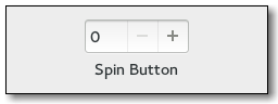
The official API for the Gtk::SpinButton widget goes like this:
Gtk::SpinButton.new(min, max, step)
= Gtk::SpinButton.new(0, 100, 5)
To query the current value of a spin button, use:
.value
To set the current value of the spin-button you can use the following method:
.set_value(0)
.set_value(50)
You can left-mouse-button click and middle-mouse-button click on the spinbutton (+ and -) itself - that is, changing the step size. This will change the current value via the newly designated "step size". If you have a use case or need to change the step size then you can use the following method to do so:
.set_increments() # It requires two arguments.
.set_increments(1, 1)
As mentioned elsewhere in this document, if you want to style the entry in a spinbutton then use something like this:
spinbutton entry {
background-color: black;
}
The event that is triggered when the user clicks on the + or - sign is of class Gdk::EventButton. Specifically it is a GDK_BUTTON_PRESS event. If you want to find out when the user changed the value then look at the signal called :value_changed.
The upstream API documentation for Gtk::SpinButton can be found here:
https://ruby-gnome2.osdn.jp/hiki.cgi?Gtk%3A%3ASpinButton
More documentation for GTK3 can be seen here at lazka.github.io:
https://lazka.github.io/pgi-docs/Gtk-3.0/classes/SpinButton.html
Gtk::Spinner
Gtk::Spinner can be used to indicate some activity to the user.
Let's look at an image as example first:

The spinner is the upper part that looks like a rotating circle.
Instantiating a spinner can be done via:
spinner = Gtk::Spinner.new
To start the spinner spin around its axis:
spinner.start
To make it stop spinning again:
spinner.stop
Take note that ruby-gtk3 had the method .active? which no longer appears to exist in ruby-gtk4. So if you used a spinner in ruby-gtk3 you may have to adjust the code a bit.
The new method name appears to be:
gtk_spinner_get_spinning
So in ruby-gtk4 it should be:
spinner.spinning?
If you use the custom modification defined in gtk_classes/spinner.rb then you can also use the method .is_still_spinning?() on both ruby-gtk3 and ruby-gtk4. After all that was one key goal for the gtk_paradise gem, to make working with different ruby gems possible.
API documentation for Gtk::Spinner in GTK4 can be seen here:
https://docs.gtk.org/gtk4/class.Spinner.html
Gtk::Stack
Since as of gtk3, Gtk::Stack can be used to animate transitions.
Let's have a look at how this may look like:

Gtk::Stack is a container that will only show one of its children at any given time. In contrast to Gtk::Notebook, Gtk::Stack does not provide a means for users to change the visible child. Instead, the Gtk::StackSwitcher widget can be used with Gtk.Stack to provide this functionality.
Gtk::Stack has a single CSS node called stack.
Usage example for Gtk::Stack:
stack = Gtk::Stack.new
stack.set_transition_type(Gtk::Stack::TransitionType::SLIDE_LEFT_RIGHT)
stack.set_transition_duration(1000) # Set the transition time.
Other transition types are:
Gtk::Stack::TransitionType::SLIDE_DOWN
Gtk::Stack::TransitionType::SLIDE_RIGHT
Gtk::Stack::TransitionType::SLIDE_LEFT
Gtk::Stack::TransitionType::SLIDE_UP
Gtk::Stack::TransitionType::SLIDE_LEFT_RIGHT
Gtk::Stack::TransitionType::SLIDE_UP_DOWN
Gtk::Statusbar
Let's first have a look at how the Gtk::Statusbar widget looks like:

Gtk::Statusbar can be used to provide a statusbar that is usually on the bottom of the application.
I am not sure if it is still recommended to use Gtk::Statusbar in GTK3, but if you want to, you can use it just fine, via ruby-gtk.
The primary task of a statusbar is to show information to the user about ongoing things, status change in an application, such as "The content was saved into the file /foo/bar.md", and similar notifications.
Every message that enters the statusbar stack has to provide a context id - see the example that comes in the next paragraph.
If you want to add a message to such a status bar then I highly recommend using a method that simplifies this task for you.
An example for this follows:
def (i) # aptly named method here
@status_bar.push(@status_bar_context_id, i)
end
Where @status_bar is your status-bar, and the context-id should be a unique identifier for that status bar.
If you want to remove a message you can use .pop():
.pop "Foobar" # Remove message here
.pop @status_bar.get_context_id('main')
Note that the ID has to be unique. It can be obtained via the method get_context_id.
status_bar = Gtk::Statusbar.new','Statusbar
status_bar.has_resize_grip = true
status_bar_context_id = status_bar.get_context_id("A unique ID here")
To add another message one can use .push(), as in:
.push(, "DSA4 Simulator") # Add the message here.
To automatically change a given status-bar, threads can be used. Example:
x = Thread.new {
sleep 10
.push(, )
}
Upstream documentation for gtk3 in regards to Statusbar can be found here:
https://docs.gtk.org/gtk3/class.Statusbar.html
Gtk::StatusIcon
Gtk::StatusIcon can be used to show a small status-icon.
This subsection has a few code examples, for ruby-gtk2, in regards to Gtk::StatusIcon.
tray = Gtk::StatusIcon.new
tray.visible = true
tray.pixbuf = Gdk::Pixbuf.new('monitor.png')
tray.tooltip = 'The Tooltip goes in here.'
tray.signal_connect(:popup_menu) { |w, , activate_time|
= self.
.show_all
.popup(nil, nil, , activate_time)
}
To add a stock-icon, in ruby-gtk2, you could use the following code:
status_icon.stock = Gtk::Stock::DIALOG_INFO
You can also use your own images if you'd like to, via .pixbuf=.
Example for this:
status_icon.pixbuf = Gdk::Pixbuf.new('/path/to/some/image.png')
To query whether the icon is embedded or not, use:
status_icon. # => false
Note that the status-icon will be used automatically, if it exists, by the ruby-gtk application at hand, so you do not need to add (or embed) it (in)to any other widget as such.
Gtk::Table
A table is a widget that can display its child-widgets via a tabular (table) layout.
Let's look at an example of this first:

This was an old implementation in ruby-gtk2 of the game called mastermind.
Let's look at another example:

The basic syntax to create a new table in GTK goes like this:
table = Gtk::Table.new(rows, columns, homogeneous)
table = Gtk::Table.new(2, 3, true)
You can modify various settings in the table. For instance, to modify the row spacing you can use the following API:
table.row_spacings = 4
To set the column-spacing you can use:
table.set_column_spacings(3)
Gtk::TextMark
A Gtk::TextMark is like a bookmark in a text-buffer. It "remembers" the position within a given text, even if said text changes.
It is possible to obtain an iterator in a text buffer via:
text_buffer.iter_at_mark
Gtk::TrayIcon
Gtk::TrayIcon will handle a TrayIcon in GTK.
Note that this is deprecated since as of ruby-gtk3.
In ruby-gtk2, Gtk::TrayIcon could be used to access the system tray protocol.
Gtk::TrayIcon in turn used to be a subclass of Gtk::Plug.
The canonical way to instantiate a new Gtk::TrayIcon was via:
Gtk::TrayIcon.new(name, screen = nil)
More complex example:
require 'gtktrayicon'
@tray_icon = Gtk::TrayIcon.new("testing ...")
@tray_box = Gtk::EventBox.new # optionale event box
@tray_image = Gtk::Image.new # optionales bild
@tray_icon.add(Gtk::Label.new("Hello, World!"))
@tray.signal_connect(:configure_event) { |widget, event|
@traysize = event.width > event.height ? event.width :event.height
@traysize = @traysize / 2
@traysize = 4 if @traysize < 4
@tray.signal_connect(:map_event) {
pixbuf = GdkPixbuf::Pixbuf.new(
"#@datadirend/pixmaps/radaubruder/radaubruder.svg",
@traysize, @traysize)
@trayimage.pixbuf = pixbuf
}
@tray.show_all
Gtk::TreeIter
Gtk::TreeIter is a reference to a node in a given tree-model. We thus can access the data in the model via such a TreeIter.
To obtain the value of a TreeIter you can use the method .get_value(), as in:
.get_value(column)
Gtk::TreeIter populates a Gtk::ListStore.
The API documentation for TreeIter in gtk3 can be found here:
https://docs.gtk.org/gtk3/struct.TreeIter.html
Gtk::TimerWindow::TimerWindow
A demo for a timer-window, a custom widget that is part of the gtk_paradise gem, exists via:
require 'gtk_paradise/widgets/gtk2/timer_window/timer_window.rb'
Gtk::TimerWindow::TimerWindow.run
Gtk::ToggleButton
First, let's have a look how a Gtk::ToggleButton may look like:

Here is another example:

A Gtk::ToggleButton is a button that retains its state after it was clicked by the user. It has two different states: on and off, aka clicked and "unclicked" (unchecked), or active and inactive. (Active and Inactive is the official terminology, so we should use that as well.)
In order to create a Gtk::ToggleButton instance, use code like this:
= Gtk::ToggleButton.new(label_goes_in_here)
= Gtk::ToggleButton.new('hello world!')
If you want to programmatically set the state of a Gtk::ToggleButton to active, try the following code variant:
.set_active
.active = true # Or this setter, if you prefer that style.
Or, inactive check:
.set_active(false)
If you need to query whether the toggle-button is set to active or not, you can use .active?, such as in this way:
.active?
Gtk::TreeSelection
Gtk::TreeSelection will represent the selection that can be normally found within a Gtk::TreeView instance.
To respond to the situation where the user releases the button-press, try:
tree_view.signal_connect(:button_release_event) { |, event|
puts .selection #.selected
}
Gtk::TreeView and working with Gtk::TreeView in general
This subsection will detail Gtk::TreeView in more detail.
Before we discuss the Gtk::TreeView widget more extensively let's first show a few images how such a tree-view may look like in ruby-gtk3 or in ruby-gtk2:


Gtk::TreeView is a fairly specialized widget, in that it only shows objects that implement the TreeModel interface. This will typically make use of a Gtk::ListStore object inside; this one will be displayed by the Gtk::TreeView.
So, the general strategy here is to populate the Gtk::ListStore with data, and then use the Gtk::TreeView to display that data in a convenient manner to the user.
I got rather tired of having to write so much boilerplate code in regards to Gtk::TreeView, merely for getting a simple ListStore model to work properly.
So, as of January 2021, .use_these_headers() can be used to set the titles of the TreeView column. This won't work very well in every case, but for the subset of use cases I have had so far this works fine so far; see the studium-gem for an example of this (simply grep through the gui/ subdirectory there).
Let's next show an example how to use Gtk::TreeView. We have to keep in mind that this class works closely together with Gtk::ListStore, as stated above.
Example:
@liststore = Gtk::ListStore.new(String, String)
iter = @liststore.append
iter.set_value(0, 'New')
iter.set_value(1, 'document-new')
iter = @liststore.append
iter.set_value(0, 'Open')
iter.set_value(1, 'document-open')
treeview = Gtk::TreeView.new(@liststore)
That's it for the most part.
A tree model can be applied to a Gtk::TreeView after initialization via:
tree_view.set_model(store)
To enable hints for TreeView use:
tree_view.rules_hint = true
Double-click events (via the mouse) are handled with the row-activated signal of the Gtk::TreeView class.
To enable search, do:
treeview.set_enable_search(true)
treeview.enable_search # Or this variant if you use Gtk::BaseModule.
Likewise to disable (interactive) search, do either of:
treeview.enable_search = false
treeview.set_enable_search(false)
To enable rubber-banding, aka to allow the user to select multiple rows by dragging the mouse, consider using the following API:
treeview.set_rubber_banding(true) # This does not appear to work in ruby-gtk2 though.
# or
treeview.rubber_banding # This variant works if you use Gtk::BaseModule.
To make the treeview content reorderable:
treeview.set_reorderable(true)
treeview.reorderable = true # This setter could also be used.
Likewise to disable it do either of:
treeview.set_reorderable(false)
treeview.reorderable = false
To make the headers invisible you can use this method:
treeview.headers_visible = false
(This may sometimes be useful, such as when you do not need to display the headers and want a very lean row-entry based table-layout.
To show tooltips:
treeview.set_tooltip_column(0)
To set a maximum width for the column, you can use the following:
treeview.set_max_width(300)
To sort a column, try:
columns = @tree_view.columns?
columns[0].sortable_based_on(0)
columns[1].sortable_based_on(1)
columns[2].sortable_based_on(2)
To deselect the current selection, try:
selection.unselect_all # or use .deselect if you use the gtk_paradise gem; see next line
treeview.deselect # Deselect may be shorter and easier.
The latter can be combined via a mouse button press event, such as via:
treeview. { |, event|
case event.
when 3 # Right-mouse button was clicked here.
treeview.deselect
end
}
# or, if you use Gtk::BaseModule and the modifications from
# gtk_view.rb, you can simply do:
treeview.deselect_on_right_click_event
To add a new column into a Gtk::TreeView you can use the method .insert_column(). The general API for this goes like so:
.insert_column(position, title, cell, attributes)
Examples:
@tree_view.insert_column(-1, 'User', @renderer, text: 0)
@tree_view.insert_column(-1, 'PID', @renderer, text: 1)
And for gdk-pixbuf try:
@tree_view.insert_column(-1, 'ICON', @renderer, pixbuf: 2)
Note the last part being pixbuf:.
The value -1 means that the column will be appended, aka added onto the very end.
As this is the usual mode of action, the gtk_paradise gem makes this available via .append(). I found this simpler to remember than .insert_column(-1, etc...
To programmatically set a row as selected, try:
path = Gtk::TreePath.new(i.to_s)
column = treeview.columns?[0]
edit = false
treeview.set_cursor(path, column, edit)
treeview.grab_focus
If you use the gtk_paradise gem and just want to make the columns sortable based on their own dataset, as-is, then you can use this convenience method:
.all_are_sortable
treeview.all_are_sortable # ← this is probably the simplest way
You can test this on your own easily - first use a treeview without that method call; and then use it again with that method call. You will observe that you can click on the columns to achieve sorting.
See directory_content_widget_module.rb for a working example of this.
To enable custom sorting via a function (or rather method in ruby), use an API like this:
# ======================================================================= #
# Sort the file-size entry a bit differently.
# ======================================================================= #
list_store.set_sort_func(3) { |_model, iter1, iter2|
iter2[3].to_s.sub(/ kb/,'').to_f <=> iter1[3].to_s.sub(/ kb/,'').to_f
}
This has to be called on a Gtk::ListStore instance.
Each Gtk::TreeView has an associated Gtk::TreeModel. This model contains the data that the TreeView will display.
An unfortunate side effect of the complexity necessitated by a Gtk::TreeView is that you have to specify the data types for each column the model holds.
So for example:
list_store = Gtk::ListStore.new(String, String, Float)
To select a specific selection-mode in a Gtk::TreeView, try:
tree_view.selection.mode = Gtk::SELECTION_SINGLE
Possible values here are:
Gtk::SELECTION_NONE
Gtk::SELECTION_SINGLE
Gtk::SELECTION_BROWSE
Gtk::SELECTION_MULTIPLE
To make the headers in a Gtk::TreeView clickable, use:
tree_view.headers_clickable = true
You can of course use colours too, as the following example shows; but be wary that some colour combinations may make it difficult for the reader to easily view the content:

What if you want to use CSS to style a gtk-tree-view widget?
The CSS nodes that are used by a TreeView are:
treeview.view
├── header
│ ├── <column header>
│ │
│ ╰── <column header>
│
╰── [rubberband]
The view of a Gtk::TreeView widget can be addressed via .view, as shown in the above diagram. The button in a gtk-tree-view header can be addressed via .button. The header via .header.
For example, this should work if you want to modify the button and header in a view:
treeview.view header button {
color: steelblue;
background: royalblue;
font-weight: bold;
text-shadow: none;
box-shadow: none;
}
I tested this in December 2021 and it worked. See the following image for how this looks like:

If you want to collapse an expanded tree-view programmatically you can use:
tree_view.collapse_all
The upstream API documentation for Gtk::TreeView in ruby-gtk can be found here (at the least before 2022):
https://ruby-gnome2.osdn.jp/hiki.cgi?Gtk%3A%3ATreeView
For upstream GTK3 you can use this API documentation:
https://docs.gtk.org/gtk3/class.TreeView.html
Gtk::TreePath
Usage example:
path = Gtk::TreePath.new((self.nb_rows - 1).to_s)
Gtk::TreeViewColumn
To make a TreeViewColumn sortable, use the following API:
column.set_sort_column_id(COLUMN_NUMBER_GOES_HERE)
column.set_sort_column_id(0) # And so forth.
# or alternatively this alias, aka .sort_column_id =
column.sort_column_id = 0
To allow it to be resized by the user, which I think is a useful feature, use the following code:
column.set_resizable(true)
To center the column:
column.alignment = 0.5 # Center it.
To append a column to a Gtk::TreeViewColumn do:
tree_view = Gtk::TreeView.new(@list_store)
column1 = Gtk::TreeViewColumn.new("Data", Gtk::CellRendererText.new, text: 0)
column2 = Gtk::TreeViewColumn.new("Yea", Gtk::CellRendererText.new, text: 1)
tree_view.append_column(column1)
tree_view.append_column(column2)
Rather than .insert_column one can use the simpler append_column, as the above example showed.
To obtain the maximum width for a column, in pixels of the given tree column, use:
tree_view_column.get_max_width # or
tree_view_column.max_width # -1 will be returned if no maximum width has been set
Gtk::TreeModel
The event focus_in_event is triggered every time the user clicks onto a row.
To obtain the current selection you can use this API:
tree_view.selection
Alternatively:
tree_view.selection.selected
tree_view.selection.selected.nil?
This ultimately is a double-click event.
If you need to return an Iter you can use the method .get_iter:
Gtk::TreeModel#get_iter
If you wish to determine how many elements a TreeIter contains - that is, how many children a TreeIter has - you can make use of the following method called .n_children:
tree_iter.n_children
The upstream API documentation for Gtk::TreeModel can be found here:
https://ruby-gnome2.osdn.jp/hiki.cgi?Gtk%3A%3ATreeModel
Gtk::TreeModelFilter
Let's start by showing how such a tree-model filter can be instantiated:
list_store_filter = Gtk::TreeModelFilter.new(list_store) # pass in the Gtk::ListStore here
list_store_filter.visible_column = 2
If you want to create a filter function then you can use code such as the following one:
tree_model_filter.set_modify_func(String, String) { |model, iter, column|
child_iter = model.convert_iter_to_child_iter(iter)
if column == 0
child_iter[0]
else
"#{child_iter[1]} * 2 = #{child_iter[1] * 2}"
end
}
Gtk::TreeStore
A Gtk::TreeStore is a tree model used in a Gtk::TreeView widget. It allows the user to make use of simple drag-and-drop events as well.
The typical syntax in a Gtk::TreeStore goes like this:
Gtk::TreeStore.new(type1, type2, type3, ...)
A more specific example of this follows:
tree_store = Gtk::TreeStore.new(
String,
String,
Gdk::Color,
Float,
GdkPixbuf::Pixbuf
)
Gtk::TextTag
Gtk::TextTag has various different properties.
Usage example:
tag = Gtk::TextTag.new(tag_name)
tag.foreground = 'black'
tag.background_gdk = 'steelblue'
Property | Explanation
----------------------------------------------
wrap-mode-set: true or false (Read/Write) | Whether this tag affects the line wrap mode.
Gtk::UIManager
Gtk::UIManager can be used in combination via .xml files, to create menus in a gtk-application.
You can then also use something like tearoffs, via:
ui_manager.add_tearoffs = true
Gtk::User (a custom add-on widget)
This specialized class was added to simulate dataset about a user. A save-button is then used to save this dataset.
It is distributed with the gtk_paradise gem.
This widget was added mostly for demonstration purposes only; and it lacks some functionality. Unsure whether I will continue on this, so really - just treat this as a demo class. The general idea is that the user can fill in his or her data into the widget, and then click on 'submit', similar to a web-formular.
Gtk::Video (available since as of GTK4)
class Gtk::Video is new since as of GTK4. It can be used to play a video.
Gtk::Vte and Gtk::VteTerminal
This subsection will yield some details about the vte-specific code in gtk - both Gtk::Vte as well as Gtk::VteTerminal or any other vte-specific part. The subsection will try to explain the use case and API for both these widgets.
First, you have to install the vte-bindings, and then require it in your ruby code such as in this way:
require 'vte'
require 'vte3' # or this one should work
Now you are ready to create a new vte-instance, via:
vte_terminal = Vte::Terminal.new # now we have a vte-terminal widget bound to the variable called vte_terminal
A specific font can be set in this way:
vte_terminal.set_font('Monospace 18', Vte::TerminalAntiAlias::FORCE_ENABLE)
The arguments here are the font, and then the antialias rules. For the latter, the following options are available:
Vte::TerminalAntiAlias::USE_DEFAULT
Vte::TerminalAntiAlias::FORCE_DISABLE
Vte::TerminalAntiAlias::FORCE_ENABLE
You can also designate background images for the vte-terminal, via:
vte_terminal.set_background_image(BACKGROUND_IMAGE) # Pass the path to the file in here.
Make sure to check whether the image exists; ideally via a File.exist? check.
To allow for background scrolling of the vte-terminal at hand, issue:
vte_terminal.set_scroll_background(true)
The effect of this is fairly interesting and amusing - but also rather useless, in my opinion.
You can use a dim-colour via:
vte_terminal.set_color_dim(CORAL)
If you want to you can also use the method .set_background_saturation() to get rid of some of the colour tone. Example for this:
vte_terminal.set_background_saturation(0.1)
You may want to consider trying this out, by changing the value of the argument given to the method .set_background_saturation().
The vte-terminal can respond to a :child_exited event via:
vte_terminal.signal_connect(:child_exited) { ||
exit_application # Or call destroy() here.
}
You can send commands to Vte, via .feed_child(), such as wrapped into the following method:
def do_cmd(i = 'irb')
vte_terminal.feed_child(i+N)
end
This will be UTF-8, so you could most likely use it to send (feed) emoji too. Or simple Linux/UNIX commands if you are on such a system:
vte_terminal.feed_child "ls\n"
Interestingly enough, binary Data can be sent as well, via the method .feed_child_binary():
vte_terminal.feed_child_binary(binary_data_goes_in_here)
This could perhaps be used to stream binary data onto the vte-terminal or send and display images (perhaps) - I am not quite certain about that. Note that since as of vte 0.60 .feed_child_binary() is deprecated though.
You can also send an individual String, by using the method called .feed():
vte_terminal.feed('Willkommen auf VTE')
A specific size can be set via .set_size():
vte_terminal.set_size(22, 22)
Forking a new command can be done via .fork_command():
vte_terminal.fork_command
Gtk::VteTerminal may look like this:

The dimension of a VTE Terminal can be set via the following method call:
vte_terminal.set_size(columns, rows)
Pasting the clipboard content onto the terminal is possible via:
vte_terminal.paste_clipboard
The method .span_sync in python has the following signature:
.spawn_sync(
pty_flags,
working_directory,
argv,
envv,
spawn_flags,
child_setup,
child_setup_data,
cancellable
)
The clipboard can also be copied via:
vte_terminal.copy_clipboard
If you have a need to modify the cursor and use a blinking cursor then consider making use of the following API:
vte.set_cursor_blinks(true) # true stands for blink in this context
The length of the blinking cycle can be modified via gtk-cursor-blink-time.
An important event is child-exited. This event can be used to close all vte-terminals, but only when there is only one terminal left.
In the past the following code worked for child-exited:
vte_terminal.signal_connect(:child_exited) { ||
Gtk.main_quit
}
I have not tried this in ruby-gtk3 yet, but you can probably find out whether this works on your own, if you need the functionality.
Responding to when the window title was changed should be possible via the signal window-title-changed:
vte_terminal.signal_connect('window-title-changed') { ||
# window.title = terminal.window_title
}
To respond to drag-drop events, do something like this:
vte_terminal.signal_connect(:drag_drop) { |w, dc, x, y, time|
puts ' ==> Drag-drop signal'
::Gtk::Drag.get_data(w, dc, dc.targets[0], time)
}
The upstream API documentation at the least for pygobject, in regards to vte, can be found here:
https://lazka.github.io/pgi-docs/Vte-2.91/classes/Terminal.html
Gtk::WgetWrapper (a custom add-on widget)
A small wrapper - a custom modification - over wget exists, as part of the gtk_paradise project. I only focus on the ruby-gtk3 parts, so expect the ruby-gtk2 code to be mostly just legacy at this point in time.
To try class Gtk::WgetWrapper, consider using the following file and code:
require 'gtk_paradise/widgets/gtk3/wget_wrapper/wget_wrapper.rb'
Gtk::WgetWrapper.new
(Don't forget to embed it into Gtk::Window or Gtk::Runner.)
Gtk::Widget
This is the base class for all gtk-widgets. It is somewhat similar to the div-tag in HTML.
It contains convenience methods such as:
.visible? # query the visibility status of the widget at hand
You can also change the direction, if you would like to, via the following API:
Gtk::Widget.default_direction = Gtk::Widget::TEXT_DIR_RTL
Gtk::WidgetSwitcher (a custom add-on widget)
This custom widget can be used to embed two widgets; the first one should be an image, the second widget can be any custom widget. If you click on the image, it will switch to the second widget.
I needed this functionality to be able to create a general intro image, that, when the user clicks on it, changes to the main widget.
Usage example:
require 'gtk_paradise/widgets/gtk3/widget_switcher/widget_switcher.rb'
Gtk::WidgetSwitcher.run([Gtk::Image.new('foobar.png'), Gtk::Label.new('Past image-click event')])
Gtk::TextView
Gtk::TextView can be used to display the content of a file. If you need a better viewer than Gtk::TextView then perhaps Gtk::SourceView may be an option.
Let's next look at a basic example how to use Gtk::TextView:
text_buffer = Gtk::TextBuffer.new
text_view = Gtk::TextView.new(text_buffer)
text_view.set_editable(true)
text_view.cursor_visible = false # cursor is nit mehr zu sehen.
There are four wrap-modes available for wrapping content in a Gtk::TextView buffer, as shown here as an overview:
https://docs.gtk.org/gtk3/enum.WrapMode.html
(1) wrap mode none: here, no wrapping occurs. If a scrolled window contains the view, the scrollbar expands; otherwise, the text view expands on the screen. If a scrolled window does not contain the text-view, it expands the widget horizontally.
(2) wrap mode char: this will wrap to the character, even if the wrap point occurs in the middle of a word. Unfortunately, this will split words over two lines, which makes it a bit useless for a simple text editor.
(3) wrap mode word: this will fill up the line with the largest number of words possible but do not break a word to wrap. Instead, bring the whole word onto the next line. It is the best wrap mode in my opinion, but it can lead to confusion if an editor written in gtk is assumed to display true lines rather than add a newline in order to retain a "word".
Example for this:
text_view.set_wrap_mode(::Gtk::WrapMode::WORD)
(4) wrap mode word_char: this will wrap in the same way as wrap mode word, but if a whole word takes up more than one visible width of the text view, wrap it by the character. An example for the latter is shown here:
text_view.set_wrap_mode(::Gtk::WrapMode::CHAR)
If you want to have a pure read-only textview, you can use .set_sensitive(). This will prevent the user from interacting with the widget altogether.
You can toggle the state of the visibility of the cursor via .set_cursor_visible(). To hide it, do:
text_view.set_cursor_visible(false)
To scroll to a mark you can use:
text_view = Gtk::TextView.new
text_view.scroll_mark_onscreen(@buffer.get_mark(mark_str))
To set the focus on a text view:
text_view.has_focus = true
The gtk_paradise gem comes with a small example that shows you can you style individual words in a text-buffer, such as bold text or italic text.
See the example file there:
require 'gtk_paradise/examples/gtk3/text_buffer_example.rb'
TextBufferExample.new
Once you have a gtk-text-buffer, you can simply insert markup text at any moment in time, such as in this way:
@textbuffer.insert_markup(
@textbuffer.end_iter,
"<b>and some bold text</b>", -1
)
Note that a Gtk::TextBuffer::Mark is necessary to preserve a position in a given text-buffer. The insert mark typically refers to the position of the cursor.
You can set the left margin like so:
text_view.set_left_margin(5)
# text_view.left_margin = 5 # ← Note that this is equivalent to the line above ^^^.
Similar for the right margin:
text_view.set_right_margin(5)
# text_view.right_margin = 5 # ← Note that this is equivalent to the line above ^^^.
Note that .set_top_margin() and .set_bottom_margin() exist as well.
Set where the pixels appear:
text_view.pixels_above_lines = 2
text_view.pixels_below_lines = 2
text_view.pixels_inside_wrap = 2 # Sets the default number of pixels of blank space to leave between display/wrapped lines within a paragraph
To specify a particular indent-value, use the following API:
text_view.indent = 4
To disable editing a TextView buffer do:
x = Gtk::TextView.new
x.set_editable(false) # now it can not be modified anymore
Normally long lines of text in a Gtk::TextView widget will continue horizontally until a break is entered. To wrap the text and prevent it going off the edges of the screen use the method .set_wrap_mode().
If you have a need to determine which wrap mode is in use, then you can simply query this via:
pp text_view.wrap_mode
To obtain the buffer one can use .buffer:
buffer = @text_view.buffer
The official API documentation for Gtk::TextView in ruby-gtk can be seen here:
https://ruby-gnome2.osdn.jp/hiki.cgi?Gtk%3A%3ATextView
Gtk::SizeGroup
Gtk::SizeGroup can be used to group together different wigets.
The advantage of doing so is that these widgets will all have the same size. This allows us to avoid having to use Gtk::Table.
The default size is the size of the biggest widget.
The first argument is Mode:
@size_group = Gtk::SizeGroup.new(Gtk::SizeGroup::HORIZONTAL)
@size_group.()
@size_group.()
The allowed modes are:
Gtk::SizeGroup::HORIZONTAL
Gtk::SizeGroup::VERTICAL
Gtk::SizeGroup::BOTH
To query which mode is currently active, try:
@size_group.mode
To add another gtk-widget, use .add_widget():
.add_widget(widget)
How does this look?

Gtk::Scale
class Gtk::Scale can be used to control "sliding" between different values. The user can drag the slider in order to set / assign to a specific value, via the mouse. Thus this widget allows the user to avoid having to use the keyboard.
Let's look at an image to see how this may look like:

To create a new scale-button, use an API such as the following one:
= Gtk::ScaleButton.new(Gtk::IconSize::BUTTON)
# Or if you use Gtk::BaseModule then you can simply use the following:
=
To set specific icons you can use .set_icons():
.set_icons( %w( gtk-goto-bottom gtk-goto-top gtk-execute ) )
To set to a particular value you can use the .value = method:
.value = 25
To respond to the value being changed, use :value_changed like so:
.signal_connect(:value_changed) { |, value|
puts "value changed: #{value}"
}
Internally class Gtk::Adjustment is keeping track of changes to the values of the scale-button.
For scaling an image values such as Gdk.InterpType.Hyper are important. Make sure to read up on them.
HYPER is the slowest but highest quality reconstruction function. It is derived from the hyperbolic filters in Wolberg's "Digital Image Warping", and is formally defined as the hyperbolic-filter sampling the ideal hyperbolic-filter interpolated image. The filter is designed to be idempotent for 1:1 pixel mapping. Note that this interpolation filter is deprecated, as in reality it has a lower quality than the GDK_INTERP_BILINEAR filter since as of gtk 2.38. So for ruby-gtk3 this means :bilinear. Other values are :nearest. Note that ::nearest is the fastest, so if you go for speed, consider using this variant. Be aware that scaling down will lead to a bad quality though.
More documentation about these InterpType values can be read here:
https://gnome.pages.gitlab.gnome.org/gtk/gdk-pixbuf/enum.InterpType.html
The upstream API documentation for Gtk::Scale can be found here:
https://ruby-gnome2.osdn.jp/hiki.cgi?Gtk%3A%3AScale
Gtk::IconFactory
Gtk::IconFactory can be used to handle different Gtk::IconSet instances.
Usage example:
icon_factory = Gtk::IconFactory.new
icon_factory.add_default
Gtk::Window
Gtk::Window is the "main" widget of gtk. It will hold other widgets and display them to the user.
The 'default' syntax to create a new Gtk::Window goes like this:
window = Gtk::Window.new
Note that you can use several Gtk::Window images, so you are not limited to just a single window alone.
To modify the title of a Gtk::Window instance, try:
window.title = "Hello Buttons"
window.title = "My Title"
To query the size of a Gtk::Window instance do:
window = Gtk::Window.new
p window.size # => [200, 200]
To quit an application, respond to a delete_event in particular, the following code could be used:
window.signal_connect(:delete_event) { Gtk.main_quit }
If you need to tie this functionality to a button, see the next example for the 'raw' ruby-gtk variant to use:
= Gtk::Button.new('close')
.signal_connect(:clicked) {
Gtk.main_quit
}
As the example above shows, you can in general connect to the event when a button is clicked via .signal_connect(:clicked).
Make the window resizable (which is the default, anyway):
window.resizable = true
Specify a width and height value for the window:
window.set_size_request(250, 250)
To set the border-width - in HTML and CSS this may be similar to border-width: 1px, use inner padding via:
window.border_width = 10
window.border_width = 1
If you do not need decoration in the window, such as the top bar that contains the minimize or quit application button, nor the most outer border or the titlebar, then you can use the following method call:
window.set_decorated(false)
Personally I prefer windows with decoration, but sometimes it may not be wanted, such as when you create a browser in kiosk mode for a minimal user interface.
To move the window to a particular position on the screen use .move(), such as in:
window.move(0, 0) # This is equivalent to .top_left on Gtk::Runner, by the way.
To query for the current position, use .position, as in:
pp window.position
Remember that you can also use symbols and flags, such as:
window.set_window_position(Gtk::Window::POS_CENTER)
window.set_window_position(:center) # this one should work for ruby-gtk3
This could also be used to remember the last position the window was, upon closing, and it could be used to restore that last position as well.
To make a window paintable (and thus avoid GC being triggered), use:
window.app_paintable = true
To overlay a Gtk::Window over another Gtk::Window, use code such as this:
window.keep_above = true
To maximize a widget use .maximize, such as:
window.maximize # fullscreen window
This should work for all - or most - widgets, but it is typically used on the main Gtk::Window.
The delete_event is typically used when the user is queried for a confirmation dialogue, such as:
Are you really certain that you wish to close the window?
To destroy the Gtk::Window you can use the following code:
window.signal_connect(:destroy) { Gtk.main_quit }
To set the width of the border (aka the margin), you can use this code:
window.set_border_width(2)
Or the alias called .border_width =:
window.border_width = 12
This also works on Buttons and many other widgets, of course.
Gtk::Dialog and dialog-response in ruby-gtk3
Let's show a few images to show how this may look:


To create a new Gtk::Dialog.new one may use the following API:
dialog = Gtk::Dialog.new('the_title', parent_window)
The old way in ruby-gtk2 for gtk-dialogs was going like this:
if response == Gtk::Dialog::RESPONSE_OK
In ruby-gtk3 we have to use Gtk::ResponseType::OK instead, like so:
if response == Gtk::ResponseType::OK
The following flags are possible for Gtk::Dialog (this list is not complete, though):
Gtk::Dialog::MODAL
Gtk::Dialog::NO_SEPARATOR
You can combine them like so:
Gtk::Dialog::MODAL|Gtk::Dialog::NO_SEPARATOR
Buttons can be added like so, via Gtk::Dialog#add_button(button_text, response_id):
('OK', :ok)
(::Gtk::Stock::CANCEL, :cancel)
(::Gtk::Stock::CLOSE, :close)
(::Gtk::Stock::YES, :yes)
(::Gtk::Stock::NO, :no)
("OK", Gtk::Dialog::RESPONSE_OK) # This was the old style in ruby-gtk2.
Multiple buttons in one go can be added via .add_buttons().
Adding a new widget can be dDialogone via:
child.add()
Don't forget that you can hide a dialog if you would like to, via:
dialog.hide
A default response can be set via:
dialog.set_default_response(Gtk::Dialog::RESPONSE_CANCEL)
To respond to a signal, consider using the following code:
dialog.signal_connect(:response) { |, response|
case response
when Gtk::Dialog::RESPONSE_OK
p 'OK'
when Gtk::Dialog::RESPONSE_CANCEL
p 'Cancel'
when Gtk::Dialog::RESPONSE_CLOSE
p 'Close'
@dialog.destroy
end
}
Gtk::TextChildAnchor
No clue about Gtk::TextChildAnchor yet - expect updates in the future (perhaps!).
Gtk::CellRenderer
There are seven Gtk.CellRenderer widgets.
These are:
Gtk::CellRendererText
Gtk::CellRendererToggle
Gtk::CellRendererPixbuf
Gtk::CellRendererCombo
Gtk::CellRendererProgress
Gtk::CellRendererSpinner
Gtk::CellRendererSpin
Gtk::CellRendererAccel
Gtk::CellRendererProgress
Owing to Gtk::CellRendererProgress it is possible to show a progress-bar within a cell (such as for use in a TreeView widget).
This looks roughly like this (at the least on ruby-gtk2):

Code example:
cell_renderer_progress = Gtk::CellRendererProgress.new
pcol = Gtk::TreeViewColumn.new("Progress", cell_renderer_progress, value: 1)
tree_view.append_column(pcol)
To set to the full value of the render-progress, use code such as the following:
cell_renderer_progress.set_value(100)
Gtk::CellRendererToggle
Gtk::CellRendererToggle renders a toggle button in a cell. The button is drawn as a radio- or checkbutton, depending on the 'radio' property.
When activated, it emits the 'toggled' signal.
A Gtk::CellRendererToggle can have two states:
(1) active
(2) not active
Thus, if you want to respond to any change, you may want to bind the 'active' property on the cell renderer to a boolean value in the model, thus causing the check button to reflect the state of the model.
Gtk::CellRendererPixbuf
To use it, try:
cell_renderer_pixbuf = Gtk::CellRendererPixbuf.new
This can be used to 'render' icons in a Gtk::TreeView.
To follow the state, do:
cell_renderer_pixbuf.follow_state = true
This means that the rendered pixbuf can be colourized - or not, respectively.
The official C-API documentation can be seen here:
https://docs.gtk.org/gtk3/class.CellRendererPixbuf.html
Gtk::Scrollbar and scrollable-widgets in general
Scrollbars come in two variants: the horizontal scrollbar, and the vertical scrollbar.
You can set the scrollbar via .set_placement().
If you want to style a scrollbar via CSS, you can either use scrollbar {} to style all scrollbars, or use a specific ID, and then define the values you want to use like in the following way:
#scrollbar1 slider {
/* Size of the slider */
min-width: 12px;
min-height: 12px;
border-radius: 17px;
/* Padding around the slider */
border: 3px solid transparent;
}
This requires that your scrollbar has been assigned the name scrollbar1, such as via:
.set_name('scrollbar1')
Don't forget this call, as it will otherwise not work. If you need a full, standalone example then have a look at the examples/ subdirectory - in particular the advanced examples should demonstrate this functionality.
To modify the trough, try:
scrollbar trough {
background-color: steelblue;
/*
background-color: shade(@theme_bg_color, 0.60);
margin: 20px;
padding: 40px;
*/
}
Be careful when using this, though - some scrollbars may look very strange when they become too big and too wide.
This can also be applied to other troughs, such as the trough for the Gtk::ProgressBar:
progressbar > trough {
min-height: 8px;
background-color: #007070;
}
In ruby-gtk2 we would have to differentiate between vertical and horizontal scrolling.
Example:
Gtk::HScrollbar.new(adjustment)
In ruby-gtk3 this is (probably) no longer necessary or possible - just pass :horizontal or :vertical.
The simpler variant, though, may be to add e. g. Gtk::ScrolledWindow and use the add_with_viewport variant.
To connect a scrollbar to the vertical-adjustment of another widget you can do something like this:
@scrollbar = Gtk::Scrollbar.new(:vertical, @another_widget.vadjustment)
It is possible to connect the scrolling event to a positional value in another widget. Example:
hbox.focus_vadjustment = @scrolled_window.vadjustment
Here the .vadjustment value of the scrolled-window is tied to the focus_vadjustment of another widget.
Gtk::ListStore and filtering on Gtk::ListStore
Let's begin this subsection with a few syntax-examples, to get you to understand how Gtk::ListStore is properly used.
list_store = Gtk::ListStore.new(type1, type2, type3, type4, ...)','ListStore
list_store = Gtk::ListStore.new(String, String)
list_store = Gtk::ListStore.new(String, String, String, Integer)
list_store = Gtk::ListStore.new(Integer, String, trueClass) # letzter Wert ist ein Boolean
list_store = Gtk::ListStore.new(Integer, String, GdkPixbuf::Pixbuf)
# Create 15 string entries:
list_store = Gtk::ListStore.new(*([String] * 15)) # This convenient variant makes use of 11 Strings
As can be seen we designate the type that will be shown by the ListStore. This can then, lateron, be displayed via Gtk::TreeView. Thus, if you think about it, a Gtk::ListStore is primarily a data storage for the Gtk::TreeView Widget.
To append data onto a Gtk::ListStore we first have to obtain the iter, like in this way:
iter = @list_store.append
Now we can make use of .set_value to modify the iter elements directly.
Example for this:
set_value(iter, column, value)
iter.set_value(0, v1)
iter.set_value(1, v2)
The following snippet may be useful should you need to filter on a Gtk::ListStore:
list_store.set_sort_func(3) { |_model, iter1, iter2|
iter2[3].sub(/ kb/,'').to_f <=> iter1[3].sub(/ kb/,'').to_f
}
Basically we designate the correct entry in the gtk-list-store, and within the block we'll handle the sorting, via the <=>.
See also the file gtk_paradise/widgets/shared_code/directory_content_widget/directory_content_widget_module.rb for a working example.
To clear a Gtk::ListStore instance, the method .clear can be used, like this:
list_store.clear
Gtk::TextBuffer and Gtk::TextBufferTags - selections in a TextBuffer widget and how to make use of Gtk::TextBuffer
First, let's look at an image of using colours in a Gtk::TextBuffer - this may simplify reasoning about as to what this widget does:

You can style text in gtk by tapping into the corresponding Iter in the buffer. An Iter will point to a particular place in a buffer, and associates that area with a particular tag.
The module Gtk::TextBufferTags was once used to create several tags, for use in a gtk-buffer.
I have not updated this in many years, so I am not sure how useful this is. We'll see.
To create a tag, you can do the following:
buffer.create_tag("colors", background="#000000", foreground="#FFFFFF")
A gtk-text-buffer may contain text that is styled in a specific way.
The following picture shows this:

Why may a TextBuffer be useful?
A TextBuffer contains data, such as the content of a file, which can then subsequently be displayed via ruby-gtk.
The currently-selected text in a textbuffer is the region between the "selection_bound" and "insert" marks.
This is also known as a text_iter. A text_iter represents a position between two characters in the text (or, rather, in the text buffer).
To obtain the actual text of a selection, you can use code as follows:
buffer = text_view.buffer
start_position, end_position = buffer.selection_bounds # Returns: [start, end, selected]
text = buffer.get_text(start_position, end_position, false)
This is now stored in the variable text.
If you want to make use of markup in a Gtk::TextBuffer then you can try something like this:
buffer = @view.buffer
buffer.insert_markup(buffer.start_iter, markup)
Here you need to have your markup ready (via the variable markup).
If you want to find text in a buffer you can use the methods .forward_search() and .backward_search().
You can use colours for individual tags/words in a gtk-text-buffer.
The following example shows this for a darkblue colour, in ruby-gtk3:
darkblue = text_buffer.create_tag(nil, { foreground: 'darkblue' })
text_buffer.insert(iter, "hypertext:\n", tags: [darkblue] )
Another example, for bold text:
text_buffer.create_tag("bold","weight" => :bold)
text_buffer.insert(iter, "this text",'bold')
For a gray background, consider using this:
grey_background = text_buffer.create_tag(nil, { background: 'gray' })
See also the example file at text_iterator_example.rb.
To paste the clipboard into the buffer, do:
buffer.paste_clipboard(clipboard, override_location, default_editable)
To obtain the text in a buffer, do:
buffer.text
To set the text in a gtk-buffer, use:
text_buffer.set_text('aaa sasa')
Make the buffer editable:
buffer.editable = true
To query the cursor position do:
pp buffer.cursor_position
To place the cursor on the screen, do:
buffer.place_cursor(iter)
To react to the cursor-position being changed, use code like the following variant:
text_buffer.signal_connect('notify::cursor-position') {|, event|
e 'The cursor position was changed. It is now at: '+
.cursor_position.to_s
}
If you use the modifications from the gtk_paradise gem then this can be simplified a little bit via:
text_buffer.on_cursor_position_changed {
}
It may not be a huge improvement, but being able to write less is often very convenient. I like brevity, when code is still readable.
Make the cursor in the buffer visible:
buffer.cursor_visible = true
# buffer.cursor_visible = false # and invisible again
If you wish to insert text right at the cursor then the following code may be helpful:
text_buffer = Gtk::TextBuffer.new
text_buffer = gtk_text_buffer # ← for ::Gtk::BaseModule
text_buffer.insert_at_cursor(" Test ")
To delete the whole buffer, consider using this API:
text_buffer.delete(text_buffer.start_iter, text_buffer.end_iter)
To count how many characters are in a given buffer, use the following method:
puts text_buffer.char_count
To declare a reference to an iter, marking the position in the buffer itself, do something like this:
iter = text_buffer.get_iter_at_offset(0)
It is possible to respond to certain events. For instance, if you want to know when text was inserted, then make use of the insert_text event:
buffer.signal_connect(:insert_text) { |w, iter, text, length|
.clear
}
To delete a selection, do:
buffer.delete_selection(interactive, default_editable)
buffer.delete_selection(false, false)
The method will delete the range between the "insert" and "selection_bound" marks, that is, the currently-selected text. If interactive is True, the editability of the selection will be considered (users can not delete uneditable text).
Interestingly Gtk::TextBuffer does not have Gtk::Widget as a superclass. Its direct superclass is GLib::Object. This surprised me because the custom .on_changed method defined in Gtk::Widget, as part of the gtk_paradise gem, was not working for a textbuffer. I then realized that we have to deal with GLib::Object instead in this case.
The official API documentation for Gtk::TextBuffer can be seen here:
https://ruby-gnome2.osdn.jp/hiki.cgi?Gtk%3A%3ATextBuffer
Gtk::Button and other buttons in ruby-gtk3, including the method gtk_button()
A button is a basic element for any GUI (graphical user interface).
It typically responds to different events, most importantly the "clicked" event, which is triggered when the user clicks on the button at hand.
To use underline on a button, use:
.use_underline = true
An image to a button can be added in this way:
.add(image) # I recommend this, actually - it is quite trivial to use.
In regards to ruby-gtk and upstream GTK, the API has changed between ruby-gtk2 and ruby-gtk3.
The old way in ruby-gtk2 was to do something like this:
= Gtk::Button.new('About')
In ruby-gtk3 this now requires a mandatory label: key:
= Gtk::Button.new(label: 'About')
Or, you can use Gtk::BaseModule, which is part of gtk_paradise, and then simply use gtk_button() - it will automagically work no matter whether you use ruby-gtk2 or ruby-gtk3. Simplicify for the win! \o/
You can instante a new gtk-button in this way, if you make use of the gtk_paradise project (see Gtk::BaseModule in particular):
= (
'Generate a random aminoacid sequence'
) {{ # Add a tooltip.
tooltip: 'Clicking this button will <b>generate a random aminoacid sequence</b>.'
}}
This will make use of a tooltip as well. How fancy! \o/
Note that there are many other similar methods starting with gtk_, as part of the gtk_paradise gem. Since as of 29.01.2021 these gtk_ methods are tracked via @internal_hash - or at the least they all may, eventually. gtk_button() is definitely tracked by @internal_hash. Note that this also means that you should not define the variable @internal_hash in your own custom widgets - it may conflict with the variable.
The advantage of this is that you don't have to keep track of all buttons that are used in a specific gtk-application. Instead you can simply use the following method to return an array of all buttons:
# I prefer this longer variant actually.
Keep in mind that this only works if you used gtk_button (or the alias to it, called button). I use this to consistently style all buttons in a given gtk-application via CSS or ad-hoc changes, such as .bblack1 (which, internally, also delegates towards CSS).
Note that Gtk::CheckButton is treated differently than Gtk::Button. The reason is two-fold: one, a check-button is not quite like a regular button. Two, upstream ruby-gtk seems to use different border-layouts by default, such as a rounded border for a Gtk::Button and no roundedness for a gtk-check-button. I am not sure why, but I don't want to change upstream defaults, as that may lead to downstream problems, so I just stick with the defaults there. That means if you want to modify all check-buttons, you have to use one of the following two methods instead:
You can "send" the clicked-event to a button via signal_emit such as in this way:
.signal_emit(:clicked)
In the past, say, ruby-gtk2, you could modify the background colour of a gtk-button like this:
button.modify_bg(Gtk::StateType::NORMAL, Gdk::Color.parse("red")
This is no longer necessary in ruby-gtk3. You can just use CSS for this in ruby-gtk3. The reason this is documented here is that in the event that you may want to write ruby-gtk2 specific code, you can adjust the code to your wants and needs. Personally I moved to ruby-gtk3, so I don't really need to use .modify_bg() anymore.
In the past you could combine Gtk::Button with, for instance, gnome-canvas and draw some modified buttons, such as the following example shows (two buttons are used there):

This is, I believe, no longer possible as the old ruby-gnome bindings are no longer maintained. But you can probably achieve a very similar effect via CSS (in ruby-gtk3) and style the surroundung area of a button via the border property. You can also embed the button into a gtk-container, which can then be styled additionally too.
Buttons in GTK also have certain flags, such as CAN_FOCUS, which can be set via .set_flags().
Example for this:
.set_flags(Gtk::Widget::CAN_FOCUS)
The upstream API documentation for Gtk::Button can be found here, for GTK4:
https://docs.gtk.org/gtk4/class.Button.html
Gtk::Entry, including use cases such as a password widget
Gtk::Entry can be used to allow the user to input text, via some input-field. In other words: Gtk::Entry can be used to obtain user input.
If you use Gtk::BaseModule, which is part of the gtk_paradise project, then you can simplify using Gtk::Entry in various ways.
First, you may want to instantiate a new Gtk::Entry if you use Gtk::BaseModule, which is part of the gtk_paradise gem:
entry = gtk_entry
Or you could want to use a Gtk::Entry as a password widget:
entry = gtk_password
This essentially sets as the invisible character; it's just a slightly modified Gtk::Entry. But I think using **gtk_password* as name is useful - easy to remember, in my opinion.
You can set a so-called "placeholder-text", which provides some hints how to use it. This is general functionality available from the upstream ruby-gtk3 bindings, as-is.
Example for this:
entry.set_placeholder_text("https://youtube.com/watch...")
If you use Gtk::BaseModule then this can be simplified a bit towards:
entry.ghost_text("https://youtube.com/watch...")
Various methods have been added that can simplify the use of gtk-entry via the gtk_paradise gem, such as the following few examples may show, without much further explanation:
entry.on_select_highlight_this # When the mouse-button is clicked, the entry is selected/focused.
entry.click_event_when_enter_key_was_pressed { do_call_this_method } # When the user hits the enter-key.
If you want to have a Gtk::Entry that is read-only, aka where the user may not do any modifications, you can do so upon creation time, if you use Gtk::BaseModule, via:
gtk_entry { :read_only }
Or, to modify the entry directly, for readonly setting, use:
entry.editable = false
entry.read_only # ← This can be used if you use the gtk_paradise gem
You can display small icons in a gtk-entry. For example, to show a small search-symbol, a magnifier glass, on the left hand side of a gtk-entry, use the following code:
entry = Gtk::Entry.new
icon_name = 'system-search-symbolic'
entry.set_primary_icon_name(icon_name)
# Another example, this time by leveraging the gtk-paradise project:
entry = gtk_entry_with_icon_name('edit-undo-symbolic-rtl.symbolic')
The last line of code will lead to a gtk entry that may look like this:

Oddly enough, the name primary refers to the placement of the icon on the left-hand side, whereas the name secondary refers to the placement of the icon on the right-hand side. Odd naming scheme.
To select the content of a Gtk::Entry instance, you can use the following API:
entry.select_region(0, -1)
Here -1 refers to the end-of-the-line, aka the full content of that entry. If you need to select fewer characters (a subslice) then input the number of characters there. The 0 indicates to start-from-the-left-hand side.
To designate a maximum length of allowed characters, use .set_max_length():
entry.set_max_length(25)
To designate an inner margin, also known as the inner-border, try this:
entry.inner_border = 10
To determine the cursor position within the entry, use:
entry.cursor_position
If you need to respond to a certain key pressed then the following code may be helpful, indicating to do something when the user presses the enter key:
entry.signal_connect(:key_press_event) { |, event|
call_a_method_here if Gdk::Keyval.to_name(event.keyval) == 'Return'
}
To respond to an activate-event use:
entry.signal_connect(:activate) { || enter_callback() }
To query the current text (aka the current content):
entry.text
To set the text:
entry.set_text "hello"
You can also use:
entry.insert_text " world", entry.text.length
To use invisible characters, try this:
entry.set_invisible_char(42) # 42 is "*" in unicode
To respond on scroll-events, adjust the following snippet to your needs as you may see fit:
entry.respond_to_scroll_events # ← This method is only available if you use the gtk_paradise gem
entry.signal_connect(:scroll_event) {|, event|
puts 'Yes, some scrolling event did happen just now.'
_ = event.event_type.name
case _
when 'GDK_SCROLL'
case event.direction
when Gdk::ScrollDirection::UP
e 'We scrolled up!'
when Gdk::ScrollDirection::DOWN
e 'We scrolled down!'
end
end
}
In fact: as that is a common use case it made sense to simplify this further to the following variant:
entry.signal_connect(:scroll_event) {|, event|
if scroll_up?(event)
e 'We scrolled up!'
elsif scroll_down?(event)
e 'We scrolled down!'
end
}
It's a bit shorter, so I tend to use the second variant rather than the first one.
You could also use this slightly more verbose variant:
entry.signal_connect(:event) { |, event|
if scroll_up_event?(event)
# scroll up event
elsif scroll_down_event?(event)
# scroll down event
end
}
If this does not work for you, consider calling .enable_scroll_events on the gtk-entry at hand prior to adding the above code. Afterwards it should be able to respond to mouse-scroll events. At the least that worked for me.
Since as of August 2022 you can also create a "default" gtk-entry, if you include the module Gtk::BaseModule.
Usage example:
entry1 = default_entry
This would yield a gtk-entry with a yellow background, that may look like this:

On that image shown above, the entry is the yellow area, accepting user input.
The upstream API documentation for Gtk::Entry can be found here:
https://ruby-gnome2.osdn.jp/hiki.cgi?Gtk%3A%3AEntry
Gtk::Grid and gtk_grid()
class Gtk::Grid can be used to position widgets in a grid-like layout. It is available since as of GTK version 3.
First: here is the upstream API for .attach(). I added this because I keep on forgetting what the individual entries mean.
public void attach(
Widget child,
int left,
int top,
int width = 1,
int height = 1
)
So this is - left, top, width, height.
The method .attach() will add a widget to the grid. It requires 5 parameters in total.
The position of child is determined by the two parameters called left and top.
The number of 'cells' that child will occupy is determined by width and height, respectively.
Parameters that may need an explanation:
left: the column number to attach the left side of child to
top: the row number to attach the top side of child to
width: the number of columns that child will span
height: the number of rows that child will span
Specific usage example in plain ruby-gtk3:
grid = Gtk::Grid.new
b1 = Gtk::Button.new(label: 'Button')
grid.attach(b1, 0, 0, 1, 1)
b2 = Gtk::CheckButton.new()
grid.attach(b2, 1, 0, 1, 1)
b3 = Gtk::RadioButton.new(label: 'abc')
grid.attach(b3, 2, 0, 1, 1)
The values that can be supplied to .attach() are as follows:
child # the widget to add
left # the column number to attach the left side of child to
top # the row number to attach the top side of child to
width # the number of columns that child will span
height # the number of rows that child will span
The gtk_paradise project makes use of gtk_grid() in order to create a grid layout, if you make use of Gtk::BaseModule.
Example for this:
@grid = gtk_grid
@grid.set_column_spacing(6) # To specify the spacing (distance) between the individual columns.
@grid.set_row_spacing(6)
left_entry = create_entry('LEFT ENTRY')
left_entry.set_size_request(600, 42)
@grid.attach(left_entry, 0, 0, 2, 1)
The API for .attach() is:
.attach(child, left, top, width, height)
If you use Gtk::BaseModule, which is part of the gtk_paradise gem, then you can also use this API, on the grid:
grid.left(text('This is left.'))
grid.middle(text('This is middle.'))
grid.right(text('This is right.'))
# To then force a new row, use:
grid.new_row # This is no longer necessary as of September 2021 if you use .right(). .right() will call .new_row automatically.
I find this quite simple to remember: first use .left(), then either use .middle() or .right(). Note that .middle() can be used several times, thus allowing your grid to be very flexible. If you only need a two-row grid then you can use .left() followed by .right() - and if you need to move to the next row, use .new_row(). I find this API to be much easier to use than the .attach() API. (Of course internally .left, .middle and .right() use .attach(), so it is really just syntactic sugar around .attach()).
You can also specify the margin that a Gtk::Grid should use. And, on top of that, you can set a different margin width on each of the four sides. The next code block shows how this can be done:
grid.set_margin_top(margin = 12)
grid.set_margin_end(margin = 12)
grid.set_margin_bottom(margin = 12)
grid.set_margin_start(margin = 12)
Note that you can omit the margin paramenter if you would like to:
grid.set_margin_top(12)
grid.set_margin_end(12)
grid.set_margin_bottom(12)
grid.set_margin_start(12)
To feedback the current margin in use you can do this:
grid.margin # => 12
Row-spacing and column-spacing can be set as well via:
grid.set_row_spacing(spacing=12)
grid.set_column_spacing(spacing=12)
# or
grid.set_row_spacing(12)
grid.set_column_spacing(12)
The API documentation for gtk-grid in gtk3 can be seen here:
https://docs.gtk.org/gtk3/class.Grid.html
For more documentation pertaining to Gtk::Grid, at the least for GTK4, you can read up more here:
https://docs.gtk.org/gtk4/method.Grid.attach.html
Gtk::BaseModule
The toplevel module Gtk::BaseModule, defined in this project, is an extremely important module for the gtk-paradise gem. In fact, it is the module that I typically use when I have to subclass or create a custom gtk-class. It contains many utility methods that I may use whenever I work with ruby-gtk2 or ruby-gtk3.
It can be used in the following way:
require 'gtk_paradise/requires/require_the_base_module.rb'
include ::Gtk::BaseModule
Then, within your subclass, you can call certain convenience methods.
A more specific example follows next.
Typically in order to create a new Statusbar, you would do this:
= Gtk::Statusbar.new
or perhaps:
= ::Gtk::Statusbar.new
if the outside module is module Gtk.
Since the latter is a bit harder to type, Gtk::BaseModule defines the following helper-method:
=
This is a bit simpler to type, yes? More convenient. This is also how the C code, sort of, works for GTK - you use functions primarily (and, correspondingly, methods in ruby).
But another benefit is that the methods in ruby, defined in Gtk::BaseModule, are quite versatile. We can add additional functionality to these method calls by passing a block to it.
For example, consider this code:
{ :with_resize_grip }
This works, and it means that the Gtk::Statusbar will have a resize handle (at the least in ruby-gtk2; somehow this was deprecated in ruby-gtk3, but you get the general idea here).
In oldschool ruby-gtk code, at the least for gtk2, this would be equivalent to the following code:
= ::Gtk::Statusbar.new
.has_resize_grip = true # this appears to only work in ruby-gtk2, not in ruby-gtk3 anymore
The resize grip may look like this:

So, we use only one line of code, whereas with the oldschool variant we would have to use two lines of code. This may not seem like a huge simplification, but keep in mind that you, as the writer of the ruby code, may have to remember all the API bits here, in order to use this. That is why I think it is simpler and more convenient to make useful functionality available on the moment you create a gtk-widget, as-is.
To remember:
a) there is really a LOT of code that can become shorter that way
b) almost more importantly, you can re-"style" all of ruby-gtk
and use shorter mnemonics in general.
In particular point b) is hugely important to me, since I can create content in ruby-gtk just by thinking about the problem domain appropriately, and then adding the corresponding code. This is similar to how rails works, in the sense that you operate a LOT on the DSL-level at hand, rather than focus on other aspects, such as specific, fine-tuned SQL queries.
In March 2021, I decided to change the approach how I use CSS within ruby-gtk3. The old approach that I used was a bit cumbersom. The new way will be to put all CSS rules into a special string called:
@css_string = ''.dup
This is then automatically called by Gtk::Runner.
However had, in August 2021 @css_string was deprecated. We will now store onto @internal_hash instead.
Alternatively you could call this method on your own:
apply_the_css_string
The idea behind this is that we can add all CSS rules to that string, and then call to the gtk-provider only once.
Between doing this, we could also auto-generate some CSS files, without necessarily having to distribute standalone .css files as-is.
You can add these custom CSS rules via any of the following methods:
more_css
adhoc_css
This may look like so:
more_css '
.blightgreen { border: 2px solid darkgreen; }
.bblack5 { border: 8px solid black; }
.bgreen5 { border: 8px solid green; }
'
Since as of September 2022 you can also return a custom gtk-vbox that has Gtk::BaseModule included.
The API for this is:
Gtk.
vbox = Gtk.
I needed this for the upcoming change to automatically create a gui-widget based on commandline output from other scripts.
Selecting a local file via ruby-gtk
If you would like to select / pick a local file via the gtk_paradise gem, try the Gtk::SelectFile widget:
require 'gtk_paradise/widgets/gtk2/select_file/select_file.rb'
Gtk::SelectFile.new
This also works for ruby-gtk3, since as of January 2021.
Usage example for ruby-gtk3:
require 'gtk_paradise/widgets/gtk3/select_file/select_file.rb'
Gtk::SelectFile.new
You can also pass a hash to this class, if you want to filter only for specific files.
Example:
Gtk::SelectFile.new {{ filter_for_these_file_types: '*.pdf' }} # To filter for .pdf files.
I will probably keep on making use of that class for opening file dialogs, simply because I dislike the official upstream API for opening files a lot.
Last but not least, here is a more complex example of what I tend to use for a file picker:
filename = ::Gtk.select_file(@parent_widget) {{ # @parent_widget should be of Gtk::Window class or subclass.
current_folder: current_folder,
show_hidden: true,
add_these_shortcut_folders: ARRAY_ADD_THESE_SHORTCUT_FOLDERS,
use_this_file_filter: '*.pdf'
}}
The old gtkrc file
In the past, for gtk2, a file called gtkrc could be used to style an application.
This is no longer possible in GTK3. You have to use a .css file instead, if you want to theme widgets.
This file, then, will reside at:
~/.config/gtk-3.0/gtk.css
Embedding a simple clock (for ruby-gtk2 only, presently)
If you have a need to embed a simple clock, you can use any of the following API:
Gtk.clock
Gtk.return_clock
Gtk.
Internally this will use the clock described by the file called mini_clock.rb.
To only specifically require that file, try this:
require 'gtk_paradise/widgets/mini_clock.rb'
gtk_list_store_table3
gtk_list_store_table3() can be used for a "table" with 3 columns per row.
You need to pass in an Array for it, then embed it like any other gtk-widget. That array should have a number of entries that can be divided by 3, so that each entry is filled. The first three element will become the headers (on top); the rest should be your dataset as-is, ideally as an Array.
Example:
gtk_list_store_table3( %w( 1 2 3 4 5 6 7 8 9 ) )
Coloured buttons
You can modify the colours of a gtk-widget via .modify_bg() and .modify_fg(). I found this rather cumbersome, though.
Thus, Gtk::BaseModule contains methods such as .quit_button().
It also offers a simple one-method variant to create a coloured quit button.
Example:
= (colour: 'honeydew')
The colour that you wish to use can be passed as a Hash with the symbol-key called :colour.
Note that for ruby-gtk3, the colours API has changed a bit. You may have to use Gdk::RGBA now.
An example is shown next:
rgba_object = Gdk::RGBA.new
rgba_object.parse(:silver)
.override_background_color(:normal, rgba_object)
So via override_background_color() we can set other colours.
Here is a specific example where all four values are provided to Gdk::RGBA:
.override_background_color(:normal,Gdk::RGBA.new(0.02, 0.02, 0.02, 1))
Which Gtk::Stock icons are available?
Well, I am not sure how to dynamically query this, but here is just a list of the icons I have tracked so far:
Gtk::Stock::ABOUT
Gtk::Stock::ADD
Gtk::Stock::APPLY
Gtk::Stock::BOLD
Gtk::Stock::CANCEL
Gtk::Stock::CDROM
Gtk::Stock::CLEAR
Gtk::Stock::CLOSE
Gtk::Stock::COLOR_PICKER
Gtk::Stock::CONVERT
Gtk::Stock::CONNECT
Gtk::Stock::COPY
Gtk::Stock::CUT
Gtk::Stock::DELETE
Gtk::Stock::DIALOG_AUTHENTICATION
Gtk::Stock::DIALOG_ERROR
Gtk::Stock::DIALOG_INFO
Gtk::Stock::DIALOG_QUESTION
Gtk::Stock::DIALOG_WARNING
Gtk::Stock::DISCONNECT
Gtk::Stock::DND
Gtk::Stock::DND_MULTIPLE
Gtk::Stock::EDIT
Gtk::Stock::EXECUTE
Gtk::Stock::FILE
Gtk::Stock::FIND
Gtk::Stock::FIND_AND_REPLACE
Gtk::Stock::FLOPPY
Gtk::Stock::FULLSCREEN
Gtk::Stock::GOTO_BOTTOM
Gtk::Stock::GOTO_FIRST
Gtk::Stock::GOTO_LAST
Gtk::Stock::GOTO_TOP
Gtk::Stock::GO_BACK
Gtk::Stock::GO_DOWN
Gtk::Stock::GO_FORWARD
Gtk::Stock::GO_UP
Gtk::Stock::HARDDISK
Gtk::Stock::HELP
Gtk::Stock::HOME
Gtk::Stock::INDENT
Gtk::Stock::INDEX
Gtk::Stock::INFO
Gtk::Stock::ITALIC
Gtk::Stock::JUMP_TO
Gtk::Stock::JUSTIFY_CENTER
Gtk::Stock::JUSTIFY_FILL
Gtk::Stock::JUSTIFY_LEFT
Gtk::Stock::JUSTIFY_RIGHT
Gtk::Stock::LEAVE_FULLSCREEN
Gtk::Stock::MEDIA_FORWARD
Gtk::Stock::MEDIA_NEXT
Gtk::Stock::MEDIA_PAUSE
Gtk::Stock::MEDIA_PLAY
Gtk::Stock::MEDIA_PREVIOUS
Gtk::Stock::MEDIA_RECORD
Gtk::Stock::MEDIA_REWIND
Gtk::Stock::MEDIA_STOP
Gtk::Stock::MISSING_IMAGE
Gtk::Stock::NETWORK
Gtk::Stock::NEW
Gtk::Stock::NO
Gtk::Stock::OK
Gtk::Stock::OPEN
Gtk::Stock::PASTE
Gtk::Stock::PREFERENCES
Gtk::Stock::PRINT
Gtk::Stock::PRINT_PREVIEW
Gtk::Stock::PROPERTIES
Gtk::Stock::QUIT
Gtk::Stock::REDO
Gtk::Stock::REFRESH
Gtk::Stock::REMOVE
Gtk::Stock::REVERT_TO_SAVED
Gtk::Stock::SAVE
Gtk::Stock::SAVE_AS
Gtk::Stock::SELECT_COLOR
Gtk::Stock::SELECT_FONT
Gtk::Stock::SORT_ASCENDING
Gtk::Stock::SORT_DESCENDING
Gtk::Stock::SPELL_CHECK
Gtk::Stock::STOP
Gtk::Stock::STRIKETHROUGH
Gtk::Stock::UNDELETE
Gtk::Stock::UNDERLINE
Gtk::Stock::UNDO
Gtk::Stock::UNINDENT
Gtk::Stock::YES
Gtk::Stock::ZOOM_100
Gtk::Stock::ZOOM_FIT
Gtk::Stock::ZOOM_IN
Gtk::Stock::ZOOM_OUT
To use this in a gtk-menu, you can use code like this:
= ::Gtk::ImageMenuItem.new(stock: ::Gtk::Stock::MEDIA_PLAY)
Gtk.populate_this_liststore
You can use Gtk.populate_this_liststore() to populate a gtk-list-store.
Example:
Gtk.populate_this_liststore(liststore, dataset)
First argument is the list_store; the second argument is typically an Array.
I needed this functionality because I had to dynamically read in dataset from files, and then populate a widget with that dataset.
Working with menu entries
A gtk-menu is typically at the very top of a gtk-widget, where the user can select entries in that widget, such as "open file" or "quit" the application.
Building a menu in ruby-gtk2 is surprisingly complicated; whoever designed this system wasn't really influenced by the modern www-stack, quite obviously so.
At any rate, you can use something like this:
item = ('bar',nil,3)
item.signal_connect(:activate) { e 'test 2' }
To add sub-entries into each drop-down selection you can use this:
@menu_bar =
=
filem1 = ('File') {{
submenu:
}}
To add components to the menu-bar, try:
Normally, to handle events on a gtk-menu-item, you have to use code like this:
.signal_connect(:activate) {
do_some_method_call_there
}
Via the modifications in the gtk_paradise gem, you can simplify this to:
.on_activate {
do_some_method_call_there
}
Take note that this also works for other widgets such as Gtk::RadioMenuItem:
x = ::Gtk::RadioMenuItem.new(capture_the_stream_yes, 'No')
x.on_activate {
@capture_the_stream = true
}
xmas-gifts
This "game" just was a proof-of-concept mostly; I wanted to have a small application that people could click on every day on xmas.
Lots of functionality is missing right now though. For example, checking the date, and automatically opening those images that should be displayed on x-mas. Either way, I have distributed it as-is. If anyone feels like improving on the code, go ahead. :)
Debugging gtk-widgets
I became fairly displeased how difficult it is to debug gtk-related applications. Also, trying to find useful documentation can be rather frustrating ... I learned most from reading StackOverflow, github issue trackers as well as adapting examples from pygobject and ruby-gtk2 / ruby-gtk3.
So, as I was frustrated with debugging gtk-related widgets, the .debug() method has been added to Gtk::BaseModule.
Right now this is not extremely useful, but in the long run I intend to pack it with as much useful information as possible.
You can also use the GTK-debugger that comes with gtk3 if you want to debug gtk-related applications. Make sure to enable this through gsettings via:
gsettings set org.gtk.Settings.Debug enable-inspector-keybinding true
Then hit ctrl+shift+D. The GTK-debugger will show up afterwards.
Alternatively, say that your ruby script is called foobar.rb, then the following can be used in the shell to start the debugger as well:
GTK_DEBUG=interactive ruby .rb
Personally I am using the key-combination since it seems easier to type and use. You can modify the application as-is via that debugger.
StateFlags in GTK3
I had to debug a ruby-gtk3 application. The error message was mentioning Gtk::StateFlags. As I did not know that part of GTK before, I had a look which StateFlags exist.
Here is the answer:
require 'gtk3'
pp Gtk::StateFlags.constants # => [:ACTIVE, :INCONSISTENT, :PRELIGHT, :BACKDROP, :VISITED, :CHECKED, :LINK, :FOCUSED, :INSENSITIVE, :DROP_ACTIVE, :SELECTED, :NORMAL, :DIR_LTR, :DIR_RTL]
So the old gtk2 variant is now, for example, :ACTIVE or :PRELIGHT.
Support for gtk3
The upstream ruby-gtk bindings officially support gtk3, at the least most of it, via the "gtk3" gem. This gem can be installed, like any other gem, via:
gem install gtk3
Make sure that you meet the dependencies, in particular the necessary .h files, as these bindings have to be compiled natively. (I assume that, in theory, these compiled files could be distributed, but I am unaware as to whether anyone does provide these compiled bindings. I for one always compile it anew, or alternatively, once compiled, I backup the compiled directories/files, and re-use them on my computer systems.)
Since gtk2 is quite old, having been published in the year 2002 or so.
The gtk_paradise project wants to support gtk3 as well, provided that upstream bindings are available. Since gtk4 may come out in the coming months or year, we have to adjust to that changed situation ventually.
I still have a LOT of ruby-gtk2 legacy code here, but I did decide some time ago that the support for gtk3 in gtk_paradise must be improved, so that we can, one day, transition into gtk3 optionally. I intend to retain the ruby-gtk2 support as long as possible. That is, as long as the gtk2 gem is still available, but I myself may eventually change into ruby-gtk3 completely; this is currently (December 2020) ongoing.
This subsection will have some content about how to use gtk3, but keep in mind that this information can become outdated quickly; right now this is very experimental so don't consider using it yet for anything too serious.
First, you have to pull in the gtk3-specific code from the gtk_paradise project, via:
require 'gtk_paradise/requires/require_everything_for_gtk3.rb'
This already requires gtk3.
Alternatively you could also use:
Gtk.initialize_gtk3
But this should not be necessary if you pull in the above .rb file.
Note: this may be even simplified further in the future, but for now I am still experimenting, so this is a bit volatile; consider some of this a temporary work-around.
Your subclass should be a Window:
class HelloWorld < ::Gtk::Window
include Gtk::BaseModule # And you include that gtk3.rb file here, or rather, the module.
Unfortunately, back in October 2020 I realized that the style of code in use for ruby-gtk2, in the gtk_paradise project, can not be used for ruby-gtk3 1:1.
I did not know what to do, until I realized that we could simply use another module. This then made me realize that we have to change Gtk::Runner, to offer a module-variant as well, rather than the stricter subclass variant.
For example, in ruby-gtk2 this is possible:
class Foo < ::Gtk::HBox
But in ruby-gtk3, there is no Gtk::HBox anymore, so when I use syntax like the above, it locks us into ruby-gtk2. Thus, a module is better; and perhaps subclassing your own widgets anyway.
For a more advanced example, consider this:
require 'gtk_paradise/requires/require_everything_for_gtk3.rb'
include ::Gtk::BaseModule
require 'gtk_paradise/app/app_module/app_module.rb'
include ::Gtk::AppModule
require 'rbt/gui/shared/shared_gtk_module.rb'
include ::RBT::GUI::Gtk
The last variant I used to offer support for both ruby-gtk2 and ruby-gtk3, as I only have to make a few changes to have an application run both as a ruby-gtk2 application and a ruby-gtk3 application. But this was way too verbose.
In particular, having to do two includes specifically, such as via:
include ::Gtk::BaseModule
include ::Gtk::AppModule
Was way too cumbersome.
The next idea was to unify this behaviour into a single module instead.
Thus:
require 'gtk_paradise/base_module_and_runner_module/base_module_and_runner_module.rb'
include ::Gtk::BaseModuleAndRunnerModule
Or, slightly better, use this variant:
require 'gtk_paradise/requires/base_module_and_runner_module.rb'
include ::Gtk::BaseModuleAndRunnerModule
Note that these variants simply combine the two other modules mentioned above (BaseModule and RunnerModule), so we only save a bit typing here.
It currently only works for ruby-gtk3, but in the future I intend to make it available for both ruby-gtk2 and ruby-gtk3.
Default size
The default size of Gtk.Window should be set via:
window.set_default_size()
window.set_default_size(width, height)
This should work if you desire to specify the width and height that window should occupy. The values will be in n pixel.
Pending events
You can query for pending events via:
Gtk.events_pending?
Example via ruby:
while Gtk.events_pending:
Gtk.main_iteration
Resizing widgets in GTK+
The recommended way to resize widgets is via:
.set_size_request()
Reordering child widgets:
You can reorder a child widget via .reorder_child():
vbox.reorder_child(, position)
This method can be used to position the child-widgets into a new position of the gtk-box.
Assign to the xorg-buffer button
Since as of December 2020, there is a small custom button. Upon clicking this button, the current selection will be assigned to the xorg-buffer.
I needed this functionality for several gtk-classes, hence why this was added.
The name of the class is:
ButtonXorgBuffer
This is a fairly long name, but I kept that long name because it is easier to remember, in my opinion.
Rename files and directories widget
There exists a widget that can be used to rename files or directories.
Usage example:
require 'gtk_paradise/misc/rename_widget.rb'
Gtk::RenameWidget.new
This is somewhat a proof-of-concept right now. Perhaps in the long run it will be made visually more appealing. For now it was more important to get the basic functionality working.
Response codes used by Gtk::Dialog
This is just information:
| ID | Name |
|---|---|
| -1 | NONE |
| -2 | REJECT |
| -3 | ACCEPT |
| -4 | DELETE_EVENT |
| -5 | OK |
| -6 | CANCEL |
| -7 | CLOSE |
| -8 | YES |
| -9 | NO |
| -10 | APPLY |
| -11 | HELP |
Note that all these response identifiers have a negative ID. You can add new response identifiers on your own, but it is recommended to use positive numbers for them, to avoid incompatibilities in future versions GTK+.
Images in GTK+
When an image is loaded, GTK+ typically requires you to specify a size for the image.
The available size parameters, as specified via the IconTheme enumeration, can be seen next:
INVALID: Unspecified size
MENU: 16×16 pixels
SMALL_TOOLBAR: 18×18 pixels
LARGE_TOOLBAR: 24×24 pixels
BUTTON: 24×24 pixels
DND: 32×32 pixels
DIALOG: 48×48 pixels
Gtk.run_this_widget()
The particular method called Gtk.run_this_widget() has been added to the gtk_paradise project for a single reason:
- Make it simpler to "run" a particular gtk-widget.
What does this mean?
Say that you have some custom gtk-widget, packed in a Gtk::Frame. Now you want to simply show this on the desktop.
Typically you would use:
Gtk::Window.new(.new)
Or something like that. You may also add some more custom code calls and such.
This is where I found this API to be simpler:
Gtk.()
So we can avoid calling .new, but we also get some additional definitions here. For example, pressing the keys alt+q will quit the application. Also, a default favicon may appear, and the width/height set, as well as a proper title. All this depends on your custom widget, so you sort of put this information in your custom widget, and then you are done, without having to modify Gtk::Window.new anymore.
A code example follows:
require 'roebe/gui/gtk3/show_aliases/show_aliases.rb'
Gtk.(
Roebe::GUI::Gtk::ShowAliases
) {{ position: :top_left }}
In the future, run_this_widget() may become even more useful, and allow the loading of .rb files too (we can instantiate the main widget from a .rb file after all) - but for now, this functionality has to suffice.
Requiring important files from the gtk_paradise gem
Over time, if you may have followed the evolution of this project, it became a bit difficult to understand which files one has to require and which ones are optional.
Even I struggle to remember this! So, a subsection was added to document at the least some of the more important parts.
The main part of the project, the one that I use by far the most, is Gtk::BaseModule.
The simplest way to require this, and include it into your class, is by doing the following:
require 'gtk_paradise/requires/require_the_base_module.rb'
include ::Gtk::BaseModule
However had, gtk2 and gtk3 differ a bit API-wise and usage wise. Until I have cleaned this up, I recommend that you use these two requires, depending on whether you want to use ruby-gtk2 or ruby-gtk3:
require 'gtk_paradise/require_gtk2'
# or
require 'gtk_paradise/require_gtk3'
This will essentially require 'gtk2' or 'gtk3' and also pull in a few more files. You should do this before you require Gtk::BaseModule.
For ruby-gtk3, though, at the least for the time being, I recommend to use this other approach instead:
require 'gtk_paradise/requires/require_everything_for_gtk3.rb'
This is a bit hackish, because I wrote this when I initially ported a lot of my old ruby-gtk2 code to ruby-gtk3. BUT! For the time being, it has to suffice. Again - at some later point in the future I may clean up, but I am still in the process of re-writing a lot of old ruby-gtk2 code into ruby-gtk3, so bear with me here.
Note that as of 07.01.2020 I have again simplified this; now the following will suffice for ruby-gtk3:
require 'gtk_paradise/require_gtk3'
It is a bit messy right now, but I expect the two require-lines, that is require_gtk2 and require_gtk3, to be sufficient for the future as well - so the project will probably settle on that. Just switching 2 to a 3 has to suffice. :-)
Gio in ruby-gtk3
Gio can be used for menu-actions, for example.
See this:
# option "quit"
quit_action = Gio::SimpleAction.new("quit")
quit_action.connect(:activate:) { quit_cb }
menu.add_action(quit_action)
# callback function for "quit"
def quit_cb(self, action, parameter)
e("You have quit.")
quit()
end
Gio::Menu
This class can be used to add a top-menu, such as via:
= Gio::Menu.new
.append('Preferences', 'app.preferences')
Emoji support
Note that you can use Unicode emojis in ruby-gtk as well, if these are available on the target computer system.
A simple use case for these emojis is to make use of a gtk-label and simply use that emoji as the "text" string for it.
The API for the gtk_paradise project has been simplified to the following:
gtk_label(:arrow_right)
This will use the right-pointing arrow emoji.
I found that this can be useful if you do not want to make use of an image.
Not all emojis can be accessed like this so far; stay tuned for more emojis to be added at a later time. These will be stored in the file at gtk_paradise/emojis/emojis.rb.
(Internally this will all be handled by the custom modification within Gtk::Emojis, which is part of the gtk_paradise project. The submodule is called Gtk::Emojis, unsurprisingly so.)
Note that there is also a widget called EmojiWidget, as part of the gtk_paradise project, which shows all available emojis - as long as they have been registered.
You can invoke this via the commandline by issuing:
gtkparadise --emoji
If you want to manually map a symbol, such as :arrow_right, to a particular emoji, then you use the following method:
Gtk::Emojis.map_emoji
Gtk::Emojis.map_emoji(:arrow_right)
Gtk::Emojis.map_emoji(:clock_1)
Gtk.main_file? and Gtk.set_main_file()
You can designate to @main_file on the toplevel, via:
Gtk.set_main_file()
Gtk.set_main_file('/tmp/foobar.md')
Then you can also query this via:
Gtk.main_file?
Why was this functionality added?
I had a use case where I needed to use a dialog to obtain a file from the local harddisc. As the API of the gtk-dialog is quite annoying, I simply stored the main-file onto the toplevel of Gtk. May be hackish - but it is also super-convenient.
When I need to know the file I simply query that variable.
Be careful, though, if you use different gtk-applications, as they may simply re-use that variable. So always make sure in the code that what is used there is making sense, such as when restricting this to a certain subdirectory only.
use_this_gtk_version_by_default.yml
The file use_this_gtk_version_by_default.yml, distributed as part of the gtk_paradise project (in the yaml/ subdirectory), denotes which gtk-version is the current "main" version in use.
Up until January 2021 this was gtk2 (thus, ruby-gtk2).
However had, on 17.01.2021 the gtk_paradise project changed to now default to gtk3 (thus, ruby-gtk3). I found that it is possible to transition into ruby-gtk3 completely, and since I like CSS, I embraced the CSS-support that GTK+3 brought to the table.
Note that legacy support for ruby-gtk2 will be retained as part of this project for as long as I am in charge of it. :) (I just expect that I will write more ruby-gtk3 code than ruby-gtk2 code from this point on forward.)
Letting the user pick a font (via a button)
To let the user pick a font you can use the following API:
fontchooserdialog = Gtk::FontChooserDialog.new
response = fontchooserdialog.run
if response == Gtk::ResponseType::OK
e "Font selected: "+fontchooserdialog.font.to_s
end
fontchooserdialog.destroy
Letting the user pick a colour (via a button)
You can use this, for both ruby-gtk2 and ruby-gtk3, to let the user choose a colour:
= Gtk::ColorButton.new
.set_title('Select a Colour!')
.signal_connect(:color_set) {
puts .color.to_s
}
Support for foobar.config files and configuration, via @configuration
You can use .config files since as of November 2020.
For example, the file called gidnight_commander.config looks like this:
width: 1200
height: 800
padding: 15
title: Gidnight-Commander
favicon: /home/x/DATA/images/PC/RMC.jpg
font_in_use: Sans 20
This allows us to avoid setting various methods in the gtk-widget at hand.
The file name must follow a certain scheme, e. g. in the above example the filename must be gidnight_commander.config.
You still have define one method:
# ========================================================================= #
# === use_config_file?
# ========================================================================= #
def use_config_file?
[true, __dir__]
end
And this has to return an Array. The first member, in this case true, denotes the fact that this widget will use a .config file, if found.
The second element must be dir because we depend on this information in Gtk::Runner.
Note that this is experimental as of November 2020; it may be subject to change in the future, so I don't encourage anyone to use this as of yet. But my hope is that in the future this may reduce on the boilerplate code a LOT. We can simply define some of the core layout in such a config-file, rather than having to hardcode this into .rb files.
In January 2021 the above was changed. You no longer have to define such a method; instead, you must define the instance variable @configuration, if you want to use a .config file.
This should be like this:
@configuration = [true, __dir__, NAMESPACE]
NAMESPACE will be:
NAMESPACE = inspect
It may be simpler to look at the widgets/ subdirectory of the gtk_paradise project.
How to add widgets into Gtk::Runner
Gtk::Runner offers a simplified way to quickly run other gtk-widgets.
It was created primarily so that we can reduce the amount of boiler-plate code necessary to run gtk-applications.
One use case for Gtk::Runner may go like this:
x = Bioroebe::GUI::Controller.new # Instantiate our GTK application.
r = Gtk.run(x.width?,540,
:tabble,
'Biology Controller',6
) # ^^^ here we create a new Gtk::Runner instance, via Gtk.run()
r.add(x) # ← add our instantiated GTK application.
# r << x # ← or use this variant instead
r.modify_bg(Gtk::STATE_NORMAL, Gdk::Color.parse('grey'))
# You can also use this instead of ^^^
# r.modify_background(:normal, :grey)
r.run
# Or this here:
# r.top_left_then_run
While this allows for customization, it is also quite long to use, actually.
A significantly shorter variant exists, a one-liner, if you pass in the special symbol called :default_widget, such as in the following example:
Gtk.run(default_widget: Foobar.new) # ← Foobar ought to be a GTK widget.
The argument to the method Gtk.run() must be a GTK-widget; in this case it will be class Foobar.
Since as of 2020, yet another simplified variant exists:
= Foobar.new # instantiate your gtk-widget here
r = Gtk.run # and instantiate Gtk::Runner as well
r.top_left_then_run(with: ) # then you can add the widget there
Additionally, if the widget has certain methods such as .title? or .width? and .height?, these will be automatically used by Gtk::Runner to determine these values. This is mostly a convenience feature, aimed at removing some boilerplate code.
Gtk::Runner - class versus module
In the past some years, Gtk::Runner was simply a subclass of Gtk::Windows.
In December 2020, this approach has been adjusted - some parts of Gtk::App are now implemented as a module, called Gtk::AppModule. (Before September 2021 it was called Gtk::RunnerModule. Gtk::App was called Gtk::Runner.)
The reason as to why this was done was mostly because that way we retain some more flexibility. As I am currently transitioning into ruby-gtk3, I needed to have some methods available without instantiating Gtk::Runner, due to a few incompatibilities that exist right now. The module-approach will be retained, though, even after I have fully transitioned into ruby-gtk3 - the reason is, as described, due to the fact that we gain more flexibility with some methods being implemented as a module.
Hello world examples in ruby-gtk2 and ruby-gtk3
The subdirectory called hello_world/, part of the gtk_paradise gem, contains examples for a quick hello-world button, for ruby-gtk2 and ruby-gtk3 respectively.
This was necessary because I wanted to quickly test the installation of ruby-gtk on the given computer system, in particular on windows.
Since as of January 2021 you can also run the two hello-world examples from the commandline, via vin/gtk_paradise.
Examples:
gtk_paradise --hello-world # also for ruby-gtk3
gtk_paradise --hello-world2 # for ruby-gtk2
gtk_paradise --hello-world3 # for ruby-gtk3
Padding in GTK
Oddly enough, I believe at the least for Gtk::Window, padding is called border_width.
I may set this to use in my ruby-gtk applications via:
.set_border_width(20) if respond_to? :set_border_width
Not sure if border is the same as padding (in CSS) but it seems to be so similar that I think the name padding is appropriate. (After all a border can be invisible too, and then it is the same as padding - or margin.)
Alternatively, you could use .margin= as in:
vbox.margin = 10
The FileViewer widget and displaying a file via Gtk.display_this_file()
If you need a small widget that can be used to view files, respectively the file content, try:
require 'gtk_paradise/widgets/gtk2/file_viewer/file_viewer.rb'
file_viewer = Gtk::FileViewer.new
Or:
require 'gtk_paradise/widgets/gtk3/file_viewer/file_viewer.rb'
file_viewer = Gtk::FileViewer.new
Or you can use this toplevel method:
require 'gtk_paradise/widgets/gtk2/file_viewer/file_viewer.rb'
file_viewer = Gtk.file_viewer
If you wish to quickly show the content of a file, have a look at:
require 'gtk_paradise/core_classes/text_view.rb'
Gtk.display_this_file(ARGV)
Gtk.display_this_file('/foo/bar.md')
Gtk.display_this_file('/etc/timezone')
This is an instance of Gtk::TextView. Note that you have to embed that gtk-widget into a Gtk::Window instance or similar.
A more complete example showcasing this follows next:
require 'gtk_paradise/run'
r = Gtk.run
r << Gtk.display_this_file('/etc/wgetrc')
r.top_left_then_run
Since as of January 2021, a bin/ file exists for this functionality as well, at bin/gtk_display_this_file.
Note that this defaults to ruby-gtk3, if you use that bin/ file. For gtk2, simply exchange the gtk3 line with gtk2. But I think most people have switched to gtk3 at this point in time.
Open a remote webpage
If you need a button that, upon clicking, opens a remote webpage then you could try to use the following class and API:
require 'gtk_paradise/require_gtk3' # Require the gtk-version you want to use first.
require 'gtk_paradise/widgets/version_agnostic/button_open_remote_webpage.rb' # require it firest
Gtk::ButtonOpenRemoteWebpage
Gtk::ButtonOpenRemoteWebpage.new('remote_url_goes_in_here')
Gtk::ButtonOpenRemoteWebpage.new('https://rubygems.org/') # as example
This works for ruby-gtk2 right now; it may or may not work for ruby-gtk3, we'll see.
Determining whether a key is the enter-key
You can use this API in order to determine whether a key is the enter key or whether it is not.
Gtk.enter_key?(event)
This method was added because I have had a use case to respond to both the return-key, and the smaller enter-key on the numpad on most keyboards. I am not sure why these keys are handled differently internally, but for whatever the reason for that, as far as I am concerned, both keys to me qualify as "the user did hit the enter key, so handle this case".
Gtk::Entry in the gtk_paradise gem is modified to allow a simplified API usage like this:
entry.on_enter_key_pressed { |, event|
.signal_emit(:clicked)
}
This is more of a proper DSL, where we focus on the "on_enter_key_pressed" event. This is not a real event, mind you - it is just syntactic sugar to reduce the number of lines of code, and to simplify the downstream code base.
Pango span-tag
The <<span> tag in Pango can respond to these attributes:
font_desc: Shorthand label for font family, style, size, ...
font_family: Name of font family.
face: A font family attribute.
size: # of thousandths of a point.
style: normal, oblique, italic
weight: ultralight, normal, heavy
variant: normal, smallcaps
stretch: ultracondensed, normal, ultraexpanded
foreground: RGB color specification or color name. (i.e. #ff0000 or "red")
background: RGB color specification or color name. (i.e. #0000ff or "blue")
underline: single, double, low, none
rise: position change in ten thousandths em. Subscript (-)ve, superscript (+)ve.
strikethrough: true, false
lang: Language code.
You can use these when you use the span-tag.
Example:
<span foreground="blue"><b>Bold</b> <u>is</u> <i>beautiful</i></span>"
Gtk.load_icon
I was tired of the API to load icons from the installed theme on the target computer system, so I simplified this to the following:
::Gtk.load_icon('application-exit', 32, 0)
Still not ideal, but if you know the API prior to that then this is still a definite improvement. Note that this would refer to the quit-image, 32 px wide. I needed this to have quit-buttons work properly in ruby-gtk3.
A quit button
You can use this to quickly create a quit-button:
_ =
Since as of 2021 you can also use emoji or images. Be careful with emojis, though: they may not be shown on the user's computer, depending on which unicode variant is supported, so images are more reliable. I learned this the hard way when I had an application that used emojis everywhere, only to then realize that this isn't displayed properly on all platforms/computers as such. If it works, though, then emojis are really great.
Examples:
= (:use_emoji) # Use an emoji.
= (:use_image) # Use an image.
The emoji has to be supported by the theme, and I found that different linux systems do not have equal support for this.
The image on the other hand tends to work better, but it also depends on the icon theme at hand. Either way give it a try, first the image, then the emoji - ultimately a simple "Quit" text should work best on all systems.
SVG icons
You can use:
require 'rsvg2'
to get basic SVG support. I am currently (2021) investigating this. SVG icons are scalable and quite easy to create; perhaps in the future the gtk_paradise project will support them as additional alternatives to emojis/unicode or images.
Removing a widget
You can simply use:
remove()
This is useful if you want to show a widget, and then show another widget on the old position. I tend to call remove() before I show the new widget at that position.
Timeouts
This is just a stub for now.
To remove a timeout you can try this API, using glib:
GLib::Source.remove(timeout)
Games
The gtk_paradise gem used to include a few games - or rather, game prototypes. This was deprecated in 2021 - use the games_paradise gem instead. That one will include games, including ruby-gtk specific ones.
Games could be used for education; and partially so that we may have some project on rubygems that may have a few gtk-related games. In fact this is what the games_paradise gem attempts to do.
I still have a few local games left that need to be fixed (it worked on gtk2, but old parts that were used, such as gnome-canvas, were changed upstream, e. g. lib-goo canvas, and similar).
In July 2020 a prototype for tic-tac-toe was added. It is not something great, but I wanted to add more simple games to the project, so here goes.
See also the file README.md in the games/ subdirectory of this gem.
To start the mastermind mini-game in ruby-gtk3, try:
games_paradise --mastermind3 # This uses another gem these days.
Note that in February 2021 I changed the above approach slightly.
A separate project, called games_paradise, will collect games, including gtk-bindings. This is an ongoing move ... in the long run it seems simpler to have this bundled into a separate project. That way we could also use tk or qt if we'd like to, or perhaps enable this via the browser as well.
Using options()
You can use a drop-down menu, similar to HTML, if you use the gtk_paradise project, via:
@vbox, @array_radio_buttons = (
[
'choice 1',
'choice 2',
'choice 3',
'choice 4',
'choice 5',
'choice 6',
'choice 7',
'choice 8'
]
)
minimal(@vbox)
The first variable is the widget; the second one is the array that keeps track of the gtk-radio-buttons. You can use the method .active? on them to find out which entry is selected.
Example for this, using the code above:
= @array_radio_buttons.select {|entry| entry.active? }
See also the example in the file gtk_paradise/examples/advanced/008_options_example.rb for this. It may look like so (on icewm):

Reading in data from a .csv file
You can use this method for reading in data from a .csv file:
_ = Gtk.read_in_from_this_csv_file(:default, :default, :strip_quotes)
See also this example:
require 'gtk_paradise/example/advanced/csv_example.rb'
This was mostly added in February 2021 to quickly read data from local files and present them in gtk-widgets. In the future this will probably be extended, to make it really simple to work on Linux + Ruby + GTK3 in particular.
Examples distributed as part of the gtk_paradise project and other noteworthy, customized widgets
There are many examples distributed in the gtk_paradise project. They reside under the examples/ subdirectory.
A few noteworthy ones are mentioned here in this subsection, largely because I tend to forget what they do after some weeks of not using any of them.
password_example.rb # ← This example shows how to use a "password", e. g. displaying '*' rather than the inputted character
switcher_window.rb # ← This example shows switchers. Switchers are very similar to a check-button, but they have a larger visual area to indicate "on" and "off" states.
accel_group_example.rb # ← This example shows how to use keyboard-combinations to set text in a gtk-entry field. This is useful for working quickly via the keyboard as interface.
.rb # ← This example shows how to do a colour-change upon a click-event.
css_example.rb # ← This example gathers different CSS-"tricks".
text_buffer_example.rb # ← This example shows how to style a text-buffer with different iter-marks, such as bold, or italic.
.rb # ← This example shows how to use radio-button.
popover_example.rb # ← This example shows how to use popover widgets, as enhanced tooltips.
tooltips_example.rb # ← This example shows advanced tooltips-usage.
google_searcher.rb # ← This simple widget can be used to search at google.
Some more widgets that are mentioned here:
colour_palette.rb # ← This widget can be used to select a colour. I wanted this so I can quickly change the colours.
Note that the Gtk::ColourPalette widget (the file colour_palette.rb) also has a button on the bottom that allows you to re-shuffle (assign anew) the colours in use. This is currently hardcoded to 25 random colours; in the future this may become more dynamic or selectable, but for now, if you need different colours, simply keep on clicking that button on the button of the widget.
Using a message-dialog, as pop-up widget
The following API can be used for a pop-up widget:
'text to display here goes here'
I wanted simple pop-up widgets, such as in javascript, but the API in ruby-gtk is way too horrible to use, so the above API is rather a simplification, in my opinion. :)
Note that the parent window of a message-dialog can also be set to none (nil, I assume).
The rationale for message dialogs in GTK+ is that the user should address these the moment they pop up. If no parent window is set, the message dialog can be ignored by the user, which is normally not the most appropriate action in such a case.
Modifying the background
The method modify_bg() can typically be used to change the background colour of a widget.
You can use the following API to do so with a simpler way from the gtk_paradise:
Gtk.set_background
Gtk.set_background :grey
Gtk.set_background :white
Gtk.set_background :green
Gtk.background = :grey
JavaScript-like features
In some ways GTK3 allows for java-script like actions. The names may be different and what not, but by and large you can simulate a LOT of javascript in ruby-gtk3.
For example, say that you have a gtk-entry in ruby-gtk3. How to change the background colour to forestgreen?
entry = gtk_entry
entry. {
entry.change_background_to(:green)
}
You could also use this via a reinstate-back delay, like:
entry.transition_change_background_to(:lightgreen, 3)
Note that this has not very well been tested so far. I just wanted to see if it is possible in ruby-gtk3 and CSS, and it indeed is! \o/
Drag and Drop events in GTK
The following list may not be complete - I just wanted to have a paragraph that mentions most drag-and-drop events. This was valid for ruby-gtk2, and probably for ruby-gtk3. I do not know whether these events work for ruby-gtk4; either way this is just an attempt at a little helpful information.
selection_received
selection_get
drag_begin_event
drag_end_event
drag_data_delete
drag_drop
drag_motion
drag_data_get
drag_data_received
Key events (keyboard button pressed)
To find out whether the user used the down-arrow key, on an instance of Gtk::Runner, you could use this code:
r.signal_connect(:key_press_event) {|widget, event|
if event.is_key?(:down)
The if-clause checks whether the down-key.
I needed this functionality so that I could implement a variant of Tetris in ruby-gtk.
Create a context-menu on right-mouse-click event
You can make use of a context-menu on right-mouse-click events, via Gtk::Menu. Because the API is annoying to use (seriously ...) I simplified it a bit. Note that this may be subject to change in the coming months; but for now, this has to suffice:
First, if you use Gtk::Runner, you may have to enable this:
r.
r.signal_connect(:button_press_event) { |, event|
if ::Gtk.right_mouse_click?(event) # right mouse click event.
_..popup_based_on_this_event(event)
end
}
In the class itself, such as in reset(), you can create a context menu like this:
# ====================================================================== #
# === @context_menu
# ====================================================================== #
@context_menu = (self) {{
# n_entries: 12,
actions: {
'FoobarAction1': :foobar_action1,
'FoobarAction2': :foobar_action2
}
}}
@context_menu.css_class('bblack3') # or @context_menu.css_class('bblack3_and_padding')
And a convenience method perhaps:
def
@context_menu
end
The actions: hash is important: the key is the title of the entry, and the second part is the method that you want to invoke. This method you have to define on your own.
If you want all entries in the context-menu to appear bold, you can use this:
@context_menu.make_bold
Note that a variant exists to the :action hash. You can use numbered_actions: instead. If you do so then the entries will be numbered, such as (1), (2) and so forth. I wanted this functionality so that I can quickly see how many actions are there, and which specific action is tied to what particular number. In the future key-accelerators may be added to allow keyboard users to trigger these actions, but for the time being this is mouse-centric.
You can also use a checkbox, via Gtk::CheckMenuItem.
use_project_css_file versus use_gtk_paradise_project_css_file
The method use_project_css_file was added to allow users to put a .css file into css/project.css. That way this file can be used (or re-used) to style all widgets in a given gem.
But sometimes gems are not large enough to warrant creating their own project.css file. For these cases, the following method was added:
use_gtk_paradise_project_css_file
This will make the project.css file available from the gtk_paradise gem. For example, bblack2 there means border-black, 2 pixels in width. One day I may even use the same .css files for my www-related content, as well as ruby-gtk3. But for now, the current approach has to suffice.
The main use case for use_gtk_paradise_project_css_file is to e. g. use ''bblack2'' consistently in different projects, all referring to mean the very same thing.
Note that in August 2021, use_project_css_file has been removed. But you can use append_project_css_file which is somewhat similar - it will append all .css rules stored in the project.css file onto the main CSS rules in use for the gtk-widget at hand.
Decorators
An example for a decorator is a Gtk::Frame widget.
In January 2021 I realized that you can also use Gtk::Grid in a somewhat similar way; not with a top-label as-is perhaps, but you can use CSS to get a border, similar to how Gtk::Frame does it. This is not a big revelation perhaps, but to me it was a surprise - there is more than one way to do things! \o/
If you want to work with a Gtk::Frame via the main BaseModule then you can use a few method calls.
For example, to make the gtk-frame bold, try:
frame = gtk_frame('This is a frame')
frame.make_bold
The default shadow-type for a gtk-frame is Gtk::ShadowType::ETCHED_IN. To remove the shadow-type you could use Gtk::ShadowType::NONE.
Tricks and Tipps
This subsection is a bit chaotic; I just use it as a memo for now.
How to reparent (put a widget into another widget)?
Use:
.reparent()
Setting a fancy background via CSS
You could use some CSS rules such as the following:
window {
background: linear-gradient(153deg, #151515, #151515 5px, transparent 5px) 0 0,
linear-gradient(333deg, #151515, #151515 5px, transparent 5px) 10px 5px,
linear-gradient(153deg, #222, #222 5px, transparent 5px) 0 5px,
linear-gradient(333deg, #222, #222 5px, transparent 5px) 10px 10px,
linear-gradient(90deg, #1b1b1b, #1b1b1b 10px, transparent 10px),
linear-gradient(#1d1d1d, #1d1d1d 25%, #1a1a1a 25%, #1a1a1a 50%, transparent 50%, transparent 75%, #242424 75%, #242424);
background-color: #131313;
background-size: 20px 20px;
}
gtk_button_accel
gtk_button_accel can be used, from BaseModule, to automatically make use of an accelerated button (that is a button that can be triggered via the keyboard, by shortcut combinations).
This is this similar to gtk_button, but will ensure that the button has a mnemonic shortcut.
Scrolling support in GTK
This subsection merely contains a bit of information.
Scrolling refers to the user changing focus on a widget that tends to display content larger than the display in use. For example, content that may be shown only at the end of a widget; in this case the user has to scroll (to navigate) to that position.
Internally GTK calls this 'alignment'. You can detect whether a user has scrolled back (that is, returned to the original position), by means of a scrolled window's adjustment.
An expression such as the following may be useful:
gtk_adjustment.value(adjustment) >= gtk_adjustment_upper(adjustment) - gtk_adjustment_page_size(adjustment) # - 1e-12
(I may add more information here in the future. The important take-home message is to fiddle about via adjustments.)
If you want to check for scrolling events in ruby-gtk3 then you can use this succinct variant. Let's assume we are working on a gtk-entry:
entry1.enable_scroll_events
entry1.signal_connect(:scroll_event) {|, event|
if scroll_up_event?(event)
e 'YUP IS SCROLL UP EVENT'
elsif scroll_down_event?(event)
e 'YUP IS SCROLL DOWN EVENT'
end
}
Or this variant:
entry.signal_connect(:scroll_event) {|, event|
if scroll_up?(event)
e 'We scrolled up!'
elsif scroll_down?(event)
e 'We scrolled down!'
end
}
Working with fonts, in regards to the ruby-gtk bindings as well as the gtk_paradise gem
You can set a default GTK font via regular ruby-gtk bindings like in this way:
Gtk::Settings.default.gtk_font_name = 'Sans 20'
As this may be quite common, a toplevel-API was added to the gtk_paradise project.
Use it like this:
Gtk.set_font 'Sans 26'
Gtk.font = 'Sans 26'
Note that you normally don't quite want to modify the default gtk-settings for fonts; you can change the font in use for specific widgets as well, which is probably what you may want to use instead of tampering with Gtk::Settings.
If you use the gtk_paradise gem then you can also use some symbol-shortcuts for fonts. Have a look at the second example that follows next; this one is the same as specifying exactly 'DejaVu Serif Condensed 21', as a string.
Gtk.(:default)
Gtk.(:dejavu_condensed_21) # Same as 'DejaVu Serif Condensed 21'
The first variant, where :default is passed, will simply pick whatever the constant USE_THIS_FONT, defined in the file gtk_paradise/constants/fonts.rb, is. This is currently (January 2021) the following:
Bitstream Vera Serif 22
But it may be subject to change. This caters to my own preferences, so I recommend that you simply define which font to use for your ruby-gtk application; that way you do not depend on these constants. These constants exist purely to make working with the gtk_paradise, by default, easier. After all that is the whole point for gtk_paradise to exist, in the first place. :)
Font-selection in ruby-gtk3 and using a file-chooser button via Gtk::FontChooserDialog
The proper way to use the font-selection in ruby-gtk3 goes like this:
font_chooser_dialog = Gtk::FontChooserDialog.new(title: 'Select font name', parent: nil)
The regular example for Gtk::FileChooserDialog goes like so, demonstrated via a method-call:
def on_open_clicked
dialog = Gtk::FileChooserDialog.new(
title: 'Gtk::FileChooser sample',
action: :open,
flags: :modal,
buttons: [[Gtk::Stock::OPEN, :accept],
[Gtk::Stock::CANCEL, :cancel]]
)
The code for making use of a file-chooser-button via the gtk_paradise gem goes like so:
@button_choose_file =
@button_choose_file.on_click {
create_a_new_file_chooser_dialog
main_entry?.set_text(main_file?.to_s) # Capture the main file content here.
}
See also the example at:
require 'gtk_paradise/examples/advanced/file_chooser_button_example.rb'
If you want to use the Gtk::BaseModule then you can simply use:
gtk_font_chooser_dialog
GLib::Timeout and threads in GTK
The method GLib::Timeout can be used as an alternative to Thread.new.
Right now I am not sure what the best advice is here, but if you ever run into problems with threads, keep in mind that glib-related functionality exists that you could use as well.
To create a new timeout in ruby-gtk3, try:
GLib::Timeout.add(interval) ... end
GLib::Timeout.add(1000) { do_something; true }
GLib::Timeout.add(1500) { move_circle; false }
To protect a thread, use:
Gtk.thread_protect {
}
The reason why I am not entirely sure about this being different to ruby's thread is because we can also use Thread.new {} directly, and, for instance, put a delay inside that via sleep(1000). So I really don't know the difference to GLib::Timeout.
Note that aside from GLib::Timeout.add() there is also GLib::Idle.add {}. Again, I am not sure about the real use cases of these methods.
GLib::File
GLib::File contains various file utilities and file-related functions. This may not be necessary for the ruby-gtk bindings, because ruby itself should already be superior, but perhaps there may be some functionality that is necessary on windows or other operating systems, so one should not totally forget GLib::File either.
GLib::File.new_for_uri(uri).read.close returns true, so this may be used to read files.
Plain API example follows:
GLib::File.new_for_uri(uri).read.close
API Documentation upstream can be found here:
https://developer.gnome.org/glib/stable/glib-File-Utilities.html
Using HTML tags such as h1 h2 and so forth.
Since as of January 2021, you can use "HTML-tags" such as <h1> or <h2> and so forth. These are the HTML headers; h1 is the biggest, h2 is the second biggest and so forth.
This is quite experimental as far as the gtk_paradise gem is concerned; it is simply an upscaling of the font size in use right now. But I wanted to have it available in the gtk_paradise gem, as-is, as I use HTML a lot as well, so this seemed to make it simpler to compare between different DSLs if we can just "re-use" CSS.
Note that div {} and p {} are supported as well, but this is all a bit hackish as of right now (January 2021).
See the following file here, for code that shall test this functionality:
gtk_paradise/test/.rb
My distant goal is to allow for a pseudo-DSL such as this one here:
div('mars1em') {
}
This would mean a div element, like in HTML, with a CSS class that has 1em margins to the side. I use this for my www-related content, so if I can do so in ruby-gtk then I could translate almost 1:1 all my web-related pages into ruby-gtk for (almost) "free".
Since as of June 2021 you can now use CSS classes for the headers.
So for example:
h1 'Hello world!', 'crimson'
Would show the h1-header in red. This is based on CSS rules, so make sure to load the proper .css file at hand.
You can, of course, use the CSS file that is distributed via the gtk_paradise project. Again, just have a look at the above mentioned file in the test/ directory; it shows a working example.
Pango Fonts in ruby-gtk3 and Pango::FontDescription
The old way in ruby-gtk2 for handling pango-related fonts was via this:
pango_font_description = Pango::FontDescription.new(fdia.font_desc)
The new way in ruby-gtk3 is via:
label = Gtk::Label.new("The only victory over love is flight.")
label.override_font(pango_font_description)
# More specific example for the above:
label.override_font(Pango::FontDescription.new('bold')) # To make the label bold.
You can also describe a specific font-string for Pango::FontDescription via:
Pango::FontDescription.from_string("Ubuntu 20")
To designate another font, you could use the following code:
FONT_TO_USE = Pango::FontDescription.new("Arial Bold 12")
FONT_TO_USE = Pango::FontDescription.new("Sans 10")
@label.modify_font(FONT_TO_USE)
More examples can be seen here:
https://github.com/ebruAkagunduz/gtk3-ruby-examples
Distributed examples bundled into the gtk-paradise project
One objective for this gem was to actually collect as many different gtk-related widgets as possible, while also showing how something is done, on a basic level. Such widgets will be stored under the examples/gtk2/ subdirectory (for ruby-gtk2), respectively examples/gtk3/ (for ruby-gtk3). Furthermore, for more complex widgets, the subdirectory examples/advanced/ may be used.
Right now there are more than 43 .rb files in that directory, with more coming about every once in a while.
If you know of a widget, or a custom solution, that has not been covered yet, please feel free to suggest it (via email, please), along with the code. Please do not forget to briefly document, on top of the .rb file, what that widget or ruby-file actually does. Some ruby users do not even write that, so it is hard for others to learn.
Next follows a small table with examples; I will probably re-arrange it at a later time.
071_search_bar_example.rb # shows how to use Ctrl+F to let a search-bar drop down
Scrollwheel - scrolling with the mouse
The event that is used when the user scrolls via the mouse wheel is:
widget.signal_connect(:scroll_event) {|widget, event|
If you need to distinguish between up-scroll event and down-scroll event, consider using code like this:
entry.signal_connect(:scroll_event) {|, event|
print 'Yes some scrolling happened. '
_ = event.event_type.name
case _
when 'GDK_SCROLL'
case event.direction
when Gdk::ScrollDirection::UP
e 'We scrolled up!'
when Gdk::ScrollDirection::DOWN
e 'We scrolled down!'
end
end
}
gtk_button_bux
A new button-box can be created in this way:
= (
,
) {{ layout: :horizontal,
padding: 2 }}
I needed this compact variant so that I could control everything via the Hash, rather than ad-hoc method calls lateron. Being so densely packed, this may not be easy to read, but I find it easier to change at a later moment in time, as opposed to several method calls.
Iterators in GTK
Text manipulation in GTK is typically done via iterators.
An iterator represents a position between two characters in the given text buffer. Iterators are not valid indefinitely; whenever the buffer is modified in a way that affects the contents of the buffer, all outstanding iterators become invalid so keep this in mind when working with iterators.
Convenience shortcuts for Gtk::Runner and the configuration file for Gtk::Runner
ruby-gtk allows you to use keyboard shortcuts, to trigger specific actions in the GUI at hand.
The official upstream API is a bit cumbersome, so I tried to simplify it.
The latest iteration during September 2020 allows us to use an instance of Gtk::Runner like so:
r.shortcuts {
[1, 'click_on_button_number(0)', :alt],
[2, 'click_on_button_number(1)', :alt],
}
Some aliases exist, such as:
r.keybinding 'Alt+1', 'do_ask_new_question'
r.keybinding 'Alt+2', 'do_reveal_the_answer'
r.keybinding 'Alt+Y', 'do_jump_into_the_textview'
This may not be as easy to understand, since it is mostly just a data structure - but it removes some repeated code, which may sometimes be useful to have.
To explain the last example: the keybinding combination means that the user has to press the Alt-key, and then the number 2, which in turn will invoke the method called do_reveal_the_answer.
In December 2020, the .shortcut() method was changed to allow this style of use:
r.shortcut('alt+1') { 'call_some_method_here(@even_with_arguments)' }
r.shortcut('alt+Y') { 'do_jump_into_the_textview' }
The old API was:
r.add_shortcut(1, 'focus_on(@entry_pid_number)', :alt)
r.add_shortcut(2, 'focus_on(@entry_choose_pid)', :alt)
The reason why the API above seems better is because we can group the key-combination via a String directly.
Note that if you want to use the alt-key, you can also simplify the above to:
r.alt_key(1, 'focus_entry(1)')
r.alt_shortcut(1) { 'focus_entry(1)' }
In particular the last variant is quite expressive in my opinion: you have the shortcut-name, via the alt-modifier, in the method call itself, and inside the {} block you call the method. But you can also use the first variant if you prefer it - this is the power of ruby: flexibility. Use what you prefer.
In January 2021 I added a .yml file called configuration_options_for_class_gtk_runner.yml. The idea for this file is to store any global options we may want to set for Gtk::Runner. Perhaps even a default weight and height. But for now, only one entry exists there, called shall_we_enable_simple_exit_for_all_instances_of_gtk_runner. If this is set to true then we can avoid having to call the method .enable_simple_exit() on our own. I got tired of having to add that line to every instance of Gtk::Runner, so I thought of making it the default. I thought it would be better to have this in a .yml file, so that users can simply modify this if they don't like that feature.
Since as of April 2021 you can also use this via Gtk::BaseModule.
Example - first build up the hash that you want to use, where the value entry on the right should correspond to a method that you have to add:
# ========================================================================= #
# === HASH_DESIGNATED_KEY_COMBINATIONS
# ========================================================================= #
HASH_DESIGNATED_KEY_COMBINATIONS = {
'alt+w': 'method1',
'alt+e': 'method2',
'alt+r': 'method3',
'alt+t': 'method4',
'alt+z': 'method5',
'alt+u': 'method6',
'alt+i': 'method7',
'alt+o': 'method8',
'alt+p': 'method9',
'alt+ü': 'method10',
}
enable_these_key_combinations( # This has to go into the widget that includes Gtk::BaseModule.
HASH_DESIGNATED_KEY_COMBINATIONS
)
# Example for me:
#
# r.add_accel_group(@accel_group = ::Gtk::AccelGroup.new)
# _.set_parent_widget(r)
# _.enable_these_key_combinations(HASH_DESIGNATED_KEY_COMBINATIONS)
#
# Or even shorter:
#
# r = ::Gtk.run { :add_a_new_accel_group }
# _.set_parent_widget(r)
# _.enable_these_key_combinations(HASH_DESIGNATED_KEY_COMBINATIONS)
#
# The second variant will avoid having to do **@accel_group = ::Gtk::AccelGroup.new**.
Look at various examples such as the gtk3-calculator how this is used. The above is used for that calculator to use the keyboard rather than the mouse.
As stated above, you have to define these methods in your application, e. g.:
def method1
puts 'hey there'
end
You may have to set the parent widget on Gtk::BaseModule though, via .set_parent_widget(), for this to work properly.
Drag and Drop Support in GTK
Drag Source Signals:
| Name | When it is emitted | Common Purpose |
|---|---|---|
| drag-begin | User starts a drag | Set-up drag icon |
| drag-data-get | When drag data is requested by the destination | Transfer drag data from source to destination |
| drag-data-delete | When a drag with the action Gdk.DragAction.MOVE is completed | Delete data from the source to complete the 'move' |
| drag-end | When the drag is complete | Undo anything done in drag-begin |
See also the file at lib/gtk_paradise/widgets/gtk2/clipboard_demo.rb.
Changes from ruby-gtk2 to ruby-gtk3 (and deprecations in general, including deprecations in CSS as well as deprecations to the gtk_paradise gem)
Over the years I got a bit tired having to remember what all changed between ruby-gtk2 and ruby-gtk3. So this subsection shall help me a bit, organizing things slowly. Not all of these are completely removed; some were just slightly renamed.
| GTK2 | GTK3 |
|---|---|
| Gtk::Dialog::RESPONSE_OK | Gtk::ResponseType::OK or :ok |
| Gtk::POLICY_AUTOMATIC | Gtk::PolicyType::AUTOMATIC :automatic |
| Pango::WEIGHT_BOLD | Pango::Weight::BOLD |
| Gtk.timeout_add | GLib::Timeout.add |
| Gdk::Keyval::GDK_W | Gdk::Keyval::KEY_W |
| Gdk::Keyval::GDK_KEY_Left | Gdk::Keyval::KEY_Left |
| Gdk::Keyval::GDK_KEY_Right | Gdk::Keyval::KEY_Right |
| Gdk::Keyval::GDK_KEY_Up | Gdk::Keyval::KEY_Up |
| Gdk::Keyval::GDK_KEY_Down | Gdk::Keyval::KEY_Down |
| Gtk::TextBuffer#get_iter_at_offset | Gtk::TextBuffer#get_iter_at(offset: nil) |
| Gtk::Tooltips.new | deprecated - use .hint= or another variant for tooltip support |
| Pango::WEIGHT_ULTRALIGHT | Pango::Weight::ULTRALIGHT or :ultralight |
| Gtk::TextBuffer#get_iter_at_offset | Gtk::TextBuffer#get_iter_at(:offset => nil) |
| Gtk::TextBuffer#get_iter_at_mark | Gtk::TextBuffer#get_iter_at(:mark => nil) |
In regards to CSS, the :prelight pseudo-class is deprecated in ruby-gtk3. You would get a warning such as Gtk-WARNING Theme parsing error:. Rather than :prelight, make use of :hover instead.
For the gtk_paradise project itself, the following file was deprecated in May 2021:
gtk_paradise/requires/require_the_gtk_paradise_project.rb
The file called require_files_irrespective_of_the_gtk_version_at_hand.rb now handles the old use case governed by that file. Although this may also be deprecated in the long run - I don't think we need it anymore. But we'll see.
In August 2021 the @use_this_css_file variable in Gtk::BaseModule was deprecated and removed. Perhaps it may have to be re-enabled in the future, but then if so I would rather store it into the @internal_hash variable; keeps things cleaner too when you handle this in a Hash instead.
In August 2021 support for project-specific CSS files has been removed. At a later time it is planned to re-enable this, but for now I had to remove a lot of old code. It was easier to remove it and start from scratch in this regard. The gtk_paradise CSS files can be used as a substitute for now, as well as .more_css() on an ad-hoc basis for now.
Gstreamer
Working with gstreamer can be a little bit complicated.
To make use of the Gst-framework, such as by finding the MAD audio codec, the following API can be used:
element_factory = Gst::ElementFactory.find("mad")
Cairo
This subsection may contain some semi-random information about cairo.
First we must require it:
require 'cairo'
The official upstream ruby-gtk bindings allow for an API such as this one here:
cairo_context = @drawing_area.window.create_cairo_context
cairo_context.set_source_rgb(0.2, 0.6, 0.6) # R, G, B
These are R, G, B values, in a range from 0 to 255.
To me, personally, this means (almost) nothing. So I wanted to have support for HTML colours. This is done via the colours gem, but you could substitute with any other colours-related gem.
Anyway, the API then becomes like this instead:
cairo_context.background_colour = :steelblue
cairo_context.background_color = :steelblue # Or this variant if you prefer the US spelling.
Personally I found this to be much easier to remember. Remember that in order for this to work, you need to have the colours gem installed, and require it before tapping into the cairo-context.
To draw a rectangle do:
cairo_context.rectangle(1, 20, 120, 280) # x, y, width, height
cairo_context.fill
Note that this starts from the top-left corner.
How can we think about cairo?
One useful way to think about it is as if you'd hold a paint brush in a hand, and then begin to draw objects onto paper.
You have actions such as:
fills # means to "colour in", aka fill with a colour.
transformations # examples include to-zoom-in or to-zoom-out or to-relocate-the-object
Next comes a section detailing some of the API of cairo in regards to path-drawing methods:
| Method | Description |
|---|---|
| cairo.arc() | Draw an arc in the current path. You must provide the radius of the arc, horizontal and vertical positions of its center, and the start and end angle of the curve in radians. |
| cairo.curve_to() | This method will create a Bezier curve in the current path. You must provide the end position of the curve and two control points that calculate the curve. |
| cairo.line_to() | Draw a line from the current position to the specified point. The current position is simply moved if an initial point does not exist. |
| cairo.move_to() | Move to a new position in the context, which causes a new subpath to be created. |
| cairo.rectangle() | Draw a rectangle in the current path. You must provide the coordinates of the top-left corner of the rectangle, its width, and its height. |
| cairo.rel_curve_to() | This function is the same as cairo.curve_to(), except it is drawn with respect to the current position. |
| cairo.rel_line_to() | This function is the same as cairo.line_to(), except it is drawn with respect to the current position. |
| cairo.rel_move_to() | This function is the same as cairo.move_to(), except it is drawn with respect to the current position. |
After having finished drawing the path, the path can be closed via:
cairo.path_close()
The current colour in use can be set via .set_source_rgb() as shown above:
cairo.set_source_rgb()
Antialiasing can be enabled via:
cairo.set_antialias()
To create an ImageSurface you can do this:
canvas = Cairo::ImageSurface.new(width, height)
surface = Cairo::ImageSurface.new(500, 500)
The Vte terminal
I tend to forget vte-specific stuff after some time, so here I'll collect some useful tidbits.
If you want to quit the terminal when "exit" has been issued, you can use this API:
terminal.quit_on_child_exited_signal
The signal that will be triggered is the following one:
terminal.quit_on_child_exited_signal
Drag and drop support in GTK
I kept on forgetting how to work with drag-and-drop in gtk, so this subsection was created to help me remember the important parts.
(1) Set up the widget where the user starts the drag-from action. This is the drag source. You can use this method for that:
Gtk::Widget.drag_source_set()
(2) Next, select the widget that is the one to receive this data; the user will release the mouse button. This is the drag destination. You can use this method for that:
Gtk::Widget.drag_dest_set()
(3) Last but not least, handle the relevant signals on both widgets. For this you have to connect the "drag-data-get" in the source, and the destination widget must handle the "drag-data-received" signal.
For more complicated drag actions you need to work with the Gdk::DragContext object directly.
Note that "drag-data-get" and "drag-data-received" work with Gtk::SelectionData.
on-hover effects
If you use Gtk::BaseModule then you can use the .on_hover() method on buttons.
Usage example:
.on_hover(:lightblue)
.on_hover(:steelblue)
.on_hover(:tomato)
.on_hover(:powderblue)
If you hover with the mouse cursor over the button then the colour will be changed to lightblue.
For plain CSS to handle on-hover action, consider the following code:
.foobar button {
background: palevioletred;
color: black;
border: 1px solid white;
transition: all 300ms ease-in-out;
}
.foobar button:hover {
box-shadow: 0 0 10px steelblue;
padding: 10px 20px;
font-size: 1.5em;
}
It may be simpler to just add a box-shadow effect on hover. You can do this like so:
.fancy_button:hover {
box-shadow: 0 0 8px steelblue;
}
Don't forget to attach the CSS class to your gtk-widget, e. g. a button. If it still may not work, consider using .remove_background to clear any old CSS rules that may still be in effect of the theme. But only do this when you don't want the user to use the default theme.
tabble (rtabble) - renamed to application_menu since as of 2021
First, have a look at the following URL which contains a screenshot of the original tabble:
http://www.rillion.net/tabble/index.html
This is the 'original' tabble. It is quite useful because you, sort of, get an application menu without being tied to the underlying operating system. I thought this was a great idea, so I set out to create a clone in ruby, aptly called rtabble, several years ago.
In February 2021 I realized that some of the old code makes it hard to adapt the project. In particular I wanted to add tooltips to the individual entries, at the least to those programs registered within the RBT project. But it did not work as expected; since the code was fragile, I decided to rewrite the project.
When I began to rewrite it, I also thought that another name may be more appropriate. Thus, the project was renamed to application_menu, which, I think, is clearer than the old name tabble or rtabble, respectively.
You can start this variant of tabble, if all works well, via:
gtk_paradise --tabble
gtk_paradise --rtabble
gtk_paradise --
gtk_paradise --
Since as of October 2020, the menu.yml file is now distributed with the gtk_paradise project. See the subdirectory yaml/ for that file. It is adjusted for my use case, so it may be useless for you - but at the least you can now run it, and adapt it eventually should you so desire to do. The idea is that each segment in the application_menu can be denoted by that yaml file.
Since as of January 2021, ruby-gtk3 now works for tabble (on my home setup that is; you may have to adjust the menu.yml file and simplify it).
You can specifically require ruby-gtk2 or ruby-gtk3 for tabble either way still, nonetheless.
Examples how to do this:
gtk_paradise --tabble3 # starts tabble for gtk3
gtk_paradise --tabble2 # starts tabble for gtk2; currently not possible.
gtk_paradise --tabble will now default to ruby-gtk3. Make sure you have the ruby-gtk bindings installed and work properly!
In August 2021 the tabble-specific code that was part of gtk_paradise has been rewritten. During the rewrite support for ruby-gtk2 has been dropped, unfortunately. Perhaps at a later time I may re-enable this, but gtk3 is really so much better at that point in time - I will have a look at this in the future, but without making any promise. It is a lot easier to work with ruby-gtk3 at this point.
Tabble currently (August 2021) looks like this:

Unfortunately it is a bit slow to start up; I may have to re-write it again one day.
GTK State Types
These are as follows - at the least for ruby-gtk2:
<b>STATE_ACTIVE</b>: State of a currently active widget, such as a de-pressed button.
<b>STATE_NORMAL</b>: State during normal operation
<b>STATE_PRELIGHT</b>: State indicating that the mouse pointer is over the widget and the widget will respond to mouse clicks.
<b>STATE_SELECTED</b>: State of a selected item, such the selected row in a list.
<b>STATE_INSENSITIVE</b>: State indicating that the widget is unresponsive to user actions.'
gtk_button_with_label
If you use Gtk::BaseModule then you could use gtk_button_with_label(). This extends a button to show an image as well as text (the label).
Here is a verbose example how I use it:
= ('Open something containing audio')
use_this_icon_name = 'folder-music'
icon = load_icon(use_this_icon_name, 32, 0)
.set_image(icon)
.set_always_show_image(true)
I am not completely happy with the current verbosity, but for the time being it will remain as it is (August 2021). Eventually I will probably use a simpler API that replaces the five lines of code with a single line. But for now this is how it is.
Tooltips in GTK
You can change the default delay for a tooltip via:
require 'gtk3'
# Wait 3 seconds before displaying a tooltip
Gtk::Settings.default.gtk_tooltip_timeout = 3000
window = Gtk::Window.new
window.tooltip_text = "Hello"
window.show_all
Gtk.main
Oddly enough I have not been able to make this work, though. Not sure why it does not work; I may have to test this in gtk4 again.
If you need to query the text, or the markup from a tooltip attached to a gtk-label, then use the following methods:
label.tooltip_text # where "label" should be your gtk-label
label.tooltip_markup
You can modify these entries via the usual setters, such as .set_tooltip_text() and .set_tooltip_markup().
See also the example distributed in the gtk_paradise gem, in the file examples/gtk3/065_tooltips_example.rb. It uses a button that, when you click it, will randomly set a different tooltip text, through .set_tooltip_text().
What if you want to show a dynamic tooltip that considers changed results within the GUI?
Well - simply use a method and re-build the tooltip content dynamically, like any other widget. For instance, say that you click a button; call an additional method that will modify the tooltip. This is one strategy to solve this issue.
Handling regexes
Of course you can use the regexes in ruby, but interestingly the gtk-stack also comes with regex-related functionality. See the following two examples for this:
Vte::Regex.new(regex_name, Pcre2::ALL_FLAGS, for_match: true)
= %i( optimize multiline )
GLib::Regex.new(regex_name, compile_options: )
left click events on the mouse
To respond to the left-button click event on, say, a gtk-scrolled-window, you could use this code - at the least in ruby-gtk2:
scrolled_window.signal_connect(:event) {|, event|
case event.event_type.name.to_s
when 'GDK_BUTTON_PRESS'
puts "The left mouse-button was clicked!"
end
}
Double click events via the mouse
The following should work if you use the Gtk::BaseModule:
entry = create_entry('Some text here')
entry.on_mouse_double_click_event {|, event|
do_call_a_method_here
}
This was enabled in September 2021, so I am not 100% certain that it will work. But one day it will most assuredly work, in the event that it presently does not work correctly.
In my limited findings and tests it did work already, so - who knows.
The general way to let a Gtk::Window to a double-click event, at the least in ruby-gtk2 and possibly in ruby-gtk3, was this way:
window.add_events(:button_press_mask)
window.signal_connect(:button_press_event) { |, event|
if event.event_type == Gdk::Event::BUTTON2_PRESS
p "double click" #
elsif event.event_type == Gdk::Event::BUTTON3_PRESS
p "triple click"
elseif event.event_type == Gdk::Event::BUTTON_PRESS
p "(should be) one click"
end
}
Border-related settings and supported CSS properties related to borders in GTK
This subsection may become outdated as time passes by, so I add the information when this subsection was last updated: September 2021
First, to read the official documentation have a look here:
https://gitlab.gnome.org/GNOME/gtk/-/blob/3.24.23/gtk/gtkcssstyleproperty.c#n272
Border-related properties:
border
border-bottom
border-left
border-right
border-top
border-color # Example: border-color: #cccccc; or border-color: steelblue;
border-bottom-color
border-left-color
border-right-color
border-top-color
border-style # Example: border-style: solid;
border-bottom-style
border-left-style
border-right-style
border-top-style
border-width # Example: border-width: 10px;
border-bottom-width
border-left-width
border-right-width
border-top-width
border-radius # Example: border-radius: 4px;
border-bottom-left-radius
border-bottom-right-radius
border-top-left-radius
border-top-right-radius
border-image
border-image-repeat
border-image-slice
border-image-source
border-image-width
Supported values for the border-style property are as follows:
none | solid | inset | outset | hidden | dotted | dashed | double | groove | ridge
The following image shows how this looks (on icewm):

You can style individual widgets or all of them in CSS. For example, a gtk-combo-box has a single CSS node called combobox. How to give it a dotted border in the colour steelblue?
combobox {
border: 12px dotted steelblue;
}
To style the arrow inside the combo box you could do this:
combobox arrow {
color: red;
background-color: blue;
}
Gtk.do_select_file
The method called Gtk.do_select_file() can be used to select a local file.
A more complex usage example follows:
filename = ::Gtk.select_file() {{
current_folder: current_folder,
show_hidden: true,
extra_widget: @extra_button,
add_these_shortcut_folders: ARRAY_ADD_THESE_SHORTCUT_FOLDERS,
use_this_file_filter: '.pdf'
}}
Tearoff
This short subsection shows some tear-off related information.
To add a tearoff to a combo box entry, do:
combo_box_entry.set_add_tearoffs(true)
Markup in ruby-gtk and how to use it
I tend to forget the API for how to use markup in ruby-gtk, so the following subsection shall show some ready-made examples for how to use it.
To use a markup-text on a button as tooltip, try the following API:
.tooltip_markup =
' <span weight="bold" foreground="darkgreen">Hello</span> world!'
For a specific example how this looks, look at the file called extensive_markup_example.rb under the examples/ subdirectory.
For ruby-gtk2 this can be found here:
gtk_paradise/examples/gtk2/037_extensive_markup_example.rb
For ruby-gtk3 this can be found here:
gtk_paradise/examples/gtk3/017_extensive_markup_example.rb
The following image shows how this looks for ruby-gtk3:

Note that in the gtk_paradise project, the method gtk_label() has support for markup if a <b> or <i> substring is found, aka "HTML tags".
As I tend to forget which markup rules are possible, at the least for the span tag, here is a short table that showcases this:
Supported markup tags (may become outdated):
font_desc
font_family
face
size
style
weight
variant
stretch
foreground # allowed values are RGB colours, such as '#00FF00' or names, such as 'lightblue'.
background # same as above ^^^
underline
rise
strikethrough
lang
Next a few examples that may be more complex:
<span weight="bold" foreground="darkgreen" background="lightgreen">Hello</span> world!
This also works in tooltips, which means that you can style individual entries in any colour combination, or weight/font variant that is supported - see the table defined above.
If you have HTML-like tags such as:
<green>This is in green</green>
Then you can use the ad-hoc method Gtk.replace_with_proper_tags() to convert this into markup text, such as:
<span foreground="green">This is in green</green>
The method that can be used for this is:
Gtk.()
Gtk.(TEXT)
This will work for Gtk::BaseModule as well, via replace_with_proper_tags().
See also the example called examples/advanced/018_coloured_text_example.rb for this. The following screenshot shows how this may look (without the black border; that was only done to make it look prettier here:

pkg-config "support"
You can compile a .c file using GTK via this way:
gcc -o hello_world hello_world.c `pkg-config --cflags --libs gtk4`
gcc -o hello_world hello_world.c `pkg-config --cflags --libs gtk+-3.0`
This is a bit tedious to write the pkg-config part, so as of September 2021 the gtk_paradise gem also has support for yielding the string-result of the above.
In order to use this, call the following method:
Gtk.pkg_config?
The code for this resides in the file gtk_paradise/toplevel_methods/toplevel_methods.rb.
Design guide for the gtk_paradise project
The gtk_paradise project comes with many different widgets; most of them are small or smallish. The idea here is that we can re-use these widgets in a different context, and in different projects.
In the past, before October 2021, I used no guidelines. This made it harder to extend the project; in particular because the naming scheme I use tends to be inconsistent.
So I will slowly add some ideas that should help when designing widgets.
I typically will call the header bar on top as "widget_top". Then, if there are, for instance, three vboxes in the middle, I will call these widget_left, widget_middle and widget_right. If there is another widget on the bottom then I will call it widget_bottom. This should ideally be stored in a standalone .rb file (e. g. widget_bottom.rb) but it is not mandatory. What is, however had, mandatory is that there must be a method called def widget_bottom. This is the one that will simply return the bottom widget.
I tend to slowly change most of my ruby-gtk3 GUIs to adopt this scheme. In the long run this should make it easier to build GUIs via ruby-gtk3.
Selecting a local file via ruby-gtk
If you would like to select / pick a local file via the gtk_paradise gem, try the Gtk::SelectFile widget:
require 'gtk_paradise/widgets/gtk2/select_file/select_file.rb'
Gtk::SelectFile.new
This also works for ruby-gtk3, since as of January 2021.
Usage example for ruby-gtk3:
require 'gtk_paradise/widgets/gtk3/select_file/select_file.rb'
Gtk::SelectFile.new
You can also pass a hash to this class, if you want to filter only for specific files.
Example:
Gtk::SelectFile.new {{ filter_for_these_file_types: '*.pdf' }} # To filter for .pdf files.
I will probably keep on making use of that class for opening file dialogs, simply because I dislike the official upstream API for opening files a lot.
Last but not least, here is a more complex example of what I tend to use for a file picker:
filename = ::Gtk.select_file(@parent_widget) {{ # @parent_widget should be of Gtk::Window class or subclass.
current_folder: current_folder,
show_hidden: true,
add_these_shortcut_folders: ARRAY_ADD_THESE_SHORTCUT_FOLDERS,
use_this_file_filter: '*.pdf'
}}
text_then_entry()
You can use a gtk-text, and then a gtk-entry, if you use the gtk_paradise gem.
Example for the API:
text_then_entry('Cost:', padding: 10)
So the first entry is the name for the gtk-text (the label).
The second argument can be a Hash, and it is optional. padding: 10 here means that the two widgets will have a padding of 10 pixels - this makes it a bit easier to see them distinct from one another.
Scaling a pixbuf
This is an incomplete subsection.
The code should look like this:
pixbuf_here.scale(300, 300, Gdk::Pixbuf::INTERP_HYPER) # for ruby-gtk2
pixbuf_here.scale(300, 300, :hyper) # for ruby-gtk3
Clicking on a button in ruby-gtk
I use this code to test whether a mouse-button is clicked on a Gtk::Button:
alias e puts
.signal_connect(:event) {|, event|
if event.is_a?(Gdk::EventButton) and (event.event_type.name == 'GDK_BUTTON_PRESS')
case event.
when 1
e 'The left-mouse-button was clicked.'
when 2
e 'The middle-mouse-button was clicked.'
when 3
e 'The right-mouse-button was clicked.'
end
end
}
GDK/GTK and the mouse pointer
If you want to find out the position of the mouse pointer (the cursor),then you can use the following method:
.pointer # such as [241, 230]
You can also grab the mouse pointer, in ruby-gtk3, via:
watch_cursor = Gdk::Cursor.new(:watch)
Gdk.pointer_grab(window.window, true,
:button_press_mask,
window.window,
watch_cursor,
Gdk::CURRENT_TIME
)
p Gdk.pointer_is_grabbed?
To ungrab the pointer again do:
Gdk.pointer_ungrab(Gdk::CURRENT_TIME)
p Gdk.pointer_is_grabbed?
Support for gtk2, gtk3 and gtk4
The gtk_paradise project was initially started when gtk2 was widely in use. As of 2021, gtk2 is not widely in use anymore; gtk3 has taken over, and gtk4 may replace gtk3 eventually.
I myself still have quite a bit of ruby-gtk2 code, but for the most time I transitioned into ruby-gtk3 - largely due to CSS support. CSS support is really great.
What does this mean for the gtk_paradise project? Well, ruby-gtk2 will be supported as long as someone maintains the bindings for gtk2, so I am not going to deprecate this within gtk_paradise. However had, for new code written past 2021 it will be highly likely that I will only add ruby-gtk3 specific widgets, for the most part. I may even revert some support for ruby-gtk2 in individual widgets, if these are used for a "larger goal" such as for the ruby-gtk3 webmin clone. I want to focus my time on the webmin-functionality, and less so on maintaining disparate code bases. Thus, as of past December 2021, support for ruby-gtk2 is very slightly deprecated, at the least in regards to new code. Old code should be supported for a much longer time.
Gtk.gtk_runner_factory
Typical usage example for this is:
::Gtk.gtk_runner_factory(
::Bioroebe::GUI::Gtk::ThreeToOne.new(i)
)
Setting the title, width, height and font of a gtk-widget
If you use the integrated Gtk::BaseModule then you can use the following methods to set title, width, height and font of a widget via one method call:
title_width_height()
title_width_height_font()
Pass the title, width, height, and font in accordingly. The method was added in 2022 to simplify specifying widgets properly.
Creating rounded borders via CSS automatically
It is possible to generate rounded borders via CSS.
The usual CSS rules go like this:
border: 6px dotted steelblue;
border-radius: 12px;
I wanted to automate this a little. So, for instance, use an API such as .rounded_border(12) or .rounded_border('12px'). This is quite simple to memorize.
Usage example follows, via Gtk::BaseModule:
hbox = create_hbox
# Or if you want to use it via spacing:
hbox = create_hbox {{ spacing: 10 }}
# Now you can add other widgets into this hbox:
hbox << bold_text('!!! OK !!!')
hbox.rounded_border('12px', :default, '25px solid royalblue')
# ^^^ a very thick border
Let's look at another example, this time with an image showing the end result.
= ('Run')
.rounded_border('12px', :default, '3px solid royalblue')
This would autogenerate the following CSS rule:
.border12 {
border: 3px solid royalblue;
border-radius: 12px;
}
And the button would look like this:

Dealing with encoding-issues in ruby-gtk and ruby-glib
Sometimes you may have a faulty encoding in a String and need to work with glib to overcome this problem.
Module GLib has a few methods that can be of help here.
For instance, to convert from UTF-8 encoding to ISO, you can use the following method:
GLib.convert()
GLib.convert('Datenträger bereinigen', 'utf-8', 'iso-8859-1')
GLib.convert('Übersicht über Wechselmedien', 'utf-8', 'iso-8859-1')
You can also use GLib.locale_to_utf8(v) as in:
path = GLib.locale_from_utf8(@path)
If you make use of the gtk_paradise gem then you can use:
Gtk.to_utf8()
Gtk.to_utf8('string goes here')
The custom method .treat_the_last_comment_as_synonymous_for_on_enter_event()
Since as of August 2022 all gtk-entries respond to the method .treat_the_last_comment_as_synonymous_for_on_enter_event().
This is, of course, only the case if you require the gtk_paradise gem.
Let's first look at the source code, as a copy/paste example:
# ========================================================================= #
# === treat_the_last_comment_as_synonymous_for_on_enter_event
#
# Pass a block to this method.
#
# Usage example:
#
# @entry = entry
# @entry.treat_the_last_comment_as_synonymous_for_on_enter_event {
# run_this_method(@entry)
# }
#
# ========================================================================= #
def treat_the_last_comment_as_synonymous_for_on_enter_event(&block)
on_changed {|, event| # event is probably nil.
new_text = .text?
if new_text and (new_text[-1, 1] == '#')
if block_given?
yield
end
# ================================================================= #
# Next we must remove the last character:
# ================================================================= #
.set_text(new_text[0 .. -2])
true
else
false
end
}
end
So what this method basically does is that if the last character on an input-field (an entry, for user input) is the comment character, aka '#', then this will be assumed to mean that the user instead wanted to hit the enter key.
Thus, such an entry will respond to on-enter-key-pressed events, even if the underlying toolkit does not have support for on-enter-key events.
Obviously for gtk this is not the case - you can respond to enter-key events just fine. But the libui toolkit did not allow for this in August 2022. Rather than wait for upstream to add code support for this, I decided to use this slight work around, for libui. So why was this then integrated into the gtk-paradise project?
Well - I am trying to, one day, have a unified code base, so I need to support such methods that should be similar across different toolkits, as well as the www (aka in .cgi pages or sinatra or in ruby-on-rails applications).
The functionality seemed useful to document it here; I was already using it for one libui-related project (an interactive shell), so this should be a nice, useful additional use case.
When you intend to use that method make sure to pass a block to it; this should ideally be a method that can be controlled by you. The last '#' in this case, by the way, will NOT be input, as it simply means an "enter" key event instead. It is a bit hackish, but the rationale above explains why it was added.
gtk4 support and changes in ruby-gtk4
The gtk4 gem finally works; kou added support for it in September 2022.
Many things changed in gtk4. The subsection here tries to keep track of a few changes.
Widgets in gtk4 are now visible by default, so users no longer need to explicitly show all widgets.
The method .show_all() on Gtk::Window has been removed, so old code may have to be modified in this regard.
To exit from the main application-window use:
application_window.destroy
Calling Gtk.main seems to be no longer necessary.
A larger change has been that the GtkBox properties padding, fill and expand child were removed. This one is quite a big change - I have to figure out how to deal with that.
Gdk::Screen has been deprecated and is no longer available in GDK 4. This is also a bit problematic, as quite a few methods in the gtk_paradise gem depended on it, in particular the CSS-related part. The replacement is done via Gdk::Display respectively Gdk::Display.default.
This has implications for CSS use. The old code in ruby-gtk3 has to be changed towards:
Gtk::StyleContext.add_provider_for_screen(
Gdk::Screen.default,
provider,
Gtk::StyleProvider::PRIORITY_APPLICATION
)
Towards:
Gtk::StyleContext.add_provider_for_display(
Gdk::Display.default,
provider,
Gtk::StyleProvider::PRIORITY_APPLICATION
)
Another significant change has been that event controllers and gestures replace event signals in GTK 4. That's going to be a LOT of work to change ... yikes. So let's get on it!
If, for instance, you want to be able to respond to a mouse button click event, such as the left mouse button being clicked, you can use the following code:
text1 = Gtk::Label.new('This is a test. You can click on it via the mouse.')
click1 = Gtk::GestureClick.new
click1.signal_connect(:pressed) { e 'The mouse button was clicked.' }
text1.add_controller(click1)
append(text1)
The text will then be clickable. We thus have to use Gtk::GestureClick. A bit cumbersome, in my opinion. GestureClick is able to recognize multiple clicks on a nearby zone.
.override_font() has been deprecated in GTK 4:
https://bugs.eclipse.org/bugs/show_bug.cgi?id=502105
Users now have to use CSS if they want to change the font.
The root window is an X11-centric concept that is no longer exposed in the backend-neutral GDK API. If you need to interact with the X11 root window, you can use:
Gdk::X11::Display.xrootwindow() # to get its ID
Gdk::Window has been renamed to Gdk::Surface.
Modifiers in GTK 4 were changed:
GDK_CONTROL_MASK: Primary accelerators # this may also be called the control key
GDK_ALT_MASK: Mnemonics
GDK_SHIFT_MASK: Extending selections
GDK_CONTROL_MASK: Modifying selections
GDK_CONTROL_MASK|GDK_ALT_MASK: Prevent text input
Gtk::Clipboard has been replaced with Gdk::Clipboard.
Instead of Gtk::AccelGroup, you now use a Gtk::ShortcutController with global scope.
Gtk::EventBox is no longer needed and has been removed. All widgets receive all events.
The gtk_header_bar_set_show_close_button() function has been renamed to the more accurate name Gtk::HeaderBar.set_show_title_buttons().
Tooltips no longer use GtkWindows in GTK 4, and it is no longer possible to provide a custom window for tooltips. Replacing the content of the tooltip with a custom widget is still possible, with Gtk::Tooltip.set_custom().
The source-side Drag-and-Drop apis in GTK 4 have been changed to use an event controller, [[email protected]]. Instead of calling gtk_drag_source_set() and connecting to GtkWidget signals, you create a [[email protected]] object, attach it to the widget with [[email protected]_controller], and connect to GtkDragSource signals. Instead of calling gtk_drag_begin() on a widget to start a drag manually, call [[email protected]].
The ::drag-data-get signal has been replaced by the [[email protected]::prepare] signal, which returns a [[email protected]] for the drag operation. The destination-side Drag-and-Drop API in GTK 4 have also been changed to use an event controller, [[email protected]]. Instead of calling gtk_drag_dest_set() and connecting to GtkWidget signals, you create a [[email protected]] object, attach it to the widget with [[email protected]_controller], and connect to GtkDropTarget signals. The ::drag-motion signal has been renamed to [[email protected]::accept], and instead of ::drag-data-received, you need to use async read methods on the [[email protected]] object, such as [[email protected]_async] or [[email protected]_value_async].
Gtk.ScrolledWindow replaced .add() with .set_child().
Gtk.current_event_time() was replaced with Gdk::CURRENT_TIME.
Gtk::StyleContext.add_provider_for_screen() was replaced with Gtk::StyleContext.add_provider_for_display().
Gdk::Color is also no longer available. Not sure what the replacement is.
If you want to use ruby-gtk4 and make use of the gtk_paradise gem, then you can use the following method to start a new Gtk::Application:
Gtk.default_application('xyz.caesar.cipher') {{
widget_to_use: Xyz.new
}}
In the widget_to_use you should pass an instance of your custom widget. The first argument to Gtk.default_application() should be a unique name for the application you use.
This may receive more keywords or keys of this hash as useful setters in the future. For now this has to suffice, though.
Note that you can also pass :infer such as in:
application = Gtk.default_application(:infer) {{
widget_to_use: Roebe::InteractiveCaesarCipher.new
}}
This will guess the name based on $PROGRAMS_NAME. You can also omit it altogether, in which case :infer will be assumed as the default:
application = Gtk.default_application {{
widget_to_use: Roebe::InteractiveCaesarCipher.new
}}
The delete-event has been removed. You can perhaps use
windows.signal_connect(:close_request) {}
to handle exit-events, that is the close-request signal.
Note that you can still globally set the font via:
::Gtk::Settings.default.gtk_font_name = 'Mono 35'
A new event type appears to be handled by Gtk::EventControllerKey.
This key can handle:
focus-in
focus-out
im-update
key-pressed # This signal is emitted whenever a key is pressed.
key-released # This signal is emitted whenever a key is released.
modifiers
Modifier-keys in gtk
The following modifiers are known in ruby-gtk:
Shift
Control
Meta
Super
Hyper
Alt
Compose
Apple
CapsLock
ShiftLock
They can be combined like this:
Gdk::Window::CONTROL_MASK | Gdk::Window::SHIFT_MASK
Zenity and support for zenity-like options in the gtk_paradise gem
Zenity can be used - at the least on Linux - to quickly create ad-hoc graphical user interfaces for shell scripts (or other scripts).
Several pre-defined widgets exist and can be used by invoking the program with the respective options.
Zenity is based on the GTK toolkit, so the natural idea here is for the gtk_paradise gem to support the same options (or similar ones). That way we can replace our zenity-needs with gtk_paradise. \o/
Note that as of 2022, support for this is limited, but at a later time this may be extended. For now consider this mostly a proof-of-concept.
A bin/ file may be used here, called genity. This is mostly to simulate zenity; at a later time this may be changed, but the options it will used will be retained.
Generic options:
--title
--widow-icon
--width
--height
--timeout
Show a calendar:
genity --calendar
Set the title:
genity --title="CPU Idle Time"
For more information pertaining to zenity have a look at:
https://funprojects.blog/2021/01/25/zenity-command-line-dialogs/ https://linuxconfig.org/how-to-use-graphical-widgets-in-bash-scripts-with-zenity
Gtk::BaseModuleBox and similar variants
In March 2023 new classes were added, in the following subdirectory:
gtk_paradise/base_module/widgets/
Right now only one file exists there, in this directory, called widgets.rb. This may (or may not) change in the future.
What is this file doing?
This file will contain classes such as:
Gtk::BaseModuleBox
This class is a subclass of ::Gtk::Box. Furthermore it requires Gtk::BaseModule and automatically includes it via:
include ::Gtk::BaseModule
What benefit does this have?
For now the only benefit is that we can omit doing include ::Gtk::BaseModule in subclasses, so one line was removed in total (well, actually three lines if we include the two newlines before and after the include statement).
In the future more code may be added towards these subclasses, but for now this is how things are.
The convention for giving these a name is to take the base widget, such as Gtk::Box, and simply prepend BaseModule to it. So, Gtk::Box becomes Gtk::BaseModuleBox.
Not all widgets in the Gtk namespace may be added there; I will probably only add those widgets that are more commonly used or needed.
Useful ruby-gtk and gtk-related links
This subsection may gather some nice ruby-gtk related links, be it to rubygems.org or any other URL.
https://www.rubydoc.info/gems/oekaki/
^^^ Quite nice if you need advanced drawing support in ruby-gtk widgets. Have a look at the examples in that gem. I believe a japanese author has created this project.
In the long run I'd love to add support for this in regards to free drawing into gtk_paradise, but this requires quite a bit of work and time investment which I don't have right now (November 2020).
Another interesting gem is nyle, see here:
https://rubygems.org/gems/nyle
This one is specifically for gtk3 and has a few games, too. Unfortunately the code is a bit ... peculiar, so it is hard to benefit from it. This is a problem I see with many ruby gems out there - they are not easily compatible to one another.
Here is a hint in how to resize a gtk-image:
https://gabmus.org/posts/create_an_auto-resizing_image_widget_with_gtk3_and_python/
For an overview of supported CSS, have a look here:
https://docs.gtk.org/gtk3/css-overview.html
The supported CSS properties can be found here:
https://docs.gtk.org/gtk3/css-properties.html
To read updates about GTK, consider visiting this official blog:
The official homepage - although it is a bit outdated at this point, to word this nicely - can be found at:
An old introductionary tutorial can be found here:
http://ruby-gnome2.sourceforge.net/tut/3.0.htm
A widget gallery - looking really neat - can be seen on the gtk3 homepage, at:
https://docs.gtk.org/gtk3/visual_index.html
Co-maintainers wanted
The gtk_paradise project is currently unfinished, including the documentation. While I will continue to improve it, the project is currently (as of 2023) under low maintenance mode. If others want to support the project and help update content I am happy to oblige and add co-maintainers.
Contact information and mandatory 2FA (no longer) coming up in 2022 / 2023
If your creative mind has ideas and specific suggestions to make this gem more useful in general, feel free to drop me an email at any time, via:
shevy@inbox.lt
Before that email I used an email account at Google gmail, but in 2021 I decided to slowly abandon gmail, for various reasons. In order to limit the explanation here, allow me to just briefly state that I do not feel as if I want to promote any Google service anymore when the user becomes the end product (such as via data collection by upstream services, including other proxy-services). My feeling is that this is a hugely flawed business model to begin with, and I no longer wish to support this in any way, even if only indirectly so, such as by using services of companies that try to promote this flawed model.
In regards to responding to emails: please keep in mind that responding may take some time, depending on the amount of work I may have at that moment. So it is not that emails are ignored; it is more that I have not (yet) found the time to read and reply. This means there may be a delay of days, weeks and in some instances also months. There is, unfortunately, not much I can do when I need to prioritise my time investment, but I try to consider all feedback as an opportunity to improve my projects nonetheless.
In 2022 rubygems.org decided to make 2FA mandatory for every gem owner eventually:
see https://blog.rubygems.org/2022/06/13/making-packages-more-secure.html
Mandatory 2FA will eventually be extended to all rubygems.org developers and maintainers. As I can not use 2FA, for reasons I will skip explaining here, this means that my projects will eventually be removed, as I no longer have any control over my projects hosted on rubygems.org (because I can not use 2FA).
At that point, I no longer have any control what is done to my projects since whoever is controlling the gems ecosystem took away our control here. I am not sure at which point ruby became corporate-controlled - that was not the case several years ago, so something has changed.
Ruby also only allows 2FA users to participate on the issue tracker these days:
https://bugs.ruby-lang.org/issues/18800
But this has been reverted some months ago, so it is no longer applicable. Suffice to say that I do not think that we should only be allowed to interact on the world wide web when some 'authority' authenticated us, such as via mandatory 2FA, so I hope this won't come back again.
Fighting spam is a noble goal, but when it also means you lock out real human people then this is definitely NOT a good situation to be had.
The following is old documentation that has to be included above eventually:
module Roebe::Documentation
# ========================================================================= #
# === Roebe::Documentation.gtk_image
#
# The arguments to this method are:
#
# (1) file location
# (2) css class in use
# (3) optional_id
# (4) optional css_style to use
# (5) make a linebreak or don't make a line break
#
# ========================================================================= #
def self.gtk_image(
location,
css = '',
optional_id = '',
optional_css_style = '',
)
case css
when :no_linebreak
optional_make_linebreak = false
css = ''
end
case optional_id
when :no_linebreak
optional_make_linebreak = false
optional_id = ''
end
case optional_make_linebreak
when :no_linebreak
optional_make_linebreak = false
end
case optional_id
when :drag
optional_id = 'drag_'+
File.basename(location).
downcase.
sub(/#File.extname(location)$/,'')
end
optional_id = optional_id.to_s.dup
unless optional_id.start_with? 'drag_'
if optional_id.empty?
optional_id.prepend(
File.basename(location).downcase.
sub(/#File.extname(location)$/,'')
)
end
optional_id.prepend 'drag_'
end
use_this_path_to_the_image = '/GTK/'+location
if optional_id.start_with? 'drag_'
# ===================================================================== #
# In this case we delegate onto jquery, to allow for drag-and-drop.
# ===================================================================== #
if Object.const_defined?(:Cyberweb) and
Cyberweb.respond_to?(:standalone_drag_and_drop_this_image)
result = Cyberweb.standalone_drag_and_drop_this_image(
use_this_path_to_the_image,
css,
optional_id,
optional_css_style
).dup
result << "\n
" if optional_make_linebreak
return result # Exit here early in this case.
end
end
result = string_image(
use_this_path_to_the_image,
css,
optional_id,
optional_css_style
) # cd $IMG/GUI/GTK
result = string_image(location, css, optional_id) # cd $IMG/GUI/GTK
result << "\n<br>" if optional_make_linebreak
result
end; self.instance_eval { alias gtk_img gtk_image } # === gtk_img self.instance_eval { alias return_img gtk_image } # === return_img
# ========================================================================= # # === Roebe::Documentation.gtk # ========================================================================= # def self.gtk # ======================================================================= # # Define some variables that may be used next: # ======================================================================= # stock_items = 'GUI/GTK/STOCK_ITEMS/'
div(css_class: 'default extra_css', css_style: 'padding: 1em', id: 'gtk_file_selection') { case file_chooser_dialog.run when Gtk::Dialog::RESPONSE_ACCEPT puts N+"filename = #file_chooser_dialogfile_chooser_dialog.filename" puts "uri = #file_chooser_dialogfile_chooser_dialog.uri" end
@file_chooser_dialog.destroy
Den aktuellen Namen von FileChooser kann man so setzen:
@file_chooser_dialog.current_name = 'test'
Hier muss man etwas aufmerksam sein: verwendet man die Methode .current_folder= so mag dies zu einem Konflikt mit .add_shortcut_folder() führen wenn das selbe Verzeichnis doppelt vorkommen könnte; hier bricht ruby-gtk dann ab.
# ===================================================================== # # === GTK FILESELECTION TAG. file dialog tag. # ===================================================================== #
Ich verwende stattdessen meistens:
standard_file_chooser_dialog(title,widget)
Oder, wenn das gtk_paradise Projekt verwendet wird:
Gtk.select_file()
Übrigens - um den File Chooser zu verfeinern kann man auf Gtk::FileFilter zurückgreifen - siehe Absatz darunter.
Anmerkung:
Mit extra_widget kann man nur einen Widget hinzufügen; wenn der zum Beispiel mehrere Buttons haben sollte, so muss man einen container wie VBox verwenden nutzen, der diese Buttons dann inkludiert.
Folgende default keybindings sind verfügbar (die man auch verändern kann):
location-popup: Control-L
up-folder: Alt-Up
down-folder: Alt-Down
home-folder: Alt-Home
=======================================================================
=== GTK Dialog tag.
=======================================================================
Gtk::Dialog','gtk_dialog
gtk_img('DIALOG1.png','marl3em bblack1','drag_dialog1 gtk_img('GTK_DIALOG_EXAMPLE3.png','bblack1 mar4px
Die untere Zeile mit den Buttons ist die "action area"
Hier ein Beispiel:
@button_create_dialog = Gtk::Button.new("Create Dialog")
@button_create_dialog.signal_connect(:clicked) {
@dialog = Gtk::Dialog.new
@dialog.set_title('New map') # titel setzen ist nie verkehrt
label = Gtk::Label.new("Dialog is groovy")
label.show
@dialog.vbox.pack_start(label, true, true, 30)
@dialog.(["_OK", 1], ["_Cancel", 2])
p @dialog.vbox
p @dialog.action_area
p @dialog.run
@dialog.destroy
}
Die Methode .run kann man auch so aufrufen:
@dialog = Gtk::Dialog.new
@dialog.title = "Gtk::Dialog Example"
@dialog.run { |response|
case response
when Gtk::Dialog::RESPONSE_ACCEPT
do_application_specific_something()
else
do_nothing_since_dialog_was_cancelled()
end
@dialog.destroy
}
Das 2. Argument ist das Parent Widget. Hat man mehrere Dialog Widgets sollte man immer Parent Widgets denotieren, denn dann hat man nicht Probleme wie - ein Widget ist versteckt hinter dem anderen Widget.
Manchmal will man es nicht erlauben, das ein User einen Dialog verkleinern kann, und dies geht dann so:
@dialog.resizable = false
Hier werden noch die verschiedenen dialog-response codes aufgezählt:
Gtk::Dialog::RESPONSE_OK Gtk::Dialog::RESPONSE_CANCEL
=======================================================================
=== Gdk::Cursor (gdk_cursor gdk cursor tag. gtk cursor. cur tag)
=======================================================================
div(css_class: 'default extra_css', c
GDK Cursor','gdk_cursor
e("Es gibt auch einige default cursors, hier eine Liste an möglichen (Default) GdkCursorType's:"
table3('FS0_8em martb1em s5em','','', 'X_CURSOR','ARROW','BASED_ARROW_DOWN', 'BASED_ARROW_UP','BOAT','BOGOSITY', 'BOTTOM_LEFT_CORNER','BOTTOM_RIGHT_CORNER','BOTTOM_SIDE', 'BOTTOM_TEE','BOX_SPIRAL','CENTER_PTR', 'CIRCLE','CLOCK','COFFEE_MUG', 'CROSS','CROSS_REVERSE','CROSSHAIR', 'DIAMOND_CROSS','DOT','DOTBOX', 'DOUBLE_ARROW','DRAFT_LARGE','DRAFT_SMALL', 'DRAPED_BOX','EXCHANGE','FLEUR', 'GOBBLER','GUMBY','HAND1', 'HAND2','HEART','ICON',
'IRON_CROSS',
'LEFT_PTR'+gtk_image('CURSORS/wait_cursor.png','mar2px'),
'LEFT_SIDE',
'LEFT_TEE','LEFTBUTTON','LL_ANGLE',
'LR_ANGLE','MAN','MIDDLEBUTTON',
'MOUSE','PENCIL','PIRATE',
'PLUS','QUESTION_ARROW','RIGHT_PTR',
'RIGHT_SIDE','RIGHT_TEE','RIGHTBUTTON',
'RTL_LOGO','SAILBOAT','SB_DOWN_ARROW',
'SB_H_DOUBLE_ARROW','SB_LEFT_ARROW','SB_RIGHT_ARROW',
'SB_UP_ARROW','SB_V_DOUBLE_ARROW','SHUTTLE',
'SIZING','SPIDER',
'SPRAYCAN',
'STAR','TARGET','TCROSS',
'TOP_LEFT_ARROW','TOP_LEFT_CORNER','TOP_RIGHT_CORNER',
'TOP_SIDE','TOP_TEE','TREK',
'UL_ANGLE','UMBRELLA','UR_ANGLE',
'WATCH'+gtk_image('CURSORS/wait_cursor.png','mar2px'),'XTERM'
Default ist übrigens LEFT_PTR
Code Beispiel für einen angepassten Cursor:
@fg_colour_red = Gdk::Color.new(65535, 0, 0) # rote Farbe
@bg_colour_yellow = Gdk::Color.new(65535, 65535, 0) # gelbe Farbe
source = Gdk::Pixmap.create_from_datlink main_window.window, cursor_mask_bits, DIMENSION, DIMENSION) mask = Gdk::Pixmap.create_from_datlink main_window.window, my_xbm, DIMENSION, DIMENSION) @cursor = Gdk::Cursor.new(source, mask, fg_colour_red, bg_colour_yellow, 10, 10)
(source und mask sind xbm Dateien, siehe GDK Pixmaps dazu.)
Ist ein Pixel 0 in der Mask, dann ist das Pixel transparent.
Ist ein Pixel 1 in beiden Pixmaps, dann wird es im foreground colour dargestellt.
Etwas verwirrend bei Gdk::Cursor.new ist, das es mehrere Wege gibt, diese Methode zu verwenden. Die letzt genannte folgt diesem Schema:
Gdk::Cursor.new(source, mask, fg, bg, x, y) Creates a new cursor from a given pixmap and mask. Both the pixmap and mask must have a depth of 1 (i.e. each pixel has only 2 values - on or off). The standard cursor size is 16 by 16 pixels. You can create a bitmap from inline data. source: the Gdk::Pixmap specifying the cursor. mask: the Gdk::Pixmap specifying the mask, which must be the same size as source. fg: the foreground color(Gdk::Color), used for the bits in the source which are 1. The color does not have to be allocated first. bg: the background color(Gdk::Color), used for the bits in the source which are 0. The color does not have to be allocated first. x: the horizontal offset of the hotspot of the cursor. y: the vertical offset of the hotspot of the cursor. Returns : a new Gdk::Cursor @cursor = Gdk::Cursor.new(display, XbmIcons::XBM_SWORD_ICON, 1, 1)
Einen Neuen Cursor kann man auch zur Laufzeit setzen, also zum Beispiel wenn man über ein bestimmtes Feld hovered:
@window.window.set_cursor( Gdk::Cursor.new(Gdk::Cursor::WATCH))
Zu obigen mag noch dieser Snippet hilfreich sein, der den Cursor beim Verlassen einer Area ändert:
case event.event_type.name
when 'GDK_ENTER_NOTIFY' then window.window. set_cursor(Gdk::Cursor.new(:boat)) when 'GDK_LEAVE_NOTIFY' then window.window.set_cursor(Gdk::Cursor.new(:left))
Alle Cursors erhält man so (ausgenommen CURSOR_IS_PIXMAP):
@all_cursors = Gdk::Cursor::Type.values - [Gdk::Cursor::CURSOR_IS_PIXMAP]
Apropos Cursor.. wenn man die Cursor Tasten braucht, kann man folgenden Code verwenden:
" .signal_connect(:key_press_event) { |widget, event| _ = Gdk::Keyval.to_name(event.keyval) case _ when 'Up','KP_Up' # cursor up when 'Down','KP_Down' when 'Left','KP_Left' when 'Right','KP_Right' when 'KP_Page_Down' when 'KP_End' when 'KP_Home' when 'KP_Page_Up'")
=== Gtk::TreeStore
Wobei die Argumente für die columns stehen, und bestimmte Typen haben, zb Integer oder String.
Gtk::TreeStore.new(Integer, String, GdkPixbuf::Pixbuf)
Gtk::TreeStore.new(String, String, Gdk::Color,
Float, GdkPixbuf::Pixbuf)
Das ganze kann dann zum Beispiel so aussehen:
gtk_image('TREE_STORE_COLLAPSED.png','mar8px bblack1 img('STD/LEFT_RIGHT_PFEIL.png','mar6px bblack0 gtk_image('TREE_STORE.png','mar8px bblack1
Was man erkennen kann ist, das jeder TreeStore einen kleinen Pfeil hat. Wird auf diesen Pfeil gedrückt, dann expandiert das ganze.
Nun wendet man meistens die Methode append an.
Append hängt eine row (also eine Zeile) an ein @tree_store Objekt an.
Existiert schon eine row, hängt diese Methode an die nächste row an - also nach dem letzten Kind.
iter verändert sich nun, und zeigt auf die NEUESTE row (Reihe/Zeile).
Merke: Die Reihe ist noch leer nachdem man diese Methode aufruft.
Um sie zu füllen nutzt man dann:
Gtk::TreeIter#set_value
Gtk::TreeStore#set_value
Nun ein längeres Beispiel:
@root_iter = @tree_store.append(nil)
@root_iter[0] = "Root"
@root_iter[1] = 'red' @root_iter[2] = Gdk::Color.new(0, 65535, 0) @root_iter[3] = 5.0
=======================================================================
=== Erweitern von GTK
=======================================================================
div(css_class: 'default extra_css', css_style: 'padding: 1em', id: 'gtk_erweitern') { Erweitern lässt sich Gtk recht einfach, wie auch andere Module in Ruby, zum Beispiel so:
module Gtk
class MeinWidget < Window # MeinWidget ist der neue Widget
Folgend ein Beispiel, wie man zum Beispiel einen angepassten Button erhält. Dies geht indem man von Gtk::Button subclassed:
class MyButton < Gtk::Button def initialize(text) super("label" => text) end end
Nie auf das super() vergessen, sonst kann es zu Fehlern wie:
uninitialized GLib::Object (TypeError)
kommen.
Ansonsten kann man super auch spezifisch aufrufen, zum Beispiel als ein TOPLEVEL Window:
super(Gtk::Window::Type::TOPLEVEL)
# ===================================================================== # # === Gtk.timeout_add # ===================================================================== # Gibt der Block false zurück, dann wird der Timeout zerstört, und der Block wird nicht mehr aufgerufen.
Das 2. Beispiel ruft die Methode do_something() alle 1000 millisekunden - also jede Sekunde - auf.
Die Priorität ist hierbei übrigens:
GLib::PRIORITY_DEFAULT, siehe Glib
Wozu braucht man einen Timeout?
In gewisser Weise kann man diese Methode verwenden, um einen Heartbeat zu nutzen - also zb wenn man ein kleines Spiel schreiben will, und man dafür einen Timer braucht, der die ganze Zeit im Spiel bestimmt.
Explizites entfernen des Timeout geht auch:
Gtk.timeout_remove(@tid)
API Dokumentation zu Gtk.timeout_add gibt es hier:
=======================================================================
=== Gtk:TreeModel
=======================================================================
div(css_class: 'default extra_css
Dies gibt der Theme engine den Befehl, die Reihen in verschiedenen Farben zu zeichnen.
Übrigens, will man ein popup Menu realisieren über einem Treeview Widget, sobald der User die rechte Maustaste drückt, siehe bitte meinen Absatz über Gtk::Menu
Und um die aktuelle Auswahl zu erhalten funktioniert folgender code:
pp @tree_view.selection.selected.first
Um die Auswahl wieder zu deselektieren:
@tree_view.selection.unselect_all
Folgender Code Snippet erlaubt einem, eine Auswahl zu deselektieren mit der rechten Maustaste (deselect):
@tree_view.signal_connect(:button_press_event) { |widget, event|
case event.event_type when Gdk::Event::BUTTON_PRESS # normal mouse button','mouse if event.button == 3 cmd4(' @tree_view.selection.unselect_all
Spacing kann man von TextRenderer so erreichen:
renderer.ypad = 0
Default hier ist ein Wert von 2.
=======================================================================
=== GTK RadioAction
=======================================================================
Gtk::RadioAction','gtk_radio_action
RadioAction ist ähnlich wie Gtk::RadioMenuItem.
Hierzu ein Beispiel:
Gtk::RadioAction.new(name, label, tooltip, stock_id, value)
=======================================================================
=== GTK RadioMenuItem tag.
rf ruby gtk_radio_menu_item
=======================================================================
Gtk::RadioMenuItem','gtk_radio_menu_item
Beispiele für Gtk::RadioMenuItem:
Gtk::RadioMenuItem.new(label = nil, use_underline = true)
Gtk::RadioMenuItem.new(group, label = nil, use_underline = true)
@radio_menu_item = Gtk::RadioMenuItem.new(group, "test")
Um herauszufinden, ob ein RadioMenuItem aktiv ist, kann man diesen Code verwenden:
@radio_menu_item.active?
Wird so ein RadioMenuItem angeklickt, wird das "activate" Signal ausgelöst. Auf dieses kann man wie folgt reagieren:
first.signal_connect(:activate) {
puts "First activated" }
=======================================================================
=== Gtk::TreeView tag (tree view tag, TreeView tag, tree_view tag)
=======================================================================
div(css_class: 'default extra_css', css_style: 'padding: 1em', id: 'gtk_tree_view') { @tree_view = Gtk::TreeView.new(@list_store) # .insert_column tag @tree_view = gtk_tree_view(@list_store)
gtk_image('TREE_VIEW2.png','mar0_5em bblack0','drag_tree_view_2 gtk_image('TREE_VIEW3.png','mars1em marb1em bblack1','drag_gtk_tree_view_3
Party viewer auf bl $RUBY_GTK/RPG/party_viewer.rb
ee('Sehr wichtig bei Gtk::TreeView ist .insert_column, deren externe API Dokumentation a(WIKI_URL+'Gtk%3A%3ATreeView#insert_column', content: 'hier', css_class:'s0px BO'
eingesehen werden kann.
In seiner typischen Form akzeptiert insert_column vier Parameter:',id: 'insert_column # rf rubygtk insert_column
Um eine bestimmte Column zu entfernen kann folgender Code verwendet werden:
Gtk::TreeView.new().remove_column(@tree_view_column_remote_files)
@tree_view_remote_files.remove_column(@tree_view_column_remote_files)
Über cell braucht man sich nicht viel Gedanken zu machen, da reicht folgendes:', id: 'gtk_renderer
e("Und erstellt danach eine neue Gtk::TreeViewColumn, mit inseriertem Gtk::TreeView's an der angegebenen position.
Dazu nutzen wir TreeViewColumn - siehe an anderer Stelle in diesem Dokument.
Ein kurzes Beispiel folgt, mehr Information zu TreeViewColumn sieht man unter diesem Absatz:
column = Gtk::TreeViewColumn.new("Data",
Gtk::CellRendererText.new, :text => 1)
# === Sort columns Um die Columns zu sortieren:
@tree_view.set_sort_column_id(1) # eventuell deprecated
@tree_view.append_column(column)
Um alle Expanders in TreeView zu expandieren kann man folgendes nutzen:
@tree_view.
Drag and drop ist mittels @tree_view sehr leicht möglich:
@tree_view.enable_model_drag_source(Gdk::Window::BUTTON1_MASK,
[ ["GTK_TREE_MODEL_ROW", 0, 0] ],
Gdk::DragContext::ACTION_COPY|Gdk::DragContext::ACTION_MOVE)'
@tree_view.enable_model_drag_dest([ ["GTK_TREE_MODEL_ROW", 0, 0] ],
Gdk::DragContext::ACTION_COPY|Gdk::DragContext::ACTION_MOVE)'
Auch view.hover_selection = true kann man irgendwie einsetzen ...
Für seine @tree_view kann man auch ein row-activated event registrieren lassen, zum Beispiel:
@tree_view.signal_connect(:row_activated) { puts "hello" }
:row_activated ist praktisch ein Doppel Klick auf eine Zeile, obwohl für einen echten DoppelKlick dieser Code wohl besser geeignet wäre: # mouse tag
# On mouse-click show selections of the TreeView @tree_view.signal_connect(:button_press_event) { |widget, event|','click if event.event_type == Gdk::Event::BUTTON2_PRESS and event.button == 1 # event.event_type.name puts 'MouseButton: double click event' load_selected 'elsif event.event_type == Gdk::Event::BUTTON_PRESS p "(should be) one click here" 'end
Falls der gtk_paradise gem verwendet wird kann dies vereinfacht werden:
@tree_view.on_button_press_event { |widget, event|','click if event.event_type == Gdk::Event::BUTTON2_PRESS and event.button == 1 # event.event_type.name puts 'MouseButton: double click event' load_selected 'elsif event.event_type == Gdk::Event::BUTTON_PRESS p "(should be) one click here" 'end Auf das loslassen kann man wie folgt reagieren:
@tree_view.signal_connect(:button_release_event)
Wenn man Selection multiple auswählt, mag einem vielleicht folgender Code helfen:
' @tree_view.selection.set_mode(Gtk::SelectionMode::MULTIPLE) ' @tree_view.selection.signal_connect(:changed) {|entry| print entry.count_selected_rows," : " entry.selected_each |model, path, iter| print iter[0]," " end print "\n" '}
Und das sieht dann so aus:
gtk_image('TREE_VIEW_MULTIPLE_SELECTION.png', 'bblack0', :drag, 'margin-left:4em
Will man eine bestimmte Column verändern so kann man sie wie folgt ansprechen, über .get_column():
@tree_view.get_column(5)
# ===================================================================== # # === The enter key # # rf ruby gtk_enter # # (return tag, enter tag) # ===================================================================== # Will man auf den '+sg('PC/ENTER_TASTE.jpg','marr5px',:drag)+ 'Enter Key reagieren könnte man folgenden Code verwenden:
' @tree_view.signal_connect(:key_press_event) { |w, event|','enter case Gdk::Keyval.to_name(event.keyval)','gtk_enter when 'Return','KP_Enter'
Es geht auch dieser Code wenn man das gtk_paradise Projekt verwendet:
Gtk.enter_key?(event)
Hier ein Bild (mit einem übertrieben-groß dargestelltem cursor):
gtk_image( 'TREE_VIEW_SELECTED.png', 'marl3em bblack1', :drag_tree_view_selected
Wird das gtk_paradise Projekt verwendet so kann man bequem drag-and-drop einschalten - sprich, das Ziehen der einzelnen Elemente bewirken:
@tree_view.enable_drag_and_drop
=======================================================================
=== GTK MAIN, gtk tag
=======================================================================
Gtk.main','gtk_main
Zum Ausführen des Main Events (kommt meistens am Schluss):
Gtk.main
Explizites positionieren ist auch einfach, wie zum Beispiel so:
@window.set_window_position(Gtk::Window::POS_CENTER)
@window.window_position = Gtk::Window::POS_CENTER
e( '(Die erlaubten Werte für die Position sind: POS_CENTER, POS_MOUSE, POS_NONE, POS_CENTER_ALWAYS, POS_CENTER_ON_PARENT.'
Doku dazu gibt es a(WIKI_URL+'Gtk%3A%3AWindow#Position','hier')'+
Mittels folgendem Code kann man bestimmen, ob ein Widget eine variable Größe haben kann oder nicht - man ihn also mit der Maus zb verkleinern kann:
@window.set_resizable( true )
Folgendes legt die Window Position fest:
@window.set_window_position( Position::MOUSE )
Man kann natürlich auch gleich mehrere Methoden aneinanderketten:
@window.add(@tv).set_default_size(300, 300).show_all
e( 'Auf alle Fälle wird dieser Mechanismus signal handler genannt - dies sollte man sich merken wenn man will, das die GTK Objekte miteinander kommunizieren.'
Will man main_iteration verwenden, da man zb nur eine einzige Iteration im Mainloop nutzen will, hilft einem vielleicht dies hier:
while Gtk.events_pending? Gtk.main_iteration end
Grabben kann man so:
Gtk::grab_add(self)
Hier nun die Flags eines Gtk Window (die auf http://ruby-gnome2.sourceforge.jp/hiki.cgi?Gtk%3A%3AWidget#GtkWidgetFlags mitsamt Erklärung zu finden sind):'
TOPLEVEL # zum Beispiel Gtk::Window::Type::TOPLEVEL NO_WINDOW REALIZED MAPPED VISIBLE SENSITIVE PARENT_SENSITIVE CAN_FOCUS HAS_FOCUS CAN_DEFAULT HAS_DEFAULT HAS_GRAB RC_STYLE COMPOSITE_CHILD APP_PAINTABLE RECEIVES_DEFAULT DOUBLE_BUFFERED
Dokumentation zu Gtk.main gibt es
=======================================================================
Gtk:TreeViewColumn. GTK TREE VIEW COLUMN. TreeViewColumn tag.
rf ruby_gtk gtk_treeviewcolumn
=======================================================================
div(css_class: 'default extra_css', css_style: 'padding: 1em', id: 'gtk_tree_view_column')
Gtk::TreeViewColumn','gtk_treeviewcolumn
Eine Gtk::TreeViewColumn ist eine Spalte in einem Gtk::TreeView widget.
Ein Bild erscheint hier angebracht, um zu demonstrieren wie dies aussehen mag (im Kontext):
gtk_image('TREE_VIEW_COLUMN.png', 'bblack1 mar3px mars3m', 'drag_tree_view_column
Die Parameter zu Gtk::TreeViewColumn sind folgende:', '','TreeViewColumn
Gtk::TreeViewColumn.new(title = nil, cell_renderer = nil,
attributes = nil)','TreeViewColumn
Gtk::TreeViewColumn holt sich die Information zum Darstellen der Daten aus den Attributen.
Angewandte Beispiele:
@tree_view_column = Gtk::TreeViewColumn.new("Data", Gtk::CellRendererText.new, text: 1)
" @tree_view_column = Gtk::TreeViewColumn.new('01) Gtk::CellRenderText', @renderer, text: 0, background: 1, foreground_gdk: 2, scale: 3 ' )
Man sieht, die extra Parameter kennzeichnet man mit Nummern.
Will man das alignment aufs Zentrum setzen, so verwendet man .alignment=:
foo.alignment = 0.5
0.5 heisst hier center; 0.0 steht für links; 1.0 steht für rechts.
Mittels set_cell_data_func kann man einen Block setzen, der als Mapping genutzt wird um die COlumn Values zu setzen:
'tree_view_column.set_cell_data_func(renderer) { |col, cell_renderer, model, iter| sprite = iter[0] cell_renderer.text = "#sprite.pixbuf.widthendx#sprite.pixbuf.heightend" '
Gtk:TreeViewColumn#set_attributes(renderer, attributes) then allow you to configure what data it displays from the model (ie. the Gtk::ListStore).
@tree_view_column.set_attributes(text_renderer, {:text => 0})
Möchte man alle cell-renderers erhalten, so kann man folgende Methode verwenden:
.cell_renderers
Für eine Liste der Attribute siehe Gtk::TreeViewColumn#add_attribute
=======================================================================
=== Gtk::Label
GTK MARKUP REGELN - Teil von Gtk::Label bzw eben Pango.
rf ruby gtk_markup_rules
=======================================================================
Gtk::Label (Markup Regeln. An sich ein Teil
von Pango)','gtk_markup_rules
modify_label('URL: ','darkblue')
'def modify_label(name, colour)
return Gtk::Label.new(name).set_markup
%Q[
Hier ein konkretes Beispiel für modify_bold_label, und wie es dann aussieht:
@table.attach_defaults(modify_bold_label('FileSystem ','slateblue'),1,2, 0, 1)
gtk_image('BOLD_LABEL.png', 'bblack1 mar3px', 'drag_bold_label
Den Text wrappen kann man so:
@label.set_wrap(true)
true heisst das die Zeilen gebrochen werden wenn sie die Größe des Widgets überlagern.
So, nun zu den Markup Regeln.
Allgemein sollte man das span tag nutzen - tags wie b, big, i, s, sub, sup, small, tt, u sind nur convenience tags.
Das span tag hat folgende Attribute:
font_desc, font_family, face, size, style, weight, variant, stretch, foreground, background, underline, underline_color, rise, strikethrough, strikethrough_color, fallback, lang', 'marl3em BO
Markup weight lässt sich so nutzen:
ultralight,light,normal,bold,ultrabold, heavy oder
ein Numeric weight','marl3em BO style darf diese Werte tragen:
normal,oblique,italic','marl3em BO
variant darf diese Werte tragen:
normal,smallcaps','marl3em BO
stretch darf diese Werte tragen:
ultracondensed,extracondensed,condensed,semicondensed,',
'marl3em BO normal, semiexpanded, expanded, extraexpanded, ultraexpanded', 'marl3em BO
Nun konkrete Beispiele:
Gtk::Label.new.set_markup(%Q(_Test), true)
Gtk::Label.new.set_markup(%Q(_Test), true)
Gtk::Label.new.set_markup(%Q(MoreTesting), true)'
"markup = '<span style=\"italic\" weight=\"bold\">TEXT GOES IN HERE</span>'"
@gtk_label.set_markup(markup)
# ===================================================================== # # === bold text # ===================================================================== # Mit anderen Worten, für Bold Text:
@label.set_markup("BOLD text")
# ===================================================================== # # === Determining the alignment # ===================================================================== # Die Alignments kann man so setzen:
@label.set_alignment(0, 1)
Die beiden Argumente sind xalign und yalign # ===================================================================== # # === xalign # ===================================================================== # xalign spezifiert die horizontale Ausrichtung, wobei 0 links angibt und 1 rechts.','s2em
# ===================================================================== # # === yalign # ===================================================================== # yalign ist für die vertikale Ausrichtung zuständig, wobei 0 oben spezifiziert, und 1 unten.','s2em
Justify-alignment geht auch, dies bestimmt wo der Text platziert werden soll, zb CENTER. Zuerst die möglichen Werte:
Gtk::JUSTIFY_LEFT Gtk::JUSTIFY_RIGHT Gtk::JUSTIFY_CENTER Gtk::JUSTIFY_FILL
Nun Beispiel Code dazu:','justify
@label.set_justify(Gtk::JUSTIFY_CENTER)
@label.set_justify(Gtk::JUSTIFY_RIGHT)
Eine Höchstzahl an erlaubten Zeichen kann man auch setzen:
@label.max_width_chars = 20
Einen mnemonic Widget kann man auch setzen:
types_combo = Gtk::ComboBox.new
types_label. = types_combo
s2('Mehr Doku über die API zu Gtk::Label gibts a(WIKI_URL+'Gtk%3A%3ALabel',content: 'hier
Eine spezialisiertere Form von GTK::Label ist übrigens Gtk::AccelLabel')
=======================================================================
=== Signals in ruby-gtk
=======================================================================
div(css_class: 'default extra_css', css_style: 'padding: 1em', id: 'signals') {
Signals in ruby-gtk','gtk_signals
In GTK2 gibt es die Funktion signal_new um ein neues Signal zu erzeugen.
Beispiel hierzu:
Und davor noch:
type_register
Für ruby-gtk3 muss man hingegen von GLib::Object subclassen.
=======================================================================
=== Gtk Drag and Drop DND TAG. DRAG AND DROP TAG. drag tag. dra tag.
Drag-and-drop support in GTK.
rf rubygtk gtk_drag_and_drop
=======================================================================
http://localhost/DATA/viewer/ruby_viewer.cgi#gtk_drag_and_drop
=======================================================================
div(css_class: 'default extra_css', css_style: 'padding: 1em', id: 'dnd') {
Gtk::Drag','gtk_drag_and_drop
h3('Wie erreichen wir Drag und Drop (DnD) in ruby-gtk zu verwenden?','s1em martb2px darkblue
Dazu sieht man sich zuerst einmal Gtk::Drag an.', '','Drag
a( WIKI_URL+'Gtk%3A%3ADrag', content: 'Hier die API Doku zu Gtk::Drag', css_class: 'mars1em BO'
Source Widgets (die Quelle) erlauben es einem Drag Data zu senden, ein Anwender (= der user) kann also Elemente aus ihnen herausziehen.
Destination Widgets (das Ziel) können DragData recieven.
Will man zb ein kleines Widget, wo man einfach URLs draufziehen kann, so kann man dies hier nutzen:
Gtk::Drag.dest_set()
(Dies ist auch praktisch immer die Grundlage für jegliches Drag and Drop.)','smaller marl3em italic
Drag.dest_set ist für das Ziel, für die Quelle ist zb folgendes notwendig:
Gtk::Drag.source_set(self, Gdk::Window::BUTTON1_MASK | Gdk::Window::BUTTON2_MASK, [["test", Gtk::Drag::TARGET_SAME_APP, 12345]], Gdk::DragContext::ACTION_COPY | Gdk::DragContext::ACTION_MOVE )
Das Signal für Daten, die man durch das draggen erhält, ist so:
signal_connect(:drag_data_get) { |widget, context, selection_data, info, time|
# selection_data.set("text/uri-list", 8, "hoge.txt")
selection_data.set(Gdk::Selection::TYPE_STRING, "hoge.txt")
}
Parameter sind hier gegeben:
Gtk::Drag.dest_set(widget, flags, targets, actions) Gtk::Drag.dest_set(self, Gtk::Drag::DEST_DEFAULT_MOTION | Gtk::Drag::DEST_DEFAULT_HIGHLIGHT, [["piece", Gtk::Drag::TARGET_SAME_APP, 12345]], Gdk::DragContext::ACTION_COPY| Gdk::DragContext::ACTION_MOVE)
Mögliche Flags sind übrigens:
Gtk::Drag::DEST_DEFAULT_HIGHLIGHT Gtk::Drag::DEST_DEFAULT_MOTION
Dies erklärt ein Widget als eine Mögliche Drop Destination. Man bereitet ihn also vor.
Gtk::Drag.dest_set(Gtk::Label.new("Drop Here"),
Gtk::Drag::DEST_DEFAULT_ALL,' )+ [["text/plain", 0, 0]], Gdk::DragContext::ACTION_COPY| Gdk::DragContext::ACTION_MOVE)
Der nächste Punkt ist es, den Widget mit dem drag_data_recieved Ereignis zu verbinden.
@label.signal_connect(:drag_data_received) do |w, context, x, y, drag_data, info, time|
Innerhalb dieses Block kann man so die Daten erhalten:
p drag_data.data
Zu guter Letzt noch Drag.finish aufrufen.
Gtk::Drag.finish(context, true, false, 0)
Folgendes überprüft ob eine Maus drag starting at (start_x, start_y) and ending at (current_x, current_y) has passed the GTK+ drag threshold, and thus should trigger the beginning of a drag-and-drop operation.
Gtk::Drag.threshold?(widget, start_x, start_y, current_x, current_y)
Um das aktuelle Widget als das gegrabbedte Widget zu denotieren, nutzt man einfach folgendes:
Gtk.grab_add(self)','grab_add
.grab_add sorgt dafür, das das aktuelle Widget gewissermassen das wichtigste Widget wird.
Interaktionen mit anderen Widgets der selben Applikation werden blockiert - Maus und Tastatur Ereignisse werden nur an das Window geliefert, das den .grab_add Fokus hat.
Nun ist jegliche Interaktion mit anderen Widgets blockiert.
Will man Interaktion wieder erlauben, so nutzt man grab_remove:
Gtk.grab_remove(@hbox)
Um zu überprüfen ob der pointer gegrabbed ist geht dies hier:
Gdk::pointer_is_grabbed?
Noch ein Beispiel für Drag und Drop Code:
Gtk::Drag.dest_set(@notebook, Gtk::Drag::DEST_DEFAULT_ALL,
[["text/plain", 0, 0]],
Gdk::DragContext::ACTION_COPY| Gdk::DragContext::ACTION_MOVE)
Folgendes muss man wohl zuerst setzen:
Gtk::Drag.source_unset(window)
=======================================================================
=== Gtk Dropdown
dropdown tag. drop down tag.
=======================================================================
Gtk::Dropdown','gtk_combo_box_entry
gtk_image('DROPDOWN.png','bblack1 marl2em mar3px','gtk_dropdown
Auch input Areas ohne ComboBox lassen sich bewerkstelligen, aber zuerst ein Bild:
gtk_image('ENTRY.png','bblack1 marl2em mar3px','drag_entry
Generell kann man mit ComboBox in GTK eine Art Dropdown-liste in html einsetzen. Der User kann eine Auswahl treffen. Als Parameter wird ein Boolscher Wert akzeptiert.
Man kann Daten hinzufügen:
%w( best bar fuga hoge ).each { |val| @combo_box.append_text(val) }
Den Wert einer ComboBox erhält man so:
@combo_box.signal_connect(:changed) { if @combo_box.active_iter p "- #@combo_box.activeend: #@combo_box.active_iter[0]" end }
Immer wenn es geändert wurde, fragen wir die Nummer des Entry ab (mit .active) und mit .active_iter[0] erhält man den echten Wert dahinter, der ausgesucht wurde.
gtk_image('COMBO_BOX.png','mars2em bblack2 mar3px
Man erhält so Werte wie:
1: foo
Um ein Popup zu erzwingen kann man dies hier verwenden:
@combo_box.popup
Hier ein Beispiel für ein Popup dazu:
'@combo_box.signal_connect(:event) { |widget, event| case event.event_type # event.event_type.name when Gdk::Event::BUTTON_RELEASE Thread.new @combo_box.popup end end '}
(Gtk::ComboBox hat seit GTK 2.4 übrigens Gtk::Combo ersetzt.)
=======================================================================
=== GTK Gtk::ItemFactory tag itemfactory
=======================================================================
Gtk::ItemFactory
Ein Bild zu Gtk::ItemFactory sagt mehr als tausend Worte:
Entries hinzufügen:
array_my_items = [
[ '/Entries/entry0', '
@item_factory.create_items( array_my_items )
=======================================================================
=== Gtk DrawingArea TAG
rf ruby gtk_drawing_area
=======================================================================
http://localhost/DATA/viewer/ruby_viewer.cgi#gtk_drawing_area
=======================================================================
# Gtk::DrawingArea Es bietet sich also geradezu an, um angepasste User Interface Elemente zu erstellen.
gtk_image('RUBY_CAIRO.png','pad1px bblack1 mars1em gtk_image('GTK_DRAWING_AREA_FOR_CAMATO.png','pad2px bblack1 mar0_5em mars1em gtk_image('gtk_drawing_area_three_coloured_rectangles.png','pad0px bblack1 mar0_5em mars1em gtk_image('basic_cairo_shapes.png','pad0px bblack1 mar0_5em mars1em gtk_image('cairo_transparent_rectangles.png','pad0px bblack1 mar0_5em mars1em gtk_image('cairo_donut.png','pad0px bblack1 mar0_5em mars1em gtk_image('burning_widget_example.png','pad0px bblack1 mar0_5em mars1em gtk_image('nibbles_game.png','pad0px bblack1 mar0_5em mars1em
Das spezifische Zeichnen geschieht mittels widget.window.
Zuerst müssen wir unser Objekt erstellen, wie folgendes Beispiel zeigt, und zwar mittels Gtk::DrawingArea.new
@drawing_area = Gtk::DrawingArea.new
@drawing_area.set_size_request(100,100)
Nun nutzen wir expose_event - dieses Event wird geschickt, sobald ein Widget auf dem Screen auch realisiert wird:
"@drawing_area.signal_connect(:expose_event) { |widget, event| alloc = @drawing_area.allocation # wir müssen das allocaten cairo_context = widget.window.create_cairo_context # braucht rb_cairo.h cairo_context.scale(*widget.window.size) cairo_context.set_line_width(0.04) cairo_context.save { cairo_context.set_source_color(Gdk::Color.new(65535, 65535, 65535)) cairo_context.gdk_rectangle(Gdk::Rectangle.new(0, 0, 1, 1)) cairo_context.fill }
draw(cairo_context) '}
Noch ein Beispiel:
@drawing_area.signal_connect(:expose-event) do |widget, event|
@cairo_context = widget.window.create_cairo_context # Hintergrund einfärben mit weiss oder einer anderen Farbe @cairo_context.set_source_rgb(1.0, 1.0, 1.0) # Nun müssen wir erst mal den Hintergrund anmalen @cairo_context.paint # move_to ist in x-y (links->rechts) und x-z Achse (oben->unten).
# ich denke es wird links oben gestartet @cairo_context.move_to(50, 50) # curve_to erlaubt NUR 6 Argumente: @cairo_context.curve_to(100, 25, 100, 75, 150, 50) @cairo_context.line_to(150, 150) @cairo_context.line_to(50, 150) @cairo_context.close_path @cairo_context.set_source_rgb(0.0, 0.0, 0.0) @cairo_context.fill_preserve @cairo_context.set_source_rgb(1.0, 0.0, 0.0) @cairo_context.set_line_join(Cairo::LINE_JOIN_MITER) @cairo_context.set_line_width(4) @cairo_context.stroke
So, was heisst das? Nun, zuerst füllen wir unsere Background mit weisser Farbe auf:
@cairo_context = widget.window.create_cairo_context
@cairo_context.set_source_rgb(1.0, 1.0, 1.0) @cairo_context.paint
Noch ein Beispiel, diesmal für Pixbufs:
drawing_area.signal_connect('expose-event') do |w, e| unless e.count > 0 width = w.allocation.width height = w.allocation.height pixbuf = pixbuf.scale(width, height) drawing_area.window.draw_pixbuf(gc, pixbuf, 0, 0, 0, 0, width, height, Gdk::RGB::DITHER_NORMAL, 0, 0) # gc ist Gdk::GC.new end true end
Die Dicke der Linie kann man wie folgt setzen:
cairo_context.set_line_width(0.04)
cairo_context.set_line_width(1.04)
Mittels draw_arc zeichnet man einen arc-Bogen, also einen ganzen Kreis.
Argumente zu draw_arc sind:
draw_arc(gc, filled, x, y, width, height, angle1, angle2
drawing_area.window.draw_arc( drawing_area.style.fg_gc(drawing_area.state), true, 0, 0, alloc.width, alloc.height, 0, 64 * 360)
Rectangle, also ein Rechteck, kann man so zeichnen:
.draw_rectangle(@drawing_area.style.white_gc, true, 0, 0, alloc.width, alloc.height)
Linie zeichnen geht so:
w.draw_line(@da.style.fg_gc(@da.state),0,i*ch,cw*20,i*ch)
Hier noch die Parameter zu set_line_join gesammelt:
@cairo_context.set_line_join(Cairo::LINE_JOIN_MITER)
Einen Stil kann man so setzen:
@drawing_area.set_style(@drawing_area.style.copy )
Neue Events zu einer drawing_area hinzufügen sollte so funktionieren:
@drawing_area.events |= (Gdk::Event::LEAVE_NOTIFY_MASK |
Gdk::Event::BUTTON_PRESS_MASK | Gdk::Event::POINTER_MOTION_MASK | Gdk::Event::POINTER_MOTION_HINT_MASK
Um einen Tooltip innerhalb eines Gtk::DrawingArea.new Bereiches anzeigen zu können verwendet man diesen Code hier:
drawingarea.has_tooltip = true
Übrigens, expose-event wird dann generiert, wenn ein Teil eines Window sichtbar wird (und neugezeichnet werden muss).
# === How to add events in gtk Events hinzufügen geht wie folgt:
@drawing_area.add_events(Gdk::Event::Mask::SCROLL_MASK) @drawing_area.signal_connect(:scroll_event) {|object, event| on_scroll event.direction; false } @drawing_area.signal_connect(:draw) {|object, cc| redraw; false}
@drawing_area.signal_connect(:configure_event) {|object, event| on_configure event; false}'
window.add_events(:button_press_mask) # Hinzufügen eines button-press events window.signal_connect(:button_press_event) { |widget, event| menu.popup(nil, nil, event.button, event.time) if (event.button == 3) }
# Make window sensitive to
accelerator keys generate the 'popup-menu' signal for window,
# which opens the popup-menu. window.signal_connect(:popup_menu) { |widget| menu.popup(nil, nil, 0, Gdk::Event::CURRENT_TIME) # Anmerkung: in gtk3 ist dieser event nun Gdk::CURRENT_TIME }
s2('Die API Dokumentation zu .create_cairo_context gibt es a( WIKI_URL+'Gdk%3A%3ADrawable#create_cairo_context', content: 'hier', css_class: 'BO'
Eine Subklasse kann man wie folgt erstellen:
class GtkCanvas < Gtk::DrawingArea type_register
=======================================================================
=== Gtk::Entry
=======================================================================
div(css_class: 'default extra_css', css_style: 'padding: 1em', id: 'gtk_entry') {
Gtk::Entry
Diese Klasse sieht in etwa so aus (der schwarze Pfeil im weissen Feld ist übrigens der Input-Cursor):','gtk_input
gtk_image('ENTRY3.png','bblack1 pad1px mars2em mar3px','drag_input
Hierzu noch ein weiteres Bild:
gtk_image( 'gtk_entry_aligned_to_center.png', 'bblack1 mars3em mar3px', 'drag_gtk_entry_aligned_to_center'
# 'drag_gtk_entry_aligned_to_center.png Und in der sehr bequemen Form von click-and-select auf den Gtk::Entry - und dabei auch den ganzen Gtk::Entry auswählen
- geht folgendes (wird aktiviert wenn man mit der Maus auf den Entry drückt): (on-click-select-all)
' @entry.signal_connect(:button_press_event) { |widget, event| @entry.set_focus(true) @entry.select_region(0, -1) ' }
Einen Gtk::Entry kann man leicht aktivieren - man nutzt hierzu die Methode .set_focus(true)
# ===================================================================== # # === entry.set_focus # ===================================================================== # @entry.set_focus(true) @entry.do_focus # ← Oder diese Variante wenn man Gtk::BaseModule verwendet.
(.set_focus ist übrigens eine allgemein Methode für jedes Gtk::Window.)','smaller s3em
Um auf der rechten Seite zu alignen klappt folgender Code:
# ===================================================================== # # === entry.xalign = 1 # ===================================================================== # @entry_url.xalign = 1
Um zentral zu positionieren verwendet man folgenden Code.
@entry_n_differences.xalign = 0.5 # Align towards the center.
Abfragen kann man dies natürlich auch:
@entry.inner_border
Dies sieht dann in etwa so aus, für Gtk::Border.new(30, 1, 50, 5):
gtk_image('gtk_entry_with_border.png','bblack1 marl2em
Den Cursor kann man auch willkürlich versetzen. Hier das Beispiel wie man den Cursor ganz nach rechts (ver)setzen kann:
@entry_input.position = -1
Um '+sg('PC/ENTER_TASTE.jpg'Enter (also die Enter-Taste) als "erlaubte" Input Methode zu verwenden um auf das Parent zu fokussieren, geht dieser praktische Code:
@entry_url.set_activates_default(true)
@entry_url.allow_enter # ← oder diese Variante wenn man
den gtk_paradise gem verwendet.
Um sowohl auf Enter als auch auf Return zu reagieren hilft folgender Code:
case Gdk::Keyval.to_name(event.keyval)
when 'Return','KP_Enter'
Oder, sofern das gtk_paradise Projekt verwendet wird:
" @entry.on_key_press_event { |widget, event| case Gdk::Keyval.to_name(event.keyval) when 'Return','KP_Enter' do_something_program end ' }
gtk_image('ENTRY2.png','bblack1 mars2em mar3px', 'drag_gtk_entry2
Übrigens zum farbigen Teil des Bildes oben - man bringt Farbe wie oben leicht mit folgender Methode zustande (Dazu nutzen wir Gtk::Label, welcher '+a('#gtk_label','hier ' betrachtet werden kann. Mehr dazu an der verlinkten Stelle):
Und der sieht so aus:
gtk_image('ENTRY.png','bblack1 mars3em
Den quit button kann man auch mit einem Bild versehen:
@button_quit = Gtk::Button.new(Gtk::Stock::QUIT)
# ===================================================================== # # === Events for Gtk::Entry # ===================================================================== # Events / Ereignisse für Gtk::Entry:
Um auf das Ereignis der Texteingabe zu reagieren, kann folgender Code adaptiert werden:
signal_connect(:insert_text) {|wid, string| signal_emit_stop :insert_text unless is_a_valid_number?(string) }
Auch das Löschen von Text innerhalb eines Gtk::Entry sendet ein bestimmtes Signal / Ereignis, und zwar :delete_text:
signal_connect_after(:delete_text) { valid_string? }
Will man auf Scrolling Events (scrolling mit dem Maus-Buttons) eingehen dann geht dies hier:','','scrolling # rf rubygtk scrolling
'@entry.signal_connect(:event) { |widget, event| if event.event_type.name == 'GDK_SCROLL' case event.direction when Gdk::EventScroll::Direction::DOWN cmd4(' puts "scrolled down!" when Gdk::EventScroll::Direction::UP cmd4(' puts "scrolled up!" end end '}
Eine Alternative wäre:
" when 'GDK_SCROLL' case event.direction when Gdk::EventScroll::UP when Gdk::EventScroll::DOWN
id: 'gtk_combo_box'
Gtk::ComboBox und GTK KEYBOARD (TASTEN EINLESEN)
keyval ist die Methode, um den Wert der Taste herauszufinden. Siehe auch nächster Absatz.
Eine neue ComboBox erstellen geht wie folgt:
Gtk::ComboBox.new(is_text_only = true)
Gdk::Keyval','combobox
puts Gdk::Keyval.to_name(event.keyval)','ComboBox
@shift_down = true if Gdk::Keyval.to_name(key.keyval) == "Shift_L"
@control_down = true if Gdk::Keyval.to_name(key.keyval) == "Control_L"
Obiges würde automatisch den Key anzeigen, der eingetippt wurde. Enter ist übrigens Return, und das Enter auf dem kleinen Keypad heisst KP_Enter.
s2('Mehr Information bezüglich Keyval sieht man
a('#gdk_keyval', content: 'hier
Ein HTML ähnliches DropDown menu (wie HTML <option> </option>) lässt sich auch leicht erzeugen:
@combo_box = Gtk::ComboBox.new(@list_store)
Anstatt @list_store kann man true übergeben, true heisst, das die ComboBox nur Strings akzeptiert.
Beispiel hierzu:
@combo_box = Gtk::ComboBox.new(true)
Text hinzufügen geht dann mittels Gtk::ComboBox#append_text. Beispiel:
%w( abc def ghi ).each { |value| combo_box.append_text(value) }
Um herauszufinden welcher Eintrag gerade aktiv ist funktioniert dies hier:
@combo_box.active # gibt das array-element wieder
Hier zwei Bilder (am linken Bild ist der Pfeil am wichtigsten, am rechten Bild zeigen wir einfach eine Kombination diverser Möglichkeiten):
gtk_img('COMBOBOX_ALL_IN_ONE_EXAMPLE.png','bblack1 marl2em mar1em', :drag)+
Um den Text einer Combo Box zu erhalten kann die folgende Methode verwendet werden:
.active_text()
Hierzu ein konkretes Beispiel:
@button_debug.signal_connect(:clicked) { @combo_box.active_text }
Um einzelne Einträge aus der Combo box zu entfernen nutzt man remove_text
@combo_box.remove_text(position)
Und um alle Einträge zu löschen kann folgender code verwendet werden:
@combo_box.model.clear
Normalerweise sieht man immer nur eine Auswahlmöglichkeit pro Zeile. Will man mehr sehen, nutzt man folgendes:
@combo_box.wrap_width = 3
Nun gäbe es pro Zeile 3 Auswahlmöglichkeiten.
Das Signal für eine Veränderung innerhalb einer ComboBox ist :changed, und folgender Code erlaubt es einem, herauszufinden was sich geändert hat:
'@combo_box.signal_connect(:changed)
if @combo_box.active_iter p "- #@combo_box.activeend: #@combo_box.active_iter[0]end" puts @combo_box.active_text end
'
Ein Tearoff (zum "abreissen") erhält man so:
@combo_box.add_tearoffs = true
Will man kleine Icons zur Auswahl haben kann man folgendes anwenden:
' @list_store = Gtk::ListStore.new(GdkPixbuf::Pixbuf, String)
' [[Gtk::Stock::QUIT, "quit"], ' [Gtk::Stock::CANCEL, "cancel"], ' [Gtk::Stock::OK, "ok"]].each do |stock, name| iter = @list_store.append iter[0] = @window.render_icon(stock, Gtk::IconSize::MENU, "icon") iter[1] = name
'end
combo2 = Gtk::ComboBox.new(@list_store)
Will man jedem Eintrag in einer ComboBox einen String anhängen, so kann man folgendes verwenden.
@combo_box.prepend_text('/')
Möchten wir ein Frame um den Inhalt der ComboBox anzeigen so kann folgender code verwendet werden:
@combo_box.has_frame = true
@combo_box.set_has_frame(true)
Abfragen ob ein Frame existiert geht wie folgt:
@combo_box.has_frame?
=======================================================================
=== GTK ComboBoxEntry (ComboBoxEntry tag, combo tag)
This is akin to a spin-button.
grep -R ComboBoxEntry *
rf ruby gtk_combo_box_entry
=======================================================================
http://localhost/DATA/viewer/ruby_viewer.cgi#ComboBoxEntry
=======================================================================
Gtk::ComboBoxEntry','gtk_combo_box_entry
Gtk::ComboBoxEntry ist eine angepasste ComboBox.','', 'ComboBoxEntry
Der Anwender kann entweder aus einer Liste von vorbereiteten Werten auswählen, oder einen eigenen Wert eingeben.
Das Format ist wie folgt:', id: 'combo_box
Gtk::ComboBoxEntry.new(is_text_only = true)','gtk_spin_button
' @combo_box_entry = Gtk::ComboBoxEntry.new(true)
' %w( best bar fuga hoge).each { |value| @combo_box_entry.append_text(value)' )+ ' }
' @combo_box_entry.active = 0
Wie oben gezeigt, mittels .active kann man einen aktiven Iter setzen:
@combo_box_entry.active = rand(55)
# ===================================================================== # # === Select the current active text of the ComboBoxEntry # ===================================================================== # Um den Text der aktuellen Auswahl zu erhalten kann die Methode .active_text() verwendet werden:
@combo_box_entry.active_text
Um auf eine Veränderung zu reagieren beobachtet man das Signal :changed, wie folgt:
combo_box_entry.signal_connect(:changed) { if combo_box_entry.active_iter p "#combo_box_entrycombo_box_entry.active_iter[0]"
Hier ein Bild zu ComboBoxEntry:
gtk_image('COMBO_BOX_ENTRY.png','mars2em mart8px bblack1', :drag)+
Mehr Informationen zu ComboBoxEntry gibt es dann bei ComboBox in diesem Dokument.
=======================================================================
=== Gtk::Menu
GTK MENU tag. men tag. menu tag. rf ruby gtk_menu
rf ruby gtk_menu
=======================================================================
http://localhost/DATA/viewer/ruby_viewer.cgi#gtk_menu
=======================================================================
Gtk::Menu und Gtk::MenuItem','gtk_menu
Wie erstellt man ein Menu in GTK, wie zum Beispiel ein Popup Menu?','','popup
@menu_vbox_box = Gtk::VBox.new(false, 0)
@menu = Gtk::Menu.new
Nun kann man items hinzufügen:
@item = Gtk::MenuItem.new("do something")','menuitem
Einen Separator kann man so hinzufügen:
@menu.append_separator
Dies scheint nicht mehr zu funktionieren.
Bestimmte Aktionen können wie folgt durchgeführt werden:
@item.signal_connect(:activate) { puts "Did something!" }
Die Argumente für MenuItem sind:
Gtk::MenuItem.new(label = nil, use_underline = true)
Neue Einträge fügt man mittels append hinzu. Erlaubt ist nur ein Gtk::MenuItem hier:
@menu.append(@item)
Hier ein vollständiges Beispiel:
@menu_item = Gtk::MenuItem.new('Load New Magic Theme') @first_submenu=Gtk::Menu.new @item1 = MyImageMenuItem.new('coldsnap',nil,0) @item2 = MyImageMenuItem.new('legions',nil,3) @item3 = MyImageMenuItem.new('scourge',nil,3) @item1.signal_connect(:activate) { do_something } @item2.signal_connect(:activate) { puts "test 2" } @item3.signal_connect(:activate) { puts "test 3..."} @first_submenu.append(@item1) @first_submenu.append(@item2) @first_submenu.append(@item3) @menu_item.set_submenu(@first_submenu) @menu_bar.append(@menu_item)
Wie man sieht, kann man Submenus so hinzufügen:
@first_submenu = Gtk::Menu.new
@menu_item.(@first_submenu)
@menu_separator = Gtk::Separator.new(:horizontal)
@menu_vbox_box.pack_start(@menu_separator, false, true, 0)
@menu.show_all # ganz wichtig, sonst ist das popup sehr
klein... # und das menu auf-poppen lassen wenn man die rechte Maustaste drückt
'@tree_view.signal_connect(:button_press_event) do |widget, event| if event.kind_of?(Gdk::EventButton and event.button == 3) @menu.popup nil, nil, event.button, event.time) end 'end
# Auch mit Shift-F10
@tree_view.signal_connect(:popup_menu) {
@menu.popup nil, nil, 0, Gdk::Event::CURRENT_TIME) }
Übrigens, MenuItem ist ein Derivat von Gtk::Bin, und kann somit Child Widgets nutzen.
Zur .popup Methode gibts hier Doku:
.popup parent_menu_shell, parent_menu_item,
button, activate_time) {|menu, x, y, push_in| ... }
Noch ein Beispiel dazu:
@menu.popup(nil, nil, 0, Gdk::Event::CURRENT_TIME)
a(WIKI_URL+'Gtk%3A%3AMenu', content: 'Hier', css_class: 'slateblue BO liest man mehr über die API Doku zu Gtk::Menu
=======================================================================
=== GTK MENUS tag. menu tag. menubar tag. rf ruby menu
rf ruby gtk_menubar
=======================================================================
http://localhost/DATA/viewer/ruby_viewer.cgi#gtk_menubar
=======================================================================
Gtk::Menubar und Gtk::ActionGroup','gtk_menubar
Sehen wir uns zuerst ein Beispiel an, wie Gtk::Menubar aussieht:','','menu
img('GUI/GTK/GTK_COMPLEX_MENU.png','marl4em mar3px', 'drag_gtk_complex_menu
gtk_image('GTK_COMPLEX_MENU2.png','mars2em', 'drag_gtk_complex_menu2
Wie erstellt man ein Menu in GTK mitsamt zugehörigem Firlefanz?','','gtk_menu_bar
marMan nutzt hierzu prinzipiell Gtk::MenuBar, um mehrere Gtk::Menu darin einzuordnen.
Ein konkretes Beispiel folgt:
@menu_bar = Gtk::MenuBar.new
Das alleine reicht natürlich nicht, aber man kann nun neue Menü Punkte hinzufügen:
@menu_item1 = Gtk::MenuItem.new('Erstes Menu') @menu_item1.set_submenu(@first_submenu = Gtk::Menu.new) @menu_bar.append(@menu_item1)
@menu_item2 = Gtk::MenuItem.new('Zweites Menu') @menu_item2.set_submenu(@second_submenu = Gtk::Menu.new) @menu_bar.append(@menu_item2)
beziehungsweise
@menu_bar.append( = Gtk::MenuItem.new( "file" ))
@radio_menu_item = Gtk::RadioMenuItem.new(group, "test")
Man sieht das man die .append Methode von MenuBar einsetzt.
Es empfiehlt sich weiters eine VBox zu nutzen um die Menupunkte darin einzubetten, die mit Gtk::MenuItem herangezogen werden, zum anderen Gtk::ActionGroup.new und Gtk::UIManager.new zu nutzen.
Übrigens kann man auch add_actions nutzen statt des =[] assignment:
actions.add_actions [
[ 'FileMenu', nil, '_File' ],
[ 'Sprite', Gtk::Stock::SAVE, nil, nil, nil, proc find_sprite end ],
[ 'Quit', Gtk::Stock::QUIT, nil, nil, nil, proc Gtk.main_quit end ]
]
Die Einträge bedeuten folgendes:
name
stock_id
label
accelerator
tooltip
proc
Weiter geht es mit der ActionGroup:
@action_group = Gtk::ActionGroup.new("Actions")
@action_group.add_actions(@menu_actions)
Mittels add_actions kann man weitere Menü Elemente reingeben.
Die Icons sind übrigens im Gtk::Stock Module gespeichert. Im Anhang werden die Mitglieder dieses Moduls benannt.
@menu_vbox_box = Gtk::VBox.new(false, 0)
@window.add(@menu_vbox_box)
@menu_vbox_box.pack_start(@menu_bar, false, true, 0)
Nun kann man Menupunkte reinbringen.
@menu_item = Gtk::MenuItem.new("first")
Und so weiter.
Ein MenuItem hat einige wichtige Signale:
item.signal_connect(:select) { puts "i was selected" } item.signal_connect(:activate) { puts "i was activated" }
Will man submenus erstellen so muss man wie folgt vorgehen:
@menu_item.
Konkreter:
@first_submenu = Gtk::Menu.new
@menu_item.(@first_submenu)
@menu_separator = Gtk::Separator.new(:horizontal)
@menu_vbox_box.pack_start(@menu_separator, false, true, 0)
Und in @first_submenu packt man das Menu, das man haben möchte.
Der trickreiche Teil ist es nun, diese Menustruktur zu
beschreiben. Das geht am einfachsten so
(defined root tag):
br +
hescape("@menu_ui_design = %Q["))+
hescape('
@menu_ui_design würde in diesem Fall von @ui_manager gehalten (bzw genauer von Gtk::UIManager.new)
Unter <menu gibt man seine <menuitems hinein. Im obigen Beispiel ist das New und Quit.
Die @actions gehören in eine Action Group: @action_group.add_actions(@actions)
@v_box.pack_start(@ui_manager["/MenuBar"], false, false)
Hier nun ein weiteres interessantes Beispiel:
top_menu_file.set_submenu(menu = Gtk::Menu.new)
menu.append(menu_item_add_files = Gtk::MenuItem.new( "add files" ))
menu_item_add_files.signal_connect(:activate) { @file_selection.show }
menu.append(menu_item_remove_files =
Gtk:: MenuItem.new( "remove files" )) menu_item_remove_files.signal_connect(:activate) @comandProcessor.exec(RemoveSelectedCommand.new(self)) end
Will man ein Toggle Menu hinzufügen, geht dies über die actiongroup mittels add_toggle_actions: actiongroup.add_toggle_actions(toggle_actions)
Abschliessend noch ein komplettes Beispiel von tabble.rb:
@menubar = Gtk::MenuBar.new
@top_menu = Gtk::MenuItem.new('_Menu') @menubar << @top_menu menu = Gtk::Menu.new menu_item = Gtk::MenuItem.new('TEST') menu_item.signal_connect(:button_press_event) { |widget, event| Hello world!' }
.append()
@top_menu.()
pack_start(@menubar, false, true, 0)
Man kann .freeze_notify anwenden um keine notify Events mehr zu registrieren, also zuzulassen.
signal_connect_after('show') {|widget,event| start() }
Hier nochmals ein Beispiel, wie man eine bestimmte Methode ausführen kann:
@button.signal_connect(:clicked) |widget,event| puts 'hmm' end @button.signal_connect_after('clicked') |widget,event| hi() end
Das Home dir kann man auch so herausfinden:
puts GLib.home_dir # gibt z. Bsp. /root aus
Ein bestimmtes Signal kann man auch auslösen und zwar so:
'.signal_emit(detailed_signal, *args) # Format is so: detailed_signal: a string of the form "signal-name::detail" '.signal_emit("row-changed", path, iter)
Übrigens ...
Glib.charset
Gibt den Character set wieder.
spec = GLib::Param::Int.new("integer", # name
"Integer", # nick
"Integer integer", # blurb
0, # min
10000, # max
0, # default
GLib::Param::READABLE|
GLib::Param::WRITABLE)
a(WIKI_URL+'GLib%3A%3AObject#freeze_notify',content:'Glib-Freeze Notify
Mehr API Doku zu Glib sieht man a(WIKI_URL+'GLib',content:'hier
Da es eine Subclass von Gtk::Bin ist kann es beliebige Widgets halten.
Um den Namen des Labels zu erhalten kann die .label() Methode verwendet werden:
.label
.text? # Diese Variante funktioniert wenn
der gtk_paradise gem verwendet wird.
Möchte man eine horizontale Linie erreichen dann gibt man nil an:
Gtk::MenuItem.new(nil)
API Doku zu GTK MenuItem gibt es
=======================================================================
=== Gtk::TearoffMenuItem tag. gtk_tearoff_menu_item tag.
=======================================================================
Gtk::TearoffMenuItem','gtk_tearoff_menu_item
Damit kann man aus einem Menu ein Teil ausreissen, und dies dann wieder zurück setzen.
Beispiel:
= Gtk::TearoffMenuItem.new
.append()
=======================================================================
=== GTK CALENDAR tag cal tag.
All about a GTK-Calendar.
=======================================================================
Gtk::Calendar
Ein Calendar widget zeigt einfach einen Kalender, jeweils ein ganzer Monat.
Den Tag kann man via .select_day verändern.
Was der Calendar anzeigt, kann man so einstellen:
self.set_display_options(Gtk::Calendar::SHOW_HEADING | Gtk::Calendar::SHOW_DAY_NAMES | Gtk::Calendar::NO_MONTH_CHANGE | Gtk::Calendar::SHOW_WEEK_NUMBERS | Gtk::Calendar::WEEK_START_MONDAY)
Mit der Option Gtk::Calendar::NO_MONTH_CHANGE sollte man aufpassen, da bei Verwendung der Wechsel im Monat nicht mehr möglich ist.
=======================================================================
=== Gtk::Notebook
=======================================================================
div( css_class: 'default extra_css', css_style: 'padding: 1em', id: 'gtk_notebook' ) {
true muss hier übergeben werden - default ist false. true steht dann für "can be reordered".
Die drei wichtigsten Methoden sind somit folgende:
' .set_tab_reorderable() ' .set_tab_detachable() ' .set_group_id()
' @notebook.set_tab_detachable(l12, true) ' @notebook.set_tab_detachable(l22, true) ' @notebook.set_group_id(0)
Zu set_group_id gibt es dies hier:')
=======================================================================
=== Gtk::UIManager - XML nutzen für menus
=======================================================================
Gtk::UIManager - XML Dateien nutzen für Menus
Man kann auch XML Dateien nutzen, um ein Interface zu beschreiben, dies geht dann mittels Gtk::UIManager.
Zuerst einmal erstellt man die .xml Datei.
Dann nutzt man zb folgendes:
@uimanager = Gtk::UIManager.new
@uimanager.insert_action_group actiongroup, 0)
@window.add_accel_group(uimanager.accel_group)
@uimanager.add_ui(@xml_ui_info)
Folgenden Code mag man immer wieder brauchen:
' tmp = File.read("/home/x/DATA/PC/RUBY/SRC/XML/gtk2_menu_1.xml") ' tmp = tmp.gsub(/<!--.*-->/m,"") ' @xml_ui_info = %Q[
_tmpend
']
Typische Struktur so einer XML Datei kann so sein:
@menu_ui_design = %Q[
Bild hierzu (Die Tearoffs sind diese ----- Zeilen):
img('GUI/GTK/GTK_TEAROFF_MENU.png','mar0_5em mars3em bblack1
=======================================================================
=== GTK GLADE XML. XML TAG.
rf ruby gtk_glade_xml
=======================================================================
Gtk::GladeXML','gtk_glade_xml
GladeXML erlaubt das dynamische Laden von User Interfaces mittels einer XML Beschreibung.','marl1em','xml
Man geht wie folgt vor.
Zu Beginn steht das Main tag, glade-interface:
Davor noch die eigentliche XML Deklaration.
<?xml version="1.0" standalone="no"?> <!--- mode: xml --->
<!DOCTYPE glade-interface SYSTEM "http://glade.gnome.org/glade-2.0.dtd">
Nun kann man weitere Libraries definieren, die für die Applikation genutzt werden sollen:
Man kann die Sichtbarmachung des Glade Scripts so verändern:
Als nächstes kann man einen Namen der Applikation auswählen:
Einen widget aus der XML Datei kann man so erhalten:
@console = @glade.("console")
Das Widget console findet man zb so:
<widget class="GtkWindow" id="console">
Das Packen von Widgets geht dann zb so:
a(WIKI_URL+'cmd=view&p=GladeXML', content: 'Hier zu GladeXML', css_class: 'slateblue BO' )
=======================================================================
=== GLADE TAG. rf ruby glade
=======================================================================
Glade TAG','glade
Mittels Glade beschreibt man ein User Interface in XML.
Glade beginnt praktisch immer so:
<?xml version="1.0" standalone="no"?> <!--- mode: xml --->
<!DOCTYPE glade-interface SYSTEM "http://glade.gnome.org/glade-2.0.dtd">
Um eine Bibliothek (Library) zu requiren geht in Glade dies hier:
Hat man nun einen bestimmten widget, dann kann man seine Properties setzen:
# === GLADE PROPERTY TAGS FOR GLADE TAG. Bitte alphabetisch ordnen
Um einen Widget sichtbar zu machen:
Ein Stockitem zu verwenden geht so:
Das ein Widget auf Events reagiert, erreicht man über Glade so:
Ein Widget kann Child Widgets haben, und das geht dann im Widget tag so:
Zum Erstellen von Glade Dateien kann man auch dies hier machen:
ruby-glade-create-template yourgladefile.glade > yourapp.rb
Da das schwer zu tippen ist, hab ich ein alias auf rglade gemacht.
Man muss in diesem Beispiel noch actions/Signale hinzufügen.
# GLADE LISTING. Da es manchmal nicht so einfach ist, die Beispiele zu finden, hier eine Liste (ich empfehle übrigens immer, eine ID zu vergeben):
Hier noch ein paar brauchbare Links zu Glade.
a('http://delirial.com/archives/tutorial-building-guis-for-ruby-programs-with-glade/', content:'GuisForRuby', css_class: 'slateblue BO' )
=======================================================================
=== cellrenderer tag.
=======================================================================
div {
Die CellRenderers:
Eine Methode die man hier oft nutzen kann wäre:
cell-background: Colour
Um seine Cells einheitlich einzufärben ginge dies hier:
" @renderer.set_cell_background('slateblue')",
'set_cell_background'
gtk_image('CELL_RENDERER_BACKGROUND.png','bblack1 marl2em')
=======================================================================
=== GTK CellRendererCombo.new tag. gtk_cell_renderer_combo tag.
=======================================================================
http://localhost/PC/RUBY/RUBY_GTK.php#gtk_cell_renderer_combo
=======================================================================
Gtk::CellRendererCombo','gtk_cell_renderer_combo
@cell_renderer_combo = Gtk::CellRendererCombo.new
Gtk::CellRendererCombo rendert einen Text in einer Zelle wie Gtk::CellRendererText.
Gtk::CellRendererCombo stellt ein ähnliches widget zur Verfügung wie Gtk::ComboBox, es erscheint ein kleiner Pfeil den man scrollen kann, um einen neuen Wert einzugeben.
Das bietet sich geradezu an, es für ein Interface zu einer Datenbank zu nutzen, wo nur gewisse Werte erlaubt sind.
Die folgende Methode nutzt man mittels dem edited Signal:
@cell_renderer_combo.signal_connect(:edited) { |*args| # Data entry
iter = @tree_view.model.get_iter(args[1]) iter[cnum] = args[2] }
Und wenn man will das der User nicht zufällige Daten eingeben darf (bei einer Datenbank kann dies nützlich sein:
@cell_renderer_combo.has_entry = false # User cant type in text
=======================================================================
=== GTK CellRendererText tag cell_renderer_text tag
=======================================================================
http://localhost/DATA/viewer/ruby_viewer.cgi#gtk_cell_renderer_text
=======================================================================
div(css_class: 'default extra_css', css_style: 'padding: 1em', id: 'gtk_cellrenderertext')
Gtk::CellRendererText','gtk_cell_renderer_text
CellRendererText, hier einmal ein Beispiel:
@renderer = Gtk::CellRendererText.new','CellRendererText
Vordergrund und Hintergrund kann man natürlich auch verändern:
@renderer.set_property( 'background', 'white' )",'set_property @renderer.set_property( 'foreground', 'black' )
oder
@renderer.set_property( 'background', 'lemonchiffon' ) @renderer.set_property( 'foreground', 'black' )
Dies sieht dann in etwa so aus:
gtk_image('CELL_RENDERER_TEXT.png','mars3em marb1em bblack1', 'drag_cell_renderer_text
Der Vorteil von .set_property() ist, das man global Eigenschaften setzen kann.
Das Editieren von dem Renderer - so das der Anwender auf den Eintrag draufklickt, und ihn so verändern kann - kann man so erlauben:
@renderer.editable = true
Die Font family erfährt man so:
@renderer.family
Markup kann man auch setzen:
@renderer.set_markup(text)
@renderer.set_markup(\'<span foreground="#009999">Hello world!</span>\')
@renderer.set_markup(\'<span weight="bold" foreground="#009999">Hello world!</span>\')
Weitere Einstellungen wären zum Beispiel:
@renderer.mode = Gtk::CellRenderer::MODE_EDITABLE
Den Text eines CellRenderer erhält wie folgt:
@renderer.text
Alignment kann man wie folgt beeinflussen:
@renderer.set_alignment(alignment)
@renderer.set_alignment(0, 1)
Oder so:
cell_renderer_text.xalign = 1.0 # Align to the right
cell_renderer_text.xalign = 0.5 # Align to the middle
=======================================================================
=== Gtk::Clipboard (gtk_clipboard tag)
http://localhost:10000/gtk#gtk_clipboard
=======================================================================
div(css_class: 'default extra_css', css_style: 'padding: 1em', id: 'gtk_clipboard') {
Gtk::Clipboard','clipboard
Mittels Gtk::Clipboard ist es möglich Text im Arbeitsspeicher zwischenzuspeichern, und zwischen verschiedenen Applikationen wiederzuverwenden.','', 'Clipboard
Zuerst braucht man den Clipboard Handle:
@clipboard = Gtk::Clipboard.get(Gdk::Atom.intern("CLIPBOARD",true))
Oder mittels gtk_paradise:
@clipboard = Gtk.clipboard_get
@clipboard = Gtk.clipboard_handle # wäre auch möglich
Ein Gdk::Atom ist ein numerischer Index.
Hat man nun einen solche Referenz zu einem Clipboard, mit dem String als Identifizierer, so kann man den Text im Clipboard wie folgt setzen:
@clipboard.text = 'Anything, really. Could be an object '+ 'converted to text, for example. dsdlss dkaksd'
Diesen gespeicherten Text kann man so wieder abfragen:
@clipboard.request_text do |clipboard, text, data| p text # zb label.set_text(text) end
Man kann auch ein Bild setzen:
@clipboard.image = GdkPixbuf::Pixbuf.new(path:)
Apropos - .get_clipboard kann auf events angewendet werden um den aktuellen Clipboard zu erhalten.
Auf dieses Objekt kann man dann .text = anwenden und einen neuen Clipboard setzen:','','gdk_clipboard
@button_debug.signal_connect(:clicked, entry) do |widget, event| clipboard = event.get_clipboard(Gdk::Selection::CLIPBOARD) clipboard.text = event.text end
Und pasten geht so:
button.signal_connect(:clicked, entry) { |widget, event| clipboard = event.get_clipboard(Gdk::Selection::CLIPBOARD) clipboard.request_text do |board, text, data| event.text = text end '
Oder allgemeiner:
'Gtk::Clipboard.get(Gdk::Selection::CLIPBOARD).set_text(content).store'
=======================================================================
=== Rcairo
cairo tag.
rf ruby gtk_rcairo
=======================================================================
RCairo','gtk_rcairo
Alles über Cairo','','cairo
Begint mit:
context = Cairo::Context.new(surface) context.set_source_color(:white) context.paint # scheint alles weiss zu machen
context.set_source_color(Cairo::Color::RGB.new(0.3, 0.3, 0.3)) context.rectangle(margin, margin, rectangle_width, rectangle_height) context.fill surface.write_to_png("blur.png")
Will man von einem Bild nur einen kleinen, runden Abschnitt anzeigen:
cairo_surface_t image; cairo_arc (cr, 128.0, 128.0, 76.8, 0, 2*M_PI); cairo_clip (cr); cairo_new_path (cr); / path not consumed by clip()*/ image = cairo_image_surface_create_from_png ("data/romedalen.png"); w = cairo_image_surface_get_width (image); h = cairo_image_surface_get_height (image); cairo_scale (cr, 256.0/w, 256.0/h); cairo_set_source_surface (cr, image, 0, 0); cairo_paint (cr); cairo_surface_destroy (image)
a('http://cairographics.org/samples/clip_image/', content: 'http://cairographics.org/samples/clip_image/', css_class: 'slateblue'
a('http://www.cairographics.org/documentation/', content: 'Documentation http://www.cairographics.org/documentation/', css_class: 'slateblue'
=== GTK ItemFactory
Gtk::ItemFactory
Gtk::ItemFactory ist deprecated seit Gtk+ 2.4. Verwende Gtk::UIManager stattdessen.','','ItemFactory
Die Itemfactory braucht man für Menus.
Ein wichtiger Teil der Item Factory ist create_item und ist hier zu finden.
a(WIKI_URL+'cmd=view&p=Gtk%3A%3AItemFactory&key=create_items#create_items', content: 'create_item', css_class: 'mars1em BO'
Beispiel:
@menu = ItemFactory.new(ItemFactory::TYPE_MENU_BAR,
"
Da create_item recht wichtig ist, hier ein wenig mehr an DetailInformation dazu.
create_item akzeptiert als Parameter einen Array von Item entries.
Ein Item besteht aus:
[pfad_to_menu_item, item_type = nil, accelerator = nil, extdata = nil, proc = nil, data = nil]
path: the path to the menu item
item_type: GtkItemType?. A simple item when nil is given. If it is set path, it is for a radio item to link against.
accelerator: the accelerator for the item or nil. e.g.
"
extdata: extra data for some item types:
- Gtk::ItemFactroy::IMAGE_ITEM? -> GdkPixbuf::Pixbuf
- Gtk::ItemFactroy::STOCK_ITEM? -> Stock item(constants of Gtk::Stock) proc: the callback block. data: the data passed to the block.
gtk_api_docu('ItemFactory Und hier noch der Eintrag zu Gtk::Accelerator.parse
a(WIKI_URL+'cmd=view&p=Gtk%3A%3AAccelerator&key=Gtk%3A%3AAccelerator#Gtk%3A%3AAccelerator.parse', content: 'Gtk::Accelerator.parse', css_class: 'mars1em BO' )
=======================================================================
=== Gdk::Colormap gtk colormap
=======================================================================
div(css_class: 'default extra_css', css_style: 'padding: 1em', id: 'gtk_container') {
Allocating geht so:
Gdk::Colormap.system.alloc_color(c, true, true)
@colormap.alloc_color(@white, false, true)
@colormap.alloc_color(@red, false, true)
@colormap.alloc_color(@green, false, true)
@colormap.alloc_color(@blue, false, true)
@colormap.alloc_color(@lightblue, false, true)
@colormap.alloc_color(@yellow, false, true)
In diesem Falle wäre @red zum Beispiel:
@red = Gdk::Color.new(0xffff, 0x0000, 0x0000)
=======================================================================
=== GTK BUTTONS GTK2 BUTTONS (Button ta, buttons tag, butt tag.)
This is the subsection about Gtk::Button.
gtk button tag. button tag.
rf ruby gtk_buttons
http://localhost:10000/gtk#gtk_buttons
=======================================================================
http://localhost/DATA/viewer/ruby_viewer.cgi#gtk_buttons
=======================================================================
div(css_class: 'default extra_css', css_style: 'padding: 1em', id: 'gtk_buttons') {
Gtk::Button','gtk_button # (GTK BUTTONS VERÄNDERN)
Einen Button in gtk zu erstellen ist einfach - siehe das folgende Beispiel für einen "Hello World" Button:
@button_hello_world = Gtk::Button.new("Hello World")','Button
@button_hello_world.signal_connect(:clicked) { puts "Hello World" }
Empfängt der Button das Signal clicked, so führt er seine Funktion aus. Dies kann natürlich auch nur ein Aufruf zu einer Methode sein, oder zu einem Proc.new Objekt.
# ===================================================================== # # === Ein Button in GTK reagiert auf diese Ereignisse # ===================================================================== # Generell reagiert ein Button in GTK auf folgende Events:
pressed, released, clicked, enter, leave', 'smaller marl4em
Wobei die aber deprecated sind. Statt enter sollte man enter-notify-event nutzen. br+ # ===================================================================== # # === enter-notify and leave-notify # ===================================================================== # Also - zum Beispiel als JavaScript Äquivalent:
@button_quit.signal_connect("enter-notify-event") {
puts "MouseOver()" } @button_quit.signal_connect("leave-notify-event") { puts "MouseOut()" }
# ===================================================================== # # === Gtk::ColouredButton # ===================================================================== # Gtk::ColouredButton.new('Test_cyan') @button_quit = Gtk::ColouredButton.new
Hier nun ein typischer Quit-Button(quit button):
@button_quit = Gtk::Button.new('_Quit') @button_quit.signal_connect(:clicked) { Gtk.main_quit }
Beziehungsweise ein wenig schlauer ohne quit:
'@button_launcher.signal_connect(:clicked) { |widget| puts "Launching ..." puts "Hello again - #widget.label '}
Man sieht oben bei _Quit diesen Unterstrich. Dieser bedeutet, das man einen Mnemonic hat. Manuell kann man dies auch so erstellen:
Auch einen Button mit Bild zu erstellen geht relativ einfach, wie das folgende Beispiel zeigt:
@button_quit = Gtk::Button.new(Gtk::Stock::QUIT)
@button_quit = (:quit) # ← Diese kürzere Variante
funktioniert wenn wir das gtk_paradise Projekt verwenden.
gtk_image('BUTTON_QUIT.png','marl3em pad1px bblack1 mar7px', 'drag_button_quit
@button_close = Gtk::Button.new(Gtk::Stock::CLOSE)
gtk_image('BUTTON_CLOSE.png','marl3em pad1px bblack1 mar7px
Wie man sieht, nutzt man .label um eben den Text eines Buttons zu bekommen und .set_label um ein Label zu setzen. .label gibt einem einen String zurück - den Textinhalt dieses labels.
Für einen echten Quit button nutzt man besser folgenden code:
@button_quit.signal_connect_after(:clicked) {
Gtk.main_quit }
Wobei man hier anmerken sollte, das signal_connect_after nicht das selbe wie signal_connect ist - mehr über signal_connect_after gibts hier
anm("Man sollte :clicked statt 'clicked' verwenden, also das Symbol. Ich empfehle daher das Symbol :clicked konsequent zu verwenden. br+ # ===================================================================== # # === Flags im button # ===================================================================== #
(<b class="BOLD">.set_flags()</b> ist übrigens Widget spezifisch,
nicht Button spezifisch.)
Anstatt set_flags kann man auch dies nutzen:
@button_quit.can_focus = false
Dies schaltet den Fokus ab. (Wie der Fokus ansonsten aussieht, sieht man auf den folgenden kleinen Bildern)
img('GUI/GTK/BUTTON_DISABLED_FOCUS.png','marl3em', 'drag_button_disabled_focus gtk_image('BUTTON_ENABLED_FOCUS.png','marl3em', 'drag_button_enabled_focus
Wenn man will, kann man die Aktionen des Buttons auslagern in ein Proc Objekt. Folgendes Code Beispiel zeigt, wie man die Quit Funktion auslagert:
@callback_quit = Proc.new { p "Quit is called." Gtk.main_quit }
# === Gtk Relief
(RELIEF_NORMAL ist der Default Zustand, RELIEF_NONE kann man brauchen wenn man den Button nicht "zu offensichtlich" platzieren möchte. RELIEF_HALF scheint einen button zu erstellen mit einem leichten Rand auf dessen rechter Seite).
Will man ein item für den Quit button, kann man ein Stock item nutzen (Dabei wird automatisch ein Shortcut auf Quit gelegt, man erspart sich also _Quit zu schreiben):
@button_quit = Gtk::Button.new(Gtk::Stock::QUIT)
@button_connect = Gtk::Button.new(Gtk::Stock::CONNECT)
Andere Items umfassen zum Beispiel Gtk::Stock::SAVE
gtk_image('QUIT.png','marl3em gtk_image('BUTTON_CONNECT.png','bblack1 marl3em
Man kann aber auch eigene Bilder verwenden, zum Beispiel mittels Gtk::Image, und sie dann .adden, Beispiel:
image = Gtk::Image.new('/home/x/DATA/images/RPG/STD/SWORD_SYMBOL.png')
oder ein Stock Item:
image = Gtk::Image.new; image.set(:'gtk-close', Gtk::IconSize::MENU) @button_download.add(image)
Oder diese Bilder später auch wieder zu entfernen:
@button_download.remove(image)
Eleganter geht das setzen eines Bildes aber so (wobei man ein Gtk::Image übergeben muss):
@button.set_image(@image)
Leider kann dies auch manchmal zu Problemen führen ... hat man solche Probleme, sollte man entweder button.child verwenden, oder ein echtes Gtk::Image nutzen, und wenn man andere Bilder anzeigen will, dann setzt man dieses Image eben neu via .set
Alternativ, und meine Methode der Wahl, ist es ein File zu setzen:
@image.set_file('/home/x/DATA/images/STD/SQUARE_RED.png')
Hier ein Beispiel für mouseover und mouseout:
@button_image1 = ENV['IMG'].to_s+'/STD/SYMBOL_FRAU.png' @button_image2 = ENV['IMG'].to_s+'/STD/SYMBOL_MANN.png' @main_image = Gtk::Image.new(@button_image1) @button = Gtk::Button.new() @button.add(@main_image)
@button.signal_connect("enter-notify-event") {
change_picture
}
@button.signal_connect("leave-notify-event") {
change_picture
}
change_picture verändert hier das Bild, und nutzt dabei einen flag Zustand.
Will man nicht das der Button den focus erhält nach dem click event, geht dies hier:
@button_quit.set_focus_on_click(false)
Das ist übrigens nicht das selbe wie:
@button_quit.can_focus = false
Buttons und ähnlichem kann man shortcut keys geben, die so ähnlich wie auch in FXRuby genutzt werden:
Gtk::Button.new("_HELLO")
Wenn false übergeben wird, dann wird diese Syntax so genommen wie sie übergeben wurde. Ansonsten ist H nun der event handler.
Man kann natürlich auch seinen eigenen, angepassten Button erstellen. Dies ist wohl von Vorteil, wenn ein Button sehr kompliziert wird.
Dazu muss man dem Glib object System sagen, das es sich um einen neuen Type handelt, mittels type_register
'class MyButton < Gtk::Button
attr_accessor :hitcount
# tell the GLib object system this is a new type type_register def initialize(text) super("label" => text) self.hitcount = 0 end
# rather than overriding clicked, we must # override the signal_do_clicked method def signal_do_clicked(*args) self.hitcount+=1 super end 'end
type_register registriert die neue Klasse innerhalb des GLib type System. (Mono macht dies übrigens automatisch)
Welcher Maus Button gedrückt wurde findet man mit event.button heraus.
Folgende Liste mag einem bei der Zuordnung helfen:
if event.button == 1 puts 'links' # linker knopf elsif event.button == 2 puts 'mitte' # mausknopf in der mitte else puts 'rechts' # right/rechter maus button end
Beispiel:
if event.event_type == Gdk::Event::BUTTON2_PRESS and event.button==1 # event.event_type.name
Hier Code, der zeigt, wie man einen doppel click realisieren kann mit buttons:','','','gtk_doppel_click # rf ruby gtk_doppel_click
@button.signal_connect(:button_press_event) { |widget, event| if event.button == 1 puts 'links' # linker knopf elsif event.button == 2 puts 'mitte' # mittlerer Knopf else puts 'rechts' end
Für Doppelklick hier:
elsif event.event_type == Gdk::Event::BUTTON2_PRESS # doppelklick p "double click" elsif event.event_type == Gdk::Event::BUTTON3_PRESS # trippelklick p "triple click" elsif event.event_type == Gdk::Event::BUTTON_RELEASE p "mausknopf wurde losgelassen" end end
Möchte man einen Rand setzen (border), der eine bestimmte Farbe besitzt, so kann man Gtk::Frame benutze, eine Hintergrundfarbe festlegen, und dann den eigentlichen Gtk::Button hinzufügen.
s2('Die erlaubten Gtk::Widget Flags sieht man a('#gtk_gtk', content: 'hier br+ Die verschiedenen Zustände eines Buttons kann man so verändern (also zum Beispiel Farben ändern):
@button_quit.modify_bg( Gtk::StateType::NORMAL, CORAL )
@button_quit.modify_bg( Gtk::StateType::PRELIGHT, CORAL )
@button_quit.modify_bg( Gtk::StateType::ACTIVE, CORAL )
gtk_image('COLOURED_BUTTON.png','marl3em mart8px mar3px
Davor noch gtk_paradise requiren und via','FI marl5em include ::Gtk::Colours','FI marl7em includen.','FI marl5em
Die Dokumentation zu .modify_bg ist:
modify_bg(state, color)
color muss Gdk::Color sein.
PRELIGHT entspräche mouseonover events, NORMAL ist die default Farbe. ACTIVE die, wenn der Knopf gedrückt wird.
Im Anhang A findet man alle Events.
Man nutzt die Events nun so wie oben, noch ein Beispiel zur Demonstration via GLib:
GLib::Instantiatable#signal_connect("focus_in_event")
{ do |widget, event| # ... }
# ===================================================================== # # === Border width # ===================================================================== # Zum einen kann man eine border width angeben, also einen Rand um den Button - ich halte einen Wert von 1 für recht gut:
@button_quit.set_border_width(1)
Zum anderen auch eine bestimmte Größe:
@button_quit.set_size_request(16, 26)
(Die Params bei size_request sind height, width)','FI
Will man den Text eines Buttons nachträglich ändern, geht dies mittels .label = so:
# ===================================================================== # # === .label= # ===================================================================== # @button_debug.label = "ok"
Und zum Abfragen des labels eines Buttons, einfach:
@button_debug.label
Um Stock Items bei einem Button zu verwenden, nutzt man folgende code:
@button_quit = Gtk::Button.new(Gtk::Stock::QUIT)
Einen default button, der auch direkt auf enter anspricht, kann man so realisieren:
@button_debug.can_default = true
@button_debug.grab_default
(grab_default geht nur bei einem Widget, der in einem Gtk::Window widget liegt)','FI
Wenn man mal möchte, das ein Button nicht mehr reagiert, kann man dies nutzen:
@button_quit.sensitive = false
Dies ginge übrigens auch so:
@button_quit.set_sensitive(false)
(Dies graut den button aus, und er kann nicht mehr angeklickt werden. Dies ist eine Methode für Widgets, das heisst man kann auch ganze Windows damit ausgrauen. Alternatives ausgrauen, zumindest funktional, schafft man dies mittels Gtk.grab_add())
Einen einfachen stock-ok button macht man so:','', 'stock_ok_button # rf ruby stock_ok_button
@button_ok = Gtk::Button.new(Gtk::Stock::OK)
Screenshot davon:
gtk_image('OK_BUTTON.png','mar0_5em mars3em bblack1 # button reagiert auf enter
Damit ein Button auf MouseEnter reagiert:
@button.signal_connect(:enter) do
Und der Event, der ausgelöst wird, wenn ein Button gedrückt wird, ist:
@button.signal_connect(:pressed) do
Die Signal handlers brauchen nur zwei Informationen - den Namen, und einen Block, der einen |Parameter| akzeptiert, und den widget anweist, etwas bestimmtes zu tun.
Will man den Text in einem Button auf der linken Seiten alignen, geht dies so:
.xalign = 0.0
=======================================================================
=== GTK Linkbutton tag.
=======================================================================
Gtk::LinkButton','gtk_linkbutton
gtk_image('LINK_BUTTON.png','marl5em mar8px','linkbutton Einen LinkButton macht man so:
# URI with a label
button_link = Gtk::LinkButton.new("http://ruby-gnome2.sourceforge.jp/",
"Ruby-GNOME2 Website") button_link.signal_connect(:clicked) do','LinkButton puts button2.uri end
# Global setting instead of using clicked signals. Gtk::LinkButton.set_uri_hook |button, link| puts "set_uri_hook: " + link end
=======================================================================
=== Gtk::CheckButton
GTK CHECKBOX CheckButton tag. checkbox tag, Gtk::CheckButton tag.
rf ruby gtk_check_button
=======================================================================
http://localhost/DATA/viewer/ruby_viewer.cgi#gtk_check_button
=======================================================================
Gtk::CheckButton','gtk_check_button
Einen Checkbox / Checkbutton (Gtk Checkbox) verwendet man in ruby-gtk wie folgt:','checkbox
@button_check = Gtk::CheckButton.new("_Titel")','CheckButton
oder
Das ganze sieht dann in etwa so aus:
gtk_image('CHECKBOX.png','bblack0 marl5em marr1em mar4px', :drag, :no_linebreak)+ gtk_image('CHECKBOX2.png','bblack1 mar4px', 'drag_checkbox2
Der boolsche 2. Parameter ist die Antwort auf die Frage use_underline, also ob wir ein Mnemonic verwenden sollten.
Mit anderen Worten - man kann diese Mnemonics auch in Gtk::CheckButtons verwenden.
Um den Wert abzufragen gilt das gleiche wie bei einem ToggleButton:
Ob ein CheckButton aktiv ist, also vom Anwender angeklickt worden ist, kann .active? herangezogen werden:
@button_check.active?
Nochmals kurz wie man den CheckButton auswählt, also selektiert:
@button_check.set_active(true)
Wenden wir uns nun dem Gtk::Togglebutton zu.')
=======================================================================
=== Radiobutton tag.
=======================================================================
div(css_class: 'default extra_css', css_style: 'padding: 1em', id: 'gtk_radio_button') {
Gtk::RadioButton','gtk_radiobutton
gtk_image('RADIO_BUTTON1.png','marl5em mar4px', 'drag_radio_button1 gtk_image('RADIO_BUTTON2.png','marl1em', 'drag_radio_button2
Ein Radiobutton wird so erstellt:', '','radiobutton
button_radio = Gtk::RadioButton.new("Search")','Radiobutton
Ansonsten ist es eine Subklasse von Gtk::CheckButton.
Den Text erhält man wie folgt:
.label
Folgende Signale sind einzigartig für Gtk::RadioButton:
"group-changed"
=======================================================================
=== TOGGLE BUTTON TAG. togglebutton tag. toggle tag. #gtk_toggle_button
rf rubygtk gtk_toggle_button
=======================================================================
Gtk::ToggleButton
gtk_image('TOGGLE_BUTTON.png','bblack0 marl2em
Will man ein kleines Bild drauf setzen (inklusive Tooltip), kann man folgendes verwenden:
icon = Gtk::Image.new(get_path("sheep.png"))
@button_toggle = Gtk::ToggleButton.new @button_toggle.add(icon) @tt.set_tip(@button_toggle, 'Wool', nil) tb.attach(@button_toggle, 0,1,0,1)
gtk_image('GtkToggleButtonWithImage.png','bblack0 marl2em
@button_toggle.signal_connect(:toggled) do |widget| if widget.active? puts "is active" elsif not widget.active? puts "is not active" end end
Und weil es hilfreich sein mag, kann man mittels set_active( true ) und active=( true ) auch noch den Zustand setzen.
toggle_button.active = true
Die beiden Methoden machen nicht das selbe, denn set_active umfasst mehr als .active= - 2 Signale ("clicked", "toggled") werden mit set_active() geschickt.
Man kann auch einstellen das ein ToggleButton ("Checkbutton") nicht verändert werden darf.
Ein Beispiel hierzu:
check.signal_connect(:toggled) |w| entry_toggle_editable( w, entry ) end
Ob dieser Button sichtbar ist oder nicht erkennt man relativ leicht - falls er nicht sichtbar ist, so erscheinen Sternchen. Bild davon folgt nach dem Codebeispiel hier:
@entry_url.visibility = false
gtk_image('GTK_ENTRY_VISIBILITY.png','bblack2 mar1em
=======================================================================
=== Gtk::SpinButton (spin tag)
spinbutton tag spin button tag. #gtk_spinbutton
rf ruby spin_button
=======================================================================
Gtk::SpinButton','gtk_spinbutton
Es gibt Varianten des Gtk::Button wie zum Beispiel den SpinButton (Roller, Änderer).','','SpinButton
Zuerst zwei Bilder wie so ein Gtk SpinButton aussieht:','', 'gtk_spin
img('GUI/GTK/SPIN_BUTTON1.png','bblack1 marl3em mar4px', 'drag_spin_button_1 img('GUI/GTK/SPIN_BUTTON2.png','bblack1 mar4px', 'drag_spin_button_2
Nun das Gtk::SpinButton Beispiel:','','spin_button
@button_spin = Gtk::SpinButton.new(-10, 400, 1)
Die Argumente für das oberere Beispiel wären:
Gtk::SpinButton.new(min, max, step)
Was fängt man mit so einem SpinButton an?
marMittels eines Gtk::SpinButton gibt man dem User die Möglichkeit einige Attribute zu setzen.
Der User kann so einen arrow bedienen um den Wert einzustellen.
@button_spin = Gtk::SpinButton.new
@button_spin.set_size_request(40,-1)
@button_spin.set_increments(1,5) # mittlere
taste drücken verändert den 2. wert, zb 5 @button_spin.numeric = false # true is default. Wenn false, darf man auch nicht-numerische Werte eintippen @button_spin.set_increments(2) # Wert muss gerade sein...
# ===================================================================== # # === Respond to value changed event # ===================================================================== # Will man reagieren wenn der Value geändert wird, geht dies hier:
@button_spin.signal_connect(:value_changed) {
puts "oki, changed value."
}
Will man das der SpinButton beim Überschreiten seiner maximalen Grenze wieder von vorne anfängt zu zählen, kann man dies hier setzen:
@button_spin.wrap = true
Einen aktuellen SpinButton kann man so verändern:
@button_spin.configure(adjustment, climb_rate, digits)
=======================================================================
=== GTK File Filter FileFilter tag Filter tag.
div(css_class: 'default extra_css', css_style: 'padding: 1em', id: 'gtk_file_filter')
Gtk::FileFilter
Nun kann man Regeln hinzufügen, welche Dateien gefiltert werden sollen:
@file_filter.add_pattern("*.rb")
@file_filter.add_pattern("*.rbw")
@file_chooser_dialog.add_filter(@file_filter)
add_pattern() kann kombiniert werden:
@file_filter.add_pattern("*.[rb|rbw]")
Hier noch ein etwas kompletteres Beispiel. Das Pattern filtert nach .c und .h Dateien.
@file_filter_c = Gtk::FileFilter.new
@file_filter_c.name = 'C sources' @file_filter_c.add_pattern("*.[c|h]") @file_chooser_dialog.add_filter(@file_filter_c) @file_chooser_dialog.add_shortcut_folder('/tmp')
if @file_chooser_dialog.run == Gtk::Dialog::RESPONSE_ACCEPT
puts "filename = #{@file_chooser_dialog.filename"
puts "uri = #@file_chooser_dialog@file_chooser_dialog.uri"
end
# Hinzufügen einiger patterns:
@file_filter.add_pattern( "*.png" )
@file_filter.add_pattern("*.jpg")
@file_filter.add_pattern("*.gif")
Oder dies hier:
@file_filter.add_mime_type( "image/*" )
Man kann auch custom filters anwenden.
Dies geht mittels folgender API:
.add_custom(needed){|contains, filename, uri, display_name, mime_type| ...}
pre('# Hier geschieht die eigentliche Suche. forward_search sucht ab der Position, die durch
den TextIter start angegeben wird nach dem ersten Vorkommen des Strings word und
gibt die Position des Strings als Array zurück. Das erste Element des Arrays (also
Element [0]) ist ein TextIter, der den Anfang von word im TextBuffer markiert, das
zweite Element (Element [1]) ist ein TextIter, der das Ende von word im TextBuffer
markiert.
Den TextBuffer selbst brauchen wir nicht zu übergeben, da der TextIter start dem
TextBuffer fest zugeordnet ist. Das gleiche gilt für die Ergebnis-TextIter.
def find_word_in_buffer(word, start) return start.forward_search(word, Gtk::TextIter::SEARCH_TEXT_ONLY, nil) end
=== find_words
Word ist ein String, den man im TextBuffer suchen will aTextBuffer ist
der TextBuffer der nach word durchsucht werden soll.
def find_words(word, aTextBuffer) # Im Array matches speichern wir alle Vorkommen von word. matches = Array.new # first ist das erste gefundene Vorkommen von word, das wir in aTextBuffer finden. # Wir begonnen am Anfang des TextBuffers. Die Anfangsposition liefert uns die # Methode start_iter, angewandt auf den TextBuffer. # Die forward_search in der Hilfsprozedur find_word_in_buffer liefert uns als # Ergebnis das erste Vorkommen von word als zweistelliges Array. first[0] ist # der TextIter, der den Anfang von wird im TextBuffer markiert, first[1] # ist der TextIter, der das Ende markiert. first = find_word_in_buffer(word, aTextBuffer.start_iter)
# Falls wir überhaupt etwas gefunden haben, also first nicht leer ist ... if !(first.nil?)
... legen wir unseren ersten Treffer in das Ergebnis-Array
matches << first
Wir wiederholen die Suche so lange wir etwas finden (also first nicht leer ist).
until first.nil? do
# Wir suchen weiter nach word, und zwar ab dem Ende unseres # letzten Suchergebnisses. # Zur Erinnerung: In matches sind alle bisherigen Suchergebnisse eingetragen, # mit matches.last greifen wir auf das letzte Element des Arrays zu, mit # matches.last[1] erhalten wir den TextIter, der das Ende unseres letzten # Suchergebnisses markiert. first = find_word_in_buffer(word, matches.last[1])
# Wenn wir etwas gefunden haben, wird es wieder in das Ergebnis-Array eingetragen. if !(first.nil?) matches << first end end end
# Schließlich geben wir das Ergebnis-Array zurück und können es z.B. dazu benutzen, # um die gefundenen Wortvorkommen mit Tags zu markieren. return matches
=======================================================================
=== GTK LABEL tag.
lab tag.
rf ruby gtk_label
http://localhost:10000/gtk#gtk_label
=======================================================================
div(css_class: 'default extra_css', css_style: 'padding: 1em', id: 'gtk_label') { h2('Gtk::Label', id: 'GtkLabel
oder auch
@label.label = "neuer text"
Den aktuellen Text erhält man wie folgt:
@label.label
# ===================================================================== # # === Winkel setzen / einstellen # ===================================================================== # Auch den Winkel kann man setzen:
@label.angle = 1
@label.angle = 90
@label.angle = 45
Dies würde bewirken, das der Text 45 Grad geneigt erscheint, auch wenn dies meistens nicht so gebraucht wird, ausser man will vielleicht x-y Koordinaten zeichnen.
So sieht dies dann übrigens aus:
gtk_image('GTK_LABEL_SLANTED.png','bblack1 mars2em','', 'border: 1px solid black; margin-left:2em
Wrappen kann man auch:
@label.wrap = true','label_wrap #label_wrap
Wenn dies auf true gesetzt wird dann bewirkt es das zu lange Zeilen umgebrochen werden - wenn sie also zu gross sind für diesen Widget.
False bewirkt hier das der Text einfach abgeschnitten wird.
# ===================================================================== # # === reparenting # ===================================================================== # Ein label kann man auch reparenten, spricht - einem neuen Widget zuweisen.
Beispiel:','','gtk_reparent # rf ruby gtk_reparent
'@button_reparent.signal_connect(:clicked) { label.reparent(box3) '}
Möchte man hingegen nur einen Teil eines Labels auswählen so kann die Methode .select_region() verwendet werden. Beispiel hierzu:
label1.select_region(6, 15)
# ===================================================================== # # === Alignment of Gtk::Label: # ===================================================================== # Anordnen kann man ein Gtk::Label wie folgt:
.set_xalign() .set_xalign(0.04)
Dokumentation zu Gtk::Label findet man hier:
Sehen wir uns nun an, wie wir die Label via markup verändern können.
# ===================================================================== #
# === Markup tag.
#
# rf ruby set_markup
# ===================================================================== #
@label1 = Gtk::Label.new.set_markup %Q(_Use Mnemonic),
true', 'set_markup
@label2 = Gtk::Label.new.set_markup %Q['+
'
Das 2. Argument ist der mnemonic Wert - ist er true, dann wird das Keyword unterstrichen.
Folgendes Bild zeigt wie dies aussehen mag:
gtk_image('gtk_markup.png','','drag_gtk_markup', 'border: 2px solid black; margin-left: 4em
Markup kann man auch underlinen:
Cyberweb.htmlentities(
'<span size="larger" underline="double" weight="heavy">'
)
Das Attribut size erlaubt folgende absolute Werte:
xx-small, x-small, small, medium, large, x-large, xx-large.
Zudem die relativen Werte, smaller und larger.
Farben lassen sich recht einfach machen, zuerst rot grün und blau, die man eventuell häufiger gebrauchen könnte und dann in eine gtk_colours.rb Datei reingeben könnte:
'
'+ RED = Gdk::Color.new( 65535, 0, 0 ) GREEN = Gdk::Color.new( 0, 65535, 0 ) BLUE = Gdk::Color.new( 0, 0, 65535 ) # rfgt gdk_colour c = Gdk::Color.new(0xffff, 0xffff, 0xffff)','gdk_colour '
'+Die erlaubten Werte gehen immer von 0 bis 65535 - 65535 heisst volle Intensität.
(Gdk::Color.parse sollte man sich übrigens merken, es handelt sich um eine bequeme Methode, um die GTK Farbe zu erhalten über Trivialnamen.)
Die Argumente für Gdk::Colour.new sind hier zu sehen:
Gdk::Color.new(red, green, blue)
Um einen Array mit den Werten zu erhalten geht dies hier:
@colour.to_a
Dies gibt einen Wert von 0 bis 65535.
65535 heisst volle Intensität dieser Farbe, zb voll-rot
Weiss zb ist R,G,B 255,255,255.
Schwarz zum Beispiel ist R,G,B 0,0,0.
Und lassen sich zum Beispiel wie folgt:
require 'gtk_paradise'
include Gtk::Colours
Nutzt man include Gtk spart man sich das Scopen von zum Beispiel Gtk::Table. Ich empfehle dies aber nicht unbedingt, vor allem bei Größeren Programmen kann es für andere schwierig sein, herauszufinden, wo welches Modul hingehört.
Übrigens, modify_bg lässt sich auf viel mehr anwenden, damit kann man also auch die Farbe des Hintergrundes bestimmen von einem widget (siehe auch oben den Eintrag).
@window.modify_bg(Gtk::STATE_NORMAL, MEDIUMAQUAMARINE)
Mehr über modify_bg in folgendem Link a(WIKI_URL+'cmd=view&p=Gtk%3A%3AWidget&key=modify_bg#modify_bg', content: 'hier', css_class: 'BO mars1em'
Und hier noch ein Bild dazu:
gtk_image('COLOURED_BACKGROUND.png', 'bblack2 marb1em marl3em mar3px', :drag)+
Folgende States kann man für das erste Argument zu modify_bg verwenden
STATE_NORMAL
STATE_ACTIVE
STATE_PRELIGHT
STATE_SELECTED
STATE_INSENSITIVE
=======================================================================
=== Gdk::EventButton GTK eventbutton
=======================================================================
Gdk::EventButton','gdk_event_button
Ähnlich wie Gdk EventKey ist Gdk EventButton.
Koordinaten erhält man via .x und .y Das ganze ist dann noch via .event_type näher spezifizierbar.
So kann man auch einen nick erhalten:
puts e.event_type.nick
s2('Die Events sieht man
a('#list_gdk_events', content: 'hier
und
Dokumentation zu Gdk::EventButton gibt es a(WIKI_URL+'Gdk%3A%3AEventButton', content: 'hier')
=======================================================================
=== Gdk::Geometry.new LABEL
geometry tag.
rf rubygtk gtk_geometry
=======================================================================
GDK GEOMETRY / GTK GEOMETRY','gtk_geometry
Damit legt man bestimmte Zusatzoptionen fest wie zum Beispiel die MinimalGröße oder MaximalGröße.
@geometry = Gdk::Geometry.new
Min Width und Height setzt man so:
@geometry.set_min_width(100)
@geometry.set_min_height(100)
Max width geht so:
@geometry.set_max_width(600)
@geometry.set_max_height(600)
Zudem kann man festlegen, wie weit ein Inkrement geht. Die Regeln sind einfachst und heissen width_inc für width resize increment, und height_inc für height resize increment
@geometry.set_width_inc(50)
@geometry.set_height_inc(100)
Explizit die Geometry kann man so abfragen:
@window.geometry
Dies liefert dann zum Beispiel diesen Array:
[113, 56, 550, 580, 24]
Schließlich kann man noch Tips geben und dies geht so:
mask = Gdk::Window::HINT_MIN_SIZE | Gdk::Window::HINT_MAX_SIZE | Gdk::Window::HINT_RESIZE_INC
@window.set_geometry_hints(@button_quit, @geometry, mask)
Doku zu set_geometry_hints findet man hier: a( WIKI_URL+'cmd=view&p=Gdk%3A%3AWindow&key=set_geometry_hints#set_geometry_hints', css_class: 'mars1em BO', content: 'hier'
Und zu Geometry allgemein hier:
a(WIKI_URL+'cmd=view&p=Gdk%3A%3AGeometry&key=Gdk%3A%3AGeometry.new', css_class: 'mars1em BO', content: 'hier')
=======================================================================
=== Gdk TAG
=======================================================================
Weitere Beispiele zu Gdk:
Gtk.grab_add(self)
unless Gdk::pointer_is_grabbed? Gdk::pointer_grab(self.window, false, Gdk::Event::BUTTON1_MOTION_MASK | Gdk::Event::BUTTON_RELEASE_MASK, nil, # Setze einen neuen Cursor Gdk::Cursor.new(Gdk::Cursor::FLEUR), Gdk::Event::CURRENT_TIME) end
if Gdk.pointer_is_grabbed? Gdk::pointer_ungrab(Gdk::Event::CURRENT_TIME) Gtk::grab_remove(self) end
Um obigen Code auf den Punkt zu bringen:
Man kann damit einen Pointer grabben.
Gdk.pointer_grab(window.window, true, Gdk::Event::BUTTON_PRESS_MASK, window.window, Gdk::Cursor.new(Gdk::Cursor::WATCH), Gdk::Event::CURRENT_TIME)
API Doku zu Gdk.pointer_grab ist folgendes:
Gdk.pointer_grab(window, owner_events, event_mask, confine_to, cursor, time)
Bei window muss man eben das Gtk::Window angeben.
Ungrabben kann man ihn so:
Gdk.pointer_ungrab(Gdk::Event::CURRENT_TIME)
Und abfragen ob der Pointer gegrabbed ist, geht so:
p Gdk.pointer_is_grabbed?
Werte innerhalb dieses @screen kann man so erhalten:
@screen.get_setting("gtk-double-click-time")
@screen.get_setting("gtk-dnd-drag-threshold")
@screen.get_setting("gtk-can-change-accels")
@screen.get_setting("gtk-color-palette")
@screen.get_setting("gtk-font-name")
@screen.get_setting("gtk-icon-sizes")
@screen.get_setting("gtk-key-theme-name")
@screen.get_setting("gtk-toolbar-style")
@screen.get_setting("gtk-toolbar-icon-size")
@screen.get_setting("gtk-im-preedit-style")
@screen.get_setting("gtk-im-status-style")
@screen.get_setting("gtk-cursor-blink")
@screen.get_setting("gtk-cursor-blink-time")
@screen.get_setting("gtk-theme-name")
Aktuelle Zeit über Gdk erhält man so:
Gdk::Event::CURRENT_TIME
a(WIKI_URL+'Gdk', content: 'Gdk')
=======================================================================
=== GDK Drawable gdk_drawable tag
=======================================================================
Gdk::Drawable
Um Gdk::Drawable verwenden zu können benötigt man eine Instanz von Gdk::GC (graphics context), welches wiederum den style des drawing kontrolliert.
The Gdk::GC can control the color, for example. In all of the methods that take a width or height parameter, -1 may be used to indicate that the largest possible meaningful value should be used instead of giving an explicit dimension.
# .draw_pixbux .draw_pixbuf(gc, pixbuf, src_x, src_y, dest_x, dest_y, width, height, dither, x_dither, y_dither)
=======================================================================
=== gdk gc tag
=======================================================================
GDK GC','gdk_gc
drawable = main_window.window @gc = Gdk::GC.new(drawable) window.signal_connect(:expose_event) do |widget, event| @gc.set_foreground(red) @gc.set_background(green) @gc.set_line_attributes(5, Gdk::GC::LINE_SOLID, Gdk::GC::CAP_NOT_LAST, Gdk::GC::JOIN_MITER) drawable.draw_line(gc, 20, 10, 150, 10) @gc.set_line_attributes(5, Gdk::GC::LINE_ON_OFF_DASH, Gdk::GC::CAP_NOT_LAST, Gdk::GC::JOIN_MITER) drawable.draw_line(gc, 20, 30, 150, 30) @gc.set_line_attributes(5, Gdk::GC::LINE_DOUBLE_DASH, Gdk::GC::CAP_NOT_LAST, Gdk::GC::JOIN_MITER) drawable.draw_line(gc, 20, 50, 150, 50)
Vordergrund kann man so setzen:
@gc.foreground="blue"
Hintergrund kann man so setzen:
@gc.background="blue"
Um das ganze dann zu zeichnen, nutzt man set_line_attributes und draw_line:
gc.set_line_attributes(5, Gdk::GC::LINE_ON_OFF_DASH, Gdk::GC::CAP_NOT_LAST, Gdk::GC::JOIN_MITER)
drawable.draw_line(gc, 20, 30, 150, 30)
Ein weiterer Weg, eine Fläche einzufärben, geht so:
gc.rgb_fg_color = Gdk::Color.parse(colour_to_use) alloc = drawing_area.allocation gdkwin.draw_rectangle(gc, true, 0, 0, alloc.width, alloc.height)
s2('API Doku zu Gdk::GC gibt es a( WIKI_URL+'Gdk%3A%3AGC', content: 'hier', css_class: 'bold' )
=======================================================================
=== Gtk Gstreamer tag gst tag. gstream tag
GTK GSTREAMER GST TAG
=======================================================================
Gtk Gstreamer','gstreamer
Kommen wir nun zu Gstreamer.
sg('PC/OS/LINUX/GSTREAMER.png','bblack1
Mittels
Um Gstreamer verwenden zu können müssen wir folgendes tun:
require 'gst'
Der nächste Schritt ist die Initialisierung des Gst Systems.
Gst.init
Wir können weiters einige Versionen von Gstreamer abfragen, wie zum Beispiel:
e Gst::VERSION_MAJOR
e Gst::VERSION_MINOR
e Gst::VERSION_MICRO
oder
e Gst.version # ist ein Array der die obere Info hat
Basis von Gstreamer sind Pipelines.
Ein Grundelement von Pipelines ist: # gst element Gst::Element
Die Gst::Elemente sind also gewissermassen der Grundbaustein für eine Media-pipeline.
Alle weiteren Komponenten sind von Gst::Element abgeleitet.
Alle Elemente, vom Gstreamer-Standpunkt, sind black boxes - das heisst sie haben verschiedene Aspekte. Einer davon ist zum Beispiel das Existieren von sogenannten Pads, auch besser als link points benannt.
(Der Ausdruck link points bzw pads kommt vom Löten. pads sind Drähte, die angelötet werden können.
=======================================================================
=== GLIB TAG
=======================================================================
GLIB TAG','glib
Glib ist eine Basis Bibliothek in Gnome. Sie kümmert sich um so banales wie local names und ähnlichem.
Zerst mal requiren:
require 'glib2'
Eine Liste der locale Names für sein Ruby gtk/gnome Programm erhält man so:
GLib.language_names
Konvertieren zwischen zwei Formaten geht so:
GLib.convert(str, to_codeset, from_codeset)
Einfach erklärt, Glib.convert wandelt einen String von einer Kodierung in eine andere um.
Idle hinzufügen:
'GLib.idle_add(GLib::PRIORITY_DEFAULT_IDLE, run_in_gtk, nil, nil)'
)
=======================================================================
=== Glib type register
=======================================================================
Glib type_register','glib_type_register
signal_new():
self.signal_new :value1_changed, GLib::Signal::RUN_FIRST, nil, GLib::Type['void'], Object self.signal_new :value2_changed, GLib::Signal::RUN_FIRST, nil, GLib::Type['void'], Object
signal_new('close', GLib::Signal::RUN_FIRST, nil, GLib::Type['void'])
define new signal "hoge"
signal_new("hoge", # name
GLib::Signal::RUN_FIRST, # flags
nil, # accumulator (XXX: not supported yet)
nil, # return type (void == nil)
Integer, Integer # parameter types
# ===================================================================== # # === utf conversions utf tag. UTF8 tag. # ===================================================================== # Nun folgt ein konkretes Beispiel, wie wir innerhalb von GLib Encodings konvertieren - mitsamt Umlauten:
GLib.convert('Foobar ö', 'utf-8', 'iso-8859-1') # string, to, from # dies hier is wichtiger GLib.convert("Foobar", "iso-8859-1", "utf-8") # string, to, from GLib.convert("RYOUKAI", "utf-8", "euc-jp") # string, to, from GLib.locale_to_utf8("string to UTF8") GLib.locale_from_utf8("string to UTF8")')
=======================================================================
=== Gdk::Colour
GTK FARBIGER TEXT, GTK COLOURS. gtk colour gtk farbe, colour parsing
Gdk Colours. Gdk::Color tag.
gdk_color tag. colour tag. Colours tag.
http://localhost/PC/RUBY/RUBY_GTK.php#gdk_colours
rf ruby gdk_colour
=======================================================================
http://localhost/DATA/viewer/ruby_viewer.cgi#gdk_colours
=======================================================================
div(css_class: 'default extra_css', css_style: 'padding: 1em', id: 'gdk_colours') {
Gdk::Colour - Farben in GTK/Gdk','gdk_colour
self.modify_bg(Gtk::STATE_NORMAL, BLACK)','colours
self.modify_bg(Gtk::STATE_NORMAL, DARKBLUE)
self.modify_bg(Gtk::STATE_NORMAL, Gdk::Color.new(65535, 65535, 65535))
self.modify_bg(Gtk::STATE_NORMAL, GREY)
self.modify_bg(Gtk::STATE_NORMAL, Gdk::Color.parse("grey"))
Die letzte Methode macht einen leicht grauen Hintergrund, wenn einem also keine besseren Farben einfallen für seine Applikation, dann ist dies wohl eine Option.
=======================================================================
=== GTK Eventkey, keys tag key tag. #gdk_event_key
rf ruby gdk_event_key
=======================================================================
div(css_class: 'default extra_css', css_style: 'padding: 1em', id: 'gtk_event_key') {
GDK EventKey','gdk_event_key
GTK EventKeys werden zb genutzt, um bei einem Gtk Entry die gedrückte Taste herauszufinden.
Geht zum Beispiel so:
@entry_bitrate.signal_connect(:key_press_event) { |, event|
puts Gdk::Keyval.to_name(event.keyval)
}
Übrigens, um einen globalen Quit Shortcut zu nutzen ginge dies hier:
# Use Gdk::Window::MOD1_MASK for ALT key.
@accel_group = Gtk::AccelGroup.new
add_accel_group(@accel_group)
@accel_group.connect( Gdk::Keyval::GDK_Q, :control_mask,
# CONTROL_MASK ist strg :visible) e 'Global quit key issued. Quitting.' e 'Bye from SysLauncher!' Gtk.main_quit end
Die Funktionstasten wie F11 kann man so ansprechen:
Gdk::Keyval::GDK_F9
Die ALT Taste kann wie folgt angesprochen werden:
:mod1_mask Gdk::Window::MOD1_MASK
s2('Doku zu EventKey gibt es a( WIKI_URL+'Gdk%3A%3AEventKey', content: 'hier', css_class: 'marl1em BO')
=======================================================================
=== GTK HBOX GTK H_BOX
=======================================================================
Gtk::HBox'
Akzeptiert zwei Argumente, und zwar homogeneous und spacing.
Ist homogeneous true, dann bekommen alle Kinder die selbe Space Zuteilung. Spacing gibt an wie viel padding zwischen Kindern gelegt wird.
Homogeneous kann man auch später setzen:
@h_box = Gtk::HBox.new
@h_box.homogeneous = true
Damit diese Box auch sichtbar ist, packt man sie in das Hauptfenster rein.
@window.add(@h_box1)
def callback(widget)
puts "Hello again - #widget.labelend(#widget)
was pressed."
Nun kann man in die Box Sachen reinhauen (packen), zum Beispiel:
@box1.pack_start(button1, true, true, 0)
Spacing kann man der HBox auch zuweisen:
@hbox.spacing = 22
Spacing gibt an, wie viele Pixel man zwischen die Kinder Widget platzieren soll. Es gehört als Methode zu Gtk::Box. (Eigentlich wäre ein besseres Wort statt spacing, "padding" zu verwenden.)')
=======================================================================
=== HButtonBox Tag
=======================================================================
http://localhost/DATA/viewer/ruby_viewer.cgi#gtk_hbutton_box
=======================================================================
Gtk::HButtonBox','gtk_hbutton_box
Mittels Gtk::HButtonBox erhält man ein einheitliches Layout an Buttons.
@hbutton_box = Gtk::HButtonBox.new
@hbutton_box.spacing = 5
@hbutton_box.set_border_width(4)
@hbutton_box.layout_style = Gtk::ButtonBox::END
Dies sieht dann in etwa wie folgt aus:
gtk_image('BUTTON_BOXES.png', 'mar1em mars3em', 'drag_button_boxes
Obwohl es ButtonBox genannt wird kann man auch andere Widgets reingeben, wie zum Beispiel Gtk::Label.
API Dokumentation zu HButtonBox:
=======================================================================
=== GTK V_BOX GTK v_box vbox tag
=======================================================================
Gtk::VBox','gtk_vbox
gtk_image('IFCONFIG.png','mars2em','drag_vbox @v_box = Gtk::VBox.new()
VBox.new kann mind. 2 Argumente erhalten, zuerst ein boolscher Wert, dann eine Zahl. Der Boolsche Wert true würde bedeuten, das alle widgets die selbe Größe haben, während die Zahl angibt, wie das padding zwischen den Elementen ist.
Siehe folgendes Beispiel:
Gtk::VBox.new(homogeneous = false, spacing = nil
@v_box = Gtk::VBox.new(false,10)
Nun kann man Methoden wie pack_start und pack_end verwenden, oder einfach nur die altbekannte .add Methode. # add tag
Widgets kann man in so eine VBox mittels:
Gtk::Box#pack_start','add
reinlegen, zum Beispiel Gtk::Box#pack_start(child, expand_true_or_false, fill, padding) ','s3em
a(WIKI_URL+'Gtk%3A%3ABox#pack_start', content: 'Hier pack_start Doku', css_class: 'mars1em BO'
Das Argument expand bedeutet, das ein neues ChildWidget extra Platz erhält. Falls true erhalten alle Kinder die selbe Größe.
Nochmals - Erhält das Argument fill den Wert true, heisst das, dass das ChildWidget in seinem festgelegten Raum doch noch wachsen kann - also Größer werden darf.
Um also zu packen würde das hier gehen:
@v_box.pack_start(@table, false, false, 2)
@v_box.pack_start(@table, expand: true, fill: true, padding: 0
Um ein VBox-Widget zu erstellen:
' @box1 = Gtk::VBox.new(false, 0) "Hello World"' ' end
Damit kann man Objekte innerhalb dieser Container platzieren. pack_start started von oben und arbeitet sich nach unten durch (in einer vbox), und von links nach rechts in einer hbox. pack_end macht genau das Gegenteil von pack_start.
Dies entspricht dem HTML/CSS Pendant ljust und rjust. Man kann alternativ auch .add() nutzen, und .add() chainen, zum Beispiel:
@v_box.add(@label).add(@button_ftp_site)
Mehr über VBox hier: gtk_api_docu('VBox')
=======================================================================
=== Gtk::Assistant
set_page_complete muss man offenbar setzen wenn die Page "abgearbeitet" wurde, sprich dies ist eine Art "block".
@assistant.set_page_complete(page, true)
@page = Gtk::Alignment.new(0.5, 0.5, 0.9, 0.0)
@page.add(Gtk::ProgressBar.new)
@page.show_all
@assistant.set_page_type(@page, Gtk::Assistant::PAGE_PROGRESS)
@assistant.set_page_complete(@page, true)
@assistant.set_page_title(page, "Summary") # weiteres explizites
Setzen des Titel @assistant.set_page_type(page, Gtk::Assistant::PAGE_SUMMARY)
Einen Titel kann man so setzen:
@assistant.set_page_title(page, "ein titel")
Ein kleines Bildchen kann man so verwenden:
@assistent.set_page_header_image(page, GdkPixbuf::Pixbuf.new( ENV['IMG']+'/RPG/SEXY_BOOK.gif'))
Auf der Seite so:
@assistent.set_page_side_image(page, GdkPixbuf::Pixbuf.new( ENV['IMG']+'/RPG/SEXY_BOOK.gif'))
Bei den Signals ist prepare hervorzuheben:
prepare: self, page(run last)
Das prepared Signal wird immer dann emitted wenn eine neuere Seite als die aktuelle Seite vom Assistant gesetzt wird, bevor die neue Seite sichtbar gemacht wird.
Jeder handler für dieses bestimmte Signal can do any preparation which are necessary bevor die Seite angezeigt wird.
Will man einen apply-button, macht man zum Beispiel folgendes:
.signal_connect(:apply) { puts 'apply' }
Klickt der Anwender nun auf Cancel, wird zb so ein Code ausgeführt:
signal_connect(:cancel) { self.hide }
Folgende page types kann man setzen:
.set_page_type(page, Gtk::Assistant::PAGE_CONTENT) # default
.set_page_type(page, Gtk::Assistant::PAGE_PROGRESS)
.set_page_type(page, Gtk::Assistant::PAGE_INTRO)
.set_page_type(page, Gtk::Assistant::PAGE_SUMMARY)
.set_page_type(page, Gtk::Assistant::PAGE_CONFIRM)
Die beiden letzten beenden übrigens den Assistant.
=======================================================================
=== Font size, fontsize.
rf ruby gtk_fonts
=======================================================================
div(css_class: 'default extra_css', css_style: 'padding: 1em', id: 'modify_a_font') {
Schriften in GTK
Die SchriftGröße (font size) kann wie folgt verändert werden: # ===================================================================== # # === override_font() # ===================================================================== # Um alle Toplevels zu zerstören kann man dies hier machen:
Gtk::Window.toplevels.each(&:destroy)
Gdk::Display.default.flush
=======================================================================
=== Gtk FontSelection gtk_font_selection tag. fontsel tag.
=======================================================================
Gtk::FontSelection / GTK FontSelectionDialog','gtk_font_selection
Gtk::FontSelection wird fast immer mit dem Gtk::FontSelectionDialog verwendet.
@font_selection_dialog = Gtk::FontSelectionDialog.new(title = nil)
@font_selection_dialog.set_font_name("-misc-fixed-medium-r-normal-*-*-140-*-*-c-*-iso8859-1")
@font_selection_dialog.set_preview_text("AAABBBCCC123")
@font_selection_dialog.set_filter(
Gtk::FONT_FILTER_BASE, Gtk::FONT_BITMAP | Gtk::FONT_SCALABLE, ["adobe", "misc"], ["bold", "medium"], ["i"], nil, ["p", "c"], ["iso8859-1", "jisx0208.1983-0"])
Der @font_selection_dialog kann weiter verfeinert werden:
@font_selection_dialog.ok_button.signal_connect(
Gtk::Button::SIGNAL_CLICKED) do printf("OK: font = %s\n", @font_selection_dialog.font) printf("OK: font_name = %s\n", @font_selection_dialog.font_name) printf("OK: font_selection = %s\n", @font_selection_dialog.font_selection) end
@font_selection_dialog.apply_button.signal_connect(
Gtk::Button::SIGNAL_CLICKED) do printf("Apply: font = %s\n", @font_selection_dialog.font) printf("Apply: font_name = %s\n", @font_selection_dialog.font_name) printf("Apply: font_selection = %s\n", @font_selection_dialog.font_selection) end
@font_selection_dialog.cancel_button.signal_connect( Gtk::Button::SIGNAL_CLICKED) { printf("CANCEL is clicked.") Gtk.main_quit }
@font_selection_dialog.run
Abfragen über RESPONSE_OK
if ret == Gtk::Dialog::RESPONSE_OK font_name = @font_selection_dialog.font_name
Noch ein Beispiel, diesmal mit FontSelectionDialog:
@fontsel = Gtk::FontSelectionDialog.new("gtkfontsel").show
Nun ein kurzer Hinweis. Man erhält in einem FontSelectionDialog immer den
Hier ein Bild wie das aussehen kann, man achte vor allem auf die Buttons:
gtk_image('FontSelectionDialog.png','mar0_5em mars4em @fontsel.signal_connect("delete-event")Gtk.main_quitend @fontsel.cancel_button.signal_connect(:clicked) { Gtk.main_quit } @fontsel.ok_button.signal_connect(:clicked) { puts @fontsel.font_selection.font_name @fontsel.destroy }
=======================================================================
=== Gtk::Scale
Gtk Scale tag slider tag.
https://ruby-gnome2.osdn.jp/hiki.cgi?cmd=view&p=Gtk%3A%3AScale
https://ruby-gnome2.osdn.jp/hiki.cgi?cmd=view&p=Gtk%3A%3AHScale
rf ruby gtk_scale
=======================================================================
Gtk::Scale / GTK Slider','gtk_scale
Das value_changed Signal wird ausgelöst wann immer es eine Veränderung gab.
Darauf reagieren kann man wie folgt:
scale_button.signal_connect(:value_changed) { |widget, value|
e("value changed: #value"
}
e("Der Gtk::Scale widget ist eine abstrakte Klasse.
Um einen Scale Widget zu erhalten:
Gtk::HScale.new
Gtk::VScale.new
In gtk3:
scale_l1 = Gtk::Scale.new(:vertical, 50.0, 150.0, 0.1)
bzw konkreter
# ==== Gtk::Adjustment adjustment = Gtk::Adjustment.new(0.0, 0.0, 101.0, 0.1, 1.0, 1.0) @hscale = Gtk::HScale.new(adjustment) @hscale.set_size_request(150, 50) @hscale.update_policy = Gtk::UPDATE_DELAYED @hscale.digits = 2 # So viele digits werden dargestellt @hscale.draw_value = true
Einen bestimmten Wert setzen geht so:
@hscale.set_value(3.0)
Will man den aktuellen Wert erhalten, so kann man folgendes verwenden:
@hscale.value
gtk_image('SLIDER.png','pad2px bblack1 mar1em
=======================================================================
=== Gtk::TextTag tag. GTK TEXT TAG
=======================================================================
table2('s2_5em mart1em','','', 'background: String (Write)', 'Background color as a string', 'background-full-height: true or false (Read/Write)', 'Whether the background color fills the entire line height or only the height of the tagged characters', 'background-full-height-set: true or false (Read/Write)', 'Whether this tag affects background height', 'background-gdk: Gdk::Color (Read/Write)', 'Background color as a (possibly unallocated) Gdk::Color', 'background-set: true or false (Read/Write)', 'Whether this tag affects the background color', 'background-stipple: Gdk::Pixmap (Read/Write)', 'Bitmap to use as a mask when drawing the text background', 'background-stipple-set: true or false (Read/Write)', 'Whether this tag affects the background stipple', 'direction: Integer (Read/Write)', 'Text direction, e.g. right-to-left or left-to-right', 'editable: true or false (Read/Write)',' Whether the text can be modified by the user', 'editable-set: true or false (Read/Write)', 'Whether this tag affects text editability', 'family: String (Read/Write)', 'Name of the font family, e.g. Sans, Helvetica, Times, Monospace', 'family-set: true or false (Read/Write)', 'Whether this tag affects the font family', 'font: String (Read/Write)', 'Font description as a string, e.g. "Sans Italic 12"', 'font-desc: Pango::FontDescription (Read/Write)', 'Font description as a Pango::FontDescription struct', 'foreground: String (Write)', 'Foreground color as a string', 'foreground-gdk: Gdk::Color (Read/Write)', 'Foreground color as a (possibly unallocated) Gdk::Color', 'foreground-set: true or false (Read/Write)', 'Whether this tag affects the foreground color', 'foreground-stipple: Gdk::Pixmap (Read/Write)', 'Bitmap to use as a mask when drawing the text foreground', 'foreground-stipple-set: true or false (Read/Write)', 'Whether this tag affects the foreground stipple', 'indent: Integer (Read/Write)', 'Amount to indent the paragraph, in pixels', 'indent-set: true or false (Read/Write)', 'Whether this tag affects indentation', 'invisible: true or false (Read/Write)', 'Whether this text is hidden. Not implemented in GTK 2.0', 'invisible-set: true or false (Read/Write)', 'Whether this tag affects text visibility', 'justification: Integer (Read/Write)', 'Left, right, or center justification', 'justification-set: true or false (Read/Write)', 'Whether this tag affects paragraph justification', 'language: String (Read/Write)', 'The language this text is in, as an ISO code. Pango can use this as a hint when rendering the text. If you dont understand this parameter, you probably dont need it', 'language-set: true or false (Read/Write)', 'Whether this tag affects the language the text is rendered as', 'left-margin: Integer (Read/Write)', 'Width of the left margin in pixels', 'left-margin-set: true or false (Read/Write)', 'Whether this tag affects the left margin', 'name: String (Read/Write)', 'Name used to refer to the text tag. nil for anonymous tags', 'pixels-above-lines: Integer (Read/Write)', 'Pixels of blank space above paragraphs', 'pixels-above-lines-set: true or false (Read/Write)', 'Whether this tag affects the number of pixels above lines', 'pixels-below-lines: Integer (Read/Write)', 'Pixels of blank space below paragraphs', 'pixels-below-lines-set: true or false (Read/Write)', 'Whether this tag affects the number of pixels above lines', 'pixels-inside-wrap: Integer (Read/Write)', 'Pixels of blank space between wrapped lines in a paragraph', 'pixels-inside-wrap-set: true or false (Read/Write)', 'Whether this tag affects the number of pixels between wrapped lines', 'right-margin: Integer (Read/Write)', 'Width of the right margin in pixels', 'right-margin-set: true or false (Read/Write)', 'Whether this tag affects the right margin', 'rise: Integer (Read/Write)', 'Offset of text above the baseline (below the baseline if rise is negative) in pixels', 'rise-set: true or false (Read/Write)', 'Whether this tag affects the rise', 'scale: Float (Read/Write)', 'Font size as a scale factor relative to the default font size. This properly adapts to theme changes etc. so is recommended. Pango predefines some scales such as Pango::AttrScale::X_LARGE?', 'scale-set: true or false (Read/Write)', 'Whether this tag scales the font size by a factor', 'size: Integer (Read/Write)', 'Font size in Pango units', 'size-points: Float (Read/Write)', 'Font size in points', 'size-set: true or false (Read/Write)', 'Whether this tag affects the font size', 'stretch: Integer (Read/Write)', 'Font stretch as a PangoStretch, e.g. Pango::FontDescription::STRETCH_CONDENSED', 'stretch-set: true or false (Read/Write)', 'Whether this tag affects the font stretch', 'strikethrough: true or false (Read/Write)', 'Whether to strike through the text', 'strikethrough-set: true or false (Read/Write)', 'Whether this tag affects strikethrough', 'style: Integer (Read/Write)', 'Font style as a PangoStyle, e.g. :italic', 'style-set: true or false (Read/Write)', 'Whether this tag affects the font style', 'tabs: Pango::TabArray (Read/Write)', 'Custom tabs for this text', 'tabs-set: true or false (Read/Write)', 'Whether this tag affects tabs', 'underline: Integer (Read/Write)', 'Style of underline for this text', 'underline-set: true or false (Read/Write)', 'Whether this tag affects underlining', 'variant: Integer (Read/Write)', 'Font variant as a PangoVariant, e.g. Pango::FontDescription::VARIANT_SMALL_CAPS', 'variant-set: true or false (Read/Write)', 'Whether this tag affects the font variant', 'weight: Integer (Read/Write)', 'Font weight as an integer, see predefined values in PangoWeight; for example, :bold', 'weight-set: true or false (Read/Write)', 'Whether this tag affects the font weight', 'wrap-mode: Integer (Read/Write)', 'Whether to wrap lines never, at word boundaries, or at character boundaries',
)
=======================================================================
=== Gtk::ProgressBar
=======================================================================
Noch ein komplettes Beispiel zu Gtk::ProgressBar:
' @progress_bar = Gtk::ProgressBar.new ' @progress_bar.set_activity_mode(true) ' button = Gtk::Button.new("_Click!") ' button.signal_connect(:clicked) do num = 5000 for cnt in 1 .. num @progress_bar.fraction=(Float(cnt)/num) while Gtk.events_pending? cmd4(' Gtk.main_iteration end end ' end
Den Adjustment Wert erhält man so:
adjustment = @progress_bar.adjustment
Auf schwarzem Hintergrund sieht dies vielleicht auch besser aus:
@progress_bar.modify_bg(Gtk::STATE_NORMAL, BLACK)
Und noch eine Variante:
progress.modify_bg(
Gtk::STATE_PRELIGHT,Gdk::Color.new(240*255,208*255,215*255)
)
=======================================================================
=== Gdk Pixmap tag. gdk::pixmap tag. pixma tag.
=======================================================================
GDK Pixmap','gdk_pixmap
Die Tiefe (depth) einer Pixmap ist die Anzahl an Bits / Pixel.
Bitmaps sind einfache Pixmaps mit einer Tiefe von 1 - also monochrome Bitmaps.
Jedes Pixel kann entweder ein, oder aus sein. Mehr nicht.
Gdk::Pixmap.create_from_datlink main_window.window, cursor_bits, 19, 19)
Der Aufruf zu create_from_data akzeptiert diese Methoden (ganz schön viele):
Gdk::Pixmap.create_from_datlink window, data, width, height, depth = nil, fg = nil, bg = nil)
data ist hierbei ein XBM Format.
Zu den Parametern von .create_from_data:
<i>window</i> ist ein Gdk::Window, oder nil','s2em
<i>data</i> ist der XBM String.','s2em
<i>width</i> gibt die width an, height die height.','s2em
l2em(' depth kennzeichnet wie viele Bits pro Pixel man verwenden muss.
fg ist Vordergrund Farbe, bg ist Hintergrundfarbe.','s2em
my_xbm = [ 0x00, 0x00, 0x00, 0x00, 0x00, 0x00, 0x00, 0x00, 0x00, 0x00, 0x00, 0x00, 0x00, 0x00, 0x00, 0x00, 0x00, 0x00, 0x00, 0x00, 0x00, 0x00, 0x00, 0x00, 0x00, 0x00, 0x00, 0x00, 0x00, 0x00, 0x00, 0x00, 0x00, 0x00, 0x00, 0x00, 0x00, 0x00, 0x00, 0x00, 0x00, 0x00, 0x00, 0x00, 0x00, 0x00, 0x00, 0x00, 0x80, 0xff, 0xff, 0xff, 0x00, 0x00, 0x80, 0xff, 0xff, 0xff, 0x00, 0x00, 0x00, 0x03, 0x00, 0x00, 0x00, 0x00, 0x00, 0x03, 0x00, 0x00, 0x00, 0x00, 0x00, 0x03, 0x08, 0x00, 0x00, 0x00, 0x00, 0x03, 0x08, 0x00, 0x00, 0x00, 0x00, 0x03, 0x08, 0x00, 0x00, 0x00, 0x00, 0x03, 0x08, 0x00, 0x00, 0x00, 0x00, 0x03, 0x08, 0x00, 0x00, 0x00, 0x00, 0x03, 0x08, 0x00, 0x00, 0x00, 0x00, 0x03, 0x08, 0x00, 0x00, 0x00, 0x00, 0x03, 0x08, 0x00, 0x00, 0x00, 0x00, 0x03, 0x08, 0x00, 0x00, 0x00, 0x00, 0x03, 0x08, 0x00, 0x00, 0x00, 0x00, 0x03, 0x08, 0x00, 0x00, 0x00, 0x00, 0x03, 0x08, 0x00, 0x00, 0x00, 0x00, 0x03, 0x08, 0x00, 0x00, 0x00, 0x00, 0x03, 0x00, 0x00, 0x00, 0x00, 0x00, 0x03, 0xff, 0xff, 0x1f, 0x00, 0x00, 0x03, 0xff, 0xff, 0x1f, 0x00, 0x00, 0x03, 0x00, 0x00, 0x00, 0x00, 0x00, 0x03, 0x00, 0x00, 0x00, 0x00, 0x00, 0x03, 0x00, 0x00, 0x00, 0x00, 0x00, 0x03, 0x00, 0x00, 0x00, 0x00, 0x00, 0x03, 0x00, 0x00, 0x00, 0x00, 0x00, 0x03, 0x00, 0x00, 0x00, 0x00, '0x00, 0x03, 0x00, 0x00, 0x00, 0x00, 0x00, 0x03, 0x00, 0x00, 0x00, 0x00, 0x00, 0x03, 0x00, 0x00, 0x00, 0x00, 0x00, 0x00, 0x00, 0x00, 0x00, 0x00, 0x00, 0x00, 0x00, 0x00, 0x00, 0x00, 0x00, 0x00, 0x00, 0x00, 0x00, 0x00, 0x00, 0x00, 0x00, 0x00, 0x00, 0x00, 0x00, 0x00, 0x00, 0x00, 0x00, 0x00, 0x00, 0x00, 0x00, 0x00, 0x00, 0x00, 0x00, 0x00, 0x00, 0x00,' )+ 0x00, 0x00 ].pack("c*") _ = Gdk::Pixmap.create_from_datlink self, my_xbm, 44, 44) mask = Gdk::Pixmap.create_from_datlink main_window.window, my_xbm, DIMENSION, DIMENSION)
Direkt aus einer xpm Datei ginge es auch, siehe folgendes Beispiel, wobei die XPM Datei zuletzt kommt:
Gdk::Pixmap.create_from_xpm_d(@notebook.window, nil,
BOOK_CLOSED_XPM)
Kurz die Erklärung dazu:
Gdk::Pixmap.create_from_xpm_d(window, transparent_color, data)
Window ist ein Gdk::Window, transparent_color ist oft nil, und legt dann fast, das die Pixel transparent sind.
data ist ein String, der die XPM Datei inkludiert.
Es werden 2 Argumente zurück gegeben, zuerst die wichtige pixmap, und dann die mask der bitmap, die die transparenten Teile hat.
Noch ein Beispiel:
@xpm_image_book_open, @xpm_image_book_open_mask =
Gdk::Pixmap::create_from_xpm_d( @notebook.window, nil, XbmIcons::BOOK_CLOSED_XPM)
Nun irgendwas kompliziertes ... wir wollen kleine Icons im Tab anzeigen:
label = notebook.get_tab_label(
notebook.get_nth_page(page_num)).children[0].set(pix, mask)
Einen custom Cursor kann man wie folgt erstellen:
source = Gdk::Pixmap.create_from_data(main_window.window,
xbm_data, 60, 60)
xbm_data muss im .xbm Format sein.
s2('Doku zu Gdk::Pixmap gibt es
a( WIKI_URL+'Gdk%3A%3APixmap',content: 'hier', css_class: 'BO'
=======================================================================
Pango tag. pango matrix
rf rubygtk pango
=======================================================================
Pango','pango
Weitere Snippets für Pango, wobei noch gesagt werden muss, das man FontDescription weglassen kann - Pango::WEIGHT_BOLD würde auch funktionieren:
Pango::SMALL_CAPS # small capts
Pango::STYLE_NORMAL # normaler font
Pango::STYLE_OBLIQUE # font is irgendwie nach oben.
Pango::STYLE_ITALIC # italic, slanted font also schräg gestellt
Pango::FontDescription::STRETCH_ULTRA_CONDENSED
Pango::FontDescription::STRETCH_EXTRA_CONDENSED
Pango::FontDescription::STRETCH_CONDENSED
Pango::FontDescription::STRETCH_SEMI_CONDENSED
Pango::FontDescription::STRETCH_NORMAL # default
Pango::FontDescription::STRETCH_SEMI_EXPANDED
Pango::FontDescription::STRETCH_EXPANDED
Pango::FontDescription::STRETCH_EXTRA_EXPANDED
Pango::FontDescription::STRETCH_ULTRA_EXPANDED
Markup Parsing mit Pango geht so:
attrs, text, accel_char = Pango.parse_markup(str, '$')
Parses marked-up text (see markup format) to create a plaintext string and an attribute list.
- If accel_marker is non-nil, the given character will mark the character following it as an accelerator. For example, the accel marker might be an ampersand or underscore.
All characters marked as an accelerator will receive a Pango::UNDERLINE_LOW attribute, and the first character so marked will be returned in accel_char. Two accel_marker characters following each other produce a single literal accel_marker character. Raises GLib::Error if fails to parse markup_text.
l1em('* markup_text: markup to parse (see markup format) l1em('* accel_marker: a character code(Integer) that precedes an accelerator, or nil for none l1em('* Returns: [attr_list, text, accel_char]
l2em(' o attr_list: a Pango::AttrList, or nil l2em(' o text: a text with tags stripped, or nil l2em(' o accel_char: an accelerator char, or nil
Ein Rectangle mit Pango macht man so:
rectangle = Pango::Rectangle.new(1, 2, 3, 4)')
=======================================================================
=== Gtk::Table
=======================================================================
Gtk::Table','gtk_tables
# oder
@table..column_spacings = 8
@table.set_row_spacings(3)
@table.set_border_width(5)
Row spacing gilt für Reihen, Column spacing geht für Columns. Ich empfehle die beiden immer zu setzen.
Damit man einen Überblick hat wie das dann mit diesem Spacing aussieht:
Hier ein weiteres Beispiel einer Gtk::Table, die in einem Gtk::Frame vorzufinden ist: # ===================================================================== # # === LARGER_EXAMPLE_TABLE.png # ===================================================================== # gtk_image('LARGER_EXAMPLE_TABLE.png','bblack1 mars3em mar3px
Der Parameter homogeneous kann true oder false sein. Ist er true ist, dann sind die Zellen einer Table alle gleich gross und breit.
A und O bei den Tables ist die Methode attach_defaults, die nach folgenden Regeln in einer Tabelle Widgets platziert.
Mit anderen Worten, eine table populated.
Es gibt übrigens auch die Methode attach, die ist etwas komplizierter, erlaubt aber auch mehr an "fine tuning", zum Beispiel padding:
Gtk::Table#attach(child, left_attach, right_attach,
top_attach, bottom_attach, xoptions, yoptions, xpadding, ypadding)
Zur Erklärung:
@table.attach(child, left, right, top, bottom, xopt =
Gtk::EXPAND|Gtk::FILL, yopt = Gtk::EXPAND|Gtk::FILL, xpad = 0, ypad = 0)
Dieser Code fügt ein Widget an eine Tabelle hinzu. The number of cells that a widget will occupy is specified by left, right, to and bottom.
These each represent the leftmost, rightmost, uppermost and lowest column and row numbers of the table. (Columns and rows are indexed from zero).
padl2em('child: The widget to add. padl2em('left: bezeichnet die Column Nummer to attach the left side of a child widget to. padl2em('right: the column number to attach the right side of a child widget to.'
padl2em('top: the row number to attach the left side of a child widget to.'
padl2em('bottom: the row number to attach the right side of a child widget to.'
padl2em('xopt: Used to specify the properties of the child widget when the table is resized. (GtkAttachOptions)'
padl2em('yopt: The same as xopt, except this field determines behaviour of vertical resizing. (GtkAttachOptions)'
padl2em('xpad: An integer value specifying the padding on the left and right of the widget being added to the table.'
padl2em('ypad: The amount of padding above and below the child widget.'
Returns: self
Right die rechte Side des Child Widget.
Damit ein Widget shrinked, sollte man Gtk::AttachOptions::SHRINK verwenden.
So, wieder zu attach_defaults.
# === attach_defaults @table.attach_defaults(@button_hello_world,0,1, 0, 1)
Das erste Argument - child - ist das Widget, dass man in die Tabelle einfügen will. Dann kommt left_attach, right_attach, top_attach, bottom_attach.
Die Zeilen und Spalten in einer Table folgen dieser Aufteilung (wobei wir nochmals die Argumente anzeigen):
Gtk::Table.new(rows, columns, homogeneous)
pre(' .0 1 2 3 (--> col) 0+----------+----------+----------+ | | | | 1+----------+----------+----------+ | | | | 2+----------+----------+----------+ (rows)
@table = Gtk::Table.new(4, 4,true)
@table.attach_defaults(@button_quit, 0, 1, 0, 1)
@table.attach_defaults(@button_encode,1, 2, 0, 1)
Übrigens ist attach_defaults nur eine Methode, die die attach Methode vereinfacht. Wie komplex die attach Methode sein kann zeigt folgendes Beispiel, zuerst die Rohform:
.attach(child, left, right, top, bottom, xopt = Gtk::EXPAND|Gtk::FILL, yopt = Gtk::EXPAND|Gtk::FILL, xpad = 0, ypad = 0)
@table.attach(frame, x, x + 1, y, y + 1, Gtk::EXPAND | Gtk::FILL | Gtk::SHRINK, Gtk::EXPAND | Gtk::FILL | Gtk::SHRINK, 0, 0)
Eine Table kann man auch nachträglich verGrößern:
@table.resize(rows, columns)
=======================================================================
=== Gtk::Toolbar.new
GTK TOOLBAR TAG
rf rubygtk gtk_toolbar
=======================================================================
Gtk::Toolbar
gtk_image('SMALL_TOOLBAR_EXAMPLE.png', 'mars2em bblack2', 'drag_small_toolbar_example'
Realisiert wird eine Gtk::Toolbar wie folgt:
@toolbar = Gtk::Toolbar.new
Oder kürzer, über gtk_paradise:
@toolbar = gtk_toolbar
Nun kann man Elemente mit Hilfe der .append Methode in diese Toolbar reinstellen, wobei man auch .xpm Images verwenden kann.
Der Aufruf von .append() ist wie folgt:
.append(text, tooltip_text = nil, tooltip_private_text = nil, icon = nil)
Ein weiteres, spezifischeres Beispiel für .append():
'@toolbar.append("Name", "Horizontal toolbar layout",
"Toolbar/Horizontal", Gtk::Image.new("test.xpm")) {'
toolbar.toolbar_style = Gtk::Toolbar::BOTH }
Drückt man auf die Toolbar so wird die Aktion ausgeführt, die in der {} Klammer steht.
Noch eines:
@toolbar.append(Gtk::Stock::REFRESH,
tooltip_text = "Refresh", tooltip_private_text = nil) puts Gtk::Stock.ids on_button_refresh end
.append() akzeptiert übrigens auch ein Widget als Parameter, und zwar:
.append(widget, tooltip_text = nil, tooltip_private_text = nil)
@toolbar.orientation = Gtk::ORIENTATION_HORIZONTAL
Die Besonderheit der Toolbar ist, das seine Widgets gruppiert werden können, indem man kleine Lücken (gaps oder spacer) zwischen den Widgets mittels append_space einsetzt:
@toolbar.append_space
Die möglichen Toolbar Werte sind:
Gtk::Toolbar::ICONS # anzeigen von Icons Gtk::Toolbar::TEXT # anzeigen von Text Gtk::Toolbar::BOTH # anzeigen von text + icon Gtk::Toolbar::BOTH_HORIZ # anzeigen von beidem mit horizontalem alignen
Einen separator kann man so hinzufügen:
Gtk::SeparatorToolItem.new.set_visible(true)
Die Stock Icons kann man hier sehen.
=======================================================================
=== GTK TreeSelection TAG TREESELECT TAG
=======================================================================
s2('Dokumentation zu .selected sieht man a(WIKI_URL+'Gtk%3A%3ATreeSelection#selected', content: 'hier', css_class: 'BO
Möchte man alles auswählen so kann man .select_all() verwenden, sofern der Modues Gtk::SELECTION_MULTIPLE ausgewählt wurde.
Ein Gtk::TreeSelection Objekt wird immer erstellt wenn auch ein Gtk::TreeView widget erstellt wird - es kann nur gekoppelt existieren.
Um eine ganze Reihe auszuwählen geht:
"@tree_view_right_side.selection.signal_connect(:changed) { |tree_selection| tree_selection.selected_each {|model, path, iter| e iter[0] } '}
=======================================================================
=== Gtk3
=======================================================================
div(css_class: 'default extra_css', css_style: 'padding: 1em', id: 'gtk3') {
Gtk3','gtk_application_set
Nun folgt ein Abschnitt zu gtk3. Da diese Webseite hiere jedoch allgemein recht stark aufgeteilt ist, erscheint es sinnvoller für diesen Teil das Ganze in einem Abschnitt alleine unterzubringen.
=======================================================================
DIE GTK STATUS ICON tag. icon tag. status tag. StatusIcon tag.
rf ruby StatusIcon
rf ruby gtk_statusicon
=======================================================================
Gtk::StatusIcon','gtk_statusicon
@status_icon = Gtk::StatusIcon.new','StatusIcon
@status_icon.set_blinking(true) # es blinkt
@status_icon.set_icon_name(Gtk::Stock::DIALOG_INFO)
@status_icon.set_tooltip "Some Information ...")
@status_icon.set_icon_name(Gtk::Stock::DIALOG_QUESTION)
Abfragen der Orientation:
@status_icon.orientation # => #<Gtk::Orientation horizontal>
Abfragen der Geometrie:
@status_icon.geometry
Abfragen ob das Icon sichtbar ist:
@status_icon.visible
Titel setzen geht so:
@status_icon.set_title "bla"
Einen Tooltip zu StatusIcon kann man wie folgt hinzufügen:
@status_icon.tooltip = "This works!"
Man kann es auch blinkend machen:
@status_icon.set_blinking(true)
=======================================================================
=== Gtk::ListStore GTK LISTSTORE TAG. list store tag.
liststor tag liststore tag.
rf ruby ListStore
=======================================================================
Gtk::ListStore','gtk_liststore
Gtk::ListStore ist ein Listen Model für ein TreeView Widget.', id: 'liststore
Es handelt sich um eine Liste, die in bestimmte Rubriken unterteilt werden kann - zum Beispiel Name, Alter, Beruf. Auch Grafiken können eingebettet werden.', id: 'list_store
Obiges, letztes Beispiel würde einen ListStore erstellen mit 3 Columns. Deren Typen sind Integer, String und GdkPixbuf::Pixbuf.
Man sollte unbedingt darauf achten, das es sich bei den Types um valide Types handelt - ein String ist nun einmal ein String und kein Integer.
Zudem kann Gtk::ListStore auch TreeSortable nutzen, das es dem Anwender erlaubt, die Liste zu sortieren. Und drag and drop geht natürlich auch.
Übrigens, Daten die in einem ListStore gespeichert werden, müssen nicht auch unbedingt in einem TreeView angezeigt werden. Man kann so verschieden spezialisierte TreeViews verwenden, um etwas anzuzeigen.
a(WIKI_URL+'Gtk%3A%3AListStore#append', content: 'Doku zu .append gibts hier', css_class: 's1em'
Mittels der .clear Methode kann man die Einträge auch wieder löschen, die Iter bleiben aber bestehen soweit ich weiss. ("Removes all rows from the list store.")
Siehe folgendes Beispiel hierzu:
@list_store.clear
=======================================================================
=== GDK KEYVAL GDK Keyval tag. Gdk::Keyval tag. #gdk_keyval
=======================================================================
div(css_class: 'default extra_css', css_style: 'padding: 1em', id: 'gdk_keyval') {
Gdk::Keyval
Jedes mal wenn eine Taste gedrückt wird, werden Codes geschickt. Diese Codes nennt man Key Values.
Sehr wichtig ist dabei die Datei
cat /usr/include/gtk-2.0/gdk/gdkkeysyms.h','keyval
Ein Beispiel wäre zb #define GDK_z 0x07a
Ein Anwendungsbeispiel wäre folgendes:
@accel_group_for_entry_real_name.connect(
Gdk::Keyval.from_name("a"), :control_mask, :visible) do
Ein anderes Beispiel folgt:
puts Gdk::Keyval.to_name(event.keyval)
Dies würde automatisch den Key anzeigen, der eingetippt wurde. Enter ist übrigens Return, und das Enter auf dem kleinen Keypad heisst KP_Enter - wie bereits oben erwähnt.
Allgemein - key values ist Code, der gesendet wird wann immer eine Taste gedrückt oder released wird.
Sie erscheinen im keyval field von Gdk::EventKey structures.
Diese sind signal handlers für key_press_event und key_release_event Signals.
Anwendungsbeispiel für ein Key Press Event::
" @window.signal_connect(:key_press_event) { puts "Clicked key." ' }
Wie oben gesagt, zeigt gdkkeysyms.h alle Key values.
Mittes Gdk::Keyval.to_name können key values in eine String Repräsentation umgewandelt werden.
Uppercase und lowercase kann mittels Gdk::Keyval.upper? und Gdk::Keyval.lower? herausgefunden werden:
Gdk::Keyval.to_upper und Gdk::Keyval.to_lower
wandeln einen Key in Upper oder Lower case um.
Wann immer es Sinn macht, können Keyvals zwischen und von Unicode Zeichen mit Gdk::Keyval.to_unicode und Gdk::Keyval.from_unicode konvertiert werden.
Im Anhang habe ich ein Listing der Keyval Werte.
s2('Dokumentation zu Gdk::Keyval findet man a(WIKI_URL+'Gdk%3A%3AKeyval', content: 'hier (Gdk Keyval)', css_class: 'BO
=======================================================================
=== Gtk Frame
GTK FRAME tag. Frame. frames tag. htmlframes. fra tag. Gtk::Frame.
rf ruby gtk_frame
rf viewer gtk_frame
=======================================================================
div(css_class: 'default extra_css', css_style: 'padding: 1em', id: 'gtk_frame') {
Gtk::Frame
gtk_image( 'GTK_FRAME3.png','bblack1','drag_gtk_frame3','margin-left:2em'
Konkreter - um, zum Beispiel, Bsp das Label auf der rechten Seite zu setzen, kann folgender code verwendet werden:
frame.set_label_align(1.0, 1.0)
Default ist hier 0 für xalign und und 0.5 für yalign.
Weitere Punkte hierzu sieht man dann unter Gtk::Label.
Den Style des Frame kann man auch setzen:
frame.set_shadow_type(Gtk::SHADOW_ETCHED_OUT)
frame.set_shadow_type(Gtk::SHADOW_ETCHED_IN)
Die verfügbaren Shadow Types sind:
' Gtk::SHADOW_NONE Gtk::SHADOW_IN Gtk::SHADOW_OUT cmd4(' Gtk::SHADOW_ETCHED_IN cmd5(' Gtk::SHADOW_ETCHED_OUT
Kombiniert sähe dies etwa so aus:
Gtk::Frame.new('FirefoxDcop').add(FirefoxRDcop.new)
Will man das Gtk::Frame Label verändern, zum Beispiel fett und mit blauer Farbe, muss man set_markup verwenden:
@frame.label = Gtk::Label.new.set_markup
%Q(Test)
Cyberweb.escape_html(' self.set_label_widget(Gtk::Label.new.set_markup(
%Q(#{TITLE})))
Cyberweb.escape_html(' self.label_widget.set_markup(
%Q( #{title?} ) )
Cyberweb.escape_html('
@label = Gtk::Label.new.set_markup(%Q[_Not Use Mnemonic])
Cyberweb.escape_html(' label_widget.set_markup(
%Q( #{title?} ) )
=======================================================================
=== Gtk GTK
Zum quitten:
Gtk.main_quit
=======================================================================
Gtk.main
Methoden die man im Gtk.::Modul finden kann, sind folgende welche:
Gtk.disable_setlocale
Gtk.default_language
Gtk.events_pending?
Gtk.init(argv = ARGV) # (deprecated since 2.0.15
Gtk.set_locale
Gtk.main
Gtk.main_level
Gtk.main_quit # Quit the Gtk-Application instantly.
Gtk.main_iteration
Gtk.main_iteration_do(blocking)
Gtk.main_do_event(event)
Gtk.grab_add(widget)
Gtk.grab_remove(widget')
}+ Und noch ein paar mehr.
Zum Abfragen des Event Namens:
event.event_type.name
PACK_START vs PACK_END
Wird genutzt um Widgets reinzugeben.','','padded
.pack_start(child, expand = true, fill = true, padding = 0)',
'pack_start .pack_start(frame, false, false, 5)','padding
Die Argumente bedeuten:
(a) expand: ist es true dann bekommt das Child Widget Extraplatz. Dieser Platz wird gleichmässig aufgeteilt.
(b) fill: ist dieses Argument true, dann wird anstatt gepadded der Extra-Platz dem Kind gegeben.
Das geht aber NICHT wenn expand auf false gesetzt ist.
=======================================================================
=== Gtk::AboutDialog
GTK ABOUT DIALOG tag. AboutDialog tag. About tag. #gtk_about_dialog
rf ruby gtk_about_dialog
=======================================================================
Gtk::AboutDialog
@about_dialog.documenters = ['Robert A. Heiler'] @about_dialog.license = 'This program is licenced under a ' + 'BSD style licence, NOT a GPL licence.' @about_dialog.logo = GdkPixbuf::Pixbuf.new(file: '/home/x/DATA/images/STD/UHR.png') @about_dialog.name = "RubyGTK2ReciperMaker" @about_dialog.translator_credits = "Robert A. Heiler\n" @about_dialog.version = "1.0.0" @about_dialog.website = 'http://www.hive-os.org' @about_dialog.website_label = 'HiveOS Homepage' @about_dialog.run
Für all diese .foo= setters gibt es auch .foo readers.
Ein anderes Logo kann man mittels .logo=(logo) einsetzen (wobei ein Pixbuf erwartet wird), wie schon oben gezeigt:
Im About Dialog kann man spezielle Sachen einsetzen, wie einen URL hook oder einen email hook:
Gtk::AboutDialog.set_email_hook do |about, url|
p "email_hook"
p link
end
Und so registriert man eine bestimmte Action wenn man den URL-Link klickt:
' Gtk::AboutDialog.set_url_hook { |about, url| p "url_hook" p link ' }
Hier mein komplettes Beispiel um ein Firefox tab zu laden, via dcop:
' Gtk::AboutDialog.set_url_hook do |about, url| e("Opening firefox tab for url at: #urlend" @object_rdcop_wrapper = DcopWrapper.new @object_rdcop_wrapper.firefox_open_new_tab url # open new url ' end
Um den Dialog zu starten, und danach zu zerstören:
@a.run
@a.destroy
=======================================================================
=== Gtk::TextView
=======================================================================
Gtk::TextView
the TextBuffer widget.','textview
buffer.signal_connect(:mark_set) { |buffer, iter, mark|
(buffer, )
}
buffer = contents.buffer
buffer.signal_connect(:changed) { |buffer|
(buffer, )
}
Eine lange Zeichenkette kann man einfach über mehrere Zeilen angezeigt bekommen:
your_text_view.word_wrap = "GtkWrapMode"
window.modify_bg(Gtk::STATE_NORMAL, Gtk::Colours::MEDIUMAQUAMARINE)
Will man den Cursor nicht anzeigen, geht dieser Code:
textview.cursor_visible = false
Um alles auszuwählen in einem TextView widget, kann folgender code verwendet werden:
@scrolled_window.signal_connect(:event) {|widget, event| case event.event_type.name.to_s "when 'GDK_BUTTON_PRESS' e 'The left mouse-button was clicked! Selecting everything next.' @text_view.signal_emit(:select_all, event) end }
=======================================================================
=== Gtk EntryCompletion
GTK EntryCompletion tag. gtk_entry_completion tag.
rf ruby gtk_entry_completion
=======================================================================
Gtk::EntryCompletion','gtk_entry_completion
Wir wird das dazugehörige Completion Objekt erstellt?
# Create a tree model and use it as the completion model
' @list_store = Gtk::ListStore.new(String) ' %w(GNOME total totally).each do |word| iter = @list_store.append iter[0] = word ' end
' completion.model = @list_store
# Use model column 0 as the text column
completion.text_column = 0
Ideal ist das natürlich wenn man dies für das RBT Projekt verwenden kann - für ein Dropdown Listing an verfügbaren Programmen.
=======================================================================
=== GTK SOURCE VIEW TAG SOURCEVIEW TAG. rf ruby gtk_source_view
=======================================================================
div(css_class: 'default extra_css', css_style: 'padding: 1em', id: 'source_view') {
Gtk::SourceView
gtk_image('SOURCE_VIEW3.png
Das linke Bild ist SourceView.new in quasi Rohform, das mittlere Bild ist SourceView mit etwas Text. Man sieht das man Farbe (und auch kleine Bilder) verwenden kann. Das Bild ganz rechts zeigt wie man Ruby Code farblich anzeigen kann - siehe dazu auch den Eintrag zu Gtk::SourceLanguageManager.
(Um dies zu bewerkstelligen muss man den SourceBuffer verändern.)
SourceView ist ein Child von TextView, hat also auch dessen Methoden.
@source_view = Gtk::SourceView.new(@source_buffer)
Will man zu SourceView auch noch ein scrolled window haben, dann macht man dies wie folgt:
@scrolled_window = Gtk::ScrolledWindow.new @scrolled_window.add_with_viewport(@source_view)
# oder eben #@scrolled_window.add_with_viewport(@source_view)
SourceView hat einige hilfreiche Methoden, wie zum Beispiel folgende:
@source_view.show_line_markers = true
@source_view.smart_home_end = true
@source_view.tabs_width=2
@source_view.show_margin = true
@source_view.left_margin = 10
Modifikationen kann man verbieten:
@source_view.set_editable(false)
Auto-indent kann man auch einschalten:
@source_view.auto_indent = true
Will man die aktuelle Zeile highlighten kann man diesen Code verwenden:
@source_view_type_here.highlight_current_line = true
Man kann auch verschiede bracket match styles für SourceView setzen:
bracket_match_style=(style)
Um Text zu parsen, siehe meine Klasse
bl $RUBY_GTK/gtk_tokenizer.rb','s1em BO
Einen bestimmten Line Wrap mode kann man auch setzen:
@source_view.wrap_mode = 2
Das ganze hat sich in gtksourceview2 etwas verändert.
Siehe dieses Beispiel:
view = Gtk::SourceView.new
view.show_line_numbers = true
view.insert_spaces_instead_of_tabs = true
view.indent_width = 2
view.show_right_margin = true
view.right_margin_position = 80
ruby_lang = Gtk::SourceLanguageManager.new.get_language('ruby') view.buffer.language = ruby_lang view.buffer.highlight_syntax = true view.buffer.highlight_matching_brackets = true
=======================================================================
=== Gtk::TextBuffer
=======================================================================
Beziehungsweise so:
start_iter = @text_buffer.start_iter # holt den Start Iter
@text_buffer.insert(iter, "der text","comment") # das 3.
Argument und alle weiteren kennzeichnen die tag-styles.
Pixbufs kann man auch hinzufügen, zum Beispiel so:
pixbuf = GdkPixbuf::Pixbuf.new(ENV['IMG_RPG']+'/YINYANG.png', 20, 20 ) @text_buffer.insert(iter, pixbuf)
@text_buffer.create_tag('title', 'font' => 'Sans 18') @text_buffer.create_tag('text', :font_desc => DEFAULT_FONT, :justification => Gtk::JUSTIFY_CENTER)
Mit underline geht es so:
# ===================================================================== # # rf ruby gtk_text_buffer # ===================================================================== # @text_buffer.create_tag('text', :font_desc => DEFAULT_FONT, :justification => Gtk::JUSTIFY_CENTER, :foreground => 'blue', :underline => Pango::AttrUnderline::SINGLE)"
# ===================================================================== # # Das geht nicht so recht. # ===================================================================== # @text_buffer.create_tag("heading", weight=pango.WEIGHT_BOLD, size=15 * pango.SCALE)
@text_buffer.create_tag('comment', 'foreground' => 'red', 'weight' => :bold ) @text_buffer.create_tag('const', 'foreground' => 'ForestGreen') @text_buffer.create_tag("italic", "style" => :italic)
Beziehungsweise für mich:
@text_buffer = Gtk::TextBufferTags.(@text_buffer)
Was haben diese seltsamen create_tags zu bedeuten?
Man kann mit ihnen einen TextBuffer farbig darstellen, ein comment, wie im nächsten Bild unten zu sehen ist, hätte so zum Beispiel eine rote Farbe.
Eine Ruby Konstante würde grün dargestellt werden, und so weiter - siehe das Bild unten.
Das 2. Argument ist, wie ersichtlich, ein hash mit keys wie foreground oder font oder weight.
Will man Text rauslöschen, kann man .delete verwenden:
@text_buffer.delete(start_iter, end_iter)
Text rauslöschen den man mit der Maus ausgewählt hat, geht noch einfacher mittels .delete_selection:
@source_buffer.delete_selection(true, true)
Es gibt ziemlich viele Properties, nicht alle wird man brauchen.
a('#gtk_text_tag','Hier ','BO '.'+
API Doku zu create_tag ist a(WIKI_URL+'Gtk%3A%3ATextBuffer#create_tag', 'hier zu sehen.
Die Anzahl an Linien ersieht man so:
@text_buffer.line_count
Hier noch ein wenig Information über meine virtuelle Methode get_iter_at_cursor
Sie soll den Iter an der aktuellen Cursor Position zurück geben.
Man grabbed hier die TextBuffer Mark namens "insert" und verwendet sie:','','insert # rf ruby insert
@text_buffer.get_mark("insert")
@text_buffer.get_iter_at_mark("insert")
start_pos = @text_buffer.get_iter_at_mark( @source_buffer.get_mark('selection_bound'))
Um die tag-table zu erhalten kann folgender Code verwendet werden:
@text_buffer.tag_table
=======================================================================
=== Gtk::ScrolledWindow
=======================================================================
window_placement sagt, wo das Child Element ist. BOTTOM_LEFT heisst, das es links unten ist, die Scrollbars erscheinen dann rechts, und oben.
Die Argumente für set_policy sind einfach - set_policy(hscrollbar_policy, vscrollbar_policy)')
=======================================================================
=== emit tag
=======================================================================
@b.signal_emit(:clicked) # trigger signal
Man kann auch ein Signal unattachen:
@b.signal_handler_disconnect 1
Anstatt signal_handler_disconnect kann man ein Signal auch temporär
via <b>signal_handler_block</b> ausschalten.
Jedes Gtk:Window kann einen Fokus erhalten:
@window.set_focus(true)
Wird nil als Argument übergeben, so verliert es den Fokus wieder.
Die Methode ist eng verwandt mit
@window.grab_focus
Fokus bezieht sich auf keyboard fokus
Ein Icon kann man auch setzen, und dieses Icon wird
genutzt wenn das Window minimiert/iconified wird (Favicon):
@window.set_icon(GdkPixbuf::Pixbuf.new(LOGO))
(Ich verwende lieber set_icon als
icon= aber dies ist natürlich Geschmackssache.)
Mehr API Doku über Gtk::Window:
a(WIKI_URL+'Gtk%3A%3AWindow', content: 'hier
Nun können wir ein Window Initialisieren, und in dieses Window
können wir zb Buttons mittels .add reinpacken,
sowie Code adden, damit das Window auch korrekt beendet wird:','',
'Window
@window = Gtk::Window.new() # Das einzig erlaubte Argument
hier ist zb Gtk::Window::TOPLEVEL)
# @window.title = 'My Title' # set a title
@window.signal_connect(:destroy) Gtk.main_quit end
(oder nächste Zeile)
@window.signal_connect(:delete_event) { Gtk.main_quit }
@window.set_default_size(400, 400)
@window.resize(400, 400)
@window.show_all
show_all zeigt alle Kinder eines Containers an.
Das Gegenteil von show ist übrigens <b>hide</b>, damit
kann man Widgets verstecken.
s2('API Doku zu <b>show_all</b> gibts
a(WIKI_URL+'Gtk%3A%3AWidget#show_all', content: 'hier', css_class: 'BO
Neue Titel kann man so setzen:
@window.set_title("blablabla")
frage('Wie erhält man die Größe eines Windows?
Mittels <b>#size</b>.
win = Gtk::Window.new
p win.size # => [200, 200]
Wie erwähnt ist der erste Parameter zu <b>Window.new</b>
meistens Gtk::Window::TOPLEVEL, kann aber auch
Gtk::Window::POPUP
sein. (TOPLEVEL bedeutet übrigens ein Widget ohne echten
Parent. Toplevel widgets haben immer ihr eigenes
Gdk::Window.)
Mittels <b>render_icon</b> kann man ein Bild auf das
Widget rendern.
Parameter sind folgende:
.render_icon(stock_id, size, detail = nil)
Konkretes Beispiel:
.render_icon(Gtk::Stock::ADD, Gtk::IconSize::BUTTON, "icon4")
detail ist ein optionaler string der für Themes eine
Bedeutung hat.
set_size_request(width, height)
kann man in allen Gtk::Windows setzen, und dies bestimmt
die Minimum Größe eines Widgets. Darunter geht nichts.
@window.set_size_request(600, 400)
Size Request eines Widgets ist die kleinst-mögliche Größe
die ein Widget erhalten muss damit er noch "normal"
funktioniert.
Man kann stattdessen wohl auch dies verwenden:
.set_default_size()
Man sollte aber bedenken, das size request eine
MinimalGröße setzt - der Anwender kann diese Größe
<b>nicht</b> unterschreiten, also den Widget nicht
resizen.
'Man kann ein Widget <b>modal</b> setzen, das heisst,
das andere Dialoge ausgeschaltet werden - das ist recht
wichtig bei AboutDialogen.
Wird ein Widget auf <b>modal</b> gesetzt, dann wird der Rest
der Applikation vom User Input exkludiert, sprich - man muss den
Dialog zuerst beantworten, bevor man weiterarbeiten kann.
@window.set_modal(true)
Zu guter Letzt kann man den Background auch anfärben:
@window.modify_bg(Gtk::STATE_NORMAL, MEDIUMAQUAMARINE)
@window.modify_bg(Gtk::STATE_NORMAL, BLACK)
@window.modify_bg(Gtk::STATE_NORMAL, GREY)
Will man das Window irgendwo positionen (absolute positioning),
geht dies mittels <b>.move</b>: # position tag, abs tag.
Gtk::Window#move(5, 10)
window.move(5, 10)
window.gravity = Gdk::Window::GRAVITY_SOUTH_EAST
window.move(5, 10)
window.move(0, 0)
Oder:
win.gravity = Gdk::Window::GRAVITY_SOUTH_WEST
win.move(2, Gdk.screen_height - (win.height_request + 2))
a('ruby-gnome2.sourceforge.jp/hiki.cgi?Gdk::Window#GdkGravity',
content: 'SELF'
Um herauszufinden was sich unter dem Mauszeiger befindet,
funktioniert folgender Code:
Gdk::Window.at_pointer
<b>Gtk::Window</b> lässt sich über .resize auch wieder
verändern. Dabei verhält es sich genauso als ob der User
manuell die Größe verändert hätte.
Hier muss man bedenken, das das Fenster mit dieser Methode nicht
kleiner werden darf als im size_request angegeben. Die MinimalGröße
ist so oder so 1x1 Pixel.
Beispiel:
@window.resize(50,150)
Noch eine interessante Methode, und zwar <b>.realize</b>
Diese Methode erstellt die GDK Ressourcen für ein Widget.
Man ruft sie zum Beispiel auf, um einen XPM Cursor zu
erstellen.
Normalerweise erstellt man einen Widget (und seine Kinder)
mittels der .show Methode.
Das Aufrufen von realize eines Widget realisiert übrigens
auch alle ChildWidgets.
Noch eine Information - .realize wird man wohl sehr
selten brauchen:
window.realize
Will man die X ID rausfinden, hilft das hier:
window.xid
Auf Windows geht das nicht direkt, aber über einen
Trick:
gstreamer_play_bin.video_sink.xwindow_id =
Win32API.new('user32', 'GetForegroundWindow', [], 'N').call
Den Namen explizit setzen geht so:
@window.name = "pager_window"
Ein Fenster kann man auch modal setzen. Ein modales
Fenster verhindet die Interaktionen mit anderen Fenstern
innerhalb der selben Applikation.
Anwendungsbeispiel wäre ein Dialog, der den User nach einer
Datei fragt. Erst wenn der User diese Datei angibt, kann es
weitergehen.
@window.set_modal(true)
=======================================================================
=== GTK EVENT BOX EVENTS TAG gtk_events_box tag. event tag. eventbox tag.
rf ruby gtk_events_box
=======================================================================
div(css_class: 'default extra_css', css_style: 'padding: 1em', id: 'gtk_eventbox') {
Gtk::EventBox.new','gtk_event_box
Will man nun zum Beispiel einen Gtk::Window Events hinzufügen, geht dies wie folgt:
@window.add_events(:button_press_mask) # button event
@window.add_events(:button_press_mask)
@window.add_events(Gdk::Event::BUTTON_RELEASE_MASK)
@window.add_events(Gdk::Event::POINTER_MOTION_MASK)',
'POINTER_MOTION_MASK
Um auf Scrollevents mit der mittleren Maustaste zu reagieren, mag einem folgender Code helfen:
@event_box_open_base_url.signal_connect(:event) { |widget, event|
case event.event_type.name
when 'GDK_SCROLL' # respond to scroll event.
do_something_here
when 'GDK_BUTTON_PRESS' # or 'BUTTON_PRESS_MASK'
do_something_else_here
end
"}
Um die Maus Koordinate zu erhalten ist folgender Code eventuell hilfreich, wobei :motion_notify_event für die Mausbewegung steht:
@event_box = Gtk::EventBox.new.add(@main_image) @event_box.signal_connect(:motion_notify_event) do |widget, event| e("X-Achse: #{event.x} und Y-Achse: #{event.y} # event ist vom Typ Gdk::EventButton end
Übrigens - das ganze beginnt in der linken oberen Ecke.
Ein MouseOver Event (so wie in HTML/Javascript) wäre
Gdk::Event::ENTER_NOTIFY
Mit dem Mausrad scrollen löst auch ein Event aus, und zwar GDK_SCROLL.
=======================================================================
=== DIE GTK STATUSBAR TAG
=======================================================================
Gtk::Statusbar
Übrigens kann eine Statusbar einen Resize Grip besitze; dies ist so eine Art Pfeil nach unten in der rechten, unteren Ecke. Dieser erlaubt es einem, die Statusbar zu verGrößern oder zu verkleinern.
Möchte man, zum Beispiel, immer die aktuelle Zeile anzeigen in einem Textdokument, so geht dies mit folgendem Mini-Snippet:
@source_view.signal_connect('move-cursor') { update_statusbar } @source_buffer.signal_connect('mark-set') { |w, iter, mark| update_statusbar }
gtk_api_docu('Statusbar')
=======================================================================
=== Gtk::Image
=======================================================================
Gtk::Image
Normalerweise lädt man ein Image mittels GdkPixbuf::Pixbuf ("pixel buffer") aus einem File, und stellt dieses dann dar.
beziehungsweise mittels der Nutzung von ENV:
@image = Gtk::Image.new(ENV[\'IMG_RPG\']+"/ADOPTION/WALDSZENE.jpg")
@image = Gtk::Image.new(ENV[\'IMG_RPG\']+"/STD/SEXECK.png")
Noch ein populäres Beispiel ist das gtk-close icon, das so realisiert wird:
@image = Gtk::Image.new
@image.set(:'gtk-close', Gtk::IconSize::MENU)
So sieht es übrigens aus
gtk_image('GTK_CLOSE.png','mars3em
Für gtk-open übrigens sieht dies in etwa so:
gtk_image('GTK_OPEN2.png','mar5px BLOCK mars3em', :drag)+
Um ein Image mit einem event zu verknüpfen, hilft folgendes command - man nützt dazu Gtk::EventBox wie folgt:
@main_image = Gtk::Image.new("myfile.png")
@event_box = Gtk::EventBox.new.add(@main_image)
@event_box.signal_connect(:button_press_event) { puts "Clicked." }
set_image könnte man auch nutzen.
Da Gtk::Image ein Kind von Gtk::Misc ist, kann man align Methoden anwenden - also center, left, right, und auch padding.
Eine Anmerkung: Hat man viele Bilder, kann es zu Speicherproblemen kommen. In diesem Fall sollte man immer GC.start aufrufen bevor man ein neues Bild anzeigt.
Gtk::Tooltips
Die API zu den Tooltips ist folgende:
Gtk::Tooltips.new(','hover
widget_with_tooltip,','hovertip text_shown_on_hovering,','gtk_popup # popup tag tip_private)
tip_private ist hier ein String, der weitere Information beinhaltet, wenn der User nicht mehr weiter weiss.
Explizit disablen kann man tooltips so:
@tooltips.disable
Und wieder enablen (ist per default schon eingeschalten):
@tooltips.enable
@time = Time.now
Nun mittels .set_tip den Tooltip setzen, wobei das erste Argument der Widget mit dem ToolTip ist, und das zweite Argument ein String sein muss:
@tooltips.set_tip(evbox, @config.tooltip_text, nil)
@tooltips.set_tip(self, @time.asctime, nil)
Es gibt jedoch auch andere, einfachere Möglichkeiten. Möchte man, zum Beispiel, einen Tooltip verwenden der fette Schrift inkludiert, so kann man .tooltip_markup= verwenden:
@button1.tooltip_markup = 'And this appears in bold.' @button1.tooltip_markup = 'And different colour in this way.'
Man kann auch ein tooltip-window verwenden:
tooltip_window = Gtk::Window.new(:popup)
"tooltip_button = Gtk::Label.new('Hey there!')"
tooltip_window.add(tooltip_button) tooltip_button.show button.tooltip_window = tooltip_window
Gtk::Tooltips ist deprecated. Man sollte Gtk::Tooltip verwenden.
Das geht am besten wie folgt:
object.tooltip_text = 'Hello, I am a static tooltip.'")
=======================================================================
=== GdkPixbuf::Pixbuf (GdkPixbuf::Pixbuf tag)
GDK Pixbuf tag.
rf local_gtk gdk_pixbuf
=======================================================================
GdkPixbuf::Pixbuf
Hier ein Beispiel wie man das ganze in Verbindung mit einer EventBox nutzen kann, so das diese Bilder auch auf Ereignisse "reagieren" können:
@event_box = Gtk::EventBox.new.add(@main_image)','Pixbuf
@event_box.signal_connect(:button_press_event)
{ puts "Clicked." }
width und height sind optional, default dazu wäre die Image Größe.
icon = Gtk::Image.new(pixbuf)
@pixbuf_image = GdkPixbuf::Pixbuf.new(
file: "/home/x/DATA/images/RPG/YINYANG.png"
)
Man kann dieses Pixbuf oben auch so erhalten:
@pixbuf = Gtk::Image.new(image_location).pixbuf
Um direkt auf das Fenster zu zeichnen verwendet man .draw_pixbuf.
Das kann man auch nach einem Zeitverzug machen, zum Beispiel 3 Sekunden warten bevor man zeichnet.
Die Argumente zu draw_pixbuf() sind:
draw_pixbuf(gc, pixbuf, src_x, src_y, dest_x, dest_y, width,
height, dither, x_dither, y_dither)
Renders a rectangular portion of a pixbuf to a drawable.
The destination drawable must have a colormap. All windows have a colormap, however, pixmaps only have colormap by default if they were created with a non-nil window argument.
Otherwise a colormap must be set on them with Gdk::Drawable#colormap=.
On older X servers, rendering pixbufs with an alpha channel involves round trips to the X server, and may be somewhat slow.
* gc: a Gdk::GC, used for clipping, or nil
* pixbuf: a GdkPixbuf::Pixbuf
* src_x: Source X coordinate within pixbuf.
* src_y: Source Y coordinates within pixbuf.
* dest_x: Destination X coordinate within drawable.
* dest_y: Destination Y coordinate within drawable.
* width: Width of region to render, in pixels, or -1 to use pixbuf width.
* height: Height of region to render, in pixels, or -1 to use pixbuf height.
* dither: Dithering mode(GdkRgbDither) for Gdk::RGB.
* x_dither: X offset for dither.
* y_dither: Y offset for dither.
Scalen (also die Größe verändern, also resizen) kann man wie folgt:
.scale(<b>dest_width, dest_height, interp_type =
GdkPixbuf::Pixbuf::INTERP_BILINEAR # Was INTERP_BILINEAR heisst siehe unten','resize
@pixbuf_image = @pixbuf_image.scale(45, 221, :hyper)
@image.pixbuf.scale(25, 25)
Früher konte GdkPixbuf::InterpType::HYPER verwendet werden. Mittlerweile müssen wir :hyper verwenden. :hyper ist auf alle Fälle kürzer; daher ist es meiner Meinung nach auch einfacher und besser.
Hier ein konkretes Beispiel wie man das mit roter Farbe auffüllt:
gtk_image('RED_PIXBUF.png','marl3em marl3em mar0_5em bblack1', :drag)+
red_pixbuf.fill!(0xff0000ff)
@pixbuf_image = @pixbuf_image.scale(100, 300, :hyper)
@pixbuf_image = @pixbuf_image.scale( 50, 80 )
So sieht dies etwa aus (man muss es meistens in ein Gtk::Image reinpacken)
gtk_image('GDK_PIXBUF_BOX.png','bblack2
Den Pixbuf kann man auch speichern:
save(filename, type, = nil)
@pixbuf.save(store_where, "jpeg", :quality => 80)
Hier ein kompletteres Beispiel zum Speichern:
def to_png(file = 'screenshot') file << '.png' unless file[-4,4] == '.png' pixbuf = GdkPixbuf::Pixbuf.from_drawable( Gdk::Colormap.system, @canvas.window, 0, 0, @canvas.width, @canvas.height ) e('Saving to '+Dir.pwd+file pixbuf.save(file, 'png') end
Die API zu .save ist:
.save(filename, type, options = nil)
Die API zu from_drawable ist so:
GdkPixbuf::Pixbuf.from_drawable(cmap, src, src_x, src_y,
width, height, dest = nil, dest_x = 0, dest_y = 0
s2('Die Parameter bedeuten:
p('ind0px marl2em','from_drawable'){ # rf ruby from_drawable
- cmap: A Gdk::Colormap if src doesnt have one set.
- src: Source Gdk::Drawable.
- src_x: Source X coordinate within drawable.
- src_y: Source Y coordinate within drawable.
- width: Width in pixels of region to get.
- height: Height in pixels of region to get.
- dest: Destination GdkPixbuf::Pixbuf, or nil if a new pixbuf should be created.
- dest_x: Destination X coordinate in pixbuf, or 0 if dest is nil.
- dest_y: Destination Y coordinate in pixbuf, or 0 if dest is nil.
- Returns: The same pixbuf as dest if it was non-nil, or a )+ newly-created pixbuf with a reference count of 1 if no destination pixbuf was specified, or nil on error a( 'http://ruby-gnome2.sourceforge.jp/hiki.cgi?cmd=view&p=Gdk%3A%3APixbuf&key=from_drawable#Gdk%3A%3APixbuf.from_drawable', content: 'API Doku'
Man kann auch einzelne, farbige Pixel erstellen und zwar so:
pixbuf = GdkPixbuf::Pixbuf.new(GdkPixbuf::Pixbuf::COLORSPACE_RGB, false, 8, 10, 10)
pixbuf.fill!(0xff0000ff)
pixbuf.fill!(Gdk::Color.parse("coral")) # oder dies hier # parse tag.
Die Bedeutung des obigen Pixbuf ist:
GdkPixbuf::Pixbuf.new(colorspace, has_alpha, bits_per_sample, width,
height)
Weitere Information über das Bild erhält man damit:
p @pixbuf_image.bits_per_sample
p @pixbuf.colorspace
p @pixbuf_image.n_channels
Um nur einen Teil des Bildes anzuzeigen (einen Ausschnitt anzeigen):
ausschnitt = GdkPixbuf::Pixbuf.new(src, src_x, src_y, width, height)
ausschnitt = GdkPixbuf::Pixbuf.new( @pixbuf_image, 0, 0, 20, 30 )
Die Argumente sind:
x-ausschnitt # 0..20
y-ausschnitt # 0..30
2. und 3. par.: Startposition x/y
4. und 5. par.: Länge/Höhe des Ausschnittes
Hier übergibt man also die Hauptreferenz zu einem Pixbuf (@pixbuf_image in diesem Fall), und dann wählt man mit den Parametern einen Teil des Bildes aus.
@image = FileListing.get_file_listing(HSS['IMG_RPG']+'/ADOPTION/', true).rand tmp = GdkPixbuf::Pixbuf.new( @image) small_image = GdkPixbuf::Pixbuf.new( tmp, 0, 0, 50, 50 ) @main_image.set( small_image)
Um einen Bereich zu kopieren funzt dies hier:
Pixbuf.copy_area
copy_arelink src_x, src_y, width, height, dest_pixbuf, dest_x, dest_y)
Copies a rectangular area from source pixbuf(self) to dest_pixbuf. Conversion of pixbuf formats is done automatically.
Was bedeuten die GdkInterpType?
GdkInterpType beschreibt die verschiedenen Interpolationsmöglichkeiten, die mit der Scale Funktion genutzt werden können.
GdkPixbuf::Pixbuf::INTERP_NEAREST ist die schnellste Scaling Methode, hat aber eine niedrige Qualität beim Herunterskalieren.
GdkPixbuf::Pixbuf::BILINEAR ist die beste Option wenn man nicht weiss, was man wählen soll - es hat eine gute speed/quality Balance.
GdkPixbuf::Pixbuf::INTERP_NEAREST GdkPixbuf::Pixbuf::INTERP_TILES GdkPixbuf::Pixbuf::INTERP_BILINEAR GdkPixbuf::InterpType::HYPER # hohe Qualität; :hyper kann auch verwendet werden
Hier die offizielle Doku zu a( WIKI_URL+'Gdk%3A%3APixbuf', content: 'GdkPixbuf::Pixbuf.new', css_class: 'slateblue BO'
Will man Gtk::Stock Icons benutzen, siehe
a( WIKI_URL+'Gtk%3A%3AStock', content: 'dieser Link', css_class: 'slateblue'
p Gtk::Stock.constants.sort
Ansonsten bitte zu '+a('#gtk_image','Gtk Image' springen, dort werden Informationen über Bilder (images) gesammelt.
=======================================================================
=== GTK ANHANG D - GTK STATE TYPE
=======================================================================
div(css_class: 'default extra_css', css_style: 'padding: 1em', id: 'gtk_events') { GTK Events - In Verbindung zb so genutzt:
'@event_box.signal_connect(:motion_notify_event) do |widget, event| # Gdk::Event::MOTION_NOTIFY
Mittels set_events kann man bestimmen, welche Events ein Widget erhalten soll.
Um auf alle Events zu reagieren: # rfgtk set_events
@frame.set_events(Gdk::Event::ALL_EVENTS_MASK)','set_events
Beispiel mit Kombination:
set_events(Gdk::Event::BUTTON_PRESS_MASK | Gdk::Event::KEY_PRESS_MASK | Gdk::Event::ENTER_NOTIFY_MASK | Gdk::Event::POINTER_MOTION_MASK)
Dies muss übrigens aufgerufen werden, bevor der Widget .realized wurde.
event button_press_event button_release_event client_event configure_event delete_event destroy_event drag_begin_event drag_end_event drag_data_delete drag_motion drag_drop drag_data_get drag_data_received enter_notify_event expose_event focus_in_event focus_out_event key_press_event key_release_event leave_notify_event map_event motion_notify_event # für maus bewegung no_expose_event property_notify_event proximity_in_event proximity_out_event row_activated # bei Gtk TreeView, ist dies Doppelklick scroll_event selection_clear_event selection_notify_event selection_get selection_received # is mouse click denke ich selection_request_event unmap_event visibility_notify_event window_state_event Doppel click ist etwas schwieriger, siehe dazu mein Beispiel unter Gtk::Button
=======================================================================
GTK ANHANG e - GTK Stock Items. Stock Icons.
=======================================================================
h2 'GTK Anhang E' h4('GTK Stock Items', 'BO darkblue pad5px mar1em', 'gtk_stock_items', 'border-left:3px solid darkgreen; border-top:3px solid darkgreen
Ein Beispiel zur Verwendung:
@button_quit = Gtk::Button.new(Gtk::Stock::OPEN)
Ansonsten die Übersicht über die Items:
div(id: 'stock_icons' stock_about_24.png 'Gtk::Stock::ABOUT stock_add_24.png 'Gtk::Stock::ADD stock_apply_20.png 'Gtk::Stock::APPLY stock_text_bold_24.png 'Gtk::Stock::BOLD stock_cancel_20.png 'Gtk::Stock::CANCEL stock_cdrom_24.png 'Gtk::Stock::CDROM stock_clear_24.png 'Gtk::Stock::CLEAR stock_close_24.png 'Gtk::Stock::CLOSE stock_colorselector_24.png 'Gtk::Stock::COLOR_PICKER stock_convert_24.png 'Gtk::Stock::CONVERT stock_connect_24.png 'Gtk::Stock::CONNECT stock_copy_24.png 'Gtk::Stock::COPY stock_cut_24.png 'Gtk::Stock::CUT stock_trash_24.png 'Gtk::Stock::DELETE stock_dialog_authentication_48.png 'Gtk::Stock::DIALOG_AUTHENTICATION stock_dialog_error_48.png 'Gtk::Stock::DIALOG_ERROR stock_dialog_info_48.png 'Gtk::Stock::DIALOG_INFO stock_dialog_question_48.png 'Gtk::Stock::DIALOG_QUESTION stock_dialog_warning_48.png 'Gtk::Stock::DIALOG_WARNING stock_disconnect_24.png 'Gtk::Stock::DISCONNECT stock_dnd_32.png 'Gtk::Stock::DND stock_dnd_multiple_32.png 'Gtk::Stock::DND_MULTIPLE stock_edit_24.png 'Gtk::Stock::EDIT stock_exec_24.png 'Gtk::Stock::EXECUTE stock_file_24.png 'Gtk::Stock::FILE stock_search_24.png 'Gtk::Stock::FIND stock_search_replace_24.png 'Gtk::Stock::FIND_AND_REPLACE stock_save_24.png 'Gtk::Stock::FLOPPY stock_fullscreen_24.png 'Gtk::Stock::FULLSCREEN stock_bottom_24.png 'Gtk::Stock::GOTO_BOTTOM stock_first_24.png 'Gtk::Stock::GOTO_FIRST stock_last_24.png 'Gtk::Stock::GOTO_LAST stock_top_24.png 'Gtk::Stock::GOTO_TOP stock_left_arrow_24.png 'Gtk::Stock::GO_BACK stock_down_arrow_24.png 'Gtk::Stock::GO_DOWN stock_right_arrow_24.png 'Gtk::Stock::GO_FORWARD stock_up_arrow_24.png 'Gtk::Stock::GO_UP stock_harddisk_24.png 'Gtk::Stock::HARDDISK stock_help_24.png 'Gtk::Stock::HELP stock_home_24.png 'Gtk::Stock::HOME stock_text_indent_24.png 'Gtk::Stock::INDENT stock_index_24.png 'Gtk::Stock::INDEX stock_info_24.png 'Gtk::Stock::INFO stock_text_italic_24.png 'Gtk::Stock::ITALIC stock_jump_to_24.png 'Gtk::Stock::JUMP_TO stock_align_center_24.png 'Gtk::Stock::JUSTIFY_CENTER stock_align_justify_24.png 'Gtk::Stock::JUSTIFY_FILL stock_align_left_24.png 'Gtk::Stock::JUSTIFY_LEFT stock_align_right_24.png 'Gtk::Stock::JUSTIFY_RIGHT stock_leave_fullscreen_24.png 'Gtk::Stock::LEAVE_FULLSCREEN stock_media_forward_24.png 'Gtk::Stock::MEDIA_FORWARD stock_media_next_24.png 'Gtk::Stock::MEDIA_NEXT stock_media_pause_24.png 'Gtk::Stock::MEDIA_PAUSE stock_media_play_24.png 'Gtk::Stock::MEDIA_PLAY stock_media_previous_24.png 'Gtk::Stock::MEDIA_PREVIOUS stock_media_record_24.png 'Gtk::Stock::MEDIA_RECORD stock_media_rewind_24.png 'Gtk::Stock::MEDIA_REWIND stock_media_stop_24.png 'Gtk::Stock::MEDIA_STOP stock_broken_image_24.png 'Gtk::Stock::MISSING_IMAGE stock_network_24.png 'Gtk::Stock::NETWORK stock_new_24.png 'Gtk::Stock::NEW stock_no_20.png 'Gtk::Stock::NO stock_ok_20.png 'Gtk::Stock::OK stock_open_24.png 'Gtk::Stock::OPEN stock_paste_24.png 'Gtk::Stock::PASTE stock_preferences_24.png Gtk::Stock::PREFERENCES stock_print_24.png 'Gtk::Stock::PRINT stock_print_preview_24.png 'Gtk::Stock::PRINT_PREVIEW stock_properties_24.png 'Gtk::Stock::PROPERTIES stock_exit_24.png 'Gtk::Stock::QUIT stock_redo_24.png 'Gtk::Stock::REDO stock_refresh_24.png 'Gtk::Stock::REFRESH stock_remove_24.png 'Gtk::Stock::REMOVE stock_revert_24.png 'Gtk::Stock::REVERT_TO_SAVED stock_save_24.png 'Gtk::Stock::SAVE stock_save_as_24.png 'Gtk::Stock::SAVE_AS stock_colorselector_24.png 'Gtk::Stock::SELECT_COLOR stock_font_24.png 'Gtk::Stock::SELECT_FONT stock_sort_ascending_24.png 'Gtk::Stock::SORT_ASCENDING stock_sort_descending_24.png 'Gtk::Stock::SORT_DESCENDING stock_spellcheck_24.png 'Gtk::Stock::SPELL_CHECK stock_stop_24.png 'Gtk::Stock::STOP stock_text_strikethrough_24.png 'Gtk::Stock::STRIKETHROUGH stock_undelete_24.png 'Gtk::Stock::UNDELETE stock_text_underline_24.png 'Gtk::Stock::UNDERLINE stock_undo_24.png 'Gtk::Stock::UNDO stock_text_unindent_24.png 'Gtk::Stock::UNINDENT stock_yes_20.png 'Gtk::Stock::YES stock_zoom_1_24.png 'Gtk::Stock::ZOOM_100 stock_zoom_fit_24.png 'Gtk::Stock::ZOOM_FIT stock_zoom_in_24.png 'Gtk::Stock::ZOOM_IN stock_zoom_out_24.png 'Gtk::Stock::ZOOM_OUT
Hier noch einige meiner eigenen Icons:
e(sg('GUI/GTK/CLOSE_ICON.png
'Gtk::Stock::ZOOM_OUT')
}
=======================================================================
=== GTK ANHANG A - GdkModifierType
div('s1em BO','anhang_a','border:3px solid darkgrey'){ GTK Anhang A GdkModifierType
Gdk unterstützt wie das X Window System 8 modifier keys und 5 mouse buttons.
SHIFT_MASK - the Shift key.
LOCK_MASK - a Lock key (depending on the modifier
mapping of the X server this may either be CapsLock
or ShiftLock).
MOD1_MASK - the fourth modifier key (it depends on
the modifier mapping of the X server which key is
interpreted as this modifier, but normally <span class="ud">
it is the <b>Alt</b> key </span>- der ALT key # alt tag
MOD2_MASK - the fifth modifier key (it depends on
the modifier mapping of the X server which key is
interpreted as this modifier
MOD3_MASK - the sixth modifier key (it depends on the
modifier mapping of the X server which key is interpreted
as this modifier
MOD4_MASK - the seventh modifier key (it depends on
the modifier mapping of the X server which key is
interpreted as this modifier
MOD5_MASK - the eighth modifier key (it depends on the
modifier mapping of the X server which key is interpreted
as this modifier).
RELEASE_MASK - not used in GDK itself. GTK+ uses it
to differentiate between (keyval, modifiers) pairs from
key press and release events.
MODIFIER_MASK - UNKNOWN'
end