 Glimmer DSL for SWT 4.17.10.7
JRuby Desktop Development GUI Framework


Contributors Wanted! (Submit a Glimmer App Sample to Get Started)
(The Original Glimmer Library Since 2007. Beware of Imitators!)
Glimmer DSL for SWT is a native-GUI cross-platform desktop development library written in JRuby, an OS-threaded faster version of Ruby. Glimmer's main innovation is a declarative Ruby DSL that enables productive and efficient authoring of desktop application user-interfaces while relying on the robust Eclipse SWT library. Glimmer additionally innovates by having built-in data-binding support, which greatly facilitates synchronizing the GUI with domain models, thus achieving true decoupling of object oriented components and enabling developers to solve business problems (test-first) without worrying about GUI concerns. To get started quickly, Glimmer offers scaffolding options for Apps, Gems, and Custom Widgets. Glimmer also includes native-executable packaging support, sorely lacking in other libraries, thus enabling the delivery of desktop apps written in Ruby as truly native DMG/PKG/APP files on the Mac + App Store, MSI/EXE files on Windows, and Gem Packaged Shell Scripts on Linux.
Glimmer receives two updates per month. You can trust Glimmer with your Ruby desktop GUI development needs. Please make Glimmer even better by providing feedback and contributing when possible.
Gem version numbers are in sync with the SWT library versions. The first two digits represent the SWT version number. The last two digits represent the minor and patch versions of Glimmer DSL for SWT.
Glimmer DSL for SWT versions 4.17.x.y come with SWT 4.17, which was released on September 2, 2020.

Glimmer DSL gems:
- glimmer-dsl-swt: Glimmer DSL for SWT (JRuby Desktop GUI)
- glimmer-dsl-tk: Glimmer DSL for Tk (Ruby Desktop GUI)
- glimmer-dsl-opal: Glimmer DSL for Opal (Web GUI Adapter for Desktop Apps)
- glimmer-dsl-xml: Glimmer DSL for XML (& HTML)
- glimmer-dsl-css: Glimmer DSL for CSS
Examples
Hello, World!
Glimmer code (from samples/hello/hello_world.rb):
include Glimmer

shell {
  text "Glimmer"
  label {
    text "Hello, World!"
  }
}.open
Run via glimmer samples or directly:
glimmer samples/hello/hello_world.rb
Glimmer app:

Tic Tac Toe
Glimmer code (from samples/elaborate/tic_tac_toe.rb):
# ...
@shell = shell {
text "Tic-Tac-Toe"
minimum_size 150, 178
composite {
grid_layout 3, true
(1..3).each { |row|
(1..3).each { |column|
{
layout_data :fill, :fill, true, true
text bind(@tic_tac_toe_board[row, column], :sign)
enabled bind(@tic_tac_toe_board[row, column], :empty)
font style: :bold, height: 20
{
@tic_tac_toe_board.mark(row, column)
}
}
}
}
}
}
# ...
Run via glimmer samples or directly:
glimmer samples/elaborate/tic_tac_toe.rb
Glimmer app:

Contact Manager
Glimmer code (from samples/elaborate/contact_manager.rb):
# ...
shell {
text "Contact Manager"
composite {
group {
grid_layout(2, false) {
margin_width 0
margin_height 0
}
layout_data :fill, :center, true, false
text 'Lookup Contacts'
font height: 24
label {
layout_data :right, :center, false, false
text "First &Name: "
font height: 16
}
text {
layout_data :fill, :center, true, false
text bind(@contact_manager_presenter, :first_name)
on_key_pressed {|key_event|
@contact_manager_presenter.find if key_event.keyCode == swt(:cr)
}
}
label {
layout_data :right, :center, false, false
text "&Last Name: "
font height: 16
}
text {
layout_data :fill, :center, true, false
text bind(@contact_manager_presenter, :last_name)
on_key_pressed {|key_event|
@contact_manager_presenter.find if key_event.keyCode == swt(:cr)
}
}
label {
layout_data :right, :center, false, false
text "&Email: "
font height: 16
}
text {
layout_data :fill, :center, true, false
text bind(@contact_manager_presenter, :email)
on_key_pressed {|key_event|
@contact_manager_presenter.find if key_event.keyCode == swt(:cr)
}
}
composite {
row_layout {
margin_width 0
margin_height 0
}
layout_data(:right, :center, false, false) {
horizontal_span 2
}
{
text "&Find"
{ @contact_manager_presenter.find }
on_key_pressed {|key_event|
@contact_manager_presenter.find if key_event.keyCode == swt(:cr)
}
}
{
text "&List All"
{ @contact_manager_presenter.list }
on_key_pressed {|key_event|
@contact_manager_presenter.list if key_event.keyCode == swt(:cr)
}
}
}
}
table(:multi) { |table_proxy|
layout_data {
horizontal_alignment :fill
vertical_alignment :fill
grab_excess_horizontal_space true
grab_excess_vertical_space true
height_hint 200
}
table_column {
text "First Name"
width 80
}
table_column {
text "Last Name"
width 80
}
table_column {
text "Email"
width 200
}
items bind(@contact_manager_presenter, :results),
column_properties(:first_name, :last_name, :email)
on_mouse_up { |event|
table_proxy.edit_table_item(event.table_item, event.column_index)
}
}
}
}.open
# ...
Run via glimmer samples or directly:
glimmer samples/elaborate/contact_manager.rb
Glimmer App:

Desktop Apps Built with Glimmer DSL for SWT
 Are We There Yet? - Small Project Tracking App
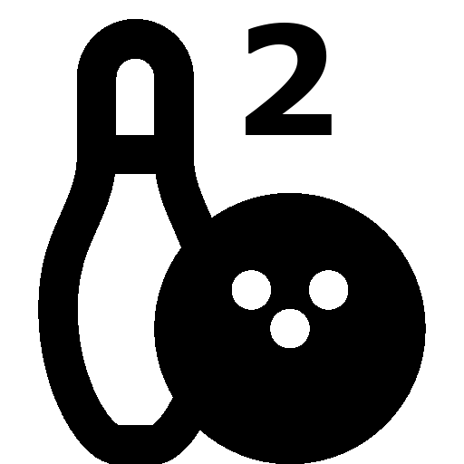 Math Bowling - Elementary Level Math Game Featuring Bowling Rules
Table of contents
- Glimmer (JRuby Desktop Development GUI Framework)
- Examples
- Hello, World!
- Tic Tac Toe
- Contact Manager
- Desktop Apps Built with Glimmer DSL for SWT
- Table of contents
- Background
- Platform Support
- Pre-requisites
- Setup
- Option 1: Direct Install
- Option 2: Bundler
- Glimmer Command
- Basic Usage
- Advanced Usage
- Glimmer Samples
- Scaffolding
- Gem Listing
- Packaging
- Raw JRuby Command
- Girb (Glimmer irb) Command
- Glimmer GUI DSL Syntax
- DSL Auto-Expansion
- Widgets
- Widget Styles
- Widget Properties
- Image
- Cursor
- Layouts
- Layout Data
- Data-Binding
- Observer
- Custom Widgets
- Custom Shells
- Drag and Drop
- Miscellaneous
- Glimmer Configuration
- logger
- import_swt_packages
- loop_max_count
- excluded_keyword_checkers
- log_excluded_keywords
- Glimmer Style Guide
- SWT Reference
- Samples
- Hello Samples
- Hello, World! Sample
- Hello, Tab!
- Hello, Combo!
- Hello, List Single Selection!
- Hello, List Multi Selection!
- Hello, Computed!
- Hello, Message Box!
- Hello, Browser!
- Hello, Drag and Drop!
- Hello, Menu Bar!
- Hello, Pop Up Context Menu!
- Hello, Custom Widget!
- Hello, Custom Shell!
- Hello, Sash Form!
- Hello, Styled Text!
- Hello, Expand Bar!
- Hello, Radio!
- Hello, Radio Group!
- Hello, Group!
- Hello, Checkbox!
- Hello, Checkbox Group!
- Hello, Directory Dialog!
- Hello, File Dialog!
- Hello, Date Time!
- Hello, Spinner!
- Hello, Table!
- Hello, Button!
- Hello, Link!
- Elaborate Samples
- External Samples
- In Production
- Math Bowling
- Are We There Yet?
- Garderie Rainbow Daily Agenda
- Packaging & Distribution
- Packaging Defaults
- Packaging Configuration
- javapackager Extra Arguments
- Verbose Mode
- Windows Application Packaging
- Mac Application Distribution
- Self Signed Certificate
- Gotchas
- App Updates
- Glimmer Supporting Libraries
- Glimmer Process
- Resources
- Help
- Issues
- Chat
- Feature Suggestions
- Change Log
- Contributing
- Contributors
- Hire Me
- License
Background
Ruby is a dynamically-typed object-oriented language, which provides great productivity gains due to its powerful expressive syntax and dynamic nature. While it is proven by the Ruby on Rails framework for web development, it currently lacks a robust platform-independent framework for building desktop applications. Given that Java libraries can now be utilized in Ruby code through JRuby, Eclipse technologies, such as SWT, JFace, and RCP can help fill the gap of desktop application development with Ruby.
Platform Support
Glimmer runs on the following platforms:
- Mac
- Windows
- Linux
Glimmer's GUI has the native look and feel of each operating system it runs on since it uses SWT behind the scenes, which leverages the following native libraries:
- Win32 on Windows
- Cocoa on Mac
- GTK on Linux
More info about the SWT GUI on various platforms can be found on the Eclipse WIKI and SWT FAQ:
https://wiki.eclipse.org/SWT/Devel/Gtk/Dev_guide#Win32.2FCocoa.2FGTK https://www.eclipse.org/swt/faq.php
Pre-requisites
- JDK 8u241 (1.8.0_241) (find at https://www.oracle.com/java/technologies/javase/javase8u211-later-archive-downloads.html)
- JRuby 9.2.13.0 (supporting Ruby 2.5.x syntax) (get via RVM on Mac and Linux or find at https://www.jruby.org/download for Windows)
- SWT 4.17 (already included in the glimmer-dsl-swt gem)
To obtain JRuby through RVM, you may run:
rvm install jruby-9.2.13.0
Glimmer might still work on other versions of Java, JRuby and SWT, but there are no guarantees, so it is best to stick to the pre-requisites outlined above.
Setup
Please follow these instructions to make the glimmer command available on your system via the glimmer-dsl-swt gem.
If you intend to learn the basics of Glimmer but are not ready to build a Glimmer app yet, pick Option 1 (Direct Install).
If you intend to build a Glimmer app from scratch with scaffolding, pick Option 1 (Direct Install) as well.
Otherwise, Option 2 (Bundler) can be followed in rare cases where you want to build an app without scaffolding.
Note: if you encounter any issues, please report and then install a previous version instead from the list of Glimmer Releases.
Option 1: Direct Install
(Use for Scaffolding)
Run this command to install directly:
jgem install glimmer-dsl-swt
Or this command if you want a specific version:
jgem install glimmer-dsl-swt -v 4.17.10.7
jgem is JRuby's version of gem command.
RVM allows running gem install directly as an alias.
Otherwise, you may also run jruby -S gem install ...
If you are new to Glimmer and would like to continue learning the basics, you may continue to the Glimmer Command section.
Otherwise, if you are ready to build a Glimmer app, you can jump to the Glimmer Scaffolding section next.
Note: if you're using activerecord or activesupport, keep in mind that Glimmer unhooks ActiveSupport::Dependencies as it does not rely on it.
Option 2: Bundler
(Use for Manual App Creation)
Add the following to Gemfile:
gem 'glimmer-dsl-swt', '~> 4.17'
And, then run:
jruby -S bundle install
Note: if you're using activerecord or activesupport, keep in mind that Glimmer unhooks ActiveSupport::Dependencies as it does not rely on it.
You may learn more about other Glimmer related gems (glimmer-dsl-opal, glimmer-dsl-xml, and glimmer-dsl-css) at Multi-DSL Support
Glimmer Command
The glimmer command allows you to run, scaffold, package, and list Glimmer applications/gems.
You can bring up usage instructions by running the glimmer command without arguments:
glimmer
On Mac and Linux, it additionally brings up a TUI (Text-based User Interface) for interactive navigation and execution of Glimmer tasks (courtesy of rake-tui).
On Windows, it simply lists the available Glimmer tasks at the end (courtsey of rake).
If you are new to Glimmer, you may read the Basic Usage section and skip the rest until you have gone through Girb (Glimmer irb) Command, Glimmer GUI DSL Syntax, and Samples.
Note: If you encounter an issue running the glimmer command, run bundle exec glimmer instead.
Basic Usage
glimmer application.rb
Runs a Glimmer application using JRuby, automatically preloading the glimmer ruby gem and SWT jar dependency.
Run Glimmer samples with:
glimmer samples
This brings up the Glimmer Meta-Sample (The Sample of Samples)
If you cloned this project locally instead of installing the gem, run bin/glimmer instead.
Example:
bin/glimmer samples
Advanced Usage
Below are the full usage instructions that come up when running glimmer without args.
Glimmer (JRuby Desktop Development GUI Framework) - JRuby Gem: glimmer-dsl-swt v4.17.10.7


Usage: glimmer [--bundler] [--pd] [--quiet] [--debug] [--log-level=VALUE] [[ENV_VAR=VALUE]...] [[-jruby-option]...] (application.rb or task[task_args]) [[application2.rb]...]

Runs Glimmer applications and tasks.

When applications are specified, they are run using JRuby,
automatically preloading the glimmer Ruby gem and SWT jar dependency.

Optionally, extra Glimmer options, JRuby options, and/or environment variables may be passed in.

Glimmer options:
- "--bundler=GROUP"   : Activates gems in Bundler default group in Gemfile
- "--pd=BOOLEAN"      : Requires puts_debuggerer to enable pd method
- "--quiet=BOOLEAN"   : Does not announce file path of Glimmer application being launched
- "--debug"           : Displays extra debugging information, passes "--debug" to JRuby, and enables debug logging
- "--log-level=VALUE" : Sets Glimmer's Ruby logger level ("ERROR" / "WARN" / "INFO" / "DEBUG"; default is none)

Tasks are run via rake. Some tasks take arguments in square brackets.

Available tasks are below (if you do not see any, please add `require 'glimmer/rake_task'` to Rakefile and rerun or run rake -T):

Select a Glimmer task to run: (Press ↑/↓ arrow to move, Enter to select and letters to filter)
‣ glimmer list:gems:customshell[query]                       # List Glimmer custom shell gems available at rubygems.org (query is optional) [alt: list:gems:cs]
  glimmer list:gems:customwidget[query]                      # List Glimmer custom widget gems available at rubygems.org (query is optional) [alt: list:gems:cw]
  glimmer list:gems:dsl[query]                               # List Glimmer DSL gems available at rubygems.org (query is optional)
  glimmer package[type]                                      # Package app for distribution (generating config, jar, and native files) (type is optional)
  glimmer package:clean                                      # Clean by removing "dist" and "packages" directories
  glimmer package:config                                     # Generate JAR config file
  glimmer package:gemspec                                    # Generate gemspec
  glimmer package:jar                                        # Generate JAR file
  glimmer package:lock_jars                                  # Lock JARs
  glimmer package:native[type]                               # Generate Native files
  glimmer run[app_path]                                      # Runs Glimmer app or custom shell gem in the current directory, unless app_path is specified, then runs it instead (app_path is optional)
  glimmer samples                                            # Brings up the Glimmer Meta-Sample app to allow browsing, running, and viewing code of Glimmer samples
  glimmer scaffold[app_name]                                 # Scaffold Glimmer application directory structure to build a new app
  glimmer scaffold:customshell[name,namespace]               # Scaffold Glimmer::UI::CustomShell subclass (full window view) under app/views (namespace is optional) [alt: scaffold:cs]
  glimmer scaffold:customwidget[name,namespace]              # Scaffold Glimmer::UI::CustomWidget subclass (part of a view) under app/views (namespace is optional) [alt: scaffold:cw]
  glimmer scaffold:gem:customshell[name,namespace]           # Scaffold Glimmer::UI::CustomShell subclass (full window view) under its own Ruby gem + app project (namespace is required) [alt: scaffold:ge...
  glimmer scaffold:gem:customwidget[name,namespace]          # Scaffold Glimmer::UI::CustomWidget subclass (part of a view) under its own Ruby gem project (namespace is required) [alt: scaffold:gem:cw]
Example (Glimmer/JRuby option specified):
glimmer --debug samples/hello/hello_world.rb
Runs Glimmer application with JRuby debug option to enable JRuby debugging.
Example (Multiple apps):
glimmer samples/hello/hello_world.rb samples/hello/hello_tab.rb
Launches samples/hello/hello_world.rb and samples/hello_tab.rb at the same time, each in a separate JRuby thread.
Glimmer Samples
You can list available Glimmer samples by running:
glimmer samples
This brings up the Glimmer Meta-Sample (The Sample of Samples):

Scaffolding
Glimmer borrows from Rails the idea of Scaffolding, that is generating a structure for your app files that helps you get started just like true building scaffolding helps construction workers, civil engineers, and architects.
Glimmer scaffolding goes beyond just scaffolding the app files that Rails does. It also packages it and launches it, getting you to a running and delivered state of an advanced "Hello, World!" Glimmer application right off the bat.
This should greatly facilitate building a new Glimmer app by helping you be productive and focus on app details while letting Glimmer scaffolding take care of initial app file structure concerns, such as adding:
- Main application class that includes Glimmer (
app/{app_name}.rb) - Main application view that houses main window content, menu, about dialog, and preferences dialog
- View and Model directories (
app/viewsandapp/models) - Rakefile including Glimmer tasks (
Rakefile) - Version (
VERSION) - License (
LICENSE.txt) - Icon (under
package/{platform}/{App Name}.{icon_extension}formacosx.icns,windows.ico, andlinux.png) - Bin file for starting application (
bin/{app_name}.rb)
You need to have your Git user.name and github.user configured before scaffolding since Glimmer uses Juwelier, which relies on them in creating a Git repo for your Glimmer app.
App
Before you start, make sure you are in a JRuby environment with Glimmer gem installed as per "Direct Install" pre-requisites.
To scaffold a Glimmer app from scratch, run the following command:
glimmer scaffold[AppName]
This will generate an advanced "Hello, World!" app, package it as a Mac DMG/PKG/APP, Windows APP, or Linux GEM, and launch it all in one fell swoop.
Suppose you run:
glimmer scaffold[greeter]
You should see output like the following:
$ glimmer scaffold[greeter]
  create  .gitignore
  create  Rakefile
  create  Gemfile
  create  LICENSE.txt
  create  README.rdoc
  create  .document
  create  lib
  create  lib/greeter.rb
  create  spec
  create  spec/spec_helper.rb
  create  spec/greeter_spec.rb
  create  .rspec
Juwelier has prepared your gem in ./greeter
Created greeter/.gitignore
Created greeter/.ruby-version
Created greeter/.ruby-gemset
Created greeter/VERSION
Created greeter/LICENSE.txt
Created greeter/Gemfile
Created greeter/Rakefile
Created greeter/app/greeter.rb
Created greeter/app/views/greeter/app_view.rb
Created greeter/package/windows/Greeter.ico
Created greeter/package/macosx/Greeter.icns
Created greeter/package/linux/Greeter.png
Created greeter/bin/greeter
Created greeter/spec/spec_helper.rb
...
Eventually, it will launch an advanced "Hello, World!" app window having the title of your application ("Greeter").

It also comes with a boilerplate Preferences dialog.

Here is the Windows version of the scaffolded "Greeter" app:

And, here is the Windows version of the boilerplate Preferences dialog.

In order to run the app after making changes, you must run the glimmer run. It automatically detects the generated run script under the bin directory and uses it as an argument.
glimmer run
Alternatively, to mantually run the app, you may type:
glimmer run[bin/greeter]
or:
glimmer bin/greeter
Desktopify
Desktopify basically turns a website into a desktop application by wrapping the website within a Browser Widget.
The desktopify app is similar to the standard scaffolded app. It can be extended and the browser may even be instrumented.
The app even remembers your cookies if you log into the website, close the app, and reopen again.
Note that on Linux, the default SWT browser, which runs on webkit, does not support HTML5 Video out of the box. If you need video support, open Gemfile after scaffolding and enable the line that has the glimmer-cw-browser-chromium gem then replace the browser in "app/views/snowboard_utah/app_view.rb" with browser(:chromium)
Before you start, make sure you are in a JRuby environment with Glimmer gem installed as per "Direct Install" pre-requisites.
To scaffold a Glimmer desktopify app from scratch, run the following command:
glimmer scaffold:desktopify[app_name,website]
This will generate a Glimmer app, package it as a Mac DMG/PKG/APP, Windows APP, or Linux GEM, and launch it all in one fell swoop.
Suppose you run:
glimmer scaffold:desktopify[snowboard_utah,https://www.brightonresort.com]
You should see output like the following:
$ glimmer scaffold:desktopify[snowboard_utah,https://www.brightonresort.com]
Fetching kamelcase-0.0.2.gem
Fetching github_api-0.19.0.gem
Fetching highline-2.0.3.gem
Fetching juwelier-2.4.9.gem
Fetching hashie-3.6.0.gem
Fetching nokogiri-1.10.10-java.gem
Fetching semver2-3.4.2.gem
Successfully installed semver2-3.4.2
Successfully installed kamelcase-0.0.2
Successfully installed highline-2.0.3
Successfully installed hashie-3.6.0
Successfully installed github_api-0.19.0
Successfully installed nokogiri-1.10.10-java
Successfully installed juwelier-2.4.9
7 gems installed
  create  .gitignore
  create  Rakefile
  create  Gemfile
  create  LICENSE.txt
  create  README.markdown
  create  .document
  create  lib
  create  lib/snowboard_utah.rb
  create  .rspec
Juwelier has prepared your gem in ./snowboard_utah
Created snowboard_utah/.gitignore
Created snowboard_utah/.ruby-version
Created snowboard_utah/.ruby-gemset
Created snowboard_utah/VERSION
Created snowboard_utah/LICENSE.txt
Created snowboard_utah/Gemfile
Created snowboard_utah/Rakefile
Created snowboard_utah/app/snowboard_utah.rb
Created snowboard_utah/app/views/snowboard_utah/app_view.rb
Created snowboard_utah/package/windows/Snowboard Utah.ico
Created snowboard_utah/package/macosx/Snowboard Utah.icns
Created snowboard_utah/package/linux/Snowboard Utah.png
Created snowboard_utah/bin/snowboard_utah
...
Eventually, it will launch a desktopified version of "https://www.brightonresort.com" having the title of ("Snowboard Utah").
Desktopified App on Mac

It also comes with a boilerplate About dialog.

Desktopified App on Windows

Desktopified App on Linux

In order to run the app after making changes, you must run the glimmer run. It automatically detects the generated run script under the bin directory and uses it as an argument.
glimmer run
Custom Shell
To scaffold a Glimmer custom shell (full window view) for an existing Glimmer app, run the following command:
glimmer scaffold:customshell[name]
Or the following alternative abbreviation:
glimmer scaffold:cs[name]
Custom Widget
To scaffold a Glimmer custom widget (part of a view) for an existing Glimmer app, run the following command:
glimmer scaffold:[name]
Or the following alternative abbreviation:
glimmer scaffold:cw[name]
Custom Shell Gem
Custom shell gems are self-contained Glimmer apps as well as reusable custom shells.
They have everything scaffolded Glimmer apps come with in addition to gem content like a Juwelier Rakefile that can build gemspec and release gems.
Unlike scaffolded Glimmer apps, custom shell gem content lives under the lib directory (not app).
They can be packaged as both a native executable (e.g. Mac DMG/PKG/APP) and a Ruby gem.
Of course, you can just build a Ruby gem and disregard native executable packaging if you do not need it.
To scaffold a Glimmer custom shell gem (full window view distributed as a Ruby gem), run the following command:
glimmer scaffold:gem:customshell[name,namespace]
Or the following alternative abbreviation:
glimmer scaffold:gem:cs[name,namespace]
It is important to specify a namespace to avoid having your gem clash with existing gems.
The Ruby gem name will follow the convention "glimmer-cs-customwidgetname-namespace" (the 'cs' is for Custom Shell).
Only official Glimmer gems created by the Glimmer project committers will have no namespace (e.g. glimmer-cs-gladiator Ruby gem)
Since custom shell gems are both an app and a gem, they provide two ways to run:
- Run the
glimmercommand and pass it the generated script under thebindirectory that matches the gem name (e.g. runglimmer bin/glimmer-cs-calculator) - Run the executable shell script that ships with the gem directly (does not need the
glimmercommand). It intentionally has a shorter name for convenience since it is meant to be used on the command line (not in a package), so you can leave out theglimmer-cs-prefix (e.g. runbin/calculatordirectly). This is also used as the main way of running custom shell gems on Linux.
Examples:
- glimmer-cs-gladiator: Gladiator (Glimmer Editor)
- glimmer-cs-calculator: Glimmer Calculator
Custom Widget Gem
To scaffold a Glimmer custom widget gem (part of a view distributed as a Ruby gem), run the following command:
glimmer scaffold:gem:customwidget[name,namespace]
Or the following alternative abbreviation:
glimmer scaffold:gem:cw[name,namespace]
It is important to specify a namespace to avoid having your gem clash with existing gems.
The Ruby gem name will follow the convention "glimmer-cw-customwidgetname-namespace" (the 'cw' is for Custom Widget)
Only official Glimmer gems created by the Glimmer project committers will have no namespace (e.g. glimmer-cw-video Ruby gem)
Examples:
- glimmer-cw-video: Video Widget
- glimmer-cw-cdatetime-nebula: Nebula CDateTime Widget
Gem Listing
The glimmer command comes with tasks for listing Glimmer related gems to make it easy to find Glimmer Custom Shells, Custom Widgets, and DSLs published by others in the Glimmer community on rubygems.org.
Listing Custom Shell Gems
The following command lists available Glimmer Custom Shell Gems (prefixed with "glimmer-cs-" by scaffolding convention) created by the the Glimmer community and published on rubygems.org:
glimmer list:gems:customshell[query]
Or the following alternative abbreviation:
glimmer list:gems:cs[query]
Example:
glimmer list:gems:cs
Output:
  Glimmer Custom Shell Gems at rubygems.org:

     Name               Gem            Version     Author                        Description

  Calculator   glimmer-cs-calculator   1.0.2     Andy Maleh   Calculator - Glimmer Custom Shell
  Gladiator    glimmer-cs-gladiator    0.2.4     Andy Maleh   Gladiator (Glimmer Editor) - Glimmer Custom Shell
  Timer        glimmer-cs-timer        1.0.0     Andy Maleh   Timer - Glimmer Custom Shell
Listing Custom Widget Gems
The following command lists available Glimmer Custom Widget Gems (prefixed with "glimmer-cw-" by scaffolding convention) created by the the Glimmer community and published on rubygems.org:
glimmer list:gems:customwidget[query]
Or the following alternative abbreviation:
glimmer list:gems:cw[query]
Example:
Check if there is a custom video widget for Glimmer.
glimmer list:gems:cw[video]
Output:
  Glimmer Custom Widget Gems matching [video] at rubygems.org:

  Name          Gem          Version     Author              Description

  Video   glimmer-cw-video   1.0.0     Andy Maleh   Glimmer Custom Widget - Video
Example:
Check all custom widgets for Glimmer.
glimmer list:gems:cw
Output:
  Glimmer Custom Widget Gems at rubygems.org:

         Name                      Gem                Version      Author                       Description

  Browser (Chromium)   glimmer-cw-browser-chromium   1.0.0       Andy Maleh   Chromium Browser - Glimmer Custom Widget
  Cdatetime (Nebula)   glimmer-cw-cdatetime-nebula   1.5.0.0.1   Andy Maleh   Nebula CDateTime Widget - Glimmer Custom Widget
  Video                glimmer-cw-video              1.0.0       Andy Maleh   Glimmer Custom Widget - Video
Listing DSL Gems
The following command lists available Glimmer DSL Gems (prefixed with "glimmer-dsl-" by convention) created by the the Glimmer community and published on rubygems.org:
glimmer list:gems:dsl[query]
Example:
glimmer list:gems:dsl
Output:
  Glimmer DSL Gems at rubygems.org:

  Name         Gem          Version    Author          Description

  Css    glimmer-dsl-css    1.1.0     AndyMaleh    Glimmer DSL for CSS
  Opal   glimmer-dsl-opal   0.4.0     AndyMaleh    Glimmer DSL for Opal
  Swt    glimmer-dsl-swt    4.17.10.7
  AndyMaleh    Glimmer DSL for SWT
  Tk     glimmer-dsl-tk     0.0.6     AndyMaleh    Glimmer DSL for Tk
  Xml    glimmer-dsl-xml    1.1.0     AndyMaleh    Glimmer DSL for XML
Packaging
Glimmer supports packaging applications as native files on Mac and Windows.
Glimmer packaging tasks are detailed under Packaging & Distribution.
On Linux, the Glimmer Custom Shell Gem approach provides a Gem Packaged Shell Script (e.g. calculator command becomes available after installing the glimmer-cs-calculator gem)
Raw JRuby Command
If there is a need to run Glimmer directly via the jruby command, you
may run the following on Windows/Linux:
jruby -r glimmer-dsl-swt -S application.rb
Or, the following on Mac:
jruby -J-XstartOnFirstThread -r glimmer-dsl-swt -S application.rb
If you want to use a specific custom version of SWT, run the following on Windows/Linux:
jruby -J-classpath "path_to/swt.jar" -r glimmer-dsl-swt -S application.rb
Or, the following on Mac:
jruby -J-XstartOnFirstThread -J-classpath "path_to/swt.jar" -r glimmer-dsl-swt -S application.rb
The -J-classpath option specifies the swt.jar file path, which can be a
manually downloaded version of SWT, or otherwise the one included in the gem. You can lookup the one included in the gem by running jgem which glimmer to find the gem path and then look through the vendor directory.
The -r option preloads (requires) the glimmer library in Ruby.
The -S option specifies a script to run.
Mac Support
The Mac is well supported with the glimmer command. The advice below is not needed if you are using it.
However, if there is a reason to use the raw jruby command directly instead of the glimmer command, you need to pass an extra option (-J-XstartOnFirstThread) to JRuby on the Mac (Glimmer automatically passes it for you when using the glimmer command).
Example:
jruby -J-XstartOnFirstThread -J-classpath "path_to/swt.jar" -r glimmer-dsl-swt -S application.rb
Girb (Glimmer irb) Command
With glimmer-dsl-swt installed, you may want to run girb instead of standard irb to have SWT preloaded and the Glimmer library required and included for quick Glimmer coding/testing.
girb
If you cloned glimmer-dsl-swt project locally, you may run bin/girb instead.
bin/girb
Watch out for hands-on examples in this README indicated by "you may copy/paste in girb"
Keep in mind that all samples live under https://github.com/AndyObtiva/glimmer-dsl-swt
Glimmer GUI DSL Syntax
Glimmer's core is a GUI DSL with a lightweight visual syntax that makes it easy to visualize the nesting of widgets in the GUI hierarchy tree.
It is available through mixing in the Glimmer module, which makes Glimmer GUI DSL keywords available to both the instance scope and class scope:
include Glimmer
For example, here is the basic "Hello, World!" sample code (you may copy/paste in girb):
include Glimmer

shell {
  text "Glimmer"
  label {
    text "Hello, World!"
  }
}.open
The include Glimmer declaration on top mixed the Glimmer module into the Ruby global main object making the Glimmer GUI DSL available at the top-level global scope.
While this works well enough for mini-samples, it is better to isolate Glimmer in a class or module during production application development to create a clean separation between view code (GUI) and model code (business domain). Here is the "Hello, World!" sample re-written in a class to illustrate how mixing in the Glimmer module (via include Glimmer) makes the Glimmer GUI DSL available in both the instance scope and class scope. That is clearly demonstrated by pre-initializing a color constant in the class scope and building the GUI in the #open instance method (you may copy/paste in girb):
class HelloWorld
  include Glimmer # makes the GUI DSL available in both the class scope and instance scope

  COLOR_FOREGROUND_DEFAULT = rgb(255, 0, 0) # rgb is a GUI DSL keyword used in the class scope

  def open
    # the following are GUI DSL keywords (shell, text, and label) used in the instance scope
    shell {
      text "Glimmer"
      label {
        text "Hello, World!"
        foreground COLOR_FOREGROUND_DEFAULT
      }
    }.open
  end
end

HelloWorld.new.open
This renders "Hello, World!" with a red foreground color:

The GUI DSL intentionally avoids overly verbose syntax, requiring as little declarative code as possible to describe what GUI to render, how to style it, and what properties to data-bind to the Models.
As such, it breaks off from Ruby's convention of using do end for multi-line blocks, opting instead for the lightweight and visual { } curly brace blocks everywhere inside the GUI DSL. More details about Glimmer's syntax conventions may be found in the Glimmer Style Guide
Glimmer DSL syntax consists mainly of:
- keywords (e.g.
tablefor a table widget) - style/args (e.g. :multi as in
table(:multi)for a multi-line selection table widget) - content (e.g.
{ table_column { text 'Name'} }as intable(:multi) { table_column { text 'name'} }for a multi-line selection table widget with a table column having header text property'Name'as content)
DSL Auto-Expansion
Glimmer supports a new and radical Ruby DSL concept called DSL Auto-Expansion. To explain, let's first mention the two types of Glimmer GUI DSL keywords: static and dynamic.
Static keywords are pre-identified keywords in the Glimmer DSL, such as shell, display, message_box, async_exec, sync_exec, and bind.
Dynamic keywords are dynamically figured out from currently imported (aka required/loaded) SWT widgets and custom widgets. Examples are: label, combo, and list for SWT widgets and c_date_time, video, and gantt_chart for custom widgets.
The only reason to distinguish between the two is to realize that importing new Glimmer custom widgets and Java SWT custom widget libraries automatically expands Glimmer's DSL vocabulary with new dynamic keywords.
For example, if a project adds this custom Java SWT library from the Nebula Project:
https://www.eclipse.org/nebula/widgets/gallery/gallery.php
Glimmer will automatically support using the keyword gallery
This is what DSL Auto-Expansion is.
You will learn more about widgets next.
Widgets
Glimmer GUIs (user interfaces) are modeled with widgets, which are wrappers around the SWT library widgets found here:
https://www.eclipse.org/swt/widgets/
This screenshot taken from the link above should give a glimpse of how SWT widgets look and feel:

In Glimmer DSL, widgets are declared with lowercase underscored names mirroring their SWT names minus the package name. For example, here are some Glimmer widgets and their SWT counterparts:
shellinstantiatesorg.eclipse.swt.widgets.Shelltextinstantiatesorg.eclipse.swt.widgets.Textbuttoninstantiatesorg.eclipse.swt.widgets.Buttonlabelinstantiatesorg.eclipse.swt.widgets.Labelcompositeinstantiatesorg.eclipse.swt.widgets.Compositetab_folderinstantiatesorg.eclipse.swt.widgets.TabFoldertab_iteminstantiatesorg.eclipse.swt.widgets.TabItemtableinstantiatesorg.eclipse.swt.widgets.Tabletable_columninstantiatesorg.eclipse.swt.widgets.TableColumntreeinstantiatesorg.eclipse.swt.widgets.Treecomboinstantiatesorg.eclipse.swt.widgets.Combolistinstantiatesorg.eclipse.swt.widgets.List
Every widget is sufficiently declared by name, but may optionally be accompanied with:
- SWT style/arguments wrapped by parenthesis according to Glimmer Style Guide (see next section for details).
- Ruby block containing content, which may be properties (e.g.
enabled false) or nested widgets (e.g.table_columnnested insidetable)
For example, if we were to revisit samples/hello/hello_world.rb above (you may copy/paste in girb):
shell {
  text "Glimmer"
  label {
    text "Hello, World!"
  }
}.open
Note that shell instantiates the outer shell widget, in other words, the window that houses all of the desktop graphical user interface.
shell is then followed by a block that contains
# ...
  text "Glimmer" # text property of shell
  label { # label widget declaration as content of shell
    text "Hello, World!" # text property of label
  }
# ...
The first line declares a property called text, which sets the title of the shell (window) to "Glimmer". Properties always have arguments (not wrapped by parenthesis according to Glimmer Style Guide), such as the text "Glimmer" in this case, and do NOT have a block (this distinguishes them from widget declarations).
The second line declares the label widget, which is followed by a Ruby content block that contains its text property with value "Hello, World!"
The widget block may optionally receive an argument representing the widget proxy object that the block content is for. This is useful in rare cases when the content code needs to refer to parent widget during declaration. You may leave that argument out most of the time and only add when absolutely needed.
Example:
shell {|shell_proxy|
  #...
}
Remember that The shell widget is always the outermost widget containing all others in a Glimmer desktop windowed application.
After it is declared, a shell must be opened with the #open method, which can be called on the block directly as in the example above, or by capturing shell in a @shell variable (shown in example below), and calling #open on it independently (recommended in actual apps)
@shell = shell {
  # properties and content
  # ...
}
@shell.open
It is centered upon initial display and has a minimum width of 130 (can be re-centered when needed with @shell.center method after capturing shell in a @shell variable as per samples)
Check out the samples directory for more examples.
Example from hello_tab.rb sample (you may copy/paste in girb):


shell {
  text "Hello, Tab!"
  tab_folder {
    tab_item {
      text "English"
      label {
        text "Hello, World!"
      }
    }
    tab_item {
      text "French"
      label {
        text "Bonjour Univers!"
      }
    }
  }
}.open
If you are new to Glimmer, you have learned enough to start running some samples. Go ahead and run all Glimmer samples, and come back to read the rest in any order you like since this material is more organized like a reference.
If you are advanced and need more widgets, check out the Nebula Project for an extensive list of high quality custom widgets:
https://www.eclipse.org/nebula/
SWT Proxies
Glimmer follows Proxy Design Pattern by having Ruby proxy wrappers for all SWT objects:
Glimmer::SWT:WidgetProxywraps all descendants oforg.eclipse.swt.widgets.Widgetexcept the ones that have their own wrappers.Glimmer::SWT::ShellProxywrapsorg.eclipse.swt.widgets.ShellGlimmer::SWT:TabItemProxywrapsorg.eclipse.swt.widget.TabItem(also adds a composite to enable adding content under tab items directly in Glimmer)Glimmer::SWT:LayoutProxywraps all descendants oforg.eclipse.swt.widget.LayoutGlimmer::SWT:LayoutDataProxywraps all layout data objectsGlimmer::SWT:DisplayProxywrapsorg.eclipse.swt.widget.Display(manages displaying GUI)Glimmer::SWT:ColorProxywrapsorg.eclipse.swt.graphics.ColorGlimmer::SWT:FontProxywrapsorg.eclipse.swt.graphics.FontGlimmer::SWT::WidgetListenerProxywraps all widget listeners
These proxy objects have an API and provide some convenience methods, some of which are mentioned below.
swt_widget
Glimmer SWT proxies come with the instance method #swt_widget, which returns the actual SWT Widget object wrapped by the Glimmer widget proxy. It is useful in cases you'd like to do some custom SWT programming outside of Glimmer.
Shell widget proxy methods
Shell widget proxy has extra methods specific to SWT Shell:
#open: Opens the shell, making it visible and active, and starting the SWT Event Loop (you may learn more about it here: https://help.eclipse.org/2019-12/nftopic/org.eclipse.platform.doc.isv/reference/api/org/eclipse/swt/widgets/Display.html). If shell was already open, but hidden, it makes the shell visible.#show: Alias for#open#hide: Hides a shell setting "visible" property to false#close: Closes the shell#center: Centers the shell within monitor it is in#start_event_loop: (happens as part of#open) Starts SWT Event Loop (you may learn more about it here: https://help.eclipse.org/2019-12/nftopic/org.eclipse.platform.doc.isv/reference/api/org/eclipse/swt/widgets/Display.html). This method is not needed except in rare circumstances where there is a need to start the SWT Event Loop before opening the shell.#visible?: Returns whether a shell is visible#opened_before?: Returns whether a shell has been opened at least once before (additionally implying the SWT Event Loop has been started already)#visible=: Setting to true opens/shows shell. Setting to false hides the shell.#pack: Packs contained widgets using SWT'sShell#packmethod#pack_same_size: Packs contained widgets without changing shell's size when widget sizes change
Widget Content Block
Glimmer allows re-opening any widget and adding properties or extra content after it has been constructed already by using the #content method.
Example (you may copy/paste in girb):
@shell = shell {
  text "Application"
  row_layout
  @label1 = label {
    text "Hello,"
  }
}
@shell.content {
  minimum_size 130, 130
  label {
    text "World!"
  }
}
@label1.content {
  foreground :red
}
@shell.open
Shell Icon
To set the shell icon, simply set the image property under the shell widget. This shows up in the operating system toolbar and app-switcher (e.g. CMD+TAB) (and application window top-left corner in Windows)
Example:
shell {
  # ...
  image 'path/to/image.png'
  # ...
}
Shell Icon Tip for Packaging on Windows
When setting shell icon for a packaged app, which has a JAR file at its core, you can reference the ico file that ships with the app by going one level up (e.g. '../AppName.ico')
Dialog
Dialog is a variation on Shell. It is basically a shell that is modal (blocks what's behind it) and belongs to another shell. It only has a close button.
Glimmer facilitates building dialogs by using the dialog keyword, which automatically adds the SWT.DIALOG_TRIM and SWT.APPLICATION_MODAL widget styles needed for a dialog.
message_box
The Glimmer DSL message_box keyword is similar to shell, but renders a modal dialog with a title text property and main body message property. It may also be opened via the #open method.
Example (you may copy/paste in girb):
include Glimmer
@shell = shell {
text 'Hello, Message Box!'
{
text 'Please Click To Win a Surprise'
{
(@shell) {
text 'Surprise'
"Congratulations!\n\nYou have won $1,000,000!"
}.open
}
}
}
@shell.open

It is also possible to use message_box even before instantiating the first shell (Glimmer builds a throwaway shell parent automatically for it):
Example (you may copy/paste in girb):
include Glimmer
{
text 'Greeting'
"Hello, World!"
}.open
Display
The SWT Display class is a singleton in Glimmer. It is used in SWT to represent your display device, allowing you to manage GUI globally
and access available monitors. Additionally, it is responsible for the SWT event loop, which runs on the first thread the Glimmer application starts on. In multi-threaded programming, Display provides the methods async_exec and sync_exec to enable enqueuing GUI changes asynchronously or synchronously from threads other than the main (first) thread since direct GUI changes are forbidden from other threads by design.
Display is automatically instantiated upon first instantiation of a shell widget.
Alternatively, for advanced use cases, a Display can be created explicitly with the Glimmer display keyword. When a shell is later declared, it
automatically uses the display created earlier without having to explicitly hook it.
@display = display {
  cursor_location 300, 300
  on_swt_keydown {
    # ...
  }
  # ...
}
@shell = shell { # uses display created above
}
The benefit of instantiating an SWT Display explicitly is to set Properties or Observers. Although SWT Display is not technically a widget, it has similar APIs and DSL support.
Multi-Threading
JRuby supports truly parallel multi-threading since it relies on the JVM (Java Virtual Machine). As such, it enables development of highly-interactive desktop applications that can do background work while the user is interacting with the GUI.
async_exec
async_exec is a Glimmer DSL keyword in addition to being a method on display. It accepts a block and when invoked, adds the block to the end of a queue of GUI events scheduled to run on the SWT event loop, executing asynchronously.
Example (you may copy/paste in girb):
@shell = shell {
  text 'Glimmer'
  @label = label {
    text 'Hello, World!'
  }
}

Thread.new {
  [:red, :dark_green, :blue].cycle { |color|
    async_exec {
      @label.content {
        foreground color if @shell.visible?
      }
    }
    sleep(1)
  }
}

@shell.open
sync_exec
sync_exec works just like async_exec except it executes the block synchronously at the earliest opportunity possible, waiting for the block to be finished.
Menus
Glimmer DSL provides support for SWT Menu and MenuItem widgets.
There are 2 main types of menus in SWT:
- Menu Bar (shows up on top)
- Pop Up Context Menu (shows up when right-clicking a widget)
Underneath both types, there can be a 3rd menu type called Drop Down.
Glimmer provides special support for Drop Down menus as it automatically instantiates associated Cascade menu items and wires together with proper parenting, swt styles, and calling setMenu.
The ampersand symbol indicates the keyboard shortcut key for the menu item (e.g. '&Help' can be triggered on Windows by hitting ALT+H)
Example of a Menu Bar (you may copy/paste in girb):
shell { |shell_proxy|
text 'Hello, Menu Bar!'
grid_layout
label(:center) {
font height: 16
text 'Check Out The File Menu and History Menu in The Menu Bar Above!'
}
{
{
text '&File'
{
text 'E&xit'
}
(0) {
text '&New'
{
(shell_proxy) {
text 'New File'
'New File Contents'
}.open
}
}
(1) {
text '&Options'
(:radio) {
text 'Option 1'
}
(:separator)
(:check) {
text 'Option 3'
}
}
}
{
text '&History'
{
text '&Recent'
{
text 'File 1'
{
(shell_proxy) {
text 'File 1'
'File 1 Contents'
}.open
}
}
{
text 'File 2'
{
(shell_proxy) {
text 'File 2'
'File 2 Contents'
}.open
}
}
}
}
}
}.open
Example of a Pop Up Context Menu (you may copy/paste in girb):
shell { |shell_proxy|
text 'Hello, Pop Up Context Menu!'
grid_layout
label {
font height: 16
text 'Right-Click To Pop Up a Context Menu'
{
{
text '&History'
{
text '&Recent'
{
text 'File 1'
{
(shell_proxy) {
text 'File 1'
'File 1 Contents'
}.open
}
}
{
text 'File 2'
{
(shell_proxy) {
text 'File 2'
'File 2 Contents'
}.open
}
}
}
}
}
}
}.open
ScrolledComposite
Glimmer provides smart defaults for the scrolled_composite widget by:
- Automatically setting the nested widget as its content (meaning use can just like a plain old
compositeto add scrolling) - Automatically setting the :h_scroll and :v_scroll SWT styles (can be set manually if only one of either :h_scroll or :v_scroll is desired )
- Automatically setting the expand horizontal and expand vertical SWT properties to
true
Widget Styles
SWT widgets receive SWT styles in their constructor as per this guide:
https://wiki.eclipse.org/SWT_Widget_Style_Bits
Glimmer DSL facilitates that by passing symbols representing SWT constants as widget method arguments (i.e. inside widget () parentheses according to Glimmer Style Guide. See example below) in lower case version (e.g. SWT::MULTI becomes :multi).
These styles customize widget look, feel, and behavior.
Example:
# ...
list(:multi) { # SWT styles go inside ()
  # ...
}
# ...
Passing :multi to list widget enables list element multi-selection.
# ...
composite(:border) { # SWT styles go inside ()
  # ...
}
# ...
Passing :border to composite widget ensures it has a border.
When you need to pass in multiple SWT styles, simply separate by commas.
Example:
# ...
text(:center, :border) { # Multiple SWT styles separated by comma
  # ...
}
# ...
Glimmer ships with SWT style smart defaults so you wouldn't have to set them yourself most of the time (albeit you can always override them):
text(:border)table(:border, :virtual, :full_selection)tree(:border, :virtual, :v_scroll, :h_scroll)spinner(:border)list(:border, :v_scroll)button(:push)
You may check out all available SWT styles here:
Explicit SWT Style Bit
When building a widget-related SWT object manually (e.g. GridData.new(...)), you are expected to use SWT::CONSTANT directly or BIT-OR a few SWT constants together like SWT::BORDER | SWT::V_SCROLL.
Glimmer facilitates that with swt keyword by allowing you to pass multiple styles as an argument array of symbols instead of dealing with BIT-OR.
Example:
style = swt(:border, :v_scroll)
Negative SWT Style Bits
In rare occasions, you might need to apply & with a negative (not) style bit to negate it from another style bit that includes it.
Glimmer facilitates that by declaring the negative style bit via postfixing a symbol with !.
Example:
style = swt(:shell_trim, :max!) # creates a shell trim style without the maximize button (negated)
Extra SWT Styles
Non-resizable Window
SWT Shell widget by default is resizable. To make it non-resizable, one must pass a complicated style bit concoction like swt(:shell_trim, :resize!, :max!).
Glimmer makes this easier by alternatively offering a :no_resize extra SWT style, added for convenience.
This makes declaring a non-resizable window as easy as:
shell(:no_resize) {
  # ...
}
Widget Properties
Widget properties such as text value, enablement, visibility, and layout details are set within the widget block using methods matching SWT widget property names in lower snakecase. You may refer to SWT widget guide for details on available widget properties:
Code examples:
# ...
label {
  text "Hello, World!" # SWT properties go inside {} block
}
# ...
In the above example, the label widget text property was set to "Hello, World!".
# ...
{
enabled bind(@tic_tac_toe_board.box(row, column), :empty)
}
# ...
In the above example, the text widget enabled property was data-bound to #empty method on @tic_tac_toe_board.box(row, column) (learn more about data-binding below)
Color
Colors make up a subset of widget properties. SWT accepts color objects created with RGB (Red Green Blue) or RGBA (Red Green Blue Alpha). Glimmer supports constructing color objects using the rgb and rgba DSL keywords.
Example:
# ...
label {
  background rgb(144, 240, 244)
  foreground rgba(38, 92, 232, 255)
}
# ...
SWT also supports standard colors available as constants under the SWT namespace with the COLOR_ prefix (e.g. SWT::COLOR_BLUE)
Glimmer supports constructing colors for these constants as lowercase Ruby symbols (with or without color_ prefix) passed to color DSL keyword
Example:
# ...
label {
  background color(:black)
  foreground color(:yellow)
}
label {
  background color(:color_white)
  foreground color(:color_red)
}
# ...
You may check out all available standard colors in SWT over here (having COLOR_ prefix):
#swt_color
Glimmer color objects come with an instance method #swt_color that returns the actual SWT Color object wrapped by the Glimmer color object. It is useful in cases you'd like to do some custom SWT programming outside of Glimmer.
Example:
color(:black).swt_color # returns SWT Color object
Font
Fonts are represented in Glimmer as a hash of name, height, and style keys.
The style can be one (or more) of 3 values: :normal, :bold, and :italic
Example:
# ...
label {
  font name: 'Arial', height: 36, style: :normal
}
# ...
Keys are optional, so some of them may be left off. When passing multiple styles, they are included in an array.
Example:
# ...
label {
  font style: [:bold, :italic]
}
# ...
You may simply use the standalone font keyword without nesting in a parent if there is a need to build a Font object to use in manual SWT programming outside of widget font property setting.
Example:
@font = font(name: 'Arial', height: 36, style: :normal)
Image
The image keyword creates an instance of org.eclipse.swt.graphics.Image.
It is a graphics Image object (not a widget), but is used used in setting the image property on label and background_image on composite (and subclasses)
Glimmer recently included EXPERIMENTAL gif animation support for the background_image property on `composite' since SWT does not support animation by default. On Windows, it only works inside composites nested under standard shells, not ones that have the SWT styles :on_top or :no_trim
Learn more about images in general at this SWT Image guide: https://www.eclipse.org/articles/Article-SWT-images/graphics-resources.html
Image Options
Options may be passed in a hash at the end of image arguments:
width: width of imageheight: height of image
If only the width or height alone are specified, the other is calculated while maintaining the image aspect ratio.
Example:
label {
  image 'someimage.png', width: 400, height: 300
}
Cursor
SWT widget cursor property represents the mouse cursor you see on the screen when you hover over that widget.
The Display class provides a way to obtain standard system cursors matching of the SWT style constants starting with prefix CURSOR_ (e.g. SWT::CURSOR_HELP shows a question mark mouse cursor)
Glimmer provides an easier way to obtain and set cursor property on a widget by simply mentioning the SWT style constant as an abbreviated symbol excluding the "CURSOR_" suffix.
Example:
shell {
  minimum_size 128, 128
  cursor :appstarting
}
This sets the shell cursor to that of SWT::CURSOR_APPSTARTING
Layouts
Glimmer lays widgets out visually using SWT layouts, which can only be set on composite widget and subclasses.
The most common SWT layouts are:
FillLayout: lays widgets out in equal proportion horizontally or vertically with spacing/margin options. This is the default layout for shell (with:horizontaloption) in Glimmer.RowLayout: lays widgets out horizontally or vertically in varying proportions with advanced spacing/margin/justify optionsGridLayout: lays widgets out in a grid with advanced spacing/margin/alignment/indentation options. This is the default layout for composite in Glimmer. It is important to master.
In Glimmer DSL, just like widgets, layouts can be specified with lowercase underscored names followed by a block containing properties, also lowercase underscored names (e.g. RowLayout is row_layout).
Example:
# ...
composite {
  row_layout {
    wrap true
    pack false
    justify true
    type :vertical
    margin_left 1
    margin_top 2
    margin_right 3
    margin_bottom 4
    spacing 5
  }
  # ... widgets follow
}
# ...
If you data-bind any layout properties, when they change, the shell containing their widget re-packs its children (calls #pack method automatically) to ensure proper relayout of all widgets.
Alternatively, a layout may be constructed by following the SWT API for the layout object. For example, a RowLayout can be constructed by passing it an SWT style constant (Glimmer automatically accepts symbols (e.g. :horizontal) for SWT style arguments like SWT::HORIZONTAL.)
# ...
composite {
  row_layout :horizontal
  # ... widgets follow
}
# ...
Here is a more sophisticated example taken from hello_computed.rb sample:

shell {
  text 'Hello, Computed!'
  composite {
    grid_layout {
      num_columns 2
      make_columns_equal_width true
      horizontal_spacing 20
      vertical_spacing 10
    }
    label {text 'First &Name: '}
    text {
      text bind(@contact, :first_name)
      layout_data {
        horizontal_alignment :fill
        grab_excess_horizontal_space true
      }
    }
    label {text '&Last Name: '}
    text {
      text bind(@contact, :last_name)
      layout_data {
        horizontal_alignment :fill
        grab_excess_horizontal_space true
      }
    }
    label {text '&Year of Birth: '}
    text {
      text bind(@contact, :year_of_birth)
      layout_data {
        horizontal_alignment :fill
        grab_excess_horizontal_space true
      }
    }
    label {text 'Name: '}
    label {
      text bind(@contact, :name, computed_by: [:first_name, :last_name])
      layout_data {
        horizontal_alignment :fill
        grab_excess_horizontal_space true
      }
    }
    label {text 'Age: '}
    label {
      text bind(@contact, :age, on_write: :to_i, computed_by: [:year_of_birth])
      layout_data {
        horizontal_alignment :fill
        grab_excess_horizontal_space true
      }
    }
  }
}.open
Check out the samples directory for more advanced examples of layouts in Glimmer.
Defaults:
Glimmer composites always come with grid_layout by default, but you can still specify explicitly if you'd like to set specific properties on it.
Glimmer shell always comes with fill_layout having :horizontal type.
This is a great guide for learning more about SWT layouts:
https://www.eclipse.org/articles/Article-Understanding-Layouts/Understanding-Layouts.htm
Also, for a reference, check the SWT API:
https://help.eclipse.org/2019-12/nftopic/org.eclipse.platform.doc.isv/reference/api/index.html
Layout Data
Layouts organize widgets following common rules for all widgets directly under a composite. But, what if a specific widget needs its own rules. That's where layout data comes into play.
By convention, SWT layouts expect widgets to set layout data with a class matching their class name with the word "Data" replacing "Layout":
GridLayouton a composite demandsGridDataon contained widgetsRowLayouton a composite demandsRowDataon contained widgets
Not all layouts support layout data to further customize widget layouts. For example, FillLayout supports no layout data.
Unlike widgets and layouts in Glimmer DSL, layout data is simply specified with layout_data keyword nested inside a widget block body, and followed by arguments and/or a block of its own properties (lowercase underscored names).
Glimmer automatically deduces layout data class name by convention as per rule above, with the assumption that the layout data class lives under the same exact Java package as the layout (one can set custom layout data that breaks convention if needed in rare cases. See code below for an example)
Glimmer also automatically accepts symbols (e.g. :fill) for SWT style arguments like SWT::FILL.
Examples:
# ...
composite {
  row_layout :horizontal
  label {
    layout_data { # followed by properties
      width 50
      height 30
    }
  }
  # ... more widgets follow
}
# ...
# ...
composite {
  grid_layout 3, false # grid layout with 3 columns not of equal width
  label {
    # layout data followed by arguments passed to SWT GridData constructor
    layout_data :fill, :end, true, false
  }
}
# ...
# ...
composite {
  grid_layout 3, false # grid layout with 3 columns not of equal width
  label {
    # layout data set explicitly via an object (helps in rare cases that break convention)
    layout_data GridData.new(swt(:fill), swt(:end), true, false)
  }
}
# ...
If you data-bind any layout data properties, when they change, the shell containing their widget re-packs its children (calls #pack method automatically) to ensure proper relayout of all widgets.
NOTE: Layout data must never be reused between widgets. Always specify or clone again for every widget.
This is a great guide for learning more about SWT layouts:
https://www.eclipse.org/articles/Article-Understanding-Layouts/Understanding-Layouts.htm
Also, for a reference, check the SWT API:
https://help.eclipse.org/2019-12/nftopic/org.eclipse.platform.doc.isv/reference/api/index.html
Data-Binding
Data-binding is done with bind command following widget property to bind and taking model and bindable attribute as arguments.
General Examples
text bind(contact, :first_name)
This example binds the text property of a widget like label to the first name of a contact model.
text bind(contact, 'address.street')
This example binds the text property of a widget like label to the nested street of
the address of a contact. This is called nested property data binding.
text bind(contact, 'address.street', on_read: :upcase, on_write: :downcase)
This example adds on the one above it by specifying converters on read and write of the model property, like in the case of a text widget. The text widget will then displays the street upper case and the model will store it lower case. When specifying converters, read and write operations must be symmetric (to avoid an infinite update loop between the widget and the model since the widget checks first if value changed before updating)
text bind(contact, 'address.street', on_read: lambda { |s| s[0..10] })
This example also specifies a converter on read of the model property, but via a lambda, which truncates the street to 10 characters only. Note that the read and write operations are assymetric. This is fine in the case of formatting data for a read-only widget like label
text bind(contact, 'address.street') { |s| s[0..10] }
This is a block shortcut version of the syntax above it. It facilitates formatting model data for read-only widgets since it's a very common view concern. It also saves the developer from having to create a separate formatter/presenter for the model when the view can be an active view that handles common simple formatting operations directly.
`text bind(contact, 'address.street', read_only: true)
This is read-ohly data-binding. It doesn't update contact.address.street when widget text property is changed.
text bind(contact, 'addresses[1].street')
This example binds the text property of a widget like label to the nested indexed address street of a contact. This is called nested indexed property data binding.
text bind(contact, :age, computed_by: :date_of_birth)
This example demonstrates computed value data binding whereby the value of age depends on changes to date_of_birth.
text bind(contact, :name, computed_by: [:first_name, :last_name])
This example demonstrates computed value data binding whereby the value of name depends on changes to both first_name and last_name.
text bind(contact, 'profiles[0].name', computed_by: ['profiles[0].first_name', 'profiles[0].last_name'])
This example demonstrates nested indexed computed value data binding whereby the value of profiles[0].name depends on changes to both nested profiles[0].first_name and profiles[0].last_name.
Example from samples/hello/hello_combo.rb sample (you may copy/paste in girb):
Combo
The combo widget provides a dropdown of options. By default, it also allows typing in a new option. To disable that behavior, you may use with the :read_only SWT style.
When data-binding a combo widget, Glimmer can automatically deduce available options from data-bound model by convention: {attribute_name}_options method.


class Person
attr_accessor :country, :country_options
def initialize
self.=["", "Canada", "US", "Mexico"]
self.country = "Canada"
end
def reset_country
self.country = "Canada"
end
end
class HelloCombo
include Glimmer
def launch
person = Person.new
shell {
composite {
combo(:read_only) {
selection bind(person, :country)
}
{
text "Reset"
do
person.reset_country
end
}
}
}.open
end
end
HelloCombo.new.launch
combo widget is data-bound to the country of a person. Note that it expects the person object to have the :country attribute and :country_options attribute containing all available countries (aka options). Glimmer reads these attributes by convention.
List
Example from samples/hello/hello_list_single_selection.rb sample:

shell {
composite {
list {
selection bind(person, :country)
}
{
text "Reset"
do
person.reset_country
end
}
}
}.open
list widget is also data-bound to the country of a person similarly to the combo widget. Not much difference here (the rest of the code not shown is the same).
Nonetheless, in the next example, a multi-selection list is declared instead allowing data-binding of multiple selection values to the bindable attribute on the model.
Example from samples/hello/hello_list_multi_selection.rb sample (you may copy/paste in girb):

class Person
attr_accessor :provinces, :provinces_options
def initialize
self.=[
"",
"Quebec",
"Ontario",
"Manitoba",
"Saskatchewan",
"Alberta",
"British Columbia",
"Nova Skotia",
"Newfoundland"
]
self.provinces = ["Quebec", "Manitoba", "Alberta"]
end
def reset_provinces
self.provinces = ["Quebec", "Manitoba", "Alberta"]
end
end
class HelloListMultiSelection
include Glimmer
def launch
person = Person.new
shell {
composite {
list(:multi) {
selection bind(person, :provinces)
}
{
text "Reset"
do
person.reset_provinces
end
}
}
}.open
end
end
HelloListMultiSelection.new.launch
The Glimmer code is not much different from above except for passing the :multi style to the list widget. However, the model code behind the scenes is quite different as it is a provinces array bindable to the selection of multiple values on a list widget. provinces_options contains all available province values just as expected by a single selection list and combo.
Note that in all the data-binding examples above, there was also an observer attached to the button widget to trigger an action on the model, which in turn triggers a data-binding update on the list or combo. Observers will be discussed in more details in the next section.
You may learn more about Glimmer's data-binding syntax by reading the code under the samples directory.
Table
The SWT Tree widget renders a multi-column data table, such as a contact listing or a sales report.
To data-bind a Table, you need the main model, the collection property, and the text display attribute for each table column.
This involves using the bind keyword mentioned above in addition to a special column_properties keyword that takes the table column text attribute methods.
It assumes you have defined the table columns via table_column widget.
Example:
shell {
  @table = table {
    table_column {
      text "Name"
      width 120
    }
    table_column {
      text "Age"
      width 120
    }
    table_column {
      text "Adult"
      width 120
    }
    items bind(group, :people), column_properties(:name, :age, :adult)
    selection bind(group, :selected_person)
    on_mouse_up { |event|
      @table.edit_table_item(event.table_item, event.column_index)
    }
  }
}
The code above includes two data-bindings:
- Table
items, which first bind to the model collection property (group.people), and then maps each column property (name, age, adult) for displaying each table item column. - Table
selection, which binds the single table item selected by the user to the attribute denoted by thebindkeyword (or binds multiple table items selected for a table with:multiSWT style) - The
on_mouse_upevent handler invokes@table.edit_table_item(event.table_item, event.column_index)to start edit mode on the clicked table item cell, and then saves or cancel depending on whether the user hits ENTER or ESC once done editing (or focus-out after either making a change or not making any changes.)
Additionally, Table items data-binding automatically stores each node model unto the SWT TableItem object via setData method. This enables things like searchability.
The table widget in Glimmer is represented by a subclass of WidgetProxy called TableProxy.
TableProxy includes a search method that takes a block to look for a table item.
Example:
found_array = @table.search { |table_item| table_item.getData == company.owner }
This finds a person. The array is a Java array. This enables easy passing of it to SWT Table#setSelection method, which expects a Java array of TableItem objects.
To edit a table, you must invoke TableProxy#edit_selected_table_item(column_index, before_write: nil, after_write: nil, after_cancel: nil) or TableProxy#edit_table_item(table_item, column_index, before_write: nil, after_write: nil, after_cancel: nil).
This automatically leverages the SWT TableEditor custom class behind the scenes, displaying a text widget to the user to change the selected or
passed table item text into something else.
It automatically persists the change to items data-bound model on ENTER/FOCUS-OUT or cancels on ESC/NO-CHANGE.
Table Selection
Table Selection data-binding is simply done via the selection property.
selection bind(group, :selected_person)
If it's a multi-selection table (table(:multi)), then the data-bound model property oughta be a collection.
selection bind(group, :selected_people)
Table Editing
Glimmer provides a custom SWT style for table editing called :editable to obviate the need for an on_mouse_up listener.
For example, the code above could be simplified as:
shell {
  @table = table(:editable) {
    table_column {
      text "Name"
      width 120
    }
    table_column {
      text "Age"
      width 120
    }
    table_column {
      text "Adult"
      width 120
    }
    items bind(group, :people), column_properties(:name, :age, :adult)
    selection bind(group, :selected_person)
  }
}
Additionally, Glimmer supports the idea of custom editors or no editor per column.
Example:
shell {
  @table = table(:editable) {
    table_column {
      text "Name"
      width 120
    }
    table_column {
      text "Age"
      width 120
      editor :spinner
    }
    table_column {
      text "Adult"
      width 120
      editor :checkbox
    }
    items bind(group, :people), column_properties(:name, :age, :adult)
    selection bind(group, :selected_person)
  }
}
The example above uses a spinner widget editor for the age column since it's an Integer and
a checkbox widget (button(:check)) editor for the adult column since it's a Boolean
Here are all the supported types of table editors:
text: expects aStringpropertycombo: expects aStringproperty accompanied by a matchingproperty_optionsproperty by convention to provide items to present in thecombocheckbox: expects aBooleanpropertyradio: expects aBooleanpropertyspinner: expects anIntegerpropertydate: expects aDateTimepropertydate_drop_down: expects aDateTimepropertytime: expects aDateTimeproperty
An editor may also take additional arguments (SWT styles such as :long for the date field) that are passed to the editor widget, as well as hash options to customize the property being used for editing (e.g. property: :raw_name for a :formatted_name field) in case it differs from the property used to display the data in the table.
Example:
shell {
  @table = table(:editable) {
    table_column {
      text "Date of Birth"
      width 120
      editor :date_drop_down, property: :date_time
    }
    table_column {
      text "Industry"
      width 120
      # assume there is a `Person#industry_options` property method on the model to provide items to the `combo`
      editor :combo, :read_only # passes :ready_only SWT style to `combo` widget
    }
    items bind(group, :people), column_properties(:formatted_date, :industry)
    selection bind(group, :selected_person)
  }
}
Check out Hello, Table! for an actual example including table editors.
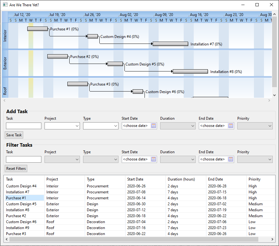
Are We There Yet? is an actual production Glimmer application that takes full advantage of table capabilities.
Table Sorting
Glimmer automatically adds sorting support to the SWT Table widget.
Check out the Contact Manager sample for an example. You may click on any column and it will sort by ascending order first and descending if you click again.
Glimmer automatic table sorting supports String, Integer, and Float columns out of the box as well as any column data that is comparable.
In cases where data is nil, depending on the data-type, it is automatically converted to Float with to_f, Integer with to_i, or String with to_s.
Should you have a special data type that could not be compared automatically, Glimmer offers the following 3 alternatives for custom sorting:
sort_property: this may be set to an alternative property to the one data-bound to the table column. For example, a table column called 'adult', which returnstrueorfalsemay be sorted withsort_property :dobinstead. This also support multi-property (aka multi-column) sorting (e.g.sort_property :dob, :name).sort_by(&block): this works just like RubyEnumerablesort_by. The block receives the table column data as argument.sort(&comparator): this works just like RubyEnumerablesort. The comparator block receives two objects from the table column data.
These alternatives could be used inside table_column for column-clicked sorting or in the table body directly to set the initial default sort.
You may also set additional_sort_properties on the parent table widget to have secondary sorting applied. For example, if you set additional_sort_properties :name, :project_name, then whenever you sort by :name, it additionally sorts by :project_name afterwards, and vice versa. This only works for columns that either have no custom sort set or have a sort_property with one property only (but no sort or sort_by block)
Example:
# ...
  table {
    table_column {
      text 'Task'
      width 120
    }
    table_column {
      text 'Project'
      width 120
    }
    table_column {
      text 'Duration (hours)'
      width 120
      sort_property :duration_in_hours
    }
    table_column {
      text 'Priority'
      width 120
      sort_by { |value| ['High', 'Medium', 'Low'].index(value) }
    }
    table_column {
      text 'Start Date'
      width 120
      sort { |d1, d2| d1.to_date <=> d2.to_date }
    }
    additional_sort_properties :project_name, :duration_in_hours, :name
    items bind(Task, :list), column_properties(:name, :project_name, :duration, :priority, :start_date)
    # ...
  }
# ...
Here is an explanation of the example above:
- Task and Project table columns are data-bound to the
:nameand:project_nameproperties and sorted through them automatically - Task Duration table column is data-bound to the
:durationproperty, but sorted via the:duration_in_hoursproperty instead - Task Priority table column has a custom sort_by block
- Task Start Date table column has a custom sort comparator block
- Additional (secondary) sort properties are applied when sorting by Task, Project, or Duration in the order specified
Tree
The SWT Tree widget visualizes a tree data-structure, such as an employment or composition hierarchy.
To data-bind a Tree, you need the root model, the children querying method, and the text display attribute on each child.
This involves using the bind keyword mentioned above in addition to a special tree_properties keyword that takes the children and text attribute methods.
Example:
shell {
  @tree = tree {
    items bind(company, :owner), tree_properties(children: :coworkers, text: :name)
    selection bind(company, :selected_coworker)
  }
}
The code above includes two data-bindings:
- Tree
items, which first bind to the root node (company.owner), and then dig down viacoworkerschildrenmethod, using thenametextattribute for displaying each tree item. - Tree
selection, which binds the single tree item selected by the user to the attribute denoted by thebindkeyword
Additionally, Tree items data-binding automatically stores each node model unto the SWT TreeItem object via setData method. This enables things like searchability.
The tree widget in Glimmer is represented by a subclass of WidgetProxy called TreeProxy.
TreeProxy includes a depth_first_search method that takes a block to look for a tree item.
Example:
found_array = @tree.depth_first_search { |tree_item| tree_item.getData == company.owner }
This finds the root node. The array is a Java array. This enables easy passing of it to SWT Tree#setSelection method, which expects a Java array of TreeItem objects.
To edit a tree, you must invoke TreeProxy#edit_selected_tree_item or TreeProxy#edit_tree_item. This automatically leverages the SWT TreeEditor custom class behind the scenes, displaying
a text widget to the user to change the selected or passed tree item text into something else. It automatically persists the change to items data-bound model on ENTER/FOCUS-OUT or cancels on ESC/NO-CHANGE.
DateTime
date_time represents the SWT DateTime widget.
Glimmer offers the following alias keywords for it for convenience:
date:date_time(:date)date_drop_down:date_time(:date, :drop_down)time:date_time(:time)calendar:date_time(:calendar)
You can data-bind any of these properties:
date_time bind(model, :property): produces a Ruby DateTime objectdate bind(model, :property): produces a Ruby Date objecttime bind(model, :property): produces a Ruby Time objectyear bind(model, :property): produces an integermonth bind(model, :property): produces an integerday bind(model, :property): produces an integerhours bind(model, :property): produces an integerminutes bind(model, :property): produces an integerseconds bind(model, :property): produces an integer
Learn more at the Hello, Date Time! sample.
If you need a better widget with the ability to customize the date format pattern, check out the Nebula CDateTime Glimmer Custom Widget
Observer
Glimmer comes with Observer module, which is used internally for data-binding, but can also be used externally for custom use of the Observer Pattern. It is hidden when observing widgets, and used explicitly when observing models.
Observing Widgets
Glimmer supports observing widgets with two main types of events:
on_{swt-listener-method-name}: where swt-listener-method-name is replaced with the lowercase underscored event method name on an SWT listener class (e.g.on_verify_textfororg.eclipse.swt.events.VerifyListener#verifyText).on_swt_{swt-event-constant}: where swt-event-constant is replaced with anorg.eclipse.swt.SWTevent constant (e.g.on_swt_showforSWT.Showto observe when widget becomes visible)
Additionally, there are two more types of events:
- SWT
displaysupports global listeners called filters that run on any widget. They are hooked viaon_swt_{swt-event-constant} - SWT
displaysupports Mac application menu item observers (on_aboutandon_preferences), which you can read about under Miscellaneous.
Number 1 is more commonly used in SWT applications, so make it your starting point. Number 2 covers events not found in number 1, so look into it if you don't find an SWT listener you need in number 1.
Regarding number 1, to figure out what the available events for an SWT widget are, check out all of its add***Listener API methods, and then open the listener class argument to check its "event methods".
For example, if you look at the Button SWT API:
https://help.eclipse.org/2019-12/index.jsp?topic=%2Forg.eclipse.platform.doc.isv%2Freference%2Fapi%2Forg%2Feclipse%2Fswt%2Fbrowser%2FBrowser.html
It has addSelectionListener. Additionally, under its Control super class, it has addControlListener, addDragDetectListener, addFocusListener, addGestureListener, addHelpListener, addKeyListener, addMenuDetectListener, addMouseListener, addMouseMoveListener, addMouseTrackListener, addMouseWheelListener, addPaintListener, addTouchListener, and addTraverseListener
Suppose, we select addSelectionListener, which is responsible for what happens when a user selects a button (clicks it). Then, open its argument SelectionListener SWT API, and you find the event (instance) methods: widgetDefaultSelected and widgetSelected. Let's select the second one, which is what gets invoked when a button is clicked.
Now, Glimmer simplifies the process of hooking into that listener (observer) by neither requiring you to call the addSelectionListener method nor requiring you to implement/extend the SelectionListener API.
Instead, simply add a on_widget_selected followed by a Ruby block containing the logic to perform. Glimmer figures out the rest.
Let's revisit the Tic Tac Toe example shown near the beginning of the page:
shell {
text "Tic-Tac-Toe"
minimum_size 150, 178
composite {
grid_layout 3, true
(1..3).each { |row|
(1..3).each { |column|
{
layout_data :fill, :fill, true, true
text bind(@tic_tac_toe_board[row, column], :sign)
enabled bind(@tic_tac_toe_board[row, column], :empty)
{
@tic_tac_toe_board.mark(row, column)
}
}
}
}
}
}
Note that every Tic Tac Toe grid cell has its text and enabled properties data-bound to the sign and empty attributes on the TicTacToe::Board model respectively.
Next however, each of these Tic Tac Toe grid cells, which are clickable buttons, have an on_widget_selected observer, which once triggered, marks the cell on the TicTacToe::Board to make a move.
Regarding number 2, you can figure out all available events by looking at the org.eclipse.swt.SWT API:
Example (you may copy/paste in girb):
SWT.Show - hooks a listener for showing a widget (using on_swt_show in Glimmer)
SWT.Hide - hooks a listener for hiding a widget (using on_swt_hide in Glimmer)
shell {
@button1 = {
text "Show 2nd Button"
visible true
on_swt_show {
@button2..setVisible(false)
}
{
@button2..setVisible(true)
}
}
@button2 = {
text "Show 1st Button"
visible false
on_swt_show {
@button1..setVisible(false)
}
{
@button1..setVisible(true)
}
}
}.open
Gotcha: SWT.Resize event needs to be hooked using on_swt_Resize because org.eclipse.swt.SWT has 2 constants for resize: RESIZE and Resize, so it cannot infer the right one automatically from the underscored version on_swt_resize
Alternative Syntax
Instead of declaring a widget observer using on_*** syntax inside a widget content block, you may also do so after the widget declaration by invoking directly on the widget object.
Example (you may copy/paste in girb):
@shell = shell {
  label {
    text "Hello, World!"
  }
}
@shell.on_shell_iconified {
  @shell.close
}
@shell.open
The shell declared above has been modified so that the minimize button works just like the close button. Once you minimize the shell (iconify it), it closes.
The alternative syntax can be helpful if you prefer to separate Glimmer observer declarations from Glimmer GUI declarations, or would like to add observers dynamically based on some logic later on.
Observing Models
Glimmer DSL includes an observe keyword used to register an observer by passing in the observable and the property(ies) to observe, and then specifying in a block what happens on notification.
class TicTacToe
include Glimmer
def initialize
# ...
observe(@tic_tac_toe_board, :game_status) { |game_status|
if game_status == Board::WIN
if game_status == Board::DRAW
}
end
# ...
end
Observers can be a good mechanism for displaying dialog messages in Glimmer (using SWT's MessageBox class).
Look at samples/elaborate/tictactoe/tic_tac_toe.rb for more details starting with the code included below.
class TicTacToe
include Glimmer
include Observer
def initialize
# ...
observe(@tic_tac_toe_board, :game_status) { |game_status|
if game_status == Board::WIN
if game_status == Board::DRAW
}
end
def
("Player #{@tic_tac_toe_board.winning_sign} has won!")
end
def
("Draw!")
end
def ()
(@shell) {
text 'Game Over'
}.open
@tic_tac_toe_board.reset
end
# ...
end
Custom Widgets
Custom widgets are brand new Glimmer DSL keywords that represent aggregates of existing widgets (e.g. address_form), customized existing widgets (e.g. greeting_label), or brand new widgets (e.g. oscilloscope)
You can find out about published Glimmer Custom Widgets by running the glimmer list:gems:customwidget command
Glimmer supports three ways of creating custom widgets with minimal code:
- Method-based Custom Widgets (for single-view-internal reuse): Extract a method containing Glimmer DSL widget syntax. Useful for quickly eliminating redundant code within a single view.
- Class-based Custom Widgets (for multiple-view-external reuse): Create a class that includes the
Glimmer::UI::CustomWidgetmodule and Glimmer DSL widget syntax in abody {}block. This will automatically extend Glimmer's DSL syntax with an underscored lowercase keyword matching the class name by convention. Useful in making a custom widget available in many views.
Approach #1 is a casual Ruby-based approach. Approach #2 is the official Glimmer approach. Typically, when referring to Custom Widgets, we are talking about Class-based Custom Widgets.
A developer might start with approach #1 to eliminate duplication in a view and later upgrade it to approach #2 when needing to export a custom widget to make it available in many views.
Class-based Custom Widgets offer a number of benefits over method-based custom widgets, such as built-in support for passing SWT style, nested block of extra widgets and properties, and before_body/after_body hooks.
Simple Example
Method-Based Custom Widget Example
(you may copy/paste in girb)
Definition and usage in the same file:
def red_label(label_text)
  label {
    text label_text
    background :red
  }
end

shell {
  red_label('Red Label')
}.open
Class-Based Custom Widget Example
Simply create a new class that includes Glimmer::UI::CustomWidget and put Glimmer DSL code in its #body block (its return value is stored in #body_root attribute). Glimmer will then automatically recognize this class by convention when it encounters a keyword matching the class name converted to underscored lowercase (and namespace double-colons :: replaced with double-underscores __)
(you may copy/paste in girb)
Definition:
class RedLabel
  include Glimmer::UI::CustomWidget

  body {
    label(swt_style) {
      background :red
    }
  }
end
Usage:
shell {
  red_label(:center) {
    text 'Red Label'
    foreground :green
  }
}.open
As you can see, RedLabel became the Glimmer DSL keyword red_label and worked just like a standard label by taking in SWT style and nested properties. As such, it is a first-class citizen of the Glimmer GUI DSL.
Custom Widget Lifecycle Hooks
You may execute code before or after evaluating the body with these lifecycle hooks:
before_body: takes a block that executes in the custom widget instance scope before callingbody. Useful for initializing variables to later use inbodyafter_body: takes a block that executes in the custom widget instance scope after callingbody. Useful for setting up observers on widgets built inbody(set in instance variables) and linking to other shells.
Lifecycle Hooks Example
(you may copy/paste in girb)
Definition:
module Red
  class Composite
    include Glimmer::UI::CustomWidget

    before_body {
      @color = :red
    }

    body {
      composite(swt_style) {
        background @color
      }
    }
  end
end
Usage:
shell {
  red__composite {
    label {
      foreground :white
      text 'This is showing inside a Red Composite'
    }
  }
}.open
Notice how Red::Composite became red__composite with double-underscore, which is how Glimmer Custom Widgets signify namespaces by convention. Additionally, the before_body lifecycle hook was utilized to set a @color variable and use inside the body.
Keep in mind that namespaces are not needed to be specified if the Custom Widget class has a unique name, not clashing with a basic SWT widget or another custom widget name.
Custom Widget API
Custom Widgets have the following attributes available to call from inside the #body method:
#parent: Glimmer object parenting custom widget#swt_style: SWT style integer. Can be useful if you want to allow consumers to customize a widget inside the custom widget body#options: a hash of options passed in parentheses when declaring a custom widget (useful for passing in model data) (e.g.calendar(events: events)). Custom widget class can declare option names (array) with::optionsclass method as shown below, which generates attribute accessors for every option (not to be confused with#optionsinstance method for retrieving options hash containing names & values)#content: nested block underneath custom widget. It will be automatically called at the end of processing the custom widget body. Alternatively, the custom widget body may callcontent.callat the place where the content is needed to show up as shown in the following example.#body_root: top-most (root) widget returned from#bodymethod.#swt_widget: actual SWT widget forbody_root
Additionally, custom widgets can call the following class methods:
::options(*option_names): declares a list of options by taking an option name array (symbols/strings). This generates option attribute accessors (e.g.options :orientation, :bg_colorgenerates#orientation,#orientation=(v),#bg_color, and#bg_color=(v)attribute accessors)::option(option_name, default: nil): declares a single option taking option name and default value as arguments (also generates attribute accessors just like::options)
Content/Options Example
(you may copy/paste in girb)
Definition:
class Sandwich
include Glimmer::UI::CustomWidget
:orientation, :bg_color
option :fg_color, default: :black
body {
composite(swt_style) { # gets custom widget style
fill_layout orientation # using orientation option
background bg_color # using container_background option
label {
text 'SANDWICH TOP'
}
content.call # this is where content block is called
label {
text 'SANDWICH BOTTOM'
}
}
}
end
Usage:
shell {
  sandwich(:no_focus, orientation: :vertical, bg_color: :red) {
    label {
      background :green
      text 'SANDWICH CONTENT'
    }
  }
}.open
Notice how :no_focus was the swt_style value, followed by the options hash {orientation: :horizontal, bg_color: :white}, and finally the content block containing the label with 'SANDWICH CONTENT'
Gotcha
Beware of defining a custom attribute that is a common SWT widget property name.
For example, if you define text= and text methods to accept a custom text and then later you write this body:
# ...
def text
  # ...
end

def text=(value)
  # ...
end

body {
  composite {
    label {
      text "Hello"
    }
    label {
      text "World"
    }
  }
}
# ...
The text method invoked in the custom widget body will call the one you defined above it. To avoid this gotcha, simply name the text property above something else, like custom_text.
Final Notes
This Eclipse guide for how to write custom SWT widgets is also applicable to Glimmer Custom Widgets written in Ruby. I recommend reading it: https://www.eclipse.org/articles/Article-Writing%20Your%20Own%20Widget/Writing%20Your%20Own%20Widget.htm
Also, you may check out Hello, Custom Widget! for another example.
Custom Shells
Custom shells are a kind of custom widgets that have shells only as the body root. They can be self-contained applications that may be opened and hidden/closed independently of the main app.
They may also be chained in a wizard fashion.
You can find out about published Glimmer Custom Shells by running the glimmer list:gems:customshell command
Example (you may copy/paste in girb):
class WizardStep
include Glimmer::UI::CustomShell
:number, :step_count
before_body {
@title = "Step #{number}"
}
body {
shell {
text "Wizard - #{@title}"
minimum_size 200, 100
fill_layout :vertical
label(:center) {
text @title
font height: 30
}
if number < step_count
{
text "Go To Next Step"
{
body_root.hide
}
}
end
}
}
end
shell { |app_shell|
text "Wizard"
minimum_size 200, 100
@current_step_number = 1
@wizard_steps = 5.times.map { |n|
wizard_step(number: n+1, step_count: 5) {
on_swt_hide {
if @current_step_number < 5
@current_step_number += 1
app_shell.hide
@wizard_steps[@current_step_number - 1].open
end
}
}
}
{
text "Start"
font height: 40
{
app_shell.hide
@wizard_steps[@current_step_number - 1].open
}
}
}.open
You may check out Hello, Custom Shell! for another example.
Drag and Drop
Glimmer offers Drag and Drop support, thanks to SWT and Glimmer's lightweight DSL syntax.
You may learn more about SWT Drag and Drop support over here: https://www.eclipse.org/articles/Article-SWT-DND/DND-in-SWT.html
To get started, simply follow these steps:
- On the drag source widget, add
on_drag_set_dataDragSourceListener event handler block at minimum (you may also addon_drag_startandon_drag_finishedif needed) - Set
event.datato transfer via drag and drop inside theon_drag_set_dataevent handler block (defaults totransfertype of:text, as in a Ruby String) - On the drop target widget, add
on_dropDropTargetListener event handler block at minimum (you may also addon_drag_enter[must setevent.detailif added],on_drag_over,on_drag_leave,on_drag_operation_changedandon_drop_acceptif needed) - Read
event.dataand consume it (e.g. change widget text) inside theon_dropevent handler block.
Example (taken from samples/hello/hello_drag_and_drop.rb / you may copy/paste in girb):
class Location
attr_accessor :country
def
%w[USA Canada Mexico Columbia UK Australia Germany Italy Spain]
end
end
@location = Location.new
include Glimmer
shell {
text 'Hello, Drag and Drop!'
list {
selection bind(@location, :country)
on_drag_set_data { |event|
list = event..getControl
event.data = list.getSelection.first
}
}
label(:center) {
text 'Drag a country here!'
font height: 20
on_drop { |event|
event..getControl.setText(event.data)
}
}
}.open

Optional steps:
- Set a
transferproperty (defaults to:text). Values may be: :text (default), :html :image, :rtf, :url, and :file, or an array of multiple values. Thetransferproperty will automatically convert your option into a Transfer object as per the SWT API. - Specify
drag_source_styleoperation (may be: :drop_copy (default), :drop_link, :drop_move, :drop_none, or an array of multiple operations) - Specify
drag_source_effect(Check DragSourceEffect SWT API for details) - Specify
drop_target_styleoperation (may be: :drop_copy (default), :drop_link, :drop_move, :drop_none, or an array of multiple operations) - Specify
drop_target_effect(Check DropTargetEffect SWT API for details) - Set drag operation in
event.detail(e.g. DND::DROP_COPY) insideon_drag_enter
Miscellaneous
Multi-DSL Support
Glimmer is a DSL engine that supports multiple DSLs (Domain Specific Languages):
- SWT: Glimmer DSL for SWT (Desktop GUI)
- Opal: Glimmer DSL for Opal (Web GUI Adapter for Desktop Apps)
- XML: Glimmer DSL for XML (& HTML) - Useful with SWT Browser Widget
- CSS: Glimmer DSL for CSS (Cascading Style Sheets) - Useful with SWT Browser Widget
Glimmer automatically recognizes top-level keywords in each DSL and activates DSL accordingly. Glimmer allows mixing DSLs, which comes in handy when doing things like using the SWT Browser widget with XML and CSS. Once done processing a nested DSL top-level keyword, Glimmer switches back to the prior DSL automatically.
SWT
The SWT DSL was already covered in detail. However, for the sake of mixing DSLs, you need to know that the SWT DSL has the following top-level keywords:
shelldisplaycolorobserveasync_execsync_exec
Opal
Full instructions are found in the Opal DSL page.
The Opal DSL is simply a web GUI adapter for desktop apps written in Glimmer. As such, it supports all the DSL keywords of the SWT DSL and shares the same top-level keywords.
XML
Simply start with html keyword and add HTML inside its block using Glimmer DSL syntax.
Once done, you may call to_s, to_xml, or to_html to get the formatted HTML output.
Here are all the Glimmer XML DSL top-level keywords:
htmltag: enables custom tag creation for exceptional cases by passing tag name as '_name' attributename_space: enables namespacing html tags
Element properties are typically passed as a key/value hash (e.g. section(id: 'main', class: 'accordion')) . However, for properties like "selected" or "checked", you must leave value nil or otherwise pass in front of the hash (e.g. input(:checked, type: 'checkbox') )
Example (basic HTML / you may copy/paste in girb):
@xml = html {
head {
(name: "viewport", content: "width=device-width, initial-scale=2.0")
}
body {
h1 { "Hello, World!" }
}
}
puts @xml
Output:
<html><head><meta name="viewport" content="width=device-width, initial-scale=2.0" /></head><body><h1>Hello, World!</h1></body></html>
Example (explicit XML tag / you may copy/paste in girb):
puts tag(:_name => "DOCUMENT")
Output:
<DOCUMENT/>
Example (XML namespaces using name_space keyword / you may copy/paste in girb):
@xml = name_space(:w3c) {
  html(:id => "thesis", :class => "document") {
    body(:id => "main") {
    }
  }
}
puts @xml
Output:
<w3c:html id="thesis" class="document"><w3c:body id="main"></w3c:body></w3c:html>
Example (XML namespaces using dot operator / you may copy/paste in girb):
@xml = tag(:_name => "DOCUMENT") {
  document.body(document.id => "main") {
  }
}
puts @xml
Output:
<DOCUMENT><document:body document:id="main"></document:body></DOCUMENT>
CSS
Simply start with css keyword and add stylesheet rule sets inside its block using Glimmer DSL syntax.
Once done, you may call to_s or to_css to get the formatted CSS output.
css is the only top-level keyword in the Glimmer CSS DSL
Selectors may be specified by s keyword or HTML element keyword directly (e.g. body)
Rule property values may be specified by pv keyword or underscored property name directly (e.g. font_size)
Example (you may copy/paste in girb):
@css = css {
  body {
    font_size '1.1em'
    pv 'background', 'white'
  }

  s('body > h1') {
    background_color :red
    pv 'font-size', '2em'
  }
}
puts @css
Listing / Enabling / Disabling DSLs
Glimmer provides a number of methods on Glimmer::DSL::Engine to configure DSL support or inquire about it:
Glimmer::DSL::Engine.dsls: Lists available Glimmer DSLsGlimmer::DSL::Engine.disable_dsl(dsl_name): Disables a specific DSL. Useful when there is no need for certain DSLs in a certain application.- `Glimmer::DSL::Engine.disabled_dsls': Lists disabled DSLs
Glimmer::DSL::Engine.enable_dsl(dsl_name): Re-enables disabled DSLGlimmer::DSL::Engine.enabled_dsls=(dsl_names): Disables all DSLs except the ones specified.
Application Menu Items (About/Preferences)
Mac applications always have About and Preferences menu items. Glimmer provides widget observer hooks for them on the display:
on_about: executes code when user selects App Name -> Abouton_preferences: executes code when user selects App Name -> Preferences or hits 'CMD+,' on the Mac
Example (you may copy/paste in girb):
class Example
def initialize
display {
on_about {
(@shell_proxy) {
text 'About'
'About Application'
}.open
}
on_preferences {
preferences_dialog = dialog {
text 'Preferences'
row_layout {
type :vertical
margin_left 15
margin_top 15
margin_right 15
margin_bottom 15
}
label {
text 'Check one of these options:'
}
(:radio) {
text 'Option 1'
}
(:radio) {
text 'Option 2'
}
}
preferences_dialog.open
}
}
@shell_proxy = shell {
text 'Application Menu Items'
fill_layout {
margin_width 15
margin_height 15
}
label {
text 'Application Menu Items'
font height: 30
}
}
@shell_proxy.open
end
end
Example.new
App Name and Version
Application name (shows up on the Mac in top menu bar) and version may be specified upon packaging by specifying "-Bmac.CFBundleName" and "-Bmac.CFBundleVersion" options.
Still, if you would like proper application name to show up on the Mac top menu bar during development, you may do so by invoking the SWT Display.setAppName method before any Display object has been instantiated (i.e. before any Glimmer widget like shell has been declared).
Example (you may copy/paste in girb):
Display.setAppName('Glimmer Demo')

shell(:no_resize) {
  text "Glimmer"
  label {
    text "Hello, World!"
  }
}.open
Also, you may invoke Display.setAppVersion('1.0.0') if needed for OS app version identification reasons during development, replacing '1.0.0' with your application version.
Checkbox Group Widget
checkbox_group (or alias check_group) is a Glimmer built-in custom widget that displays a list of checkbox buttons (button(:check)) based on its items property.
checkbox_group consists of a root composite (with grid_layout 1, false by default) that holds nested checkbox (button(:check)) widgets.
The selection property determines which checkbox buttons are checked. It expects an Array of String objects
The selection_indices property determines which checkbox button indices are checked. It expects an Array of index Integer objects that are zero-based.
The checkboxes property returns the list of nested checkbox widgets.
When data-binding selection, the model property should have a matching property with _options suffix (e.g. activities_options for activities) to provide an Array of String objects for checkbox buttons.
You may see an example at the Hello, Checkbox Group! sample.

Radio Group Widget
radio_group is a Glimmer built-in custom widget that displays a list of radio buttons (button(:radio)) based on its items property, which expects an Array of String objects.
radio_group consists of a root composite (with grid_layout 1, false by default) that holds nested radio widgets.
The selection property determines which radio button is selected. It expects a String
The selection_index property determines which radio button index is selected. It expects an index integer that is zero-based.
The radios property returns the list of nested radio widgets.
When data-binding selection, the model property should have a matching property with _options suffix (e.g. country_options for country) to provide text for radio buttons.
This custom widget is used in the Glimmer Meta-Sample (The Sample of Samples):
Glimmer Meta-Sample Code Example:
# ...
radio_group { |radio_group_proxy|
  row_layout(:vertical) {
    fill true
  }
  selection bind(sample_directory, :selected_sample_name)
  font height: 24
}

# ...
You may see another example at the Hello, Radio Group! sample.
Code Text Widget
code_text is a Glimmer built-in custom widget that displays syntax highlighted Ruby code in a customized SWT StyledText widget.
It is used in the Glimmer Meta-Sample (The Sample of Samples):
Glimmer Meta-Sample Code Example:
# ...
code_text {
  text bind(SampleDirectory, 'selected_sample.content')
  editable false
  caret nil
}
# ...
To use, simply use code_text in place of text or styled_text widget. If you set its text value to Ruby code, it automatically styles it with syntax highlighting.
Video Widget

Glimmer supports a video custom widget not in SWT.
You may obtain via glimmer-cw-video gem.
Sash Form Widget
sash_form is an SWT built-in custom widget that provides a resizable sash that splits a window area into two or more panes.
It can be customized with the weights attribute by setting initial weights to size the panes at first display.
One noteworthy thing about the Glimmer implementation is that, unlike behavior in SWT, it allows declaring weights before the content of the sash_form, thus providing more natural and convenient syntax (Glimmer automatically takes care of sending that declaration to SWT at the end of declaring sash_form content as per the SWT requirements)
Example (you may copy/paste in girb):
shell {
  text 'Sash Form Example'
  sash_form {
    label {
      text '(resize >>)'
      background :dark_green
      foreground :white
      font height: 20
    }
    label {
      text '(<< resize)'
      background :red
      foreground :white
      font height: 20
    }
    weights 1, 2
  }
}.open
You may check out a more full-fledged example in Hello, Sash Form!

Browser Widget

Glimmer supports the SWT Browser widget, which can load URLs or render HTML. It can even be instrumented with JavaScript when needed (though highly discouraged since it defeats the purpose of using Ruby except in very rare cases like leveraging a pre-existing web codebase in a desktop app).
Example loading a URL (you may copy/paste in girb):
shell {
  minimum_size 1024, 860
  browser {
    url 'http://brightonresort.com/about'
  }
}.open
Example rendering HTML with JavaScript on document ready (you may copy/paste in girb provided you install and require glimmer-dsl-xml gem):
shell {
minimum_size 130, 130
@browser = browser {
text html {
head {
(name: "viewport", content: "width=device-width, initial-scale=2.0")
}
body {
h1 { "Hello, World!" }
}
}
on_completed { # on load of the page execute this JavaScript
@browser..execute("alert('Hello, World!');")
}
}
}.open
SWT Browser Style Options
The browser widget can use a particular desktop browser by setting the SWT Style to:
:webkit: use the Webkit browser engine:chromium: use the Chromium browser engine
Example using the Chromium browser (you may copy/paste in girb):
shell {
  minimum_size 1024, 860
  browser(:chromium) {
    url 'http://brightonresort.com/about'
  }
}.open
This relies on Glimmer's Multi-DSL Support for building the HTML text using Glimmer XML DSL.
Glimmer Configuration
Glimmer configuration may be done via the Glimmer::Config module.
logger
The Glimmer DSL engine supports logging via a standard STDOUT Ruby Logger configured in the Glimmer::Config.logger config option.
It is set to level Logger::ERROR by default.
Log level may be adjusted via Glimmer::Config.logger.level just like any other Ruby Logger.
Example:
Glimmer::Config.logger.level = :debug
This results in more verbose debug loggging to STDOUT, which is very helpful in troubleshooting Glimmer DSL syntax when needed.
Example log:
D, [2017-07-21T19:23:12.587870 #35707] DEBUG -- : method: shell and args: []
D, [2017-07-21T19:23:12.594405 #35707] DEBUG -- : ShellCommandHandler will handle command: shell with arguments []
D, [2017-07-21T19:23:12.844775 #35707] DEBUG -- : method: composite and args: []
D, [2017-07-21T19:23:12.845388 #35707] DEBUG -- : parent is a widget: true
D, [2017-07-21T19:23:12.845833 #35707] DEBUG -- : on listener?: false
D, [2017-07-21T19:23:12.864395 #35707] DEBUG -- : WidgetCommandHandler will handle command: composite with arguments []
D, [2017-07-21T19:23:12.864893 #35707] DEBUG -- : widget styles are: []
D, [2017-07-21T19:23:12.874296 #35707] DEBUG -- : method: list and args: [:multi]
D, [2017-07-21T19:23:12.874969 #35707] DEBUG -- : parent is a widget: true
D, [2017-07-21T19:23:12.875452 #35707] DEBUG -- : on listener?: false
D, [2017-07-21T19:23:12.878434 #35707] DEBUG -- : WidgetCommandHandler will handle command: list with arguments [:multi]
D, [2017-07-21T19:23:12.878798 #35707] DEBUG -- : widget styles are: [:multi]
The logger instance may be replaced with a custom logger via Glimmer::Config.logger = custom_logger
To reset logger to the default instance, you may call Glimmer::Config.reset_logger!
All logging is done lazily via blocks (e.g. logger.debug {message}) to avoid affecting app performance with logging when below the configured logging level threshold.
Glimmer DSL for SWT enhances Glimmer default logging support via the Ruby logging gem, enabling buffered asynchronous logging in a separate thread, thus completely unhindering normal desktop app performance.
Other config options related to the logging gem are mentioned below.
logging_devices
This is an array of these possible values: :stdout (default), :stderr, :file, :syslog (default), :stringio
It defaults to [:stdout, :syslog]
When :file is included, Glimmer creates a 'log' directory directly below the Glimmer app local directory.
It may also be customized further via the logging_device_file_options option.
This is useful on Windows as an alternative to syslog, which is not available on Windows by default.
logging_device_file_options
This is a hash of logging gem options for the :file logging device.
Default: {size: 1_000_000, age: 'daily', roll_by: 'number'}
That ensures splitting log files at the 1MB size and daily, rolling them by unique number.
logging_appender_options
Appender options is a hash passed as options to every appender (logging device) used in the logging gem.
Default: {async: true, auto_flushing: 500, write_size: 500, flush_period: 60, immediate_at: [:error, :fatal], layout: logging_layout}
That ensures asynchronous buffered logging that is flushed every 500 messages and 60 seconds, or immediately at error and fatal log levels
logging_layout
This is a logging gem layout that formats the logging output.
Default:
Logging.layouts.pattern(
  pattern: '[%d] %-5l %c: %m\n',
  date_pattern: '%Y-%m-%d %H:%M:%S'
)
import_swt_packages
Glimmer automatically imports all SWT Java packages upon adding include Glimmer, include Glimmer::UI::CustomWidget, or include Glimmer::UI::CustomShell to a class or module. It relies on JRuby's include_package for lazy-importing upon first reference of a Java class.
As a result, you may call SWT Java classes from Glimmer Ruby code without mentioning Java package references explicitly.
For example, org.eclipse.swt.graphics.Color can be referenced as just Color
The Java packages imported come from the Glimmer::Config.import_swt_packages config option, which defaults to Glimmer::Config::DEFAULT_IMPORT_SWT_PACKAGES, importing the following Java packages:
org.eclipse.swt.*
org.eclipse.swt..*
org.eclipse.swt.layout.*
org.eclipse.swt.graphics.*
org.eclipse.swt.browser.*
org.eclipse.swt.custom.*
org.eclipse.swt.dnd.*
If you need to import additional Java packages as extra Glimmer widgets, you may add more packages to Glimmer::Config.import_swt_packages by using the += operator (or alternatively limit to certain packages via = operator).
Example:
Glimmer::Config.import_swt_packages += [
  'org.eclipse.nebula.widgets.ganttchart'
]
Another alternative is to simply add a java_import call to your code (e.g. java_import 'org.eclipse.nebula.widgets.ganttchart.GanttChart'). Glimmer will automatically take advantage of it (e.g. when invoking gantt_chart keyword)
Nonetheless, you can disable automatic Java package import if needed via this Glimmer configuration option:
Glimmer::Config.import_swt_packages = false
Once disabled, to import SWT Java packages manually, you may simply:
include Glimmer::SWT::Packages: lazily imports all SWT Java packages to your class, lazy-loading SWT Java class constants on first reference.java_import swt_package_class_string: immediately imports a specific Java class whereswt_package_class_stringis the Java full package reference of a Java class (e.g.java_import 'org.eclipse.swt.SWT')
Note: Glimmer relies on nested_imported_jruby_include_package, which automatically brings packages to nested-modules/nested-classes and sub-modules/sub-classes.
You can learn more about importing Java packages into Ruby code at this JRuby WIKI page:
https://github.com/jruby/jruby/wiki/CallingJavaFromJRuby
loop_max_count
Glimmer has infinite loop detection support. It can detect when an infinite loop is about to occur in method_missing and stops it. It detects potential infinite loops when the same keyword and args repeat more than 100 times, which is unusual in a GUI app.
The max limit can be changed via the Glimmer::Config::loop_max_count=(count) config option.
Infinite loop detection may be disabled altogether if needed by setting Glimmer::Config::loop_max_count to -1
excluded_keyword_checkers
Glimmer permits consumers to exclude keywords from DSL processing by its engine via the excluded_keyword_checkers config option.
To do so, add a proc to it that returns a boolean indicating if a keyword is excluded or not.
Note that this proc runs within the context of the Glimmer object (as in the object mixing in the Glimmer module), so checker can can pretend to run there with its self object assumption.
Example of keywords excluded by glimmer-dsl-swt:
Glimmer::Config.excluded_keyword_checkers << lambda do |method_symbol, *args|
  method = method_symbol.to_s
  result = false
  result ||= method.start_with?('on_swt_') && is_a?(Glimmer::UI::CustomWidget) && respond_to?(method)
  result ||= method == 'dispose' && is_a?(Glimmer::UI::CustomWidget) && respond_to?(method)
  result ||= ['drag_source_proxy', 'drop_target_proxy'].include?(method) && is_a?(Glimmer::UI::CustomWidget)
  result ||= method == 'post_initialize_child'
  result ||= method.end_with?('=')
  result ||= ['finish_edit!', 'search', 'all_tree_items', 'depth_first_search'].include?(method) && is_a?(Glimmer::UI::CustomWidget) && body_root.respond_to?(method)
end
log_excluded_keywords
This just tells Glimmer whether to log excluded keywords or not (at the debug level). It is off by default.
Glimmer Style Guide
- Widgets are declared with underscored lowercase versions of their SWT names minus the SWT package name.
- Widget declarations may optionally have arguments and be followed by a block (to contain properties and content)
- Widget blocks are always declared with curly braces
- Widget arguments are always wrapped inside parentheses
- Widget properties are declared with underscored lowercase versions of the SWT properties
- Widget property declarations always have arguments and never take a block
- Widget property arguments are never wrapped inside parentheses
- Widget listeners are always declared starting with
on_prefix and affixing listener event method name afterwards in underscored lowercase form - Widget listeners are always followed by a block using curly braces (Only when declared in DSL. When invoked on widget object directly outside of GUI declarations, standard Ruby conventions apply)
- Data-binding is done via
bindkeyword, which always takes arguments wrapped in parentheses - Custom widget body, before_body, and after_body blocks open their blocks and close them with curly braces.
- Custom widgets receive additional arguments to SWT style called options. These are passed as the last argument inside the parentheses, a hash of option names pointing to values.
SWT Reference
https://www.eclipse.org/swt/docs.php
Here is the SWT API:
https://help.eclipse.org/2019-12/nftopic/org.eclipse.platform.doc.isv/reference/api/index.html
Here is a visual list of SWT widgets:
https://www.eclipse.org/swt/widgets/
Here is a textual list of SWT widgets:
Here is a list of SWT style bits as used in widget declaration:
https://wiki.eclipse.org/SWT_Widget_Style_Bits
Here is a SWT style bit constant reference:
Here is an SWT Drag and Drop guide:
https://www.eclipse.org/articles/Article-SWT-DND/DND-in-SWT.html
Here is an SWT Custom Widget guide:
Here is an SWT Image guide:
https://www.eclipse.org/articles/Article-SWT-images/graphics-resources.html
Here is an SWT Graphics / Canvas-Drawing guide:
https://www.eclipse.org/articles/Article-SWT-graphics/SWT_graphics.html
Here is the Nebula Project (custom widget library) homepage:
https://www.eclipse.org/nebula/
Samples
Check the samples directory in glimmer-dsl-swt for examples on how to write Glimmer applications. To run a sample, make sure to install the glimmer gem first and then use the glimmer command to run it (alternatively, you may clone the repo, follow CONTRIBUTING.md instructions, and run samples locally with development glimmer command: bin/glimmer).
You may run any sample via this command:
glimmer samples
This brings up the Glimmer Meta-Sample (The Sample of Samples)
Hello Samples
For hello-type simple samples, check the following.
Hello, World! Sample
Code:
Hello, Tab!
Code:
Hello, Combo!
This sample demonstrates combo data-binding.
Code:
Hello, List Single Selection!
This sample demonstrates list single-selection data-binding.
Code:
samples/hello/hello_list_single_selection.rb
Hello, List Multi Selection!
This sample demonstrates list multi-selection data-binding.
Code:
samples/hello/hello_list_multi_selection.rb
Hello, Computed!
This sample demonstrates computed data-binding.
Code:
samples/hello/hello_computed.rb
Hello, Message Box!
This sample demonstrates a message_box dialog.
Code:
samples/hello/hello_message_box.rb

Hello, Browser!
This sample demonstrates the browser widget.
Code:
samples/hello/hello_browser.rb
Hello, Drag and Drop!
This sample demonstrates drag and drop in Glimmer.
Code:
samples/hello/hello_drag_and_drop.rb
Hello, Menu Bar!
This sample demonstrates menus in Glimmer.
Code:
samples/hello/hello_menu_bar.rb


Hello, Pop Up Context Menu!
This sample demonstrates pop up context menus in Glimmer.
Code:
samples/hello/hello_pop_up_context_menu.rb


Hello, Custom Widget!
This sample demonstrates the use of a custom widget in Glimmer.
Code:
samples/hello/hello_custom_widget.rb

Hello, Custom Shell!
This sample demonstrates the use of a custom shell (aka custom window) in Glimmer.
Code:
samples/hello/hello_custom_shell.rb


Hello, Sash Form!
This sample demonstrates the use of a sash_form in Glimmer.
Code:
samples/hello/hello_sash_form.rb
Hello, Sash Form! Horizontal Orientation
Hello, Sash Form! Resized

Hello, Sash Form! Sash Width Changed

Hello, Sash Form! Vertical Orientation

Hello, Sash Form! Green Label Maximized

Hello, Sash Form! Red Label Maximized

Hello, Styled Text!
This sample demonstrates the use of a styled_text in Glimmer.
Code:
samples/hello/hello_styled_text.rb
Hello, Styled Text!

Hello, Expand Bar!
This sample demonstrates the use of a expand_bar and expand_item in Glimmer.
Code:
samples/hello/hello_expand_bar.rb
Hello, Expand Bar! All Expanded

Hello, Expand Bar! Productivity Expanded

Hello, Expand Bar! Tools Expanded

Hello, Expand Bar! Reading Expanded

Hello, Radio!
This sample demonstrates the use of a radio (aka button(:radio)) in Glimmer.
Code:
Hello, Radio!

Hello, Radio Group!
This sample demonstrates the use of a radio_group in Glimmer, which provides terser syntax for representing multiple radio buttons by relying on data-binding to automatically spawn the radio widgets based on available options on the model.
Code:
samples/hello/hello_radio_group.rb
Hello, Radio Group!

Hello, Group!
This sample demonstrates the use of a group in Glimmer (not to be confused with the logical radio group custom widget, this is just an alternative to composite that provides a border around content).
Code:
Hello, Group!

Hello, Checkbox!
This sample demonstrates the use of a checkbox (aka check or button(:check)) in Glimmer.
Code:
samples/hello/hello_checkbox.rb
Hello, Checkbox!

Hello, Checkbox Group!
This sample demonstrates the use of a checkbox_group (aka check_group) in Glimmer, which provides terser syntax for representing multiple checkbox buttons (button(:check)) by relying on data-binding to automatically spawn the checkbox widgets (button(:check)) based on available options on the model.
Code:
samples/hello/hello_checkbox_group.rb
Hello, Checkbox Group!
Hello, Directory Dialog!
This sample demonstrates the use of a directory_dialog in Glimmer.
Code:
samples/hello/hello_directory_dialog.rb
Hello, Directory Dialog!

Hello, Directory Dialog! Browse...

Hello, Directory Dialog! Selected Directory

Hello, File Dialog!
This sample demonstrates the use of a file_dialog in Glimmer.
Code:
samples/hello/hello_file_dialog.rb
Hello, File Dialog!

Hello, File Dialog! Browse...

Hello, File Dialog! Selected File

Hello, Date Time!
This sample demonstrates the use of date_time widget keywords in Glimmer: date, date_drop_down, time, and calendar
Code:
samples/hello/hello_date_time.rb
Hello, Date Time!

Hello, Spinner!
This sample demonstrates the use of spinner widget in Glimmer
Code:
samples/hello/hello_spinner.rb
Hello, Spinner!

Hello, Table!
This sample demonstrates the use of table widget in Glimmer, including data-binding, multi-type editing, sorting, and filtering.
Code:
Hello, Table!

Hello, Table! Editing Game Date

Hello, Table! Editing Game Time

Hello, Table! Editing Home Team

Hello, Table! Sorted Game Date Ascending

Hello, Table! Sorted Game Date Descending

Hello, Table! Playoff Type Combo

Hello, Table! Playoff Type Changed

Hello, Table! Game Booked

Hello, Table! Context Menu

Hello, Button!
This sample demonstrates the use of the button widget in Glimmer, including data-binding and click event triggering via on_widget_selected.
Code:
Hello, Button!

Hello, Button! Incremented 7 times!

Hello, Link!
This sample demonstrates the use of the link widget in Glimmer, including identifying which link was clicked and performing an action (displaying help) based on its location.
Code:
Hello, Link!

Hello, Link! Clicked

Elaborate Samples
For more elaborate samples, check the following:
User Profile
This sample was used in the DZone Article about Glimmer, demonstrating Glimmer widgets in general.
Please note that the code has changed since that article was written (the GUI DSL has been improved/simplified), so use the code sample mentioned here instead as the correct version.
Code:
samples/elaborate/user_profile.rb

Login
This sample demonstrates basic data-binding, password and text fields, and field enablement data-binding.
Code:


Tic Tac Toe Sample
This sample demonstrates a full MVC application, including GUI layout, text and enablement data-binding, and test-driven development (has specs).
Code:
(Please note that on some Linux instances where the display x-axis is set to double-scale, you need to set the shell minimum_size to 300, 178 instead of 150, 178)
samples/elaborate/tic_tac_toe.rb


Contact Manager Sample
This sample demonstrates table data-binding, sorting, filtering, GUI layout, MVP pattern, and test-driven development (has specs).
Code:
samples/elaborate/contact_manager.rb
Contact Manager
Contact Manager - Find

Contact Manager - Edit Started

Contact Manager - Edit In Progress

Contact Manager - Edit Done

External Samples
Glimmer Calculator
 Glimmer Calculator is a basic calculator sample app demonstrating data-binding and TDD (test-driven-development) with Glimmer following the MVP pattern (Model-View-Presenter).

Gladiator
 Gladiator (short for Glimmer Editor) is a Glimmer sample project under on-going development.
You may check it out to learn how to build a Glimmer Custom Shell gem.
Gladiator (short for Glimmer Editor) is a Glimmer sample project under on-going development.
You may check it out to learn how to build a Glimmer Custom Shell gem.
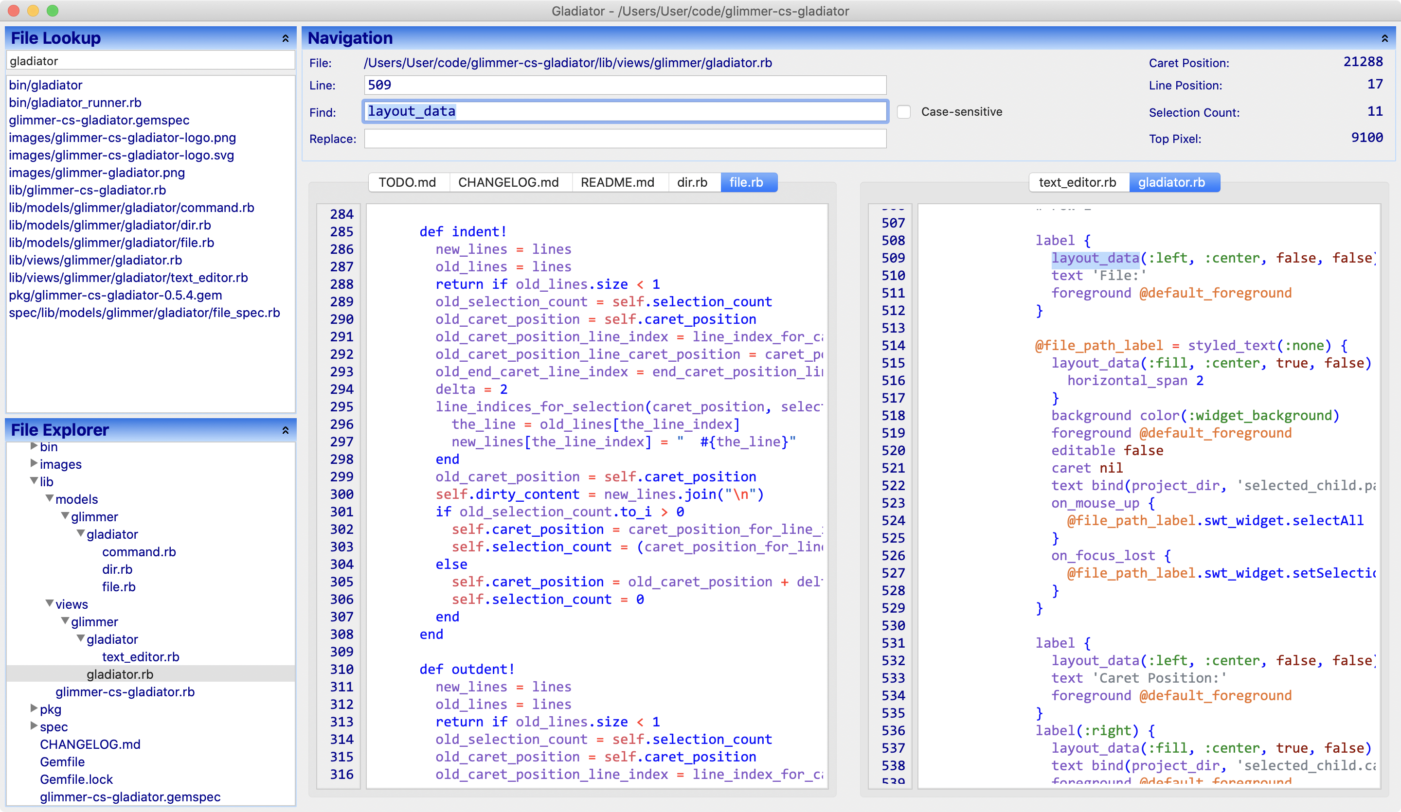
Gladiator is a good demonstration of:
- MVP Pattern
- Tree data-binding
- List data-binding
- Text selection data-binding
- Tabs
- Context menus
- Custom Shell
- Custom widget
Timer
 Timer is a sample app demonstrating data-binding, multi-threading, and Java (Sound) library integration in a desktop application.
In Production
The following production apps have been built with Glimmer.
If you have a Glimmer app you would like referenced here, please mention in a Pull Request.
Math Bowling
Math Bowling: an educational math game for elementary level kids
Are We There Yet?
Are We There Yet?: A tool that helps you learn when your small projects will finish
Garderie Rainbow Daily Agenda
 Garderie Rainbow Daily Agenda: A child nursery daily agenda reporting desktop app
Packaging & Distribution
Note: this section mostly applies to Mac and Windows. On Linux, you can just run glimmer package:gem and after installing the gem, you get an executable matching the name of the app/custom-shell-gem you are building (e.g. calculator command becomes available after installing the glimmer-cs-calculator gem)
Glimmer simplifies the process of native-executable packaging and distribution on Mac and Windows via a single glimmer package command:
glimmer package
It works out of the box for any application scaffolded by Glimmer Scaffolding, generating all available packaging types on the current platform (e.g. DMG, PKG, APP on the Mac) and displaying a message indicating what pre-requisite setup tools are needed if not installed already (e.g. Wix Toolset to generate MSI files on Windows)
You may choose to generate a specific type of packaging instead by addionally passing in the [type] option. For example, this generates an MSI setup file on Windows:
glimmer package[msi]
- Available Mac packaging types are
dmg,pkg, andimage(image means a pure Macappwithout a setup program) - Available Windows packaging types are
msi,exe, andimage(image means a Windows application directory without a setup program). Learn more about Windows packaging are over here.
Note: if you are using Glimmer manually, to make the glimmer package command available, you must add the following line to your application Rakefile (automatically done for you if you scaffold an app or gem with glimmer scaffold[AppName] or glimmer scaffold:gem:customshell[GemName]):
require 'glimmer/rake_task'
The Glimmer packaging process done in the glimmer package command consists of the following steps:
- Generate gemspec via Juwelier (
glimmer package:gemspec): Having a gemspec is required by thejar-dependenciesJRuby gem, used by JRuby libraries to declare JAR dependencies. - Lock JAR versions (
glimmer package:lock_jars): This locks versions of JAR dependencies leveraged by thejar-dependenciesJRuby gem, downloading them into the./vendordirectory so they would get inside the top-level Glimmer app/gem JAR file. - Generate Warbler config (
glimmer package:config): Generates initial Warbler config file (under./config/warble.rb) to use for generating JAR file. - Generate JAR file using Warbler (
glimmer package:jar): Enables bundling a Glimmer app into a JAR file under the./distdirectory - Generate native executable using javapackager (
glimmer package:native): Enables packaging a JAR file as a DMG/PKG/APP file on Mac, MSI/EXE/APP on Windows, and DEB/RPM/APP on Linux (Glimmer does not officially support Linux with theglimmer packagecommand yet, but it generates the JAR file successfully, and you could usejavapackagermanually afterwards if needed).
Those steps automatically ensure generating a JAR file under the ./dist directory using Warbler, which is then used to automatically generate a DMG/MSI file (and other executables) under the ./packages/bundles directory using javapackager.
The JAR file name will match your application local directory name (e.g. MathBowling.jar for ~/code/MathBowling)
The DMG file name will match the humanized local directory name + dash + application version (e.g. Math Bowling-1.0.dmg for ~/code/MathBowling with version 1.0 or unspecified)
The glimmer package command will automatically set "mac.CFBundleIdentifier" to ="org.#project_name.application.#project_name".
You may override by configuring as an extra argument for javapackger (e.g. Glimmer::RakeTask::Package.javapackager_extra_args = " -Bmac.CFBundleIdentifier=org.andymaleh.application.MathBowling")
Packaging Defaults
Glimmer employs smart defaults in packaging.
The package application name (shows up in top menu bar on the Mac) will be a human form of the app root directory name (e.g. "Math Bowling" for "MathBowling" or "math_bowling" app root directory name). However, application name and version may be specified explicitly via "-Bmac.CFBundleName" and "-Bmac.CFBundleVersion" options.
Also, the package will only include these directories: app, config, db, lib, script, bin, docs, fonts, images, sounds, videos
After running once, you will find a config/warble.rb file. It has the JAR packaging configuration. You may adjust included directories in it if needed, and then rerun glimmer package and it will pick up your custom configuration. Alternatively, if you'd like to customize the included directories to begin with, don't run glimmer package right away. Run this command first:
glimmer package:config
This will generate config/warble.rb, which you may configure and then run glimmer package afterwards.
Packaging Configuration
- Ensure you have a Ruby script under
bindirectory that launches the application, preferably matching your project directory name (e.g.bin/math_bowling) :ruby require_relative '../app/my_application.rb' - Include Icon (Optional): If you'd like to include an icon for your app (.icns format on the Mac), place it under
package/macosxmatching the humanized application local directory name (e.g. 'Math Bowling.icns' [containing space] for MathBowling or math_bowling). You may generate your Mac icon easily using tools like Image2Icon (http://www.img2icnsapp.com/) or manually using the Mac terminal commandiconutil(iconutil guide: https://applehelpwriter.com/tag/iconutil/) - Include DMG Background Icon (Optional): Simply place a .png file under
package/macosx/{HumanAppName}-background.png - Include Version (Optional): Create a
VERSIONfile in your application and fill it your app version on one line (e.g.1.1.0) - Include License (Optional): Create a
LICENSE.txtfile in your application and fill it up with your license (e.g. MIT). It will show up to people when installing your app. Note that, you may optionally also specify license type, but you'd have to do so manually via-BlicenseType=MITshown in an example below. - Extra args (Optional): You may optionally add the following to
Rakefileto configure extra arguments for javapackager:Glimmer::RakeTask::Package.javapackager_extra_args = "..."(Useful to avoid re-entering extra arguments on every run of rake task.). Read about them in their section below.
javapackager Extra Arguments
In order to explicitly configure javapackager, Mac package attributes, or sign your Mac app to distribute on the App Store, you can follow more advanced instructions for javapackager here:
- https://docs.oracle.com/javase/9/tools/javapackager.htm#JSWOR719
- https://docs.oracle.com/javase/8/docs/technotes/tools/unix/javapackager.html
- https://docs.oracle.com/javase/8/docs/technotes/guides/deploy/self-contained-packaging.html#BCGICFDB
- https://docs.oracle.com/javase/8/docs/technotes/guides/deploy/self-contained-packaging.html
- https://developer.apple.com/library/archive/releasenotes/General/SubmittingToMacAppStore/index.html#//apple_ref/doc/uid/TP40010572-CH16-SW8
The Glimmer rake task allows passing extra options to javapackager via:
Glimmer::RakeTask::Package.javapackager_extra_args="..."in your application Rakefile- Environment variable:
JAVAPACKAGER_EXTRA_ARGS
Example (Rakefile):
require 'glimmer/rake_task'

Glimmer::RakeTask::Package.javapackager_extra_args = '-BlicenseType="MIT" -Bmac.category="public.app-category.business" -Bmac.signing-key-developer-id-app="Andy Maleh"'
Note that mac.category defaults to "public.app-category.business", but can be overridden with one of the category UTI values mentioned here:
Example (env var):
JAVAPACKAGER_EXTRA_ARGS='-Bmac.CFBundleName="Math Bowling Game"' glimmer package
That overrides the default application display name.
Verbose Mode
Pass -v to javapackager in Glimmer::RakeTask::Package.javapackager_extra_args or by running glimmer package:native[type] -v to learn more about further available customizations for the installer you are requesting to generate.
Windows Application Packaging
Windows offers two options for setup packaging:
msi(recommended): simpler packaging option. Requires WiX Toolset and .NET Framework. Simply runglimmer package[msi](orglimmer package:native[msi]if it's not your first time) and it will give you more details on the pre-requisites you need to install (e.g. WiX Toolset and .NET Framework 3.5 SP1).exe: more advanced packaging option. Requires Inno Setup. Simply runglimmer package[exe](orglimmer package:native[exe]if it's not your first time) and it will tell you what you need to install.
If you just want to test out packaging into a native Windows app that is not packaged for Windows setup, just pass image to generate a native Windows app only.
Mac Application Distribution
Recent macOS versions (starting with Catalina) have very stringent security requirements requiring all applications to be signed before running (unless the user goes to System Preferences -> Privacy -> General tab and clicks "Open Anyway" after failing to open application the first time they run it). So, to release a desktop application on the Mac, it is recommended to enroll in the Apple Developer Program to distribute on the Mac App Store or otherwise request app notarization from Apple to distribute independently.
Afterwards, you may add developer-id/signing-key arguments to javapackager via Glimmer::RakeTask::Package.javapackager_extra_args or JAVAPACKAGER_EXTRA_ARGS according to this webpage: https://docs.oracle.com/javase/9/tools/javapackager.htm#JSWOR719
DMG signing key argument:
-Bmac.signing-key-developer-id-app="..."
PKG signing key argument:
-Bmac.signing-key-developer-id-installer="..."
Mac App Store signing key arguments:
-Bmac.signing-key-app="..."
-Bmac.signing-key-pkg="..."
Self Signed Certificate
You may still release a signed DMG file without enrolling into the Apple Developer Program with the caveat that users will always fail in opening the app the first time, and have to go to System Preferences -> Privacy -> General tab to "Open Anyway".
To do so, you may follow these steps (abbreviated version from https://developer.apple.com/library/archive/documentation/Security/Conceptual/CodeSigningGuide/Procedures/Procedures.html#//apple_ref/doc/uid/TP40005929-CH4-SW2):
- Open Keychain Access
- Choose Keychain Access > Certificate Assistant > Create Certificate ...
- Enter Name (referred to below as "CertificateName")
- Set 'Certificate Type' to 'Code Signing'
- Create (if you alternatively override defaults, make sure to enable all capabilities)
- Add the following option to javapackager:
-Bmac.signing-key-developer-id-app="CertificateName"viaGlimmer::RakeTask::Package.javapackager_extra_argsorJAVAPACKAGER_EXTRA_ARGS
Example:
Glimmer::RakeTask::Package.javapackager_extra_args = '-Bmac.signing-key-developer-id-app="Andy Maleh"'
Now, when you run glimmer package, it builds a self-signed DMG file. When you make available online, and users download, upon launching application, they are presented with your certificate, which they have to sign if they trust you in order to use the application.
Gotchas
- Specifying License File
The javapackager documentation states that a license file may be specified with "-BlicenseFile" javapackager option. However, in order for that to work, one must specify as a source file via "-srcfiles" javapackager option.
Keep that in mind if you are not going to rely on the default LICENSE.txt support.
Example:
Glimmer::RakeTask::Package.javapackager_extra_args = '-srcfiles "ACME.txt" -BlicenseFile="ACME.txt" -BlicenseType="ACME"'
- Mounted DMG Residue
If you run glimmer package multiple times, sometimes it leaves a mounted DMG project in your finder. Unmount before you run the command again or it might fail with an error saying: "Error: Bundler "DMG Installer" (dmg) failed to produce a bundle."
By the way, keep in mind that during normal operation, it does also indicate a false-negative while completing successfully similar to the following (please ignore):
Exec failed with code 2 command [[/usr/bin/SetFile, -c, icnC, /var/folders/4_/g1sw__tx6mjdgyh3mky7vydc0000gp/T/fxbundler4076750801763032201/images/MathBowling/.VolumeIcon.icns] in unspecified directory
App Updates
Glimmer already supports automatic (and manual) app updates via the Mac App Store for Mac apps. Simply run the glimmer package command with the Mac App Store keys configured as per Mac Application Distribution instructions and you get automatic (and manual) app update support courtesy of the Mac App Store.
Glimmer Supporting Libraries
Here is a list of notable 3rd party gems used by Glimmer:
- juwelier: generates app gems during Glimmer Scaffolding
- logging: provides extra logging capabilities not available in Ruby Logger such as multi-threaded buffered asynchronous logging (to avoid affecting app performance) and support for multiple appenders such as stdout, syslog, and log files (the last one is needed on Windows where syslog is not supported)
- nested_inherited_jruby_include_package: makes included SWT/Java packages available to all classes/modules that mix in the Glimmer module without having to manually reimport
- os: provides OS detection capabilities (e.g.
OS.mac?orOS.windows?) to write cross-platform code inexpensively - puts_debuggerer: helps in troubleshooting when adding
require 'pd'and using thepdcommand instead ofputsorp(also#pd_inspector#pdiinstead of#inspect) - rake: used to implement and execute
glimmercommands - rake-tui: Rake Text-based User Interface. Allows navigating rake tasks with arrow keys and filtering task list by typing to quickly find an run a rake task.
- rouge: Ruby syntax highlighter used in the
code_textGlimmer DSL for SWT custom widget leveraged by the Glimmer Meta-Sample - super_module: used to cleanly write the Glimmer::UI:CustomWidget and Glimmer::UI::CustomShell modules
- text-table: renders textual data in a textual table for the command-line interface of Glimmer
- warbler: converts a Glimmer app into a Java JAR file during packaging
Glimmer Process
Glimmer Process is the lightweight software development process used for building Glimmer libraries and Glimmer apps, which goes beyond Agile, rendering all Agile processes obsolete. Glimmer Process is simply made up of 7 guidelines to pick and choose as necessary until software development needs are satisfied.
Learn more by reading the GPG (Glimmer Process Guidelines)
Resources
- Code Master Blog
- JRuby Cookbook by Justin Edelson & Henry Liu
- InfoQ Article
- DZone Tutorial
- MountainWest RubyConf 2011 Video
- RubyConf 2008 Video
Help
Issues
You may submit issues on GitHub.
Click here to submit an issue.
Chat
If you need live help, try to
Feature Suggestions
These features have been suggested. You might see them in a future version of Glimmer. You are welcome to contribute more feature suggestions.
Glimmer DSL Engine specific tasks are at:
Change Log
Also: glimmer/CHANGELOG.md
Contributing
Contributors Wanted!
If you would like to contribute to Glimmer, please study up on Glimmer and SWT, run all Glimmer samples, and build a small sample app (perhaps from this TODO list) to add to glimmer-dsl-swt Hello or Elaborate samples via a Pull Request. Once done, contact me on Chat.
You may apply for contributing to any of these Glimmer DSL gems whether you prefer to focus on the desktop or web:
- glimmer-dsl-swt: Glimmer DSL for SWT (Desktop GUI)
- glimmer-dsl-opal: Glimmer DSL for Opal (Web GUI Adapter for Desktop Apps)
- glimmer-dsl-xml: Glimmer DSL for XML (& HTML)
- glimmer-dsl-css: Glimmer DSL for CSS (Cascading Style Sheets)
Contributors
- Andy Maleh (Founder)
- Dennis Theisen (Contributor, originally in Glimmer before splitting glimmer-dsl-swt)
Click here to view contributor commits.
Hire Me
If your company would like to invest fulltime in further development of the Glimmer open-source project, hire me.
License
Copyright (c) 2007-2020 - Andy Maleh.
--
Built for Glimmer (DSL Framework).