Nebula CDateTime Widget 1.5.0.2.0
 Glimmer Custom Widget
The Nebula CDateTime Widget is a Date and Time selection widget that can be used in a simple, dropdown, spinner, or compact style.
Packaged as a Glimmer Custom Widget to provide date/time selection via a combo/dropdown-style widget in Glimmer DSL for SWT using the c_date_time Glimmer DSL keyword.
Now, also supports Glimmer DSL for Opal Auto-Webifier of Desktop Apps via Rails/Opal.
glimmer-cw-cdatetime-nebula 1.5.0.x.y gem versions map to Nebula CDateTime Widget version 1.5.0 (which comes with Nebula 2.4.2)
Table of contents
- Nebula CDateTime Widget 1.5.0.2.0
Pre-requisites
- Glimmer DSL for SWT application, Glimmer custom shell, or another Glimmer custom widget
- JRuby version required by Glimmer DSL for SWT
- Java version required by Glimmer DSL for SWT
For Glimmer DSL for Opal auto-webification, this is also required:
- Glimmer DSL for Opal Rails application
- Clocklet (included in gem)
Setup
Versions follow this convention:
- First 3 numbers map to the official Nebula CDateTime library version (e.g. 1.5.0)
- Last 2 numbers map to minor and patch versions for Glimmer Custom Widget wrapper
Glimmer DSL for SWT
Glimmer Application
Add the following to a Glimmer application Gemfile:
gem 'glimmer-cw-cdatetime-nebula', '~> 1.5.0.2.0'
Run:
jruby -S bundle
(or just bundle if using [RVM)
Glimmer Custom Shell or Glimmer Custom Widget
When reusing in a Glimmer custom shell or custom widget, you can follow the same steps for Glimmer application, and then add a require statement to your library file after glimmer-dsl-swt and before additional library require statements:
require 'glimmer-dsl-swt'
require 'glimmer-cw-cdatetime-nebula'
# ... more require statements follow
Java Imports
Requiring the gem automatically configures java imports in Glimmer for auto import via JRuby include_package on first use:
org.eclipse.nebula.cwtorg.eclipse.nebula.widgets.cdatetime
Glimmer DSL for Opal
The glimmer-cw-cdatetime-nebula gem is a Rails Engine gem that includes assets and supports Glimmer DSL for Opal.
Setup
Please follow the following steps to setup assuming you have a pre-setup Glimmer DSL for Opal Rails app.
Add the following to Gemfile after glimmer-dsl-opal and other glimer-dsl-* gems:
gem 'glimmer-cw-cdatetime-nebula', '~> 1.5.0.2.0'
Edit app/views/layouts/application.html.erb and add the following below other stylesheet_link_tag declarations:
<%= stylesheet_link_tag 'glimmer_cw_cdatetime_nebula/glimmer_cw_cdatetime_nebula', media: 'all', 'data-turbolinks-track': 'reload' %>
That's it! Now, you can use the following keywords (with other keywords mentioned under instructions having partial support):
c_date_timec_datec_timec_date_time_drop_downc_date_drop_downc_time_drop_downc_time_compact
Here is a sample Rails app that has everything configured (you just have to edit app/assets/javascripts/application.rb to enable the desired sample):
https://github.com/AndyObtiva/sample-glimmer-dsl-opal-rails5-app
Instructions
This glimmer-cw-cdatetime-nebula gem adds the c_date_time keyword to the Glimmer GUI DSL as well as other alias keywords (e.g. drop down style, spinner style, and compact style) as explained below.
The c_date_time keyword optionally takes CDT style bits as arguments. When not specified, smart defaults are used instead.
Example:
c_date_time(:border, :compact, :drop_down, :date_long)
Further instructions may be found at the Nebula CDateTime Widget homepage.
Sample
Glimmer DSL for SWT Sample
Please run the following command to launch the Nebula CDateTime Glimmer Custom Widget Gallery app:
glimmer sample:run[c_date_time_gallery]
Glimmer Code:
require_relative '../../lib/glimmer-cw-cdatetime-nebula'

class CDateTimeGallery
  include Glimmer

  def open
    shell {
      grid_layout(4, false) {
        vertical_spacing 20
      }
      text 'Nebula CDateTime Glimmer Custom Widget Gallery'

      label {
        layout_data(:center, :center, true, false) {
          horizontal_span 4
        }
        text 'Nebula CDateTime Glimmer Custom Widget Gallery'
        font height: 24, style: :bold
      }

      tab_folder {
        tab_item {
          grid_layout 2, false
          text 'Simple'

          label {
            text 'c_date_time'
            font name: 'Consolas', height: 14
          }
          c_date_time

          label {
            text 'c_date'
            font name: 'Consolas', height: 14
          }
          c_date

          label {
            text 'c_time'
            font name: 'Consolas', height: 14
          }
          c_time
        }

        tab_item {
          grid_layout 2, false
          text 'Drop Down'

          label {
            text 'c_date_time_drop_down'
            font name: 'Consolas', height: 14
          }
          c_date_time_drop_down {
            layout_data(:fill, :center, true, true)
          }

          label {
            text 'c_date_drop_down'
            font name: 'Consolas', height: 14
          }
          c_date_drop_down {
            layout_data(:fill, :center, true, true)
          }

          label {
            text 'c_time_drop_down'
            font name: 'Consolas', height: 14
          }
          c_time_drop_down {
            layout_data(:fill, :center, true, true)
          }
        }

        tab_item {
          grid_layout 2, false
          text 'Spinner'

          label {
            text 'c_date_time_spinner'
            font name: 'Consolas', height: 14
          }
          c_date_time_spinner {
            layout_data(:fill, :center, true, true)
          }

          label {
            text 'c_date_spinner'
            font name: 'Consolas', height: 14
          }
          c_date_spinner {
            layout_data(:fill, :center, true, true)
          }

          label {
            text 'c_time_spinner'
            font name: 'Consolas', height: 14
          }
          c_time_spinner {
            layout_data(:fill, :center, true, true)
          }
        }

        tab_item {
          grid_layout 2, false
          text 'Compact'

          label {
            text 'c_date_time_compact'
            font name: 'Consolas', height: 14
          }
          c_date_time_compact {
            layout_data(:fill, :center, true, true)
          }

          label {
            text 'c_date_compact'
            font name: 'Consolas', height: 14
          }
          c_date_compact {
            layout_data(:fill, :center, true, true)
          }

          label {
            text 'c_time_compact'
            font name: 'Consolas', height: 14
          }
          c_time_compact {
            layout_data(:fill, :center, true, true)
          }
        }
      }
    }.open
  end
end

CDateTimeGallery.new.open
Glimmer DSL for Opal Sample
The same Glimmer DSL for SWT sample runs in Glimmer DSL for Opal unchanged, albeit with partial support at the moment.
Open a Document.ready? block in app/assets/javascripts/application.rb and add inside it the Glimmer GUI DSL code above or a require statement as done below.
require 'glimmer-dsl-opal'

Document.ready? do
  require 'samples/nebula/c_date_time_gallery.rb'
end
Run:
rails s
Visit: 'http://localhost:3000'

Simple Style
Simple style is the default style when using c_date_time, c_date, and c_time keywords. It displays a graphical calendar/clock.
CDT::SIMPLE style is applied by default but may be overriden by manually passing arguments to the keywords.

c_date_time
Main keyword representing the Nebula CDateTime custom widget. Defaults to date/time pattern 'MM/dd/yyyy hh:mm a' and simple style with a border
c_date
Alias keyword that specifies date pattern 'MM/dd/yyyy' and simple style with a border
c_time
Alias keyword that specifies time pattern 'hh:mm a' and simple style with a border
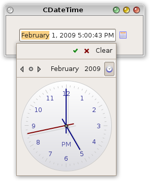
Drop Down Style
Drop down style is used with the c_date_time_drop_down, c_date_drop_down, and c_time_drop_down keywords to provide a text box for textual entry of date/time coupled with a drop down button for bringing up the calendar/clock to perform graphical selection.
CDT::DROP_DOWN style is applied by default but may be overriden by manually passing arguments to the keywords.

c_date_time_drop_down
Alias keyword that specifies date/time pattern 'MM/dd/yyyy hh:mm a' and drop down style with a border

c_date_drop_down
Alias keyword that specifies date pattern 'MM/dd/yyyy' and drop down style with a border

c_time_drop_down
Alias that specifies time pattern 'hh:mm a' and drop down style with a border

Spinner Style
Spinner style is used with the c_date_time_spinner, c_date_spinner, and c_time_spinner keywords to provide a spinner for textual entry of date/time accompanied by up and down spinner buttons.
CDT::SPINNER style is applied by default but may be overriden by manually passing arguments to the keywords.

c_date_time_spinner
Alias that specifies date/time pattern 'MM/dd/yyyy hh:mm a' and spinner style with a border
c_date_spinner
Alias that specifies date pattern 'MM/dd/yyyy' and spinner style with a border
c_time_spinner
Alias that specifies time pattern 'hh:mm a' and spinner style with a border
Compact Style
Compact style is used with the c_date_time_compact, c_date_compact, and c_time_compact keywords to provide a compact text widget for date/time without any extra buttons.
CDT::COMPACT style is applied by default but may be overriden by manually passing arguments to the keywords.

c_date_time_compact
Alias that specifies date/time pattern 'MM/dd/yyyy hh:mm a' and compact style (just a text field) with a border
c_date_compact
Alias that specifies date pattern 'MM/dd/yyyy' and compact style (just a text field) with a border
c_time_compact
Alias that specifies time pattern 'hh:mm a' and compact style (just a text field) with a border
CDT Style Arguments
CDT styles are fully documented in the Nebula CDT Javadoc.
The cdt keyword builds a CDT style by passing in comma-separated symbols (e.g. cdt(:border, :drop_down, :date_long))
For example, instead of passing style as bit-or'ed CDT Constant style bits:
c_date_time(CDT::BORDER | CDT::TAB_FIELDS | CDT::DROP_DOWN | CDT::DATE_LONG)
You instead pass style as comma-separated symbols:
c_date_time(cdt(:border, :tab_fields, :drop_down, :date_long))
However, c_date_time goes one step further and uses it internally automatically by all c_date_time keyword initializers, so you could ditch the cdt entirely when constructing a widget.
c_date_time(:border, :tab_fields, :drop_down, :date_long)
Furthermore, c_date_time has pre-configured smart defaults for CDT styles:
'c_date_time'              => [:border, :tab_fields, :simple],
'c_date'                   => [:border, :tab_fields, :date_short, :simple],
'c_time'                   => [:border, :tab_fields, :time_short, :simple],
'c_date_time_compact'      => [:border, :tab_fields, :compact],
'c_date_compact'           => [:border, :tab_fields, :date_short, :compact],
'c_time_compact'           => [:border, :tab_fields, :time_short, :compact],
'c_date_time_spinner'      => [:border, :tab_fields, :spinner],
'c_date_spinner'           => [:border, :tab_fields, :date_short, :spinner],
'c_time_spinner'           => [:border, :tab_fields, :time_short, :spinner],
'c_date_time_drop_down'    => [:border, :tab_fields, :drop_down],
'c_date_drop_down'         => [:border, :tab_fields, :drop_down, :date_short],
'c_time_drop_down'         => [:border, :tab_fields, :drop_down, :time_short],
Data-Binding and Observers:
The selection property provides access to the value selected by the user. It can be hooked with basic data-binding to a model property. Additionaly observers may be attached too, such as on_widget_selected and on_key_pressed.
Example:
# ...
composite {
# ...
@start_at = c_date_time(:border, :drop_down, :date_long) {
# ...
selection bind(@task, :start_at)
on_key_pressed { |event|
@end_at..set_focus if event.keyCode == swt(:cr)
}
}
}
# ...

Table Editor
c_date_time (and any keyword aliases) can be used as a table / table_column editor by passing as symbol to editor property (optionally followed by args model editing property).
Example:
# ...
  table { |table_proxy|
    # ... other table_column declarations
    table_column {
      text 'Start Date'
      width CONFIG[:table_column_width_hint]
      editor :c_date_time, cdt(:border, :drop_down, :date_long), property: :start_at
    }
    table_column {
      text 'End Date'
      width CONFIG[:table_column_width_hint]
      editor :c_date_drop_down, property: :end_at
    }
    # ... other table_column declarations
    items bind(Task, :list), column_properties(:project_name, :task_type, :name, :start_date, :end_date, :duration, :priority)
    # ... other table GUI code
  }
# ...

API
You may check out the Nebula CDateTime Widget Javadoc API.
One noteworthy property is pattern, which can be customized according to the date/time pattern SimpleDateFormat Javadoc.
Example:
c_date_time(:border, :drop_down) {
  pattern 'hh:mm a'
}
This should customize c_date_time to function just like c_time_drop_down
Glimmer Custom API
Glimmer adds a few extra API methods to CDateTime from Nebula.
toggle_open
Programmatically toggle date/time dropdown as open (simpler than directly calling .swt_widget.set_open in certain circumstances)
text_widget_proxy
Provides access to the inner text widget to allow programmatic adding of obesrvers and/or data-binding.
Example:
c_time { |proxy|
proxy..content {
on_swt_mouseup { |event|
proxy.toggle_open
}
}
}
TODO
Change Log
Contributing to glimmer-cw-cdatetime-nebula
- Check out the latest master to make sure the feature hasn't been implemented or the bug hasn't been fixed yet.
- Check out the issue tracker to make sure someone already hasn't requested it and/or contributed it.
- Fork the project.
- Start a feature/bugfix branch.
- Commit and push until you are happy with your contribution.
- Make sure to add tests for it. This is important so I don't break it in a future version unintentionally.
- Please try not to mess with the Rakefile, version, or history. If you want to have your own version, or is otherwise necessary, that is fine, but please isolate to its own commit so I can cherry-pick around it.
Copyright
Copyright (c) 2020 - Andy Maleh
--
 Built for Glimmer DSL for SWT (Ruby Desktop Development GUI Library).